hand held samples | because it has to be seen in person

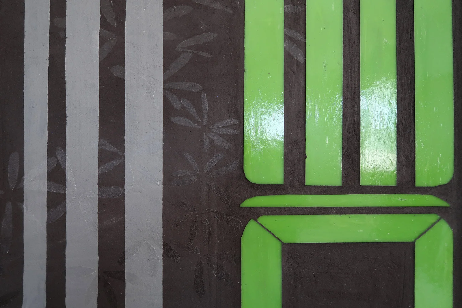
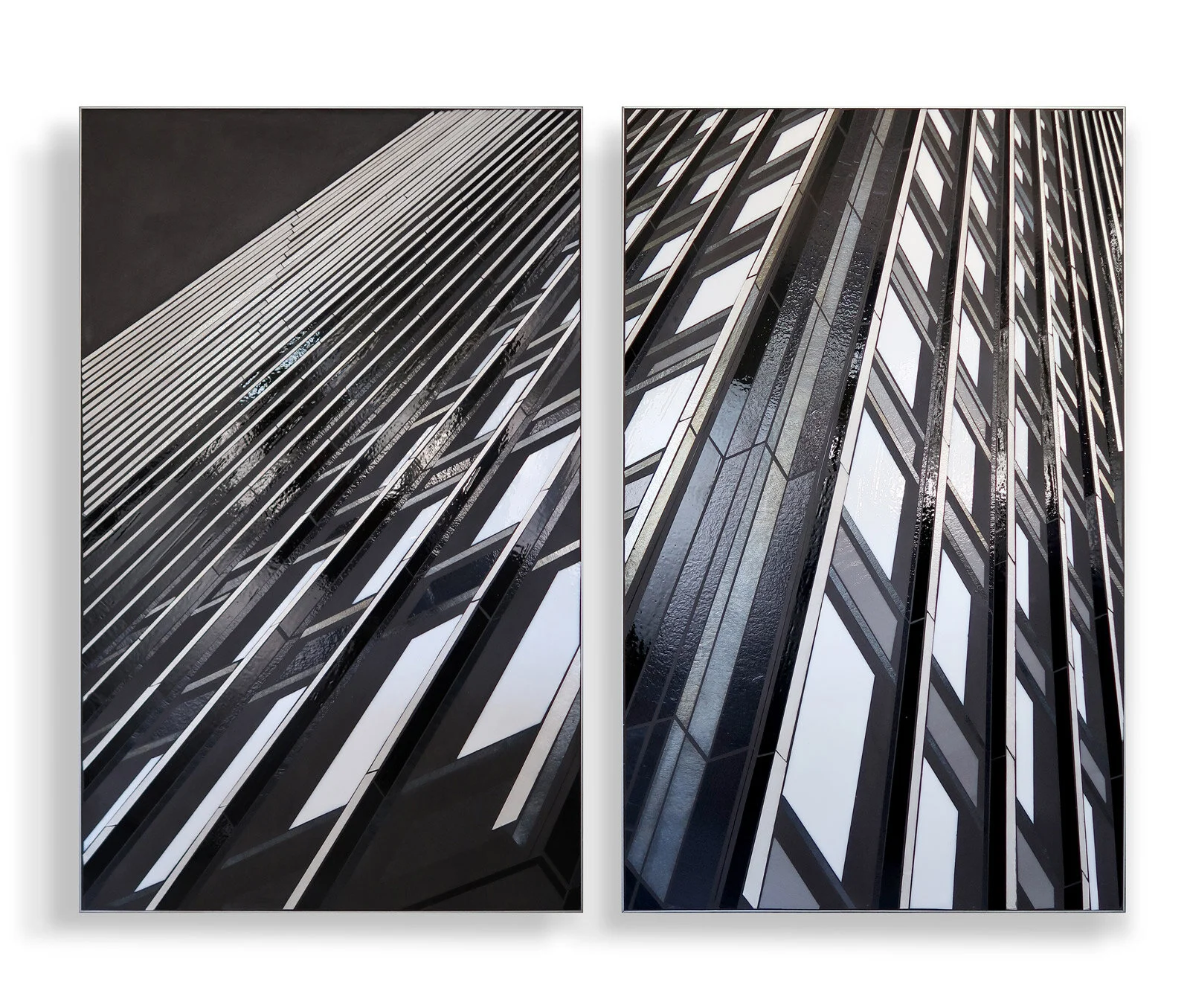
I am well aware of how important it is to see my work in person. Holding a sample in your hand you immediately understand how glass interacts with light and movement; how matte concrete offers an important textural contrast to shimmering glass; how surprisingly light the work is. You understand how the surface imperfections of glass and hand cutting makes the work accessible and engaging.

SCAN+ 8”x8” hand held sample

I now have 8”x8” samples available for client meetings and presentations.

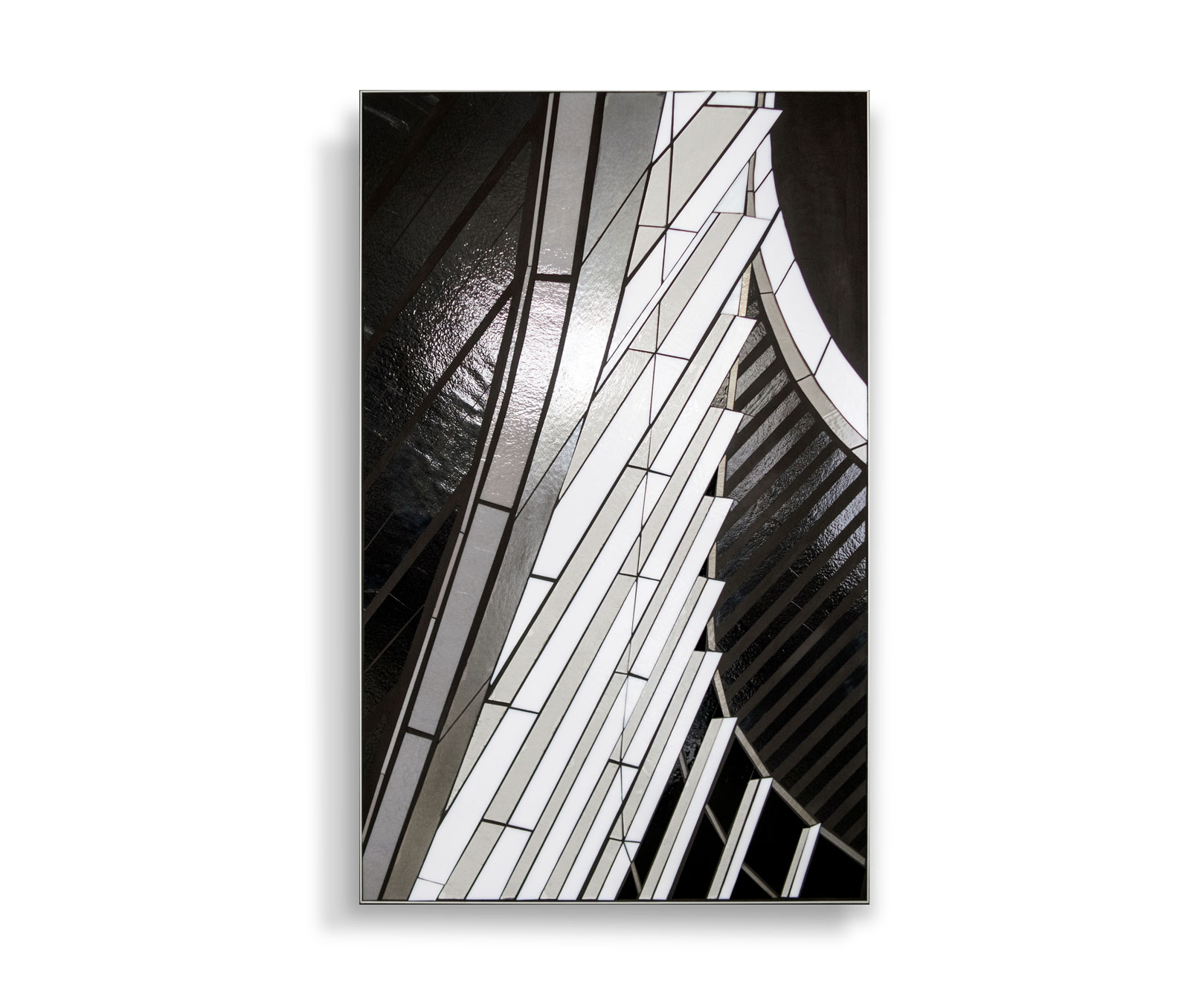
  • black and white sample of REFLECT/architectural abstractions

  • color sample of SCAN+GROW/geometric abstractions

Custom boxes arrived this week to frame the samples, providing a clean edge and way to handle the pieces easily. Gotta say. I love the magnetic close.

8”x8” hand held sample REFLECT | architectural abstraction

8”x8” hand held sample SCAN + GROW | abstracted geometrics

Let me know if you need a sample to make a final decision or for your client meeting.


New ideas | Urban vocab

New work is in progress in the studio. Working title for the series is ‘urban vocab.’ The work is an integrative series that pulls together elements from all three of my series—REFLECT, GROW and SCAN—to address a recurring theme for me: urban meets nature. Rooted in EO Wilson’s 1986 concept of biophilia, I have a strong belief in the importance of staying connected to the natural world. We thrive on the multi-sensory stimulation and dynamic embodied experience found in the information rich natural world. The built world provides a qualitatively different, arguably less robust experience. Nonetheless the hard-edged line and form, predictability and repetition of the urbanscape is an integral part of our daily visual experience. To avoid the typical cliches with cut glass—and as a work around for technical limitations—I use urban line+form as visual analogy for natural forms. Viewers are offered an information set that requires cognitive engagement to translate additional non-literal meaning and in so doing the viewer is invited to co-create the visual experience.

urban vocab | 20”x20” mixed media with glass c Heather Hancock 2019

With this new series, I’m re-thinking grout as both a lovely urban concrete texture and as a canvas for painted elements to interact with hard-edged glass. The ubiquitous natural world appears as a transient, light- and motion-activated element in gloss varnish.

Pulling abstracted text, built world and natural elements into a single composition leads to both simplicity (ie negative space) and complexity (ie layering). Three simple color palettes and two contrast options (high contrast black matte concrete or low contrast silver matte concrete) create endless potential for unique hangings of these bold and playful 20”x20” pieces.

urban vocab | 20”x20” mixed media with glass c Heather Hancock 2019

urban vocab | 20”x20” mixed media with glass c Heather Hancock 2019

SOFA Chicago

I enjoyed an art-filled weekend at Navy Pier for SOFA Chicago.

Brand new work in my Reflect/architectural series was shown by Ken Saunders Gallery.

Ken Saunders Gallery at SOFA Expo Chicago 2019

Reflect 3.9 EDGE 2@48”x30” hand cut glass inlay c Heather Hancock 2019

These urban abstractions are inspired by our everyday experience of moving through the city. Light and shadow play across architectural surfaces offering moments of surprise and discovery. I am inspired by the vibrancy and information I notice in the world around me. The fluidity and constant transformations in the natural world contrast with the predictable segments and hard transitions I find in the cityscape. Light connects these two worlds, bringing both clarity and complexity to the everyday.

Ken Saunders Gallery | SOFA Expo Chicago 2019

Reflect 3.9 EDGE 2@48”x30” hand cut glass inlay c Heather Hancock 2019

Susie Silbert presented work on a number of artists in the current New Glass Now exhibition at Corning. Susie talked about my previous career in healthcare as a speech language pathologist and how it informs my exploration of vocabularies of architecture and urban spaces.

Susie Silbert | Curator of Modern and Contemporary Glass at Corning Museum of Glass

Reflect 3.2 Curve | at New Glass Now Corning Museum of Glass

yep. I had a great time at SOFA. : )

Grow 1.0 | digital prairie

Enjoyed coming back to GROW 1.0 this week for a small piece. This version of prairie is inspired by seeing the stems and leaves in circuit board lines. It makes my prairie girl heart happy : )

GROW 1.5 hand cut glass inlay 15x24 c Heather Hancock 2019

detail | GROW 1.5 hand cut glass inlay 15x24 c Heather Hancock 2019

GROW 1.5 hand cut glass inlay 15x24 c Heather Hancock 2019

GROW | biophilic design

I’ve loved coming back to GROW with some new directions. My ‘ivy on concrete’ wall has evolved to include abstracted text forms and an expanded role for the matte grout as a canvas for etching + varnish elements.

Grow 4.1 48”x30” hand cut glass inlay c Heather Hancock 2019

GROW 4.1 is ready for installation at a Chicago law firm. The firm’s design incorporates biophilic design elements (including potted plants and a living wall). Looking forward to seeing this piece installed as part of their contemporary art program.

Grow 4.1 48”x30” hand cut glass inlay c Heather Hancock 2019

The client opted for a lower contrast iron gray grout for this project. This gives a true concrete look and allows the etched elements to be more visible.

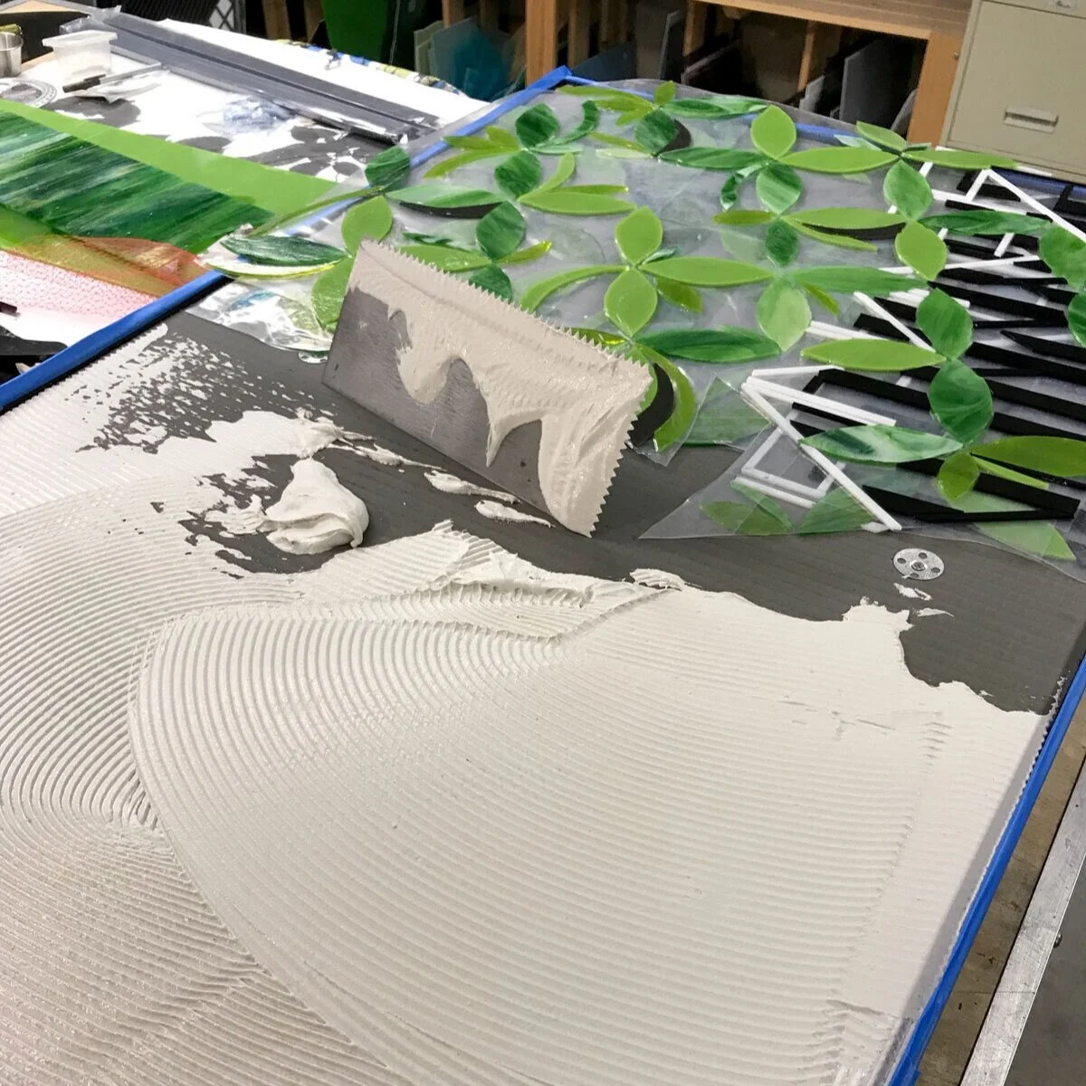
WIP | 1/8” glass is embedded in 1/16” thinset bed.

Just add light. GROW is happy in any lighting conditions.

GROW 4.1 detail

KIAF SEOUL

My work has made it around the world to Seoul. First stop: Korean International Art Fair at the end of September. This five day international art fair hosts 175 galleries from 17 countries and this year a record 82,000 visitors.

Gallery Sklo included my work in their crisp white and gray booth.

Urban abstractions from my REFLECT series are inspired by our everyday experience of moving through the city. Light and shadow play across architectural surfaces offering moments of surprise and discovery. The work explores the vibrancy of the cityscape understood as light and shadow, repetition and variation, information and chaos.

Ms Kim, Gallery Sklo and Andrew Bae, Andrew Bae Gallery

All photos courtesy of Gallery Sklo.

Beauty in Structure

I found some time over the summer to experiment with compositions featuring structural elements. I am always on the look out for coherent built world lines. Trusses and structural beams might be the ultimate in coherent lines. Inspired by the modernist structural beauty at McCormick Place, these studies explore the visual interest (and beauty) of structural elements.

Reflect 1.58 and Reflect 1.57 | Truss studies | each 24”x24” mixed media with glass inlay c Heather Hancock 2019

For years I have noticed the pop of orange pipes weaving through the trusses when driving past on Lake Shore Drive. This created the opportunity to experiment with introducing a color element into this series.

Reflect 1.59 | Truss study 3 | 24”x24” mixed media with glass inlay c Heather Hancock 2019

Looking forward to more in this series.


Grow | organic abstractions for biophilic design

I came to my art practice with a strong interest in biophilic design. Having worked in healthcare for more than a decade, I am well aware of the importance of natural views and light, organic shapes and forms to well-being. EO Wilson’s concept of our innate attunement to the natural world has been widely adopted as an important restorative element in our urbanized lives.

Grow | urban vine 15”x24” handcut glass alongside matte black grout c Heather Hancock 2019

Growing up on the Canadian prairies I was surrounded by spare natural beauty. I’ve learned to find similarly spare, hard beauty in Chicago’s urban landscape. Setting glass alongside industrial materials such as grout, cement and metal points to the contrast between the natural and manmade worlds and creates tension between light and dark, brilliance and opacity, vibrancy and restraint, fragility and permanence.

Grow offers abstracted organic shapes alongside urban line and texture for a bold visual element relevant to biophlic design. Hand cut glass shimmers and shifts for an engaging visual experience.

Scan | healthcare imagery

rendering Scan with client relevant content+imagery embedded | 2@48”x30” c Heather Hancock 2019

This invited design proposal incorporated content and imagery relevant to the clients in a health+wellness related space. Biological systems and synapses appear in abstract form alongside key words from the clients’ mission statement.

synapses + biological systems encoded along with client’s mission words

Scan | environmental installation

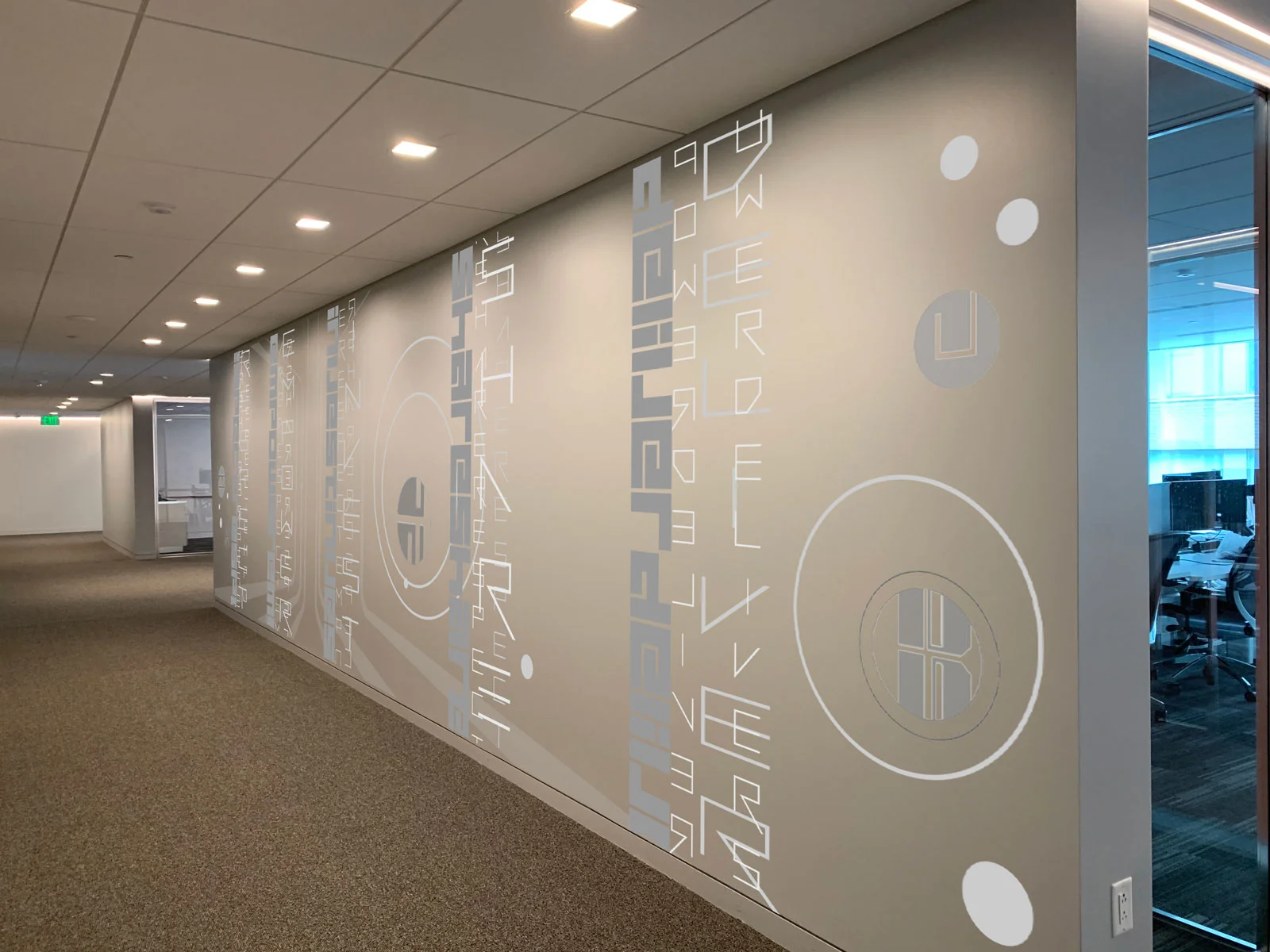
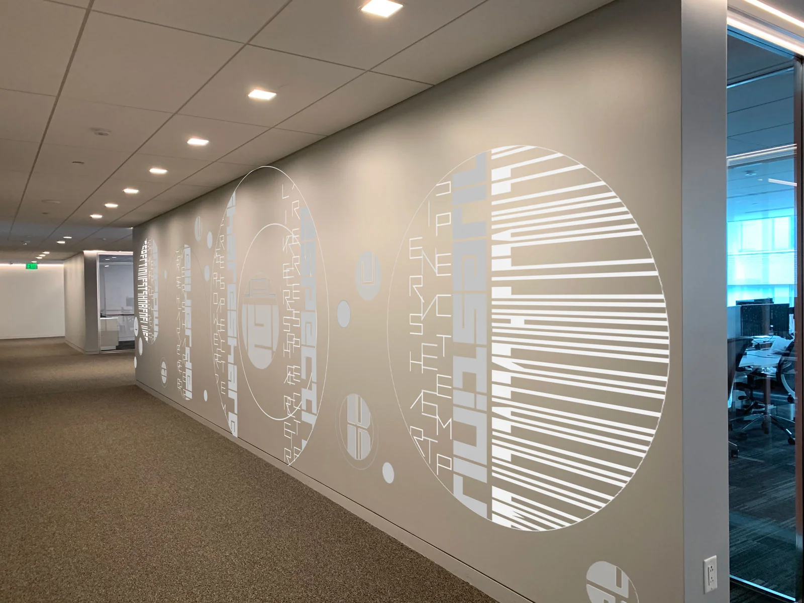
I was recently invited to develop a concept for a printed environmental installation using Scan as the starting point for the composition. Working with anchor words provided by the client, the goals for a visual concept included:

  1. printable/easily fabricated wall installation for a 100” x 30’ hallway

  2. integrate the clients’ words in an abstracted way

  3. create an engaging visual experience for an interior employee hallway…traffic going in both directions.

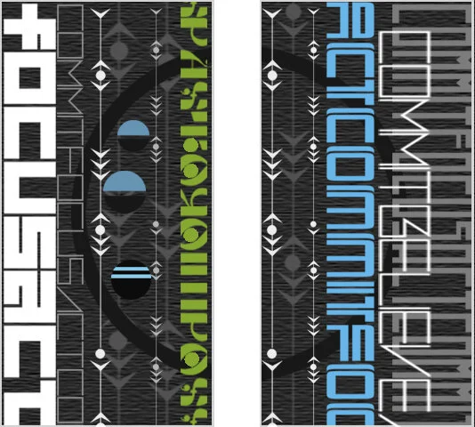
FIve anchor words created the vertical elements for the composition floating along the wall. Oversize circle frames were added to bring more of the playful shape into the concept and soften the rectilinear nature of the hallway span. Compositions were completed by bringing in additional abstracted text elements, creating visual rhythms and variations across the span. First versions were envisioned in a neutral palette integrated with the existing colorway of the hallway. Crisp white, silver sheen and medium gray provided adequate contrast while being visually integrated within the hallway.

Additional concepts incorporated graphic takes on waves and a tree. Borrowing built world forms to represent natural world forms is a modernist trope that I have always been drawn to.

While this installation did not go forward to fabrication I loved the challenge of transforming an everyday corporate hallway into a compelling visual experience.

New Glass Now | Corning Museum of Glass

My weekend at Corning Museum of Glass was truly incredible. I am thrilled to be part of this landmark survey show of contemporary glassmaking and thinking. The contemporary wing is drop dead gorgeous with natural light filtering through high ceiling beams. The Corning Museum team created a cohesive installation with the diverse range of glass art.
Read More


#newglassnow is a global survey of contemporary glassmaking, featuring objects, installations, videos, and performances made in the last three years by 100 artists of 32 nationalities. Heather’s Reflect 3.2 Curve, above, was chosen by selectors Aric Chen and Beth Lipman:

Heather Hancock uses glass inlay to re-create the geometries of mid-century modern architectural facades, capturing a sense of the ephemeral within their otherwise highly rational compositions. —Aric Chen

The show is hanging through January 5, 2020 at the Corning Museum of Glass.

Corning Museum of Glass | New Glass Now

I am thrilled to have work headed to the New Glass Now show at the Corning Museum of Glass. The show opens May 12th and runs through January 5, 2020.

New Glass Now documents the innovation and dexterity of artists, designers, and architects around the world working in the challenging material of glass. A global survey designed to show the breadth and depth of contemporary glassmaking, the exhibition will feature objects, installations, videos, and performances made by 100 artists of 32 nationalities working in more than 25 countries.

Earlier work from my Reflect series was included in last year’s CMOG New Glasswork Review (39). Now I am looking forward to having new work included in this extraordinary exhibition of art from around the world.

Scan | UrbanLines

A recent invited design proposal gave me the chance to explore new concepts with Scan. Abstracted text forms point to the infinite creativity of language. Our minds are attuned to detecting pattern, scanning for relevant information and finding meaning in the world around us. For this proposal I combined abstracted text forms with backgrounded urban and natural imagery. Simple graphic elements are inspired by my interest in finding beauty in unexpected places. Living in urbanscapes requires new ways of seeing beauty around us and staying connected to the natural world.

rendering | Scan: UrbanLines (concept1) 4 @ 28”x48” c Heather Hancock 2019

rendering | panel1 Scan: UrbanLines c Heather Hancock 2019

rendering | Scan: urban lines (concept2) | 4 panels at 24”x48” c Heather Hancock 2019


Panel4 Scan: UrbanLines 22”x34”

c Heather Hancock 2019


EMERGE | invited design proposal

I was recently selected as a semi-finalist and invited to present a design proposal for an art installation at the newly renovated Health+Sciences building at Triton College in River Grove, IL.

Goals: Create a responsive visual experience in Commons area celebrating the extraordinary contributions of faculty and students to broader community. Activate space with shimmering glass and encoded content with relevance to faculty and students in Health+Sciences building.

EMERGE | design concept 3@36”x84” | c Heather Hancock 2019

EMERGE | design concept 3@36”x84” | c Heather Hancock 2019

In Scan, abstracted text forms suggest the infinite creativity of language. Our minds are attuned to detecting pattern, scanning for relevant information and finding meaning in the world around us. I combined abstracted text forms with backgrounded imagery referencing biological process and systems. The color palette was taken from the colorways established by FGM Architecture. Simplified graphic forms offer visually ambiguous elements—ranging from synaptic transmission to electronic circuitry to a thriving vine. Abstracted text also drawn from the biological sciences provide vertical rhythm, encoded content and bold color elements.

EMERGE | design concept 3@36”x84” | c Heather Hancock 2019

Rendered in shimmering glass, this installation creates an endlessly dynamic and varied visual experience for faculty+students and visitors to the building.

additional art installation site | EMERGE 2@30”x60” c Heather Hancock 2019

A whole new perspective

This large-scale residential commission was just installed in a recently renovated home. The clients worked with architect Jeanie Petrick over the past several months to renovate their early 1900s home with a contemporary industrial twist. They saw my architectural abstractions hanging at a show last spring and envisioned a piece on their dark charcoal gray dining room wall connecting with both their contemporary aesthetic and commitment to incorporating local art into their home. These clients have collected art from local artists in the various cities they’ve lived in, making art an important part of their story.

Reflect 4.3 beams | glass | 5’x3’ c Heather Hancock 2019

After a studio visit, the clients selected an abstraction of the exterior beam structure of the 875 N. Michigan Ave building. They determined that a horizontal piece at a full 60” x 36” would hold the wall in their dining room. The horizontal orientation created an expanded canvas for exploring the urban beauty in these architectural lines and rhythms.

The dark charcoal gray wall and white moldings create an architectural framing of the piece. A glass chandelier, wood table and zinc countertops create an engaging material dialog with the art piece in the space.

Reflect 4.3 beams | glass | 5’x3’ c Heather Hancock 2019