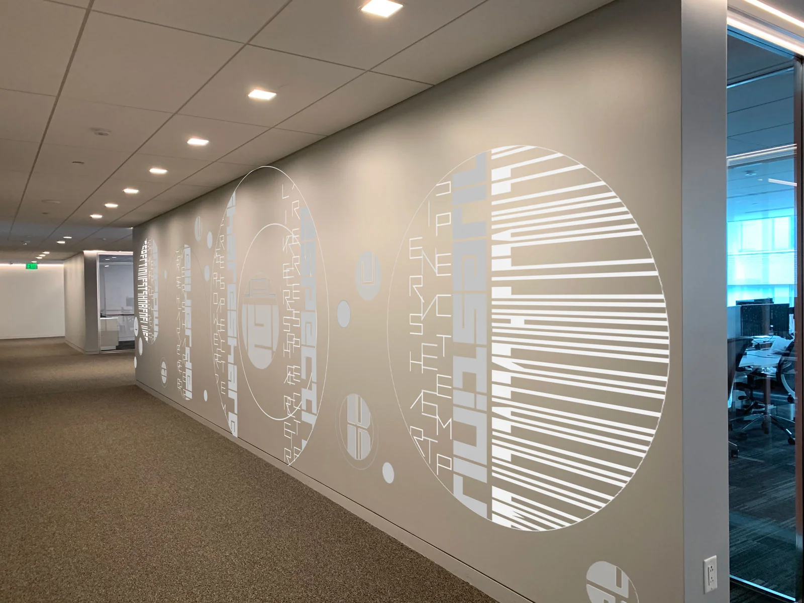
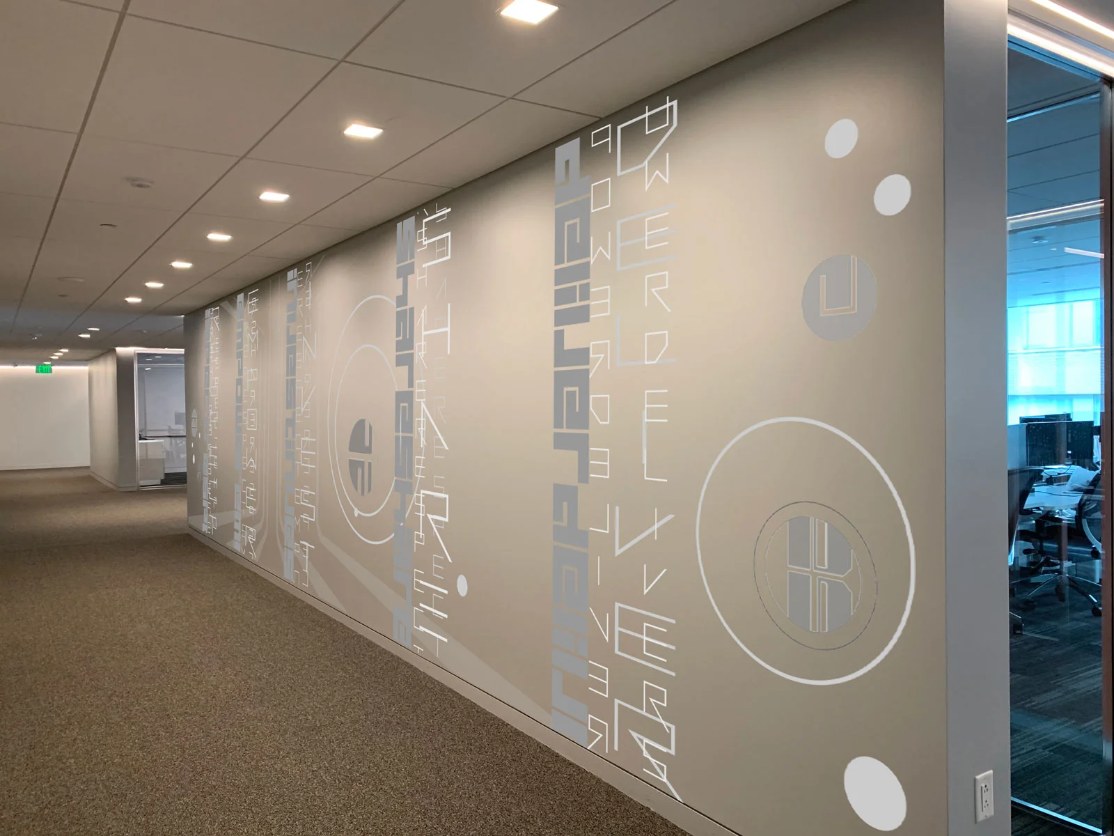
I was recently invited to develop a concept for a printed environmental installation using Scan as the starting point for the composition. Working with anchor words provided by the client, the goals for a visual concept included:
printable/easily fabricated wall installation for a 100” x 30’ hallway
integrate the clients’ words in an abstracted way
create an engaging visual experience for an interior employee hallway…traffic going in both directions.
FIve anchor words created the vertical elements for the composition floating along the wall. Oversize circle frames were added to bring more of the playful shape into the concept and soften the rectilinear nature of the hallway span. Compositions were completed by bringing in additional abstracted text elements, creating visual rhythms and variations across the span. First versions were envisioned in a neutral palette integrated with the existing colorway of the hallway. Crisp white, silver sheen and medium gray provided adequate contrast while being visually integrated within the hallway.
Additional concepts incorporated graphic takes on waves and a tree. Borrowing built world forms to represent natural world forms is a modernist trope that I have always been drawn to.
While this installation did not go forward to fabrication I loved the challenge of transforming an everyday corporate hallway into a compelling visual experience.


