I’ve been creating citySCAPES for a while now. They all started with a goal of creating a ‘city font.’ I wanted to see if I could create a simple vocabulary that read as an abstract city, essentially like a line of text. I have a longstanding obsession with letter forms and have worked with text in many different forms.
This piece in my Proust series (collaboration with Dr. Virginia Barry’s book Scratch and Sniff Proust, the neuroscience of scent) was the original version of a ‘city font.’ Here a tiny French village.
Proust series | combray 18”x24” c Heather Hancock
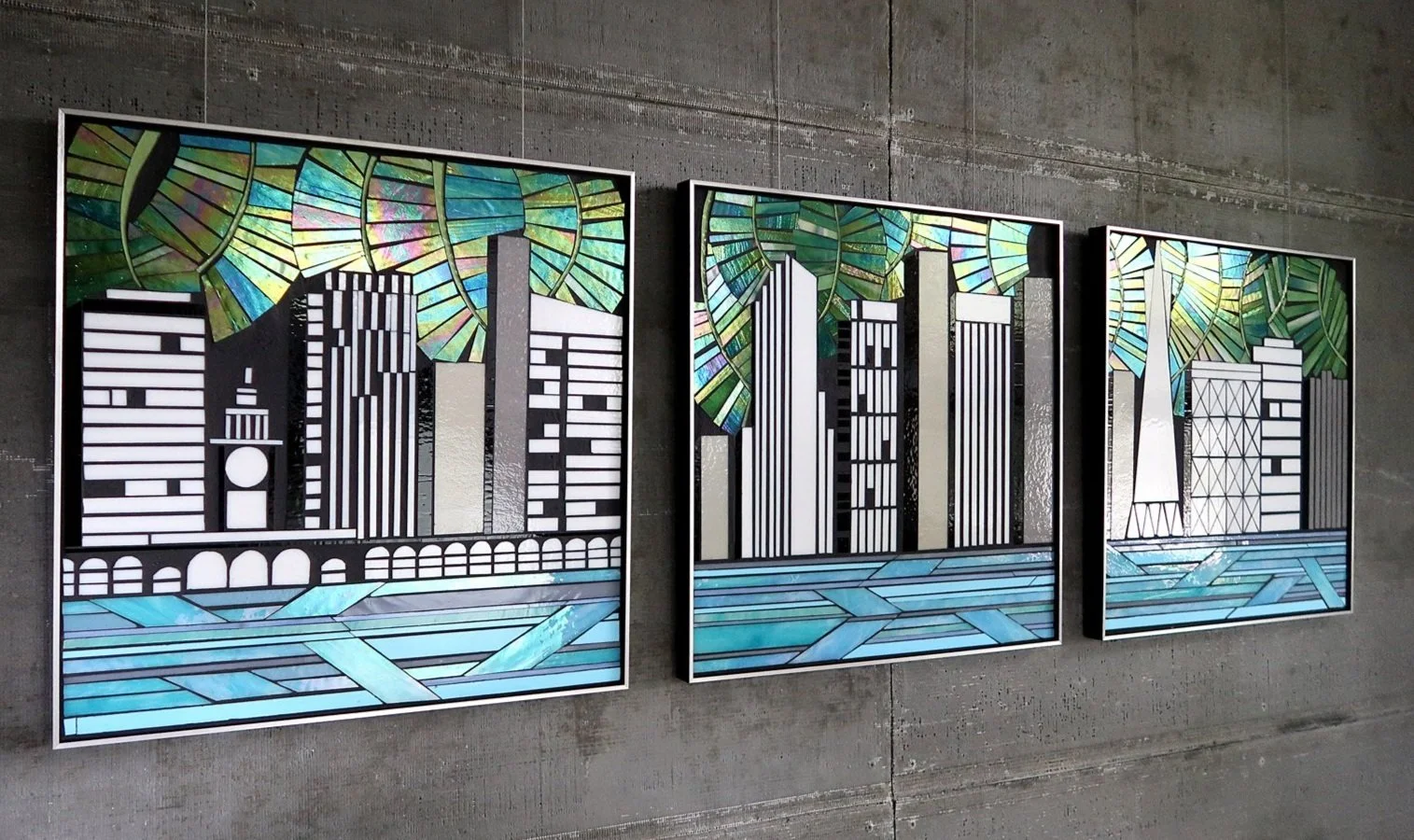
The next commissioned cityscape was for a building lobby in my hometown, Evanston, IL. This piece kept the graphic font-like concept for the city element and added the foliage on top (a reference to both the city’s robust urban forest and the botanical imagery in the architectural details on the facade of the building). A graphic lake concept completed the bottom of the piece for a highly stylized cityscape.
City|Evanston hand cut glass c Heather Hancock
detail City|Evanston
For subsequent commissions clients requested more representational city skylines. San Diego was still an abstracted all white simple forms but now overall forms were informed by an actual skyline.
SF skyline went further with specific SF buildings represented in a graphic style.
City|SF hand cut glass c Heather Hancock
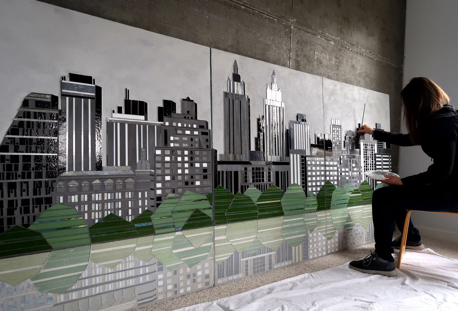
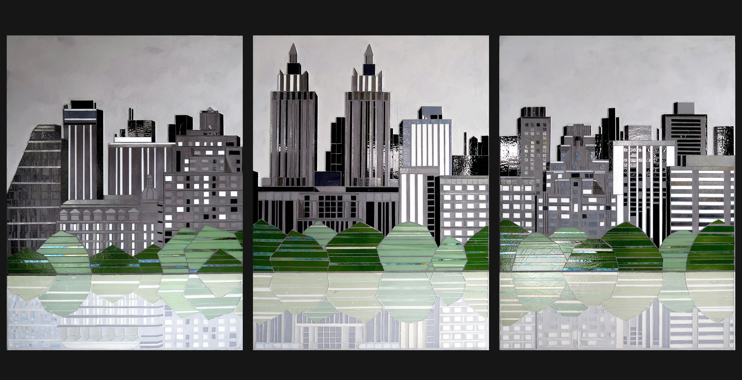
And then came the NYC project with an imaginary skyline created based on the upper west side from central park. With much bigger panels, more detail could be included. And, of course, this project has the first reflection in glass (which I must do more of).
City | NYC 48”x36”x3 hand cut glass c Heather Hancock 2021
City | NYC 48”x36”x3 hand cut glass c Heather Hancock 2021
Recent proposals have me thinking about cityscapes again. The wheels are turning. I’m envisioning a more abstracted approach again. Love seeing the evolution of ideas with different projects and clients.


