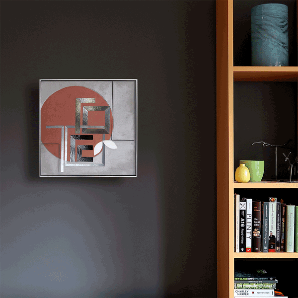
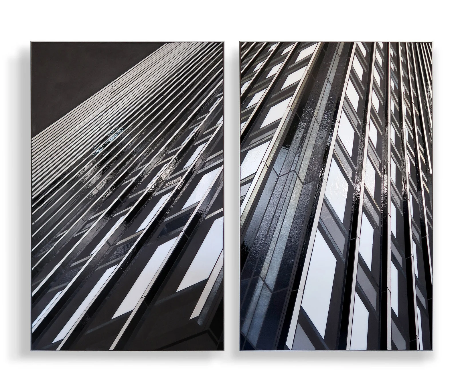
Recent piece in my architectural series. This piece is inspired by the curved grid of Chicago’s Lake Point Tower. The starting point for my art practice is how the human mind is engaged by information in the environment. The natural world gives us perfectly complex and comprehensible information which is fundamentally restorative. In the city we sort through layers and fragments of explicit and implicit information. We filter, decipher and decode and are occasionally rewarded with moments of discovery, surprise and beauty.

REFLECT 3.6 curved grid | hand cut glass inlay 48”x30” c Heather Hancock 2020

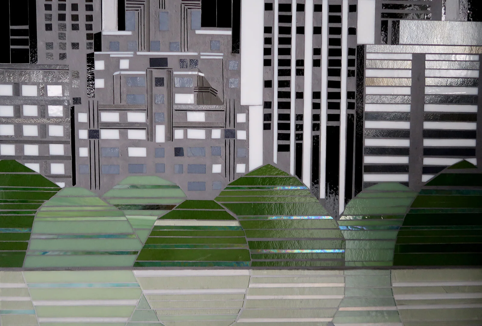
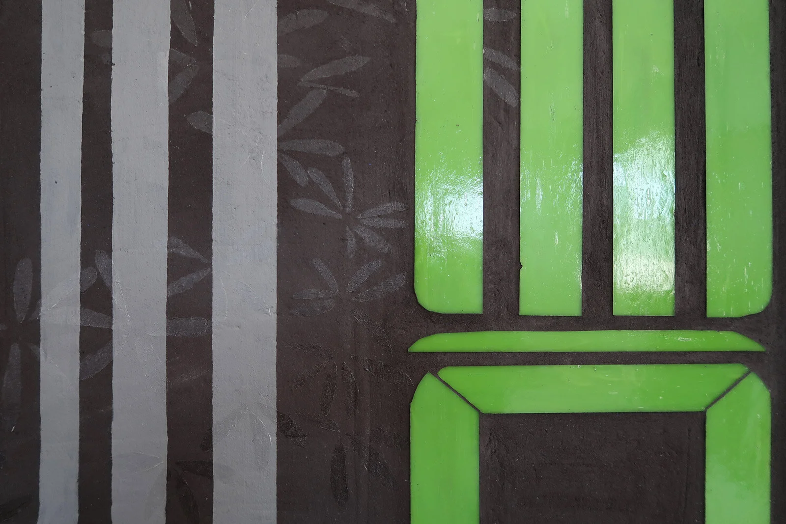
DETAIL


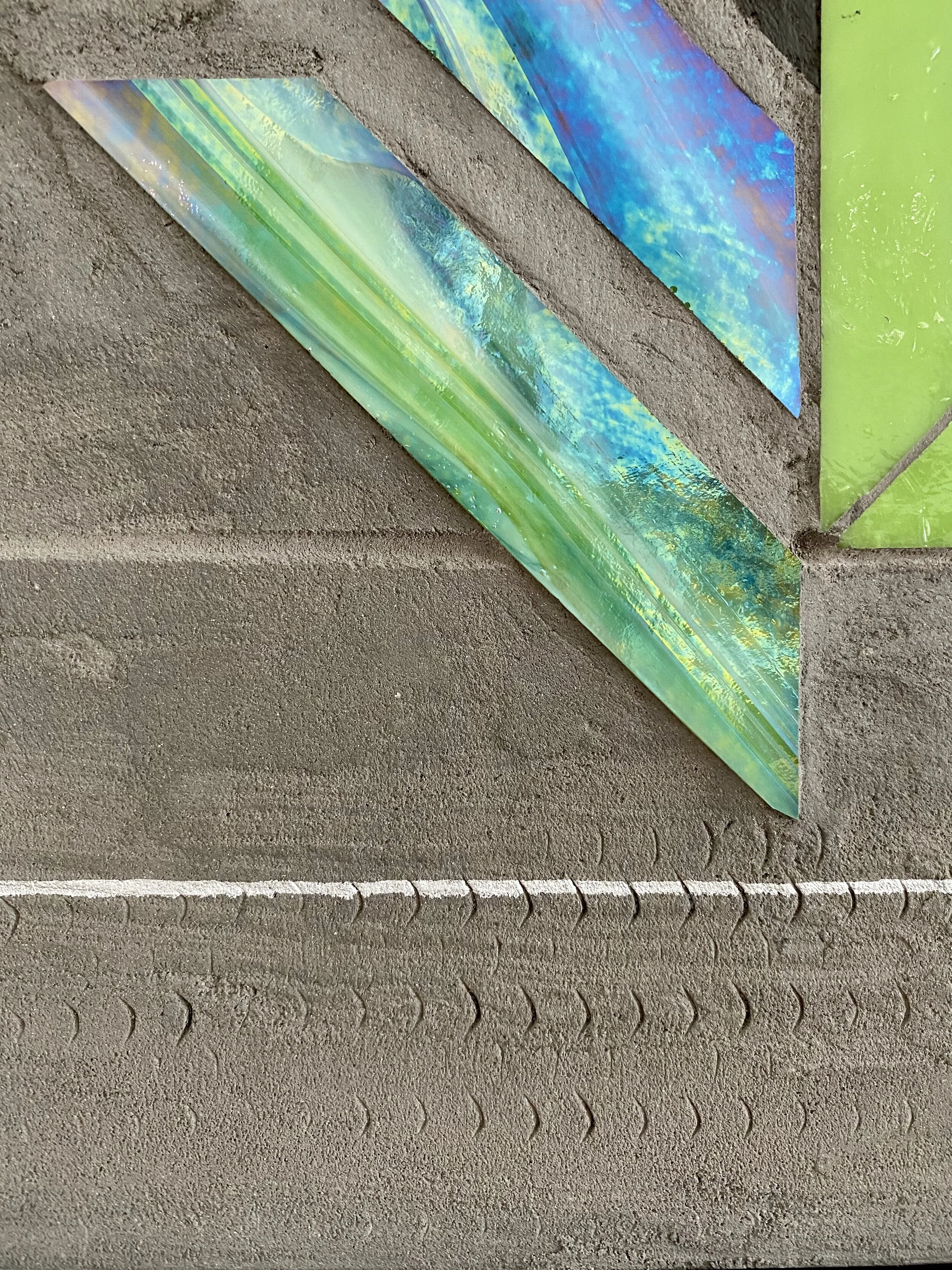
![[detail] REFLECT 4.4 | Cadence 56” x 30” hand cut glass + concrete](https://images.squarespace-cdn.com/content/v1/556a1236e4b063c81eb15dee/1600284710617-1VZR3BE9O1WHEEEQ7DD5/R4.4_edge-detail-WEB.jpg)