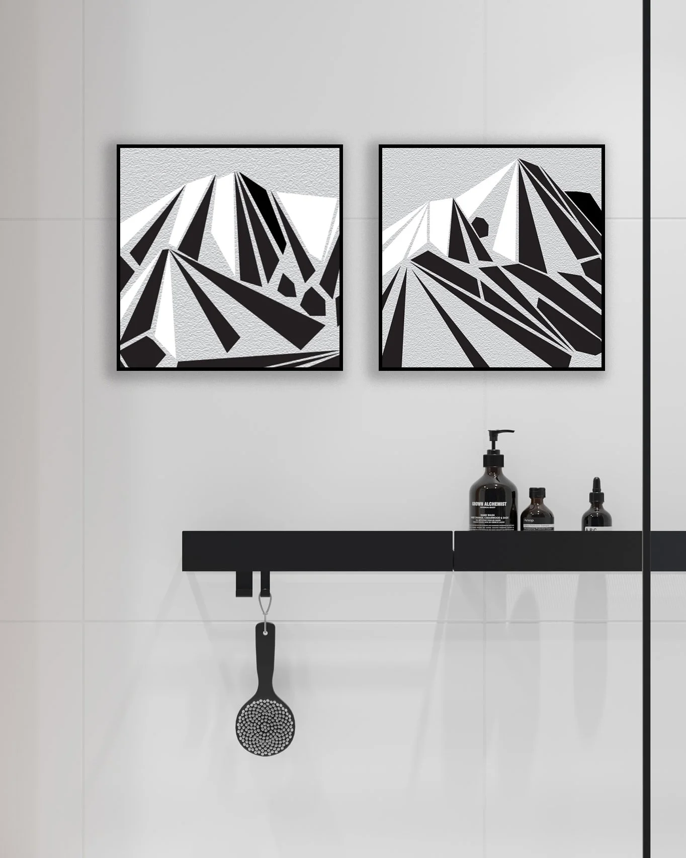
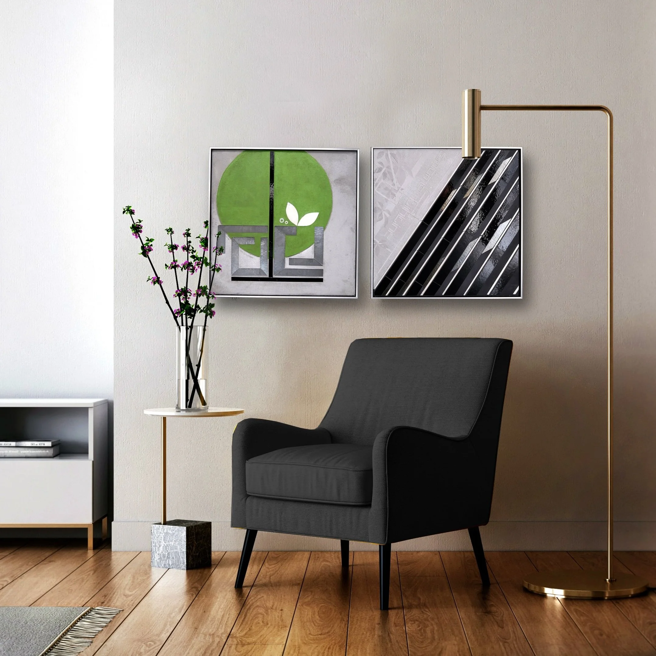
Loving how these grayscale UrbanVines are working in this executive suite.
urbanVines in situ | financial firm | NY photo credit: Forrest Scott Group

urbanVines in situ | financial firm | NY photo credit: Forrest Scott Group
Loving how these grayscale UrbanVines are working in this executive suite.

urbanVines in situ | financial firm | NY photo credit: Forrest Scott Group

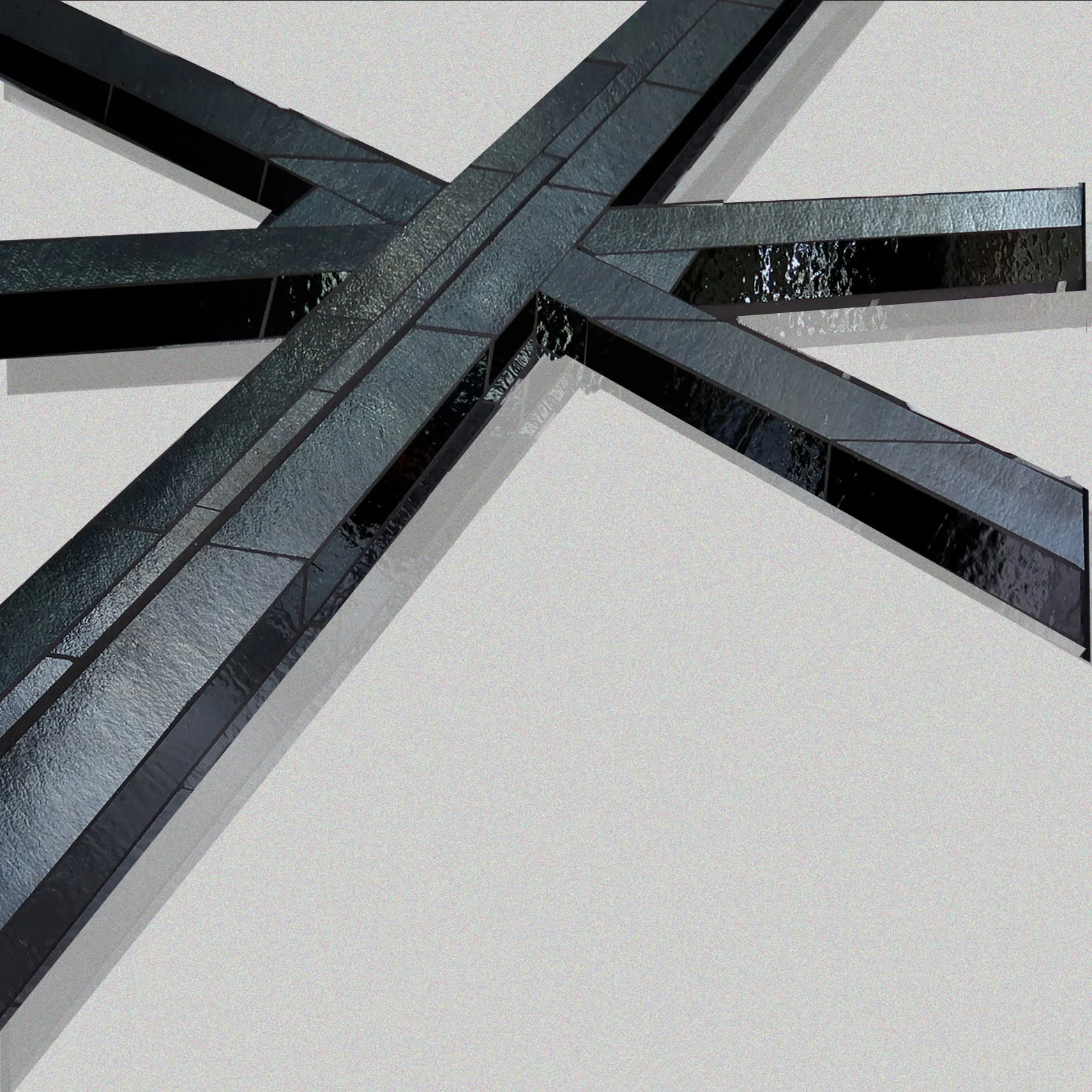
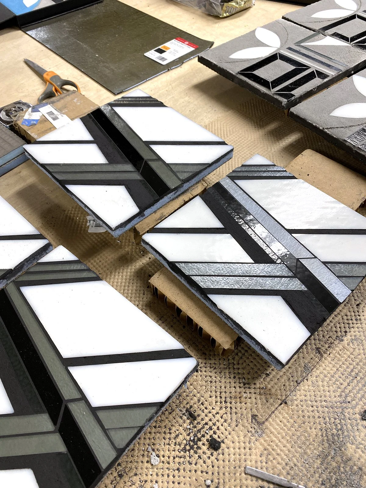
urbanvine 3.0 | each 20”x20” hand cut glass inlay with textured concrete c Heather Hancock 2022

urbanVine 3.2 20”x20” c Heather Hancock 2022

urbanVine 3.1 20”x20” c Heather Hancock 20

urbanVine 3.3 20”x20” c Heather Hancock 20
I am busy exploring a new clean-line foliage idea. Project code name: urban vine. It’s an idea that I often re-visit. Nature thriving around city strikes me as the ultimate metaphor for us finding our way in challenging environments.

I can see this ‘urban vine’ thriving in a vertical composition and catching light in a hallway or stairwell.

Always happy to brainstorm with you about how art can play a role in bringing space to life.
April in Chicago is always cold and gray and rainy. But spring blossoms are braving it and as happens every April, I’m inspired to find new leaf shapes and ideas for ‘clean line’ foliage. I’m exploring some irregular geometries to encode the idea of constant change and transformation we see in nature. I’m also trying much lower contrast versions…all new for me.

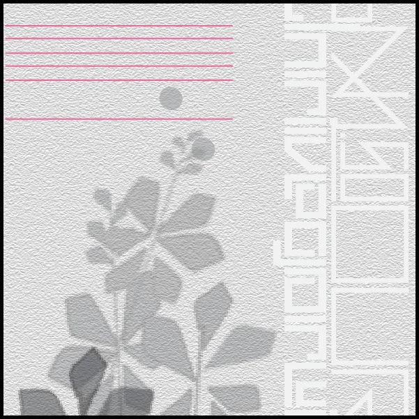
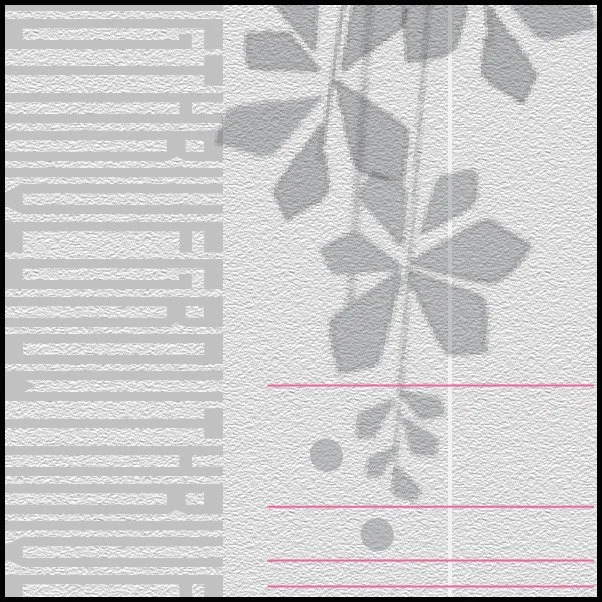
urban vine v1 | irregular geometric leaf v1 | silver background | hand cut glass + concrete c Heather Hancock 2022
urban vine v2 | irregular/rounded geometric leaf v2 | silver background | hand cut glass + concrete c Heather Hancock 2022

urban vine | hand cut glass + concrete c Heather Hancock 2022
New vocabulary and technique invariably lead to new bigger ideas. I’m thrilled to be working on new proposals for large scale installations—and enjoying the vibrant array of greens and blues in front of me right now.
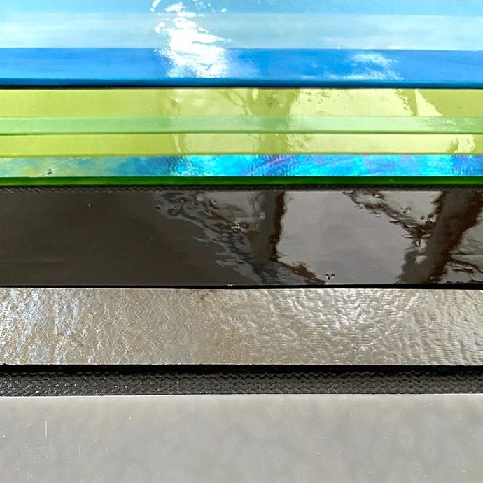
If you have follow my work you know I often work in grayscale. In part, working with a limited palette keeps me focused on form and composition and I love the spare elegance of grayscale art. Black/white glass is also an economical way to explore ideas. It is less expensive than colored glass and allows me to maintain a smaller glass inventory in the studio.
That said, most of my commissions are realized with color. Working with art consultant Debbie Sotzsky of Art Matters on an installation for a DC area lobby, I used the clients’ color way to develop a complementary glass palette. This made for the right vibrancy and drama for a contemporary light-filled lobby.


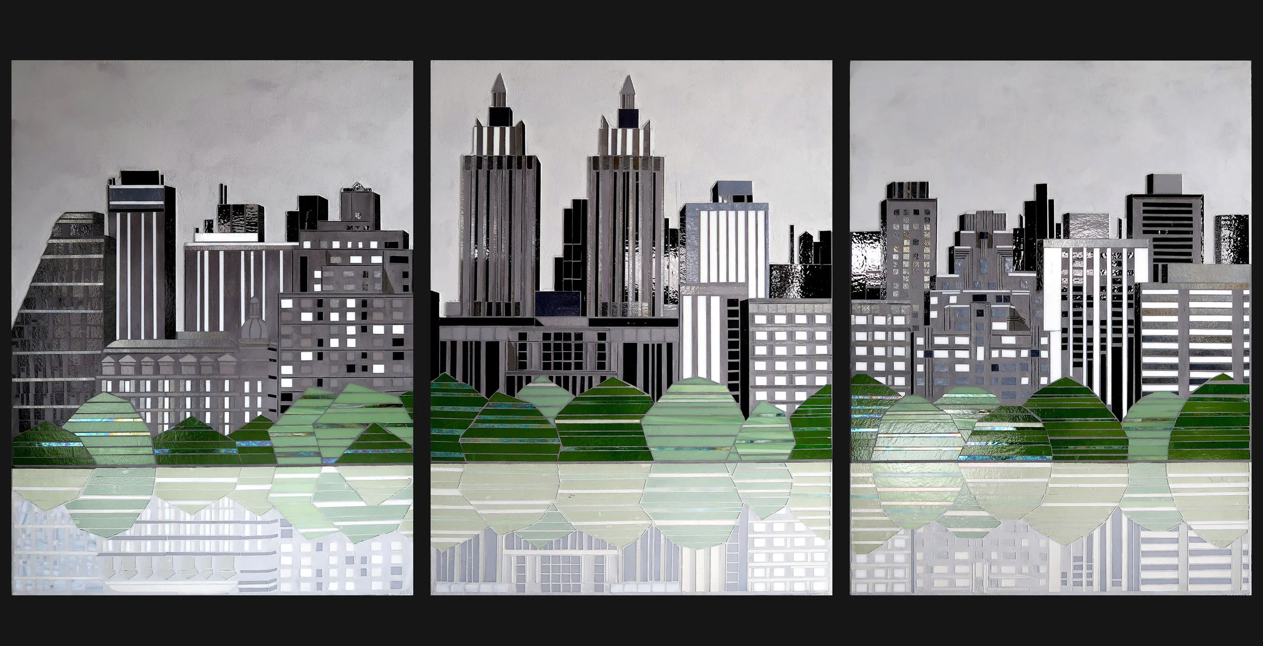
detail | Scan: MOVE 10 panels 13’ x 8’ hand cut glass + concrete c Heather Hancock 2021
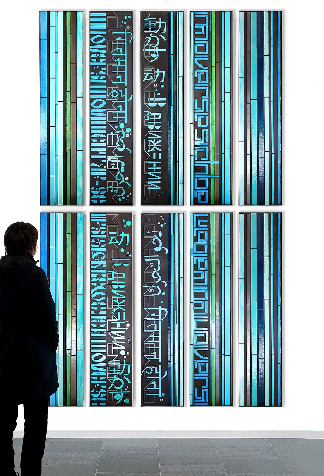
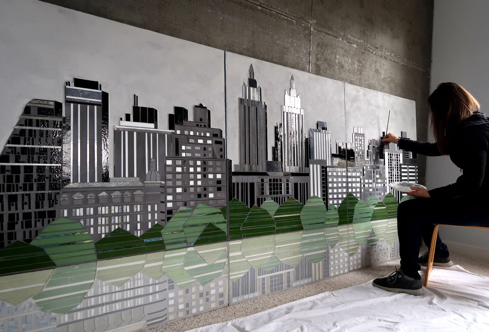
Scan: MOVE | 13’ x 8’ (10 panels of hand cut glass + concrete ) c Heather Hancock 2021
I love how this project turned out and I’m excited to be working on next concepts.
Let me know if I can help out with any projects on your desk right now. I’m always available to brainstorm how art can be integrated into beautiful spaces.
Refining drawings. Planning glass palette. Exploring composition ideas. Cannot wait to realize these pieces in shimmering glass + matte texture.


Starting to think a bit about next gen REFLECT series. I can envision a minimalist approach using the same clean line architectural imagery. And, possibly some additional abstract elements will start to weave in.

rendering | minimalist compositions REFLECT 20” x 20”


This past month has been focused on developing new proposals. Thinking about new spaces and viewers always gets me thinking in new directions.
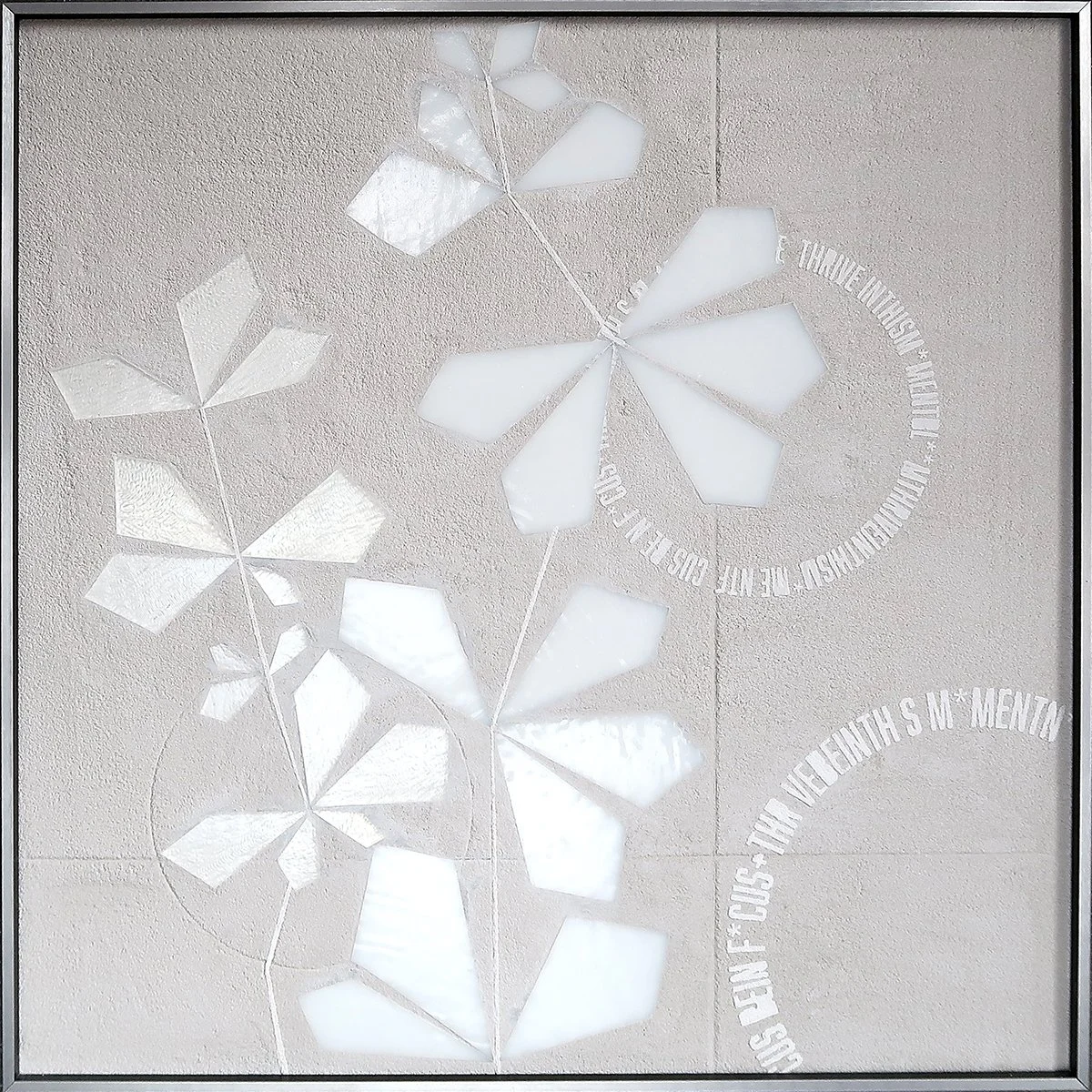
Starting with some rough sketches, I’m thinking about ‘vine on concrete wall’ idea that I always see as the ultimate metaphor for surviving and thriving in hard times/places. So many different ways to bring this idea to life. I will start with some 20”x20” sketches in glass+concrete to figure out what elements are glass vs etched vs embossed vs painted.


sketches | SCAN/thrive collage with frost gray +whites/grays
I so enjoyed a virtual studio visit with the KBAA team yesterday. Here are some images of the studio…and commission process notes. hh

studio tour

studio tour Feb22

studio tour Feb22

studio tour Feb22
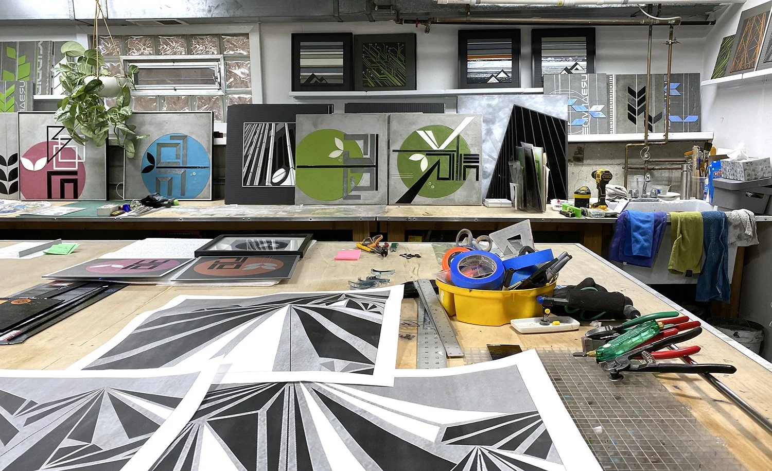
studio tour Feb22: next up is a series of 20”x20” pieces exploring mountain imagery.

my tools!
studio tour Feb22. I am exploring prints on aluminum and layered mylar.

studio tour Feb22
sample idea board

sample rendering > final piece
sample of rendering and final pieces
8”x8” sample ENCODE
8”x8” sample REFLECT


sneak peek. healthcare | graphic lobby 250SF in 14 panels


8”x8” hand held sample

rendering | installation for fabrication in exterior grade vinyl and paint (project was a covid casualty).
Some of my very first art pieces years ago were mountain themed. I grew up experiencing the pure awe of the Canadian Rockies. Their rugged hard edged beauty and monumentality puts everything into perspective: we are tiny specks on this ancient planet.
I did a series of mountainSCAPES a few years ago for a west coast healthcare facility. This graphic approach to mountain and sky created a crisp shimmering view in a patient waiting area.

mountainVIEW San Diego c Heather Hancock
And now with new ways of approaching texture and color and dimension, I’m excited to circle back and re-visit this imagery.


And, of course, can’t wait to get back to reflections. This time I can see glass and paint combined.
I can also imagine how gorgeous this could be in muted evening shades (grayed mauves and blues).
Next step refining drawings and planning a glass order. Mixing iridized silvers with blacks and whites will get glass working to create dimension and inorganic irregularities.

I recently had a lovely conversation with Catherine Orer for the Artist Entrepreneur podcast.
First, I so appreciate Catherine’s introduction to the episode. She talks about the uniquely challenging times right now and the need to be patient and gentle with ourselves in this moment with so much uncertainty and recovery.
We had a free-ranging chat about how I came to my art practice with glass from healthcare, the creative challenges and advantages of working with glass, and a bit about my experience commissioned work with art consultants.
Check in out…and take a look back through the episodes. Some great resources for small biz/creative entrepreneurs. Don’t miss Episode39 with PandrDesign.

I’m excited to be developing an installation concept to connect with the facility’s surrounding pastoral landscape. I like the idea of a using color to create an abstract landscape and then reward a viewer with additional information and detail as they get closer. It’s a huge piece so it needs to be a graphic, clean lined approach to fit within project budget.


detail | preliminary concept c Heather Hancock 2022
I’ve been creating citySCAPES for a while now. They all started with a goal of creating a ‘city font.’ I wanted to see if I could create a simple vocabulary that read as an abstract city, essentially like a line of text. I have a longstanding obsession with letter forms and have worked with text in many different forms.
This piece in my Proust series (collaboration with Dr. Virginia Barry’s book Scratch and Sniff Proust, the neuroscience of scent) was the original version of a ‘city font.’ Here a tiny French village.

Proust series | combray 18”x24” c Heather Hancock
The next commissioned cityscape was for a building lobby in my hometown, Evanston, IL. This piece kept the graphic font-like concept for the city element and added the foliage on top (a reference to both the city’s robust urban forest and the botanical imagery in the architectural details on the facade of the building). A graphic lake concept completed the bottom of the piece for a highly stylized cityscape.

City|Evanston hand cut glass c Heather Hancock
detail City|Evanston
For subsequent commissions clients requested more representational city skylines. San Diego was still an abstracted all white simple forms but now overall forms were informed by an actual skyline.

City|San Diego hand cut glass c Heather Hancock
SF skyline went further with specific SF buildings represented in a graphic style.
City|SF hand cut glass c Heather Hancock
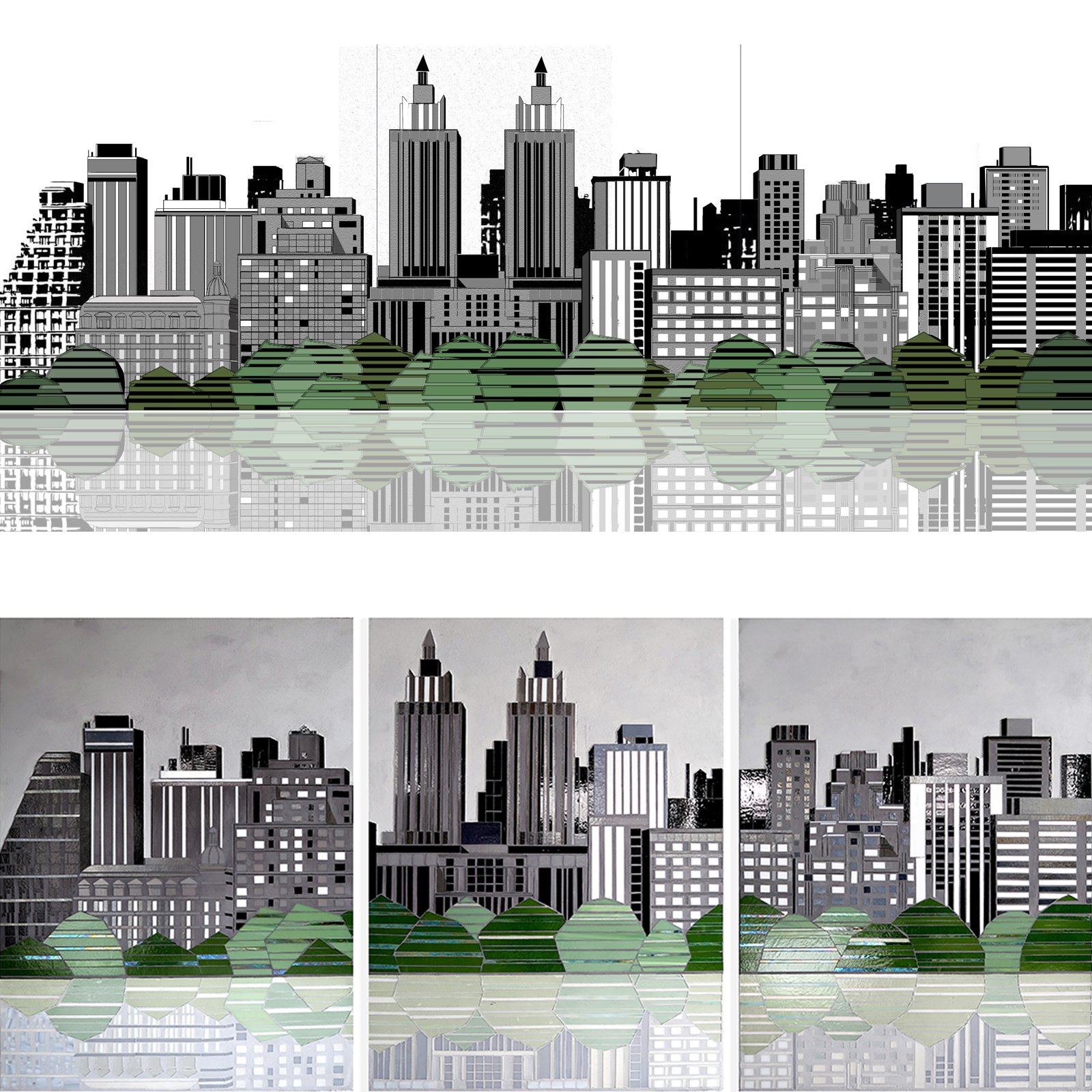
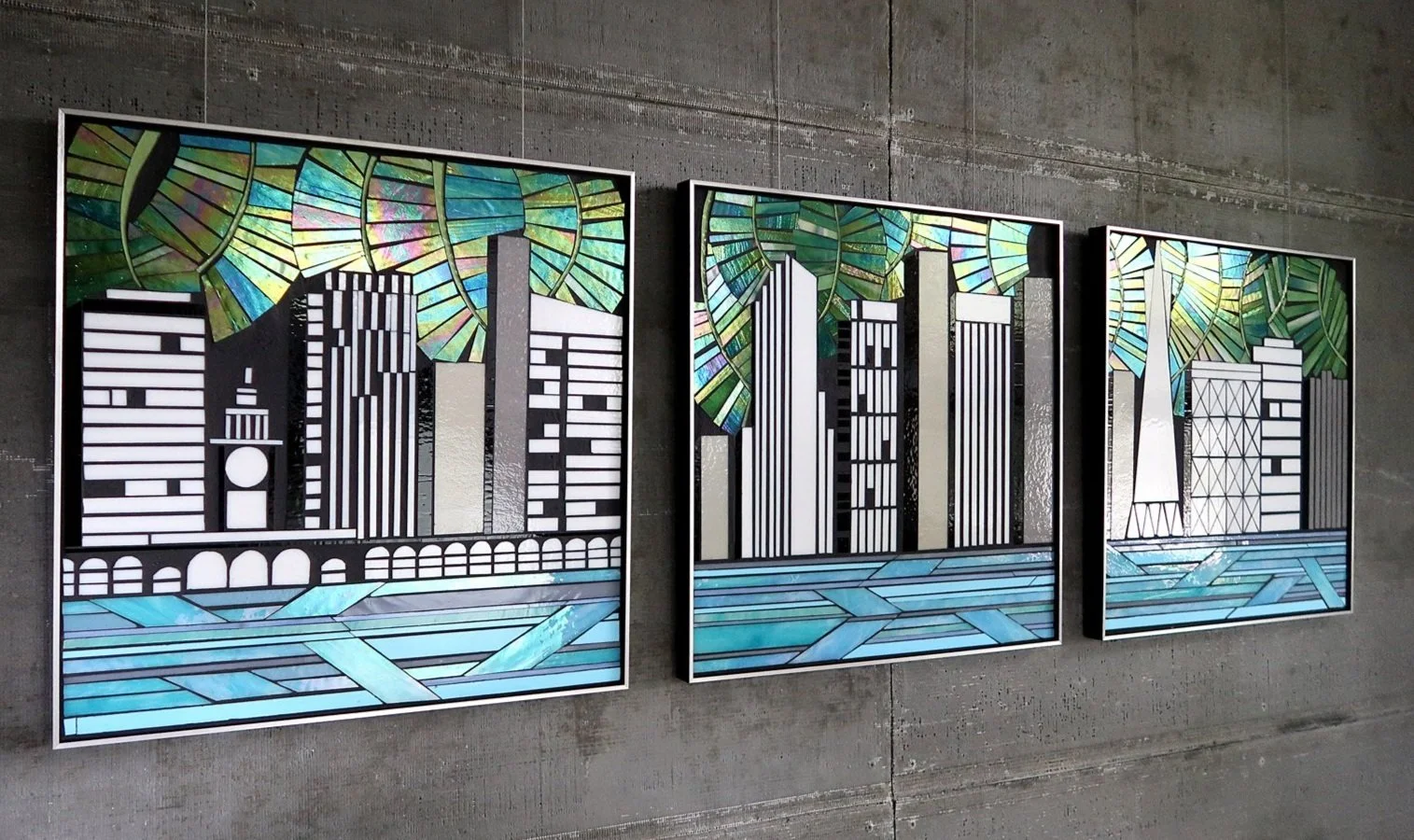
And then came the NYC project with an imaginary skyline created based on the upper west side from central park. With much bigger panels, more detail could be included. And, of course, this project has the first reflection in glass (which I must do more of).
City | NYC 48”x36”x3 hand cut glass c Heather Hancock 2021
City | NYC 48”x36”x3 hand cut glass c Heather Hancock 2021
Recent proposals have me thinking about cityscapes again. The wheels are turning. I’m envisioning a more abstracted approach again. Love seeing the evolution of ideas with different projects and clients.

8”x 8” hand held sample | ENCODE
8”x 8” hand held sample | ENCODE

8”x 8” hand held sample | REFLECT/architectural

8”x 8” hand held sample | REFLECT/architectural
It’s hard to explain glass using static images. Hand samples are available for client meetings. Get in touch about your project.
I love when ideas intersect in new ways. My core interest is the aesthetics of information. In current work information-rich nature gets reduced to simple graphic versions, borrowing “built world” lines to convey natural imagery. City environments tend to be either information overwhelm—signage, street markings, infrastructure, material transitions, sanctioned and unsanctioned painting+markings, etc.—or uninteresting repetition, patterned or chaotic. I am interested in the compelling form of diverse kinds of information: textural/tactile, matte vs glossy/reflectance, structural, semantic, spatial, natural.
A recent idea board explores integrating REFLECT/architectural work and SCAN/abstract text forms into a dimensional urban collage. Recent technical discoveries with my ENCODE series free me to explore lovely minimalist compositions.
Love this approach and can’t wait to try something like this.
About a year and a half ago I made hand held samples available for client meetings and it has been a game changer. I always say that glass is “alive.” Holding a sample in hand, a viewer immediately understands how glass flickers and shimmers as it (or the viewer) moves around. Seeing glass in person also helps understand that the work is dimensional, on its way to sculptural. I consistently hear back from art consultant partners that samples make all the difference in conveying the ‘specialness’ of glass to clients, something that is so challenging to capture in static images.

Get in touch if you need samples for client meetings.
Thrilled to see my ENCODE and REFLECT series in dialog. Techniques and approaches I’ve developed with ENCODE are driving new ideas for my REFLECT series.
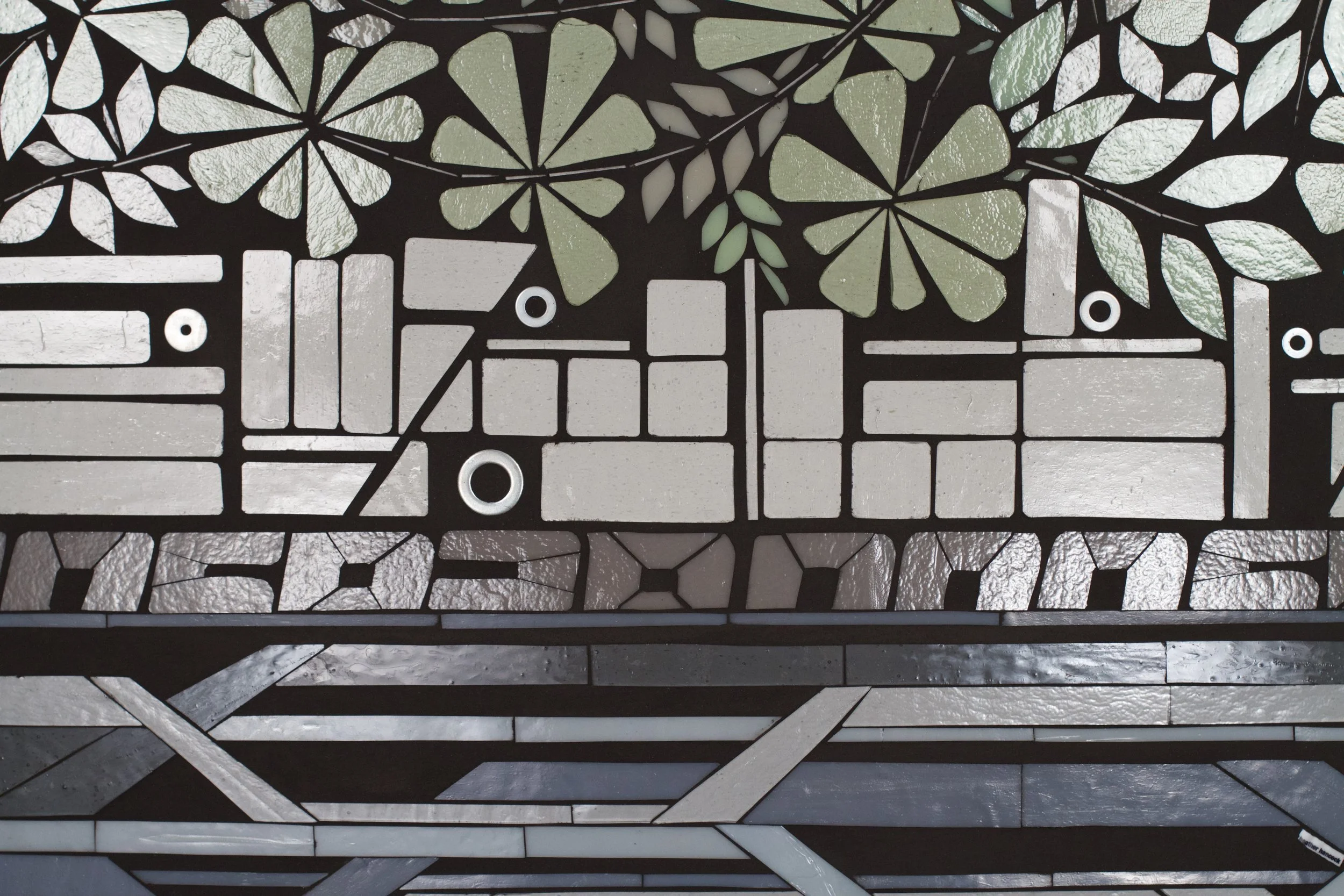
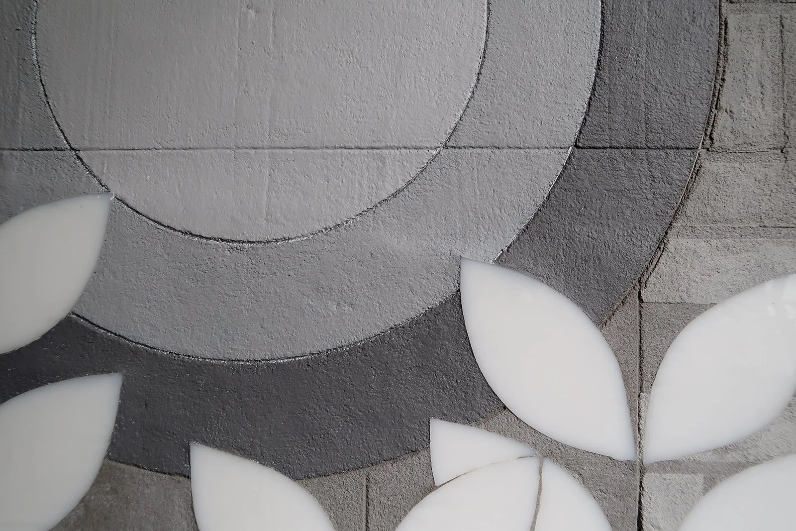
Leave it to me to make work that is super hard to photograph. I love the subtlety of the ‘embossed’ grout-on-grout elements on the top corner. From a distance it looks like neutral texture. You gotta get close to see the full detail. Lots to explore with this approach.

detail REFLECT 6.1
ENCODE 3.8 ACT | REFLECT 6.1 | 20”x20” hand cut glass + texture c Heather Hancock 2022
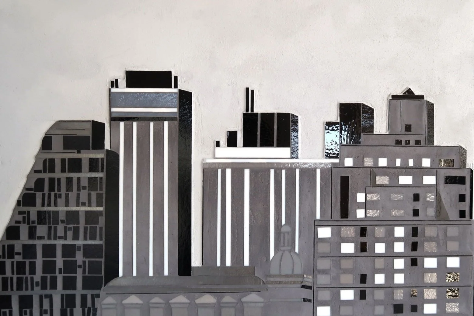
January has been a month for exploring ideas and testing techniques. I have been thinking about how my two main groups of work, REFLECT and ENCODE, are related. Both series approach city as communication. REFLECT focuses on the vocabulary of architecture and the viewer’s role in perceiving the repetition and rhythms. ENCODE finds beauty in abstracted text forms, fragments of words and ideas, pointing to the ubiquitous signage, markings in the city. I can see these series will begin to interact.

detail | Reflect 6.1 2022
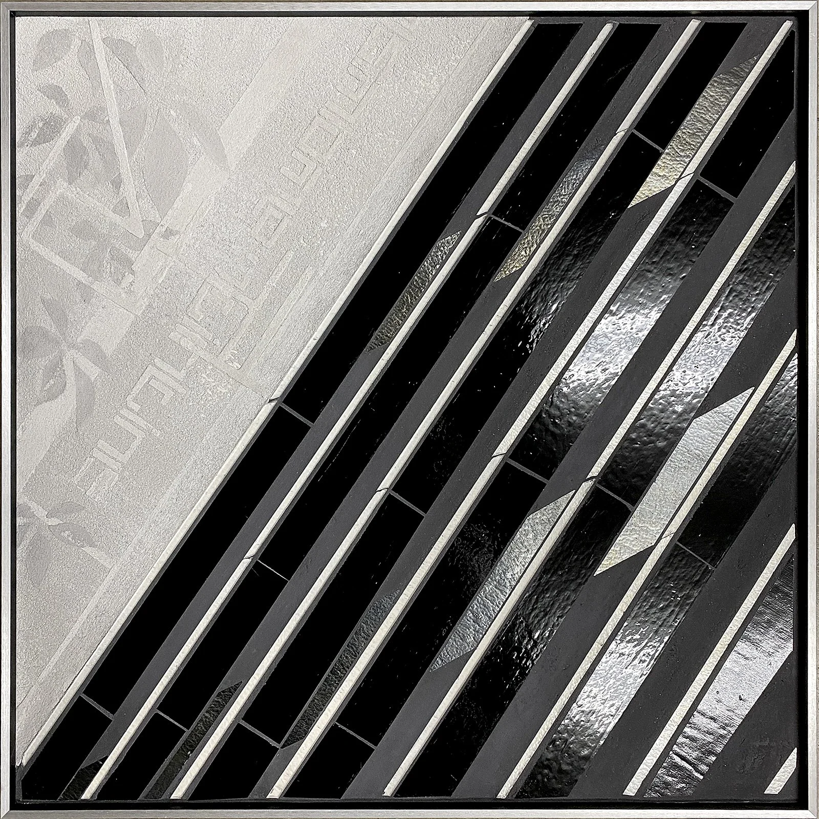
REFLECT 6.1 20”x20” urban layers
I’m excited to be thinking about my biggest project yet.
I am developing concepts for a reception desk in a hospital. The clients have requested my interpretation of their rolling landscape. I’m enjoying the challenge of using my “precision line” approach for a landscape concept. My goal is to let glass speak for itself within a minimalist composition that offers a moment of beauty and interest in a busy healthcare environment.
I love coming full circle back to healthcare with my artwork. Much of the initial inspiration and impetus for my creative practice comes directly from working in hospitals. Thinking about how profoundly our physical surroundings impact our well-being led to my interest in exploring how art can be a powerful element in creating inviting, interesting spaces.
prelim sketching | approach to landscape c Heather Hancock 2022
