I have a complicated relationship with color. Maybe it’s more accurately described as color commitment issues. I am admittedly a bit obsessed with gray. My years living in and around Chicago have undoubtedly informed this preference. I find grayscale palettes subdued and understated, encouraging focus on texture and surface and reflectance.

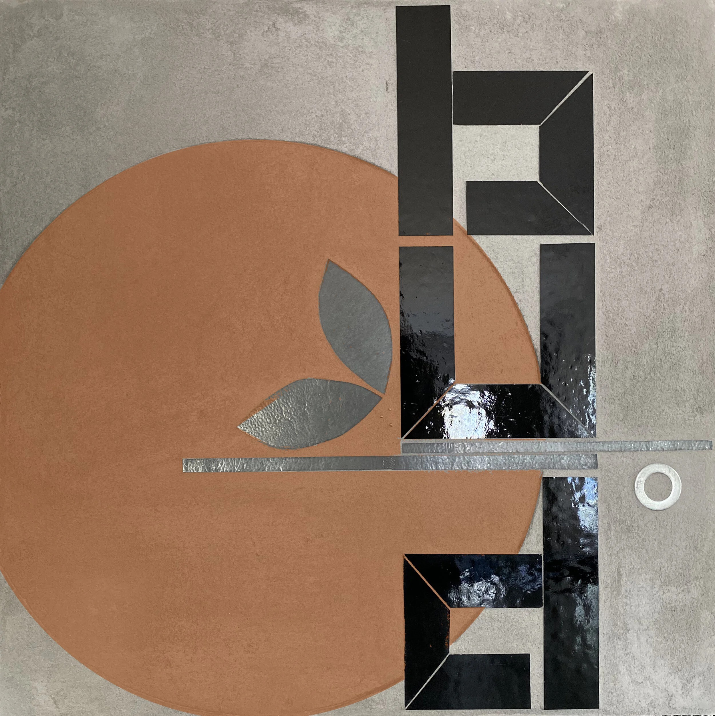
Working with glass for so many years has shaped my understanding of color. Color in glass can be unlike color in any other medium: astonishingly varied and shifting depending on lighting and viewer position. At the same time, I have often struggled to find exactly the right hue/saturation/intensity in glass. There are significant gaps in hue and saturation. And when the color I want is made, it’s not always available. I went two years recently without being able to get any blues or greens. This was part of the impetus behind my shift to grayscale glass palettes. For my architectural series REFLECT, a grayscale palette meant readily available glass that connected well with the compositions I was exploring. Now that I am ready to explore color again I am using paint to introduce color to these textured canvases. It’s been a lot of experimentation to find the palette range I was imagining. Getting there. And love how the paint works on the textured surface. There’s a deep connection with the functional painting associated with city information: street markings, signage, way finding. So much information in the city guides our behavior and directs our attention even when we generally don’t consciously focus on it.

color modeling: SLATE blue

color modeling: SIENNA
color modeling: BURNT ORANGE

color modeling: VIOLET