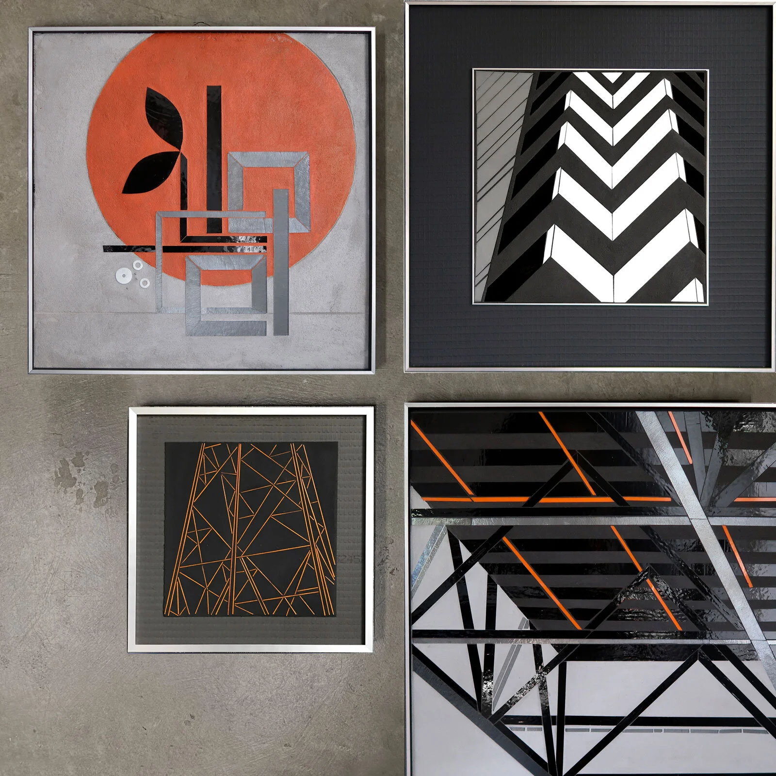
Some days call for gray on gray.
ENCODE: Focus | hand cut glass + paint | 20”x20” c Heather Hancock 2020
I regularly cycle between popping saturated color and grayscale. I ended up working in mostly with grays, blacks and whites a few years ago when certain colors of glass were not readily available. I was exploring architectural form+line at the time so grayscale was an easy and logical simplification of my glass palette. I’m ready for color again, and finding my paint palette with ENCODE but I’m also mixing in some grayscale pieces and love how these look.
grayscale | ENCODE + REFLECT c Heather Hancock
I especially love to see the dialog with the architectural series. I can see that these different approaches to beauty and information in the cityscape are connected. There’s something so clear and crisp…helps me focus.


