General
New Exhibition: Gallery, Now!
Six local artists have transformed a vacant commercial space in downtown Evanston into a destination for...
continue reading this exhibition →

Impel 3: Linking interior + exterior
When architect Todd Pape and his wife Tracie started planning a conversion of their 3-car garage into a flexible indoor/outdoor space, they say that one of the things they agreed on early in the planning process was that they wanted to incorporate my art into the space. Love that. Todd, Tracie and their two school-aged (soccer fanatic) sons live on an astonishing country-in-the-city half-acre lot in the middle of Evanston. The original 1910 farmhouse is perched at one corner of the yard and at the other is a low-slung terracotta and brick clad garage. Rather than tackling a home renovation, Todd and Tracie saw the potential to convert their seldom used garage into a sleek indoor-outdoor multi-purpose space. Re-envisioning some of the building's original functional elements, Todd designed a minimal space that almost disappears as it points toward the outdoor world. Garage doors flood the space with natural light. When opened, the entire west wall disappears to create a literal indoor-outdoor connection--and in fact the garage door on the east wall can also be opened for an entirely open space. The original industrial concrete floors have been polished and stained a warm caramel. A mahogany pergola over a bluestone patio extends the space well into the yard and creates a striking facade for the 1-story building.
Todd and Tracie picked the Impel art series as the starting point for this commission. A nature-inspired palette of blues, greens and neutrals connects the work with their expansive yard and garden. Impel offers a social landscape, entities in interaction with each other and the environment leading to constant evolution and change. Impel1 and Impel2 were completed in 2009 and were my first large-scale pieces using sheet glass. I was thrilled with my newfound freedom to cut in glass the lines and forms I could envision and draw. Three years later, my cutting technique has continued to progress and new lines and refined forms can be seen in Impel3. I love the implication of constant movement and impingements that leave us changed and re-shaped, only to be changed again. The social landscape ideas connect directly with Tracie's work as a therapist and meditation mentor. And, in fact, one of the primary uses of the space will be Tracie's mediation practice.
At the entrance to the space, Todd had 8" x 8" niches constructed on either side of the door, lit by overhead sconces. Two 8" x 8" Impels cropped from the larger piece and worked at a much larger scale to create self-contained compositions prime the viewer for the full size Impel3 (24" x 24") seen directly upon entering the space. The interior wall where Impel3 hangs is painted with black chalkboard paint, adding a playful, kid-friendly feature to the space while at the same time creating a dramatic backdrop against which Impel3 floats and shimmers.
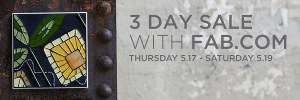
3-Day Sale with Fab.com
 I am delighted to be collaborating with Fab.com to introduce Mosaic Elements to a wider audience of design enthusiasts. BLOOM, FLOAT and GLYPH are available to Fab.com members at special pricing now through Saturday, 5/19. Membership is easy--and free.
You can find the sale here at Fab.com
New Mosaic Art: Impel 4
8" x 8" glass, gold, grout Impel places cognitive experience within a social context, exploring how...
New Mosaic Art: FLOAT | Mist
In FLOAT a shimmering sphere drifts across an aqueous background. The decaying manmade settings highlight the...
as seen in CS Interiors | Spring edition
About FLOAT
FLOAT links directly back to earlier work in the Flow series. Flow explores movement through space and time with inevitable convergences and divergences. Trace (2006) was a four-part composition in this series, incorporating my ever-present circle form and organic interconnecting lines. My experiments with a threaded 24k gold smalti line as a linking device started with Trace. A recent commission for a healthcare facility brought me back to the Flow series which I used as a starting point to develop Float (2011), a multi-piece composition using new materials and cutting techniques. FLOAT has now been included in my Mosaic Elements series, offering the next iteration of movement through space and time. FLOAT suggests an aqueous setting and visual inspirations include droplets and bubble forms on water. The pieces in the Mosaic Element FLOAT series can be used as a narrative sequence with the shimmering sphere moving across the three pieces. Or a more graphic visual pattern emerges by using multiples of the same piece hung in different orientations. Color palette 'shine' suggests a sunlit daytime version while 'mist' conveys a shimmering moonscape.
See FLOAT Mosaic Elements
BLOOM | vivid
 Find all Mosaic Element art images here.
Searching for sparkle
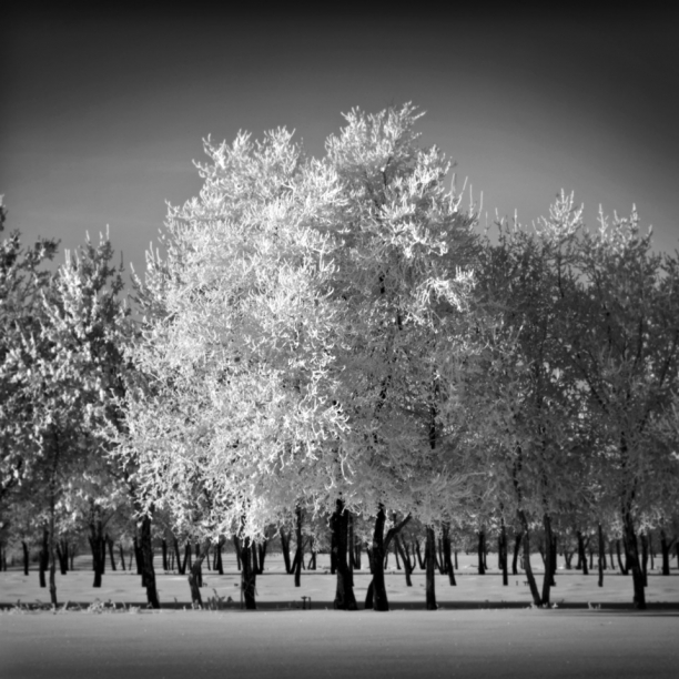
I've had to search for sparkle this brown winter. Regular trips to the lakefront have yielded ice in many forms: countless different icicle formations, air bubbles in ice, ice crystals cantilevered over the sand, ice encrusted grass and trees, ice splashed rocks, ice spicules etc etc. But it just occurred to me that what I'm actually missing is hoar frost. I have never seen hoar frost in Chicago. The closest we get is when the cement-heavy lake-effect snow weighs down tree branches. But there's no sparkle. Often branches break. It's mostly bleak.
Waking up to an Alberta morning where literally every single branch and blade of grass is outlined in sparkling feathery ice cystals that glint and shimmer in the winter sunshine against an intense blue sky is pure magic. For a few hours there is a complete transformation from drab winter into a glittering wonderland, like living in a snowglobe.
I've always wondered about the unappealing name. "Hoar" comes from an Old English adjective which means showing signs of old age. If I were naming it, I'd call it "metamorphotic" frost for it's profound transformation of objects and landscape--or something more poetic like "ethereal" or "gossamer" frost. As a kid, hoar frost seemed like a random phenomenon but I'm sure my Dad could predict hoar frost conditions. It takes a clear, cold night where objects become colder than the surrounding air while a light wind circulates more humidified air allowing ice crystals to form and grow. Their size depends on temperature and humidity levels.
Gradually, the ice crystals fall away and it's back to winter normal. But there's always the chance of waking up in that sparkling magical place again tomorrow.
*Hoar Frost (2010) courtesy of the seriously talented photographer Adrian Michael based in Saskatoon, SK. You can see more of his fabulous images at www.adrianmichael.ca. I am particularly drawn to the familiar canadian landscapes made otherworldly in Adrian's 'Rockies' and 'Prairie' portfolios.
Framing Experience
This afternoon was spent talking philosophy of framing at the Alley Gallery. Here's the deal: I see my work as in motion. We get a fleeting glimpse of a moment, a fragment and then it's gone. Light animates the glass and changes the image with our movements, extending the idea of an ephemeral experience. Now here's where my framing issues come in: for me, a frame implies closure and definition at best and limits and constraints at worst. In my installation at Uncommon Ground, there's a literal escape from the frame. Irrepressible circles make a break for it up the wall, bouncing and floating free. I can envision a massive installation of Realize, the shimmering lines coursing out and disappearing off the edges. On the other hand, I am also very interested in presentation and finish. I want polished pieces. I have to manage edges. The work needs to be ready to hang. I need frames. So back to the most charming location in Evanston and my visit with Brent Houston, Darren Oberto and Ross Martens of the Alley Gallery. They hear me out each time (they've heard this before) and nod gravely at the conundrum in which I find myself. They are all practicing artists as well as expert framers so they are up for this conversation. They remind me that the physical frame has both a structural purpose of protecting the piece and a visual function of highlighting and calling attention to--rather than limiting--the work. Brent talks about the required switch from the deeply invested subjective perspective of artist to the objective perspective of viewer for making framing decisions. His tricks for literally getting a new perspective on the piece include viewing the piece through a mirror or looking at the piece from an extreme angle, rather than head-on. While I crave a consistent, uniform approach to framing, Brent recommends considering each piece (or series) individually and finding framing solutions that best connect with a particular composition, color palette, and set of transitions. And then he gamely shows me a bajllion different frame samples to explore options that connect with the work.
I am drawn to the simple spare metal floater frames with a very narrow profile. The frame meets the functional need of edging the piece and then provides a simple outline--a sort of dotted line which will allow my moment in time to move freely. Brent et al framed Verge this way. But I now have several new frame samples to look at with art in my studio and will keep an open mind to see what works for an upcoming commission. And after considerable solo deliberation, I'll use my own personal trick for getting an objective perspective: go talk art+frames with Brent, Darren and Ross at the Alley Gallery.
Kiln Magic
I have my fuchsia and coral glass. Gorgeous! I know very little about kiln-formed glasswork so I was excited to head to Turtle Bay Glass last weekend to pick up my freshly fired pinks and corals and at the same time to get a studio tour and visit with glass artist Paul Messink. With an impeccably organized workspace filled with natural light, plenty of technical equipment and tons of glass, Paul is Exhibit A of Art Meets Science. An IT engineer by day, Paul has been working with glass for several years. I met Paul a number of years ago at an art festival in Chicago when I was first starting to exhibit my work. While I was learning the magic of glass and grout, Paul was exploring the magic of glass and heat. Keeping meticulous notes on technique, Paul has explored many different types of fused and kiln-formed glass.
Paul has mastered the technique to realize his current artistic goals which feature enchanting compositions of spare landscape imagery. Trees recede into the distance and fog with amazing perspective achieved using color, size and literal depth. The muted blues or greens or grays encased in glass contribute to the ethereal quality of the compositions. To create these pieces, Paul paints various elements of each composition onto individual layers of glass. The piece he was working on while I was there involved 6 separate layers of glass and involved precision painting of many many tiny branches with a customized paintbrush. Once all painting is complete and cured, the glass layers are fired into a single solid glass piece. The piece is fired at the target heat for a relatively short period of time (a matter of a few hours) but the cooling down or annealing is where it gets tricky. Annealing is the process of cooling glass to return it from liquid to solid state. Without proper annealing, the glass can cool unevenly. This stress can cause the glass to crack or break while in the kiln or leave it brittle, potentially breaking days, months or even years later. Bottomline: you need your kiln-form artist to be equal parts artist and engineer.
I love the contrast between permanence and ephemerality in Paul's current work: a satisfying, solid block of glass containing a floating, diaphanous world.
See the complete piece "Blue Trees" and other pieces by Paul Messink at Turtle Bay Glass.
Finding Fuchsia
The color I'm craving right now is fuchsia. This specific color need hits at the beginning of winter every year and I begin to search for fuchsia in any form. I study the withered vines on my fence that have turned bright pink. I buy pomegranates in bulk without actually eating them. I find the fuchsia element in street art. Sometimes I have to paint things fuchsia. What I really want is fuchsia glass. There are plenty of plums, violets, mauves and lilacs but blue-toned pinks are rare. Bullseye creates some eye-popping pinks and purples but according to the catalog many of them are considered "strikers" which require firing to achieve their full color. I generally ignore all glass samples marked "pre-fired" but this time as I pored over the sample box, I realized that these are exactly the gorgeous pinks (and corals) I'm craving. So I picked up the phone and met the very helpful Sarah Givens of Bullseye glass. Sarah explained that true (blue) pink is challenging to manufacture owing to its volatile gold-based chemical composition. Many of the purples and pinks are more sensitive to heat so Bullseye avoids applying too much during production of these colors. Given that the majority of their glass is used by kiln-form artists, "strikers" can tolerate additional kiln-work, giving the artist longer working time with the glass and more control over the final color.
But where does that leave the cold/cut glass artist?! Sarah suggested tracking down a local kiln-form artist who might be able to fire the glass for me. So I contacted my friend Paul Messink of Turtle Bay Glass. I met Paul a number of years ago at an art festival in Chicago. I was starting to exhibit my work and he was finding his way in the kiln-formed glass world. We've kept in touch. Apparently there's room in his kiln schedule right now so there are 8 sheets of intense fuchsia and vivid coral en route to his studio. He'll fire it and I'll go for a studio visit early in the New Year to see what I can learn about his process and current work. Looking forward to catching up with Paul and to having these lush glass colors.
Treasure Hunt for Form
Photo Shoot images
Treasure Hunt for Color
It’s fascinating how late fall forces a different kind of visual attention. Moving from the abundance and even overwhelm of color in spring through fall, I am now on the hunt for micro-points of color in the bleak gray of late Chicago fall. I'm finding surprisingly vibrant color still. Against the bare, black trees, the grass still reads as green. I’ve been watching my neighbor’s clematis transform from a cloud of sparkling white-star blooms in early fall to these amazing spiraling deadheads with deep pink centers. Within minutes of home, crazy orange seeds are popping out of white berries. On a run at the lake, I noticed a carpet of crushed red berries and had to go back to take some pictures. And then I found the ultimate color treasure: fuchsia. My helleborus sent out a random, post-season fuchsia bloom and I could not take my eyes off it until a hard frost finally put a stop to the show. These micro-discoveries are tremendously rewarding, treasures popping out from the stark gray Chicago palette.
Photoshoot: Modern Ruins
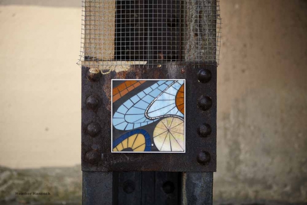
Location #1 Mulford viaduct | 10:00am | 37° | windchill 28° | Cloudy It’s cold. Really cold on bare hands but off to a good start. The mounting tape is totally working despite the damp and cold—in fact, don’t use any more of this marvelous 3M Outdoor Mounting tape than the required 4”. Prying Mosaic Elements off the walls with cold fingers is turning out to be Challenge #1. Tiny lush BLOOM against the vast deteriorating manmade structures is exactly the visual surprise I imagined.
Location #2 Greenleaf viaduct | 11:30am | 39° | windchill 30° | Partly Sunny
Setting up at the fabulous metal grid at the Greenleaf viaduct. There are remnants of graffiti showing through the buffing; along with the rusting metal and hardware it’s a piece of abstract art in its own right. The monochromatic GLYPHS are perfect on the gorgeous patina, making an interesting connection with the tagged surface.
Challenge #2 is reaching high enough on the grid to create an interesting composition of GLYPHS. Climbing a Dr Seuss-worthy stack of crates teetering on top of stepstool perched on top of a tree root counterbalanced by concrete debris, I manage to get the top GLYPH affixed. An Evanston Police Officer stops by. He’s mostly interested in my plans for the viaduct. With the guarantee that we’re not permanently contributing anything to the existing patina he’s off. Challenge #3: The sun has come out and we’re getting hard shadows. So we wait, squinting and frowning at the brave November sun and cheering on the wisps of cloud.
Location #3 Clark Street Breakwater | 1:00pm | 36° | windchill 26° | Snow
I found the breakwater on a warm sunny day a while back. In dry conditions, it has a gorgeous rich patina of blacks and browns with rust accents. I loved the idea of photographing FLOAT in its natural habitat of sky+water. The breakwater looks totally different today. There’s no patina; just blackhole steel. And I begin to understand its function as the wind whips up from the north, tiny snowflakes swirl and waves crash over and through the massive steel barrier. We move farther along the breakwater in search of a section with less water pouring down it. We find a small useable section. I affix FLOAT. It’s funny to be in the snow with waves crashing around us. We’re laughing. We're trying to take pictures. Challenge #4: And then our funny snow shower turns evil and it’s a full-on winter blizzard with ice pellets pouring down and the wind roaring. Cameras won’t focus and things are getting wet. We call it, grabbing art and cameras and gear and scramble off the beach. Sigh. Back to Location #1 to take a few last images of FLOAT, a little forlorn away from its majestic aqueous setting. For now, we have to settle for dripping water and stalactites. But I know I’m going back to finish FLOAT.
Home | 2:00pm
Done. Back home. Great day. And it only takes a few hours for the feeling to return to my fingers. Can’t wait for proofs.
Mosaic Elements
Glyphs heart silver sharpie
While shooting GLYPHS last Thursday on this fabulous decaying metal grid, I noticed and loved the tag in silver sharpie. I even asked the photographer to work it into her shots. First let me say I'm a sucker for silver sharpie. It works the same way as white gold against grout: pure, reflectant shimmer. It pulls me in and makes me look again. It disappears at certain angles and pops again with the right lighting or movement. It leads to the same embodied interaction between viewer and context that I love in glass and gold.
Second, I do admire an artful tag--not going there on the 'art vs. vandalism' thing. I get this basic human impulse to transform a simple 'I am here' into a beautiful calligraphic form which exists objectively in the world as a physical mark. For me the egocentrism of the act is mitigated by the flowing, rhythmic script--rendered in sparkling, shimmering sharpie.


