General

Readers of Evanston feature

Flourish is featured today on Readers of Evanston. Earlier this week, I had great conversation with Katie Barthelemy from Evanston Public Library who structures the conversation with my all-time favorite question "what are you reading?" here's what Readers of Evanston wrote:

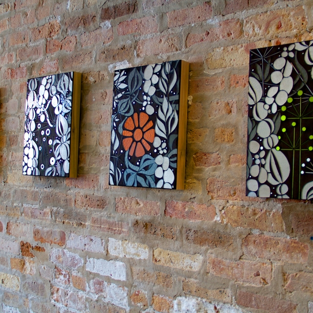
Heather Hancock is a visual artist and the creator of Flourish in downtown Evanston. “One of the things I’m really interested in is how the urban landscape influences our behavior, and our mood, and our affect, and what we can do in the urban world streetscape to create a moment of surprise or discovery. In the natural world there is constant change and variety, but in the built world, we see a lot of repetition. I’m interested in how we connect the natural world to the built world; but also, on a beautiful brick wall, how do we create something that is different and surprising?” Flourish is just that: a beautiful installment of reflectors and tape on an outer brick wall meant to be a temporary exhibition— it will disappear again within the next two weeks. Glass, Heather’s usual medium, "is all about lasting forever, so it was really a fun to think ‘what can we build that has visual impact but can be a temporary installation?’”

READERS OF EVANSTON | Evanston Public Library | photo credit Katie Barthelemy

Heather’s choice of reading, Places of the heart: The psychogeography of everyday life, connects to her work and her mission: Canadian psychologist Colin Ellard, studies how “architecture, streetscapes, [and] facades effect our experience of place and our well-being. It’s really exciting work because that’s exactly what I’m interested in with my work. Another relevant and amazing book is Nesting: Body, Dwelling, Mind by Sarah Robinson which offers another take on thinking about what it is in our built world that helps us live well."

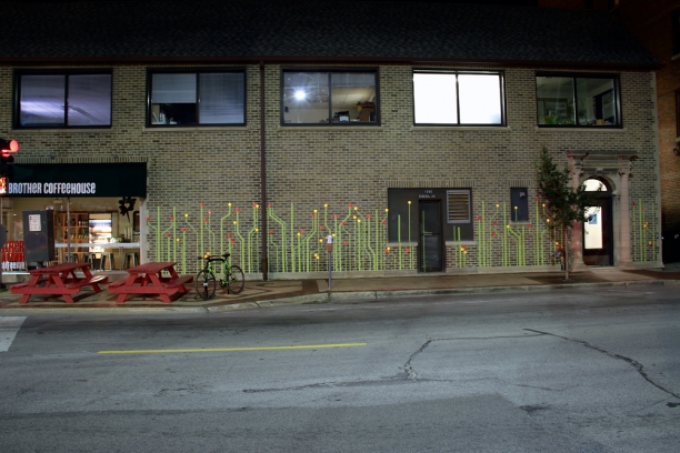
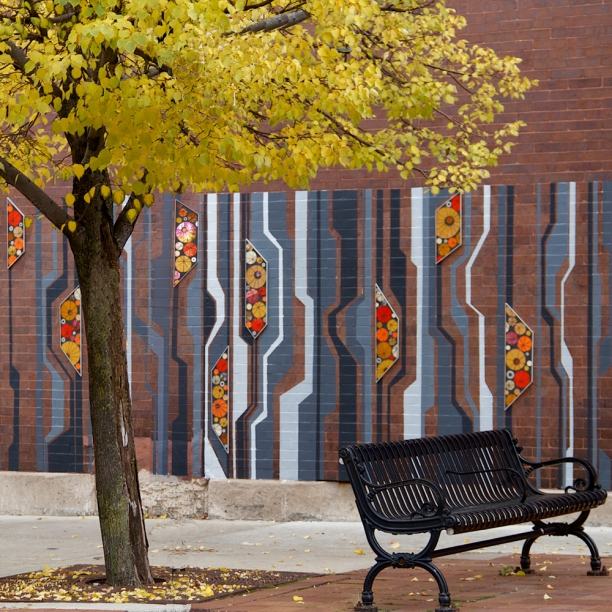
Flourish is now on display outside the Other Brother Coffee House on Sherman and Grove. Heather explains, “Downtown Evanston commissioned Flourish as part of their initiative to create engaging public spaces. Given I’m usually engineering pieces that will last forever I enjoyed developing concepts for a playful, short-term urban experience." Re-purposing functional materials (masonry tape and reflectors) and lines from the built world, Flourish interacts with motion and ambient light to offer pedestrians a moment of surprise in the streetscape.
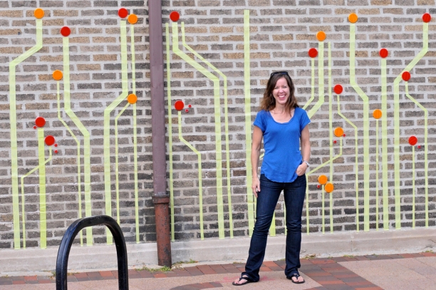
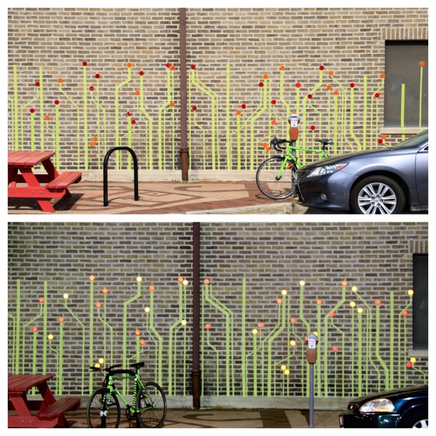
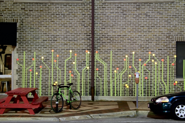
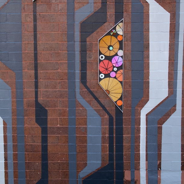
Flourish (detail) in different lighting conditions | Heather Hancock 2015

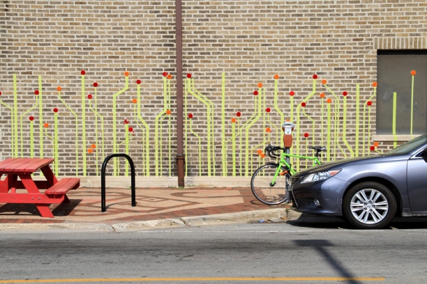
Flourish at Other Brother Coffee in downtown Evanston

More about this project.

Flourish | a temporary public art installation

My work centers around finding the points of intersection between the built and natural worlds. I'm a firm believer in EO Wilson's concept of biophilia, that humans are attuned to the natural world and maintaining that connection is integral to our well-being. I'm equally interested in finding information and beauty in the precision geometries, repetition and structure of the urban environment; shorthand: "living well in the built world." So I was delighted when the innovative urban planner+landscape architecture firm Teska Associates and Downtown Evanston asked me to generate some ideas for a temporary public art installation as part of a 'people space' or parklet concept. Understanding how to create engaging public spaces fits well with my interests in creating engaging visual experiences. Public art is an opportunity to create moments of surprise and discovery. And, in this case, an opportunity to source and experiment with temporary, removable materials.

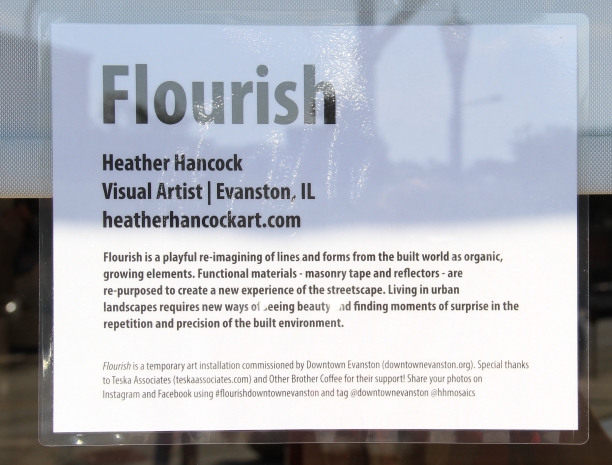
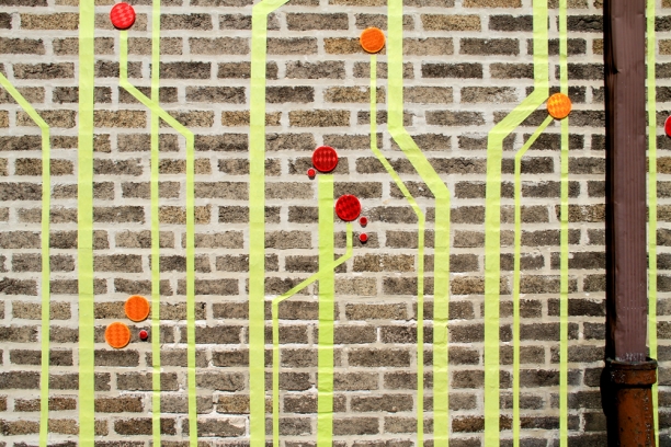
Flourish is a playful re-imagining of lines and forms from the built world as organic, growing elements. Functional materials--masonry tape and bike reflectors--are re-purposed to create a new experience of the streetscape.
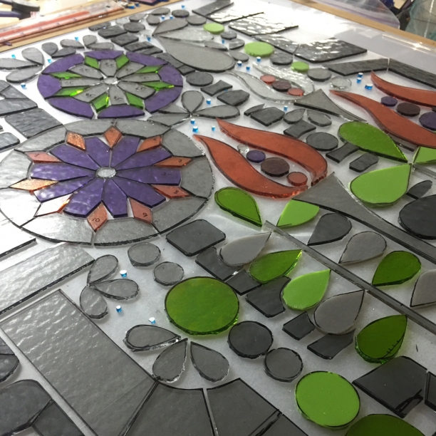
Flourish | detail | tape+reflectors | 30'x6' c Heather Hancock 2015


In daylight, the piece is fresh greens with popping accents in reds and ambers.


In the evening, ambient light and motion makes for a flickering, shimmering walk-by experience.

Living in urban landscapes requires new ways of seeing beauty and finding moments of surprise in the repetition and precision of the built environment.

Big thanks to Downtown Evanston for commissioning this project...and being game to experiment with this concept. Stay tuned for the next steps at this corner with Teska Associates, Downtown Evanston and The Other Brother Coffeehouse.

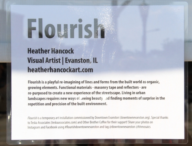
Flourish | sign

More about this project.

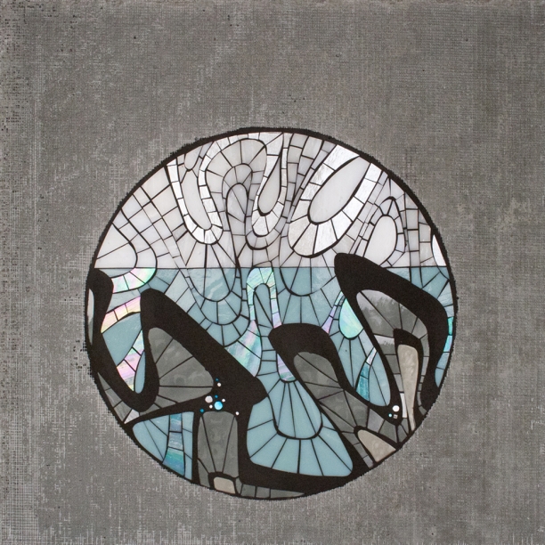
Glide

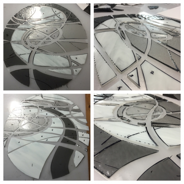
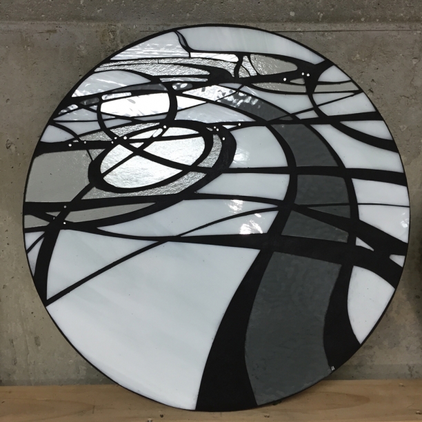
A new commission is giving me the chance to re-visit some favorite concepts and visual referents. Glide is a graphic abstraction of skating inspired lines. These curving, interconnected lines encode velocity and distance, technology-meets-mineral-world. In Glide, there is a new level of precision in creating coherent negative space. Moving away from more traditional piece-by-piece mosaic composition, forms here are cut to work in multiple directions for a bolder, simplified visual impact. Cut in a crisp palette of whites and grays, two pieces in 16" and 20" rounds will offer a visual contrast to the strong rectilinear elements of the client's kitchen. Glide | cutting glass | checking lines c Heather Hancock 2015

Glide 20" | grouting c Heather Hancock 2015

Urban vocab: Geometry

I am exploring new work around the idea of 'living well in the built world.' I am a firm believer in EO Wilson's concept of 'biophilia': humans are innately attuned to nature. Given the biology of our attention which necessarily habituates to repetitive stimuli, the natural world features a perfect balance of repetition and difference. While we may read natural world elements as repeating or patterned, at micro through macro levels of observation, we find infinite variation, difference and information. My hypothesis is that there are some ways in which the lines and forms of the urban world are similarly engaging. Our interaction with the built world is rarely static and symmetrical. Rather we are encountering infinite compositions in distorting lines and forms as we move through our city environments. Perhaps these distortions of precision built world geometries and symmetries, lead to visual experience that echoes (albeit faintly) that of the natural world.

Here's my starting point in this urban vocab exploration.

Urban vocab | Lines 2.1 | 20"x20" glass+grout c Heather Hancock 2015
Urban vocab | Lines 2.2 | 20"x20" glass+grout c Heather Hancock 2015
Urban vocab | Lines 2.3 | 20"x20" glass+grout c Heather Hancock 2015

Place-making: abstract portrait of Evanston

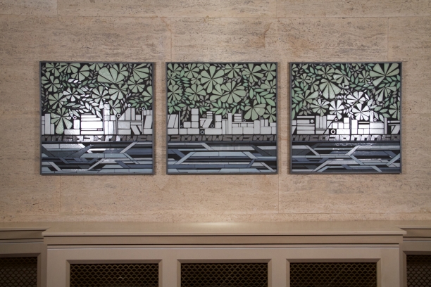
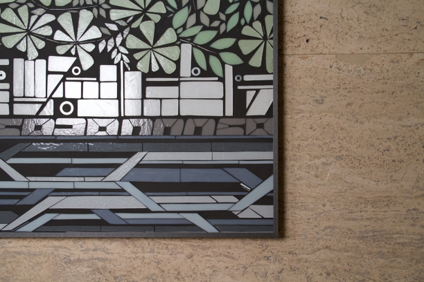
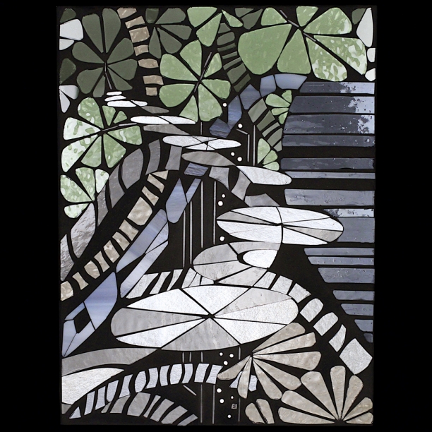
The historic 1920s Hahn building in downtown Evanston by architect John Nyden has long caught my eye. Pale green architectural ornamentation on the building facade connects the built and natural worlds with curving imagery of flora and fauna in structured symmetrical sections. Under the direction of designer Karen Behles, the shared interior spaces in the Hahn building are being upgraded. Karen invited me to develop site-specific art pieces for their lobby. The travertine clad walls in the entrance hall and lobby create a warm neutral backdrop for crisp art pieces in glass. Pale green foliage elements connect with both the architectural ornamentation on the facade and Evanston's urban forest. Rendered in olive and driftwood gray glass, these curving, organic elements contrast with the graphic city forms and intertwining linear lake elements. The palette of soft whites, olive green and layered blues complements and plays off the neutral travertine cladding.

I trust this concept will offer visual engagement for the community of professionals using this building for years to come.

City | 3@32"x32" | glass+grout c Heather Hancock 2015

detail City | 3@32"x32" | glass+grout c Heather Hancock 2015

More images and about this project here.


Sycamore | creating a kitchen view

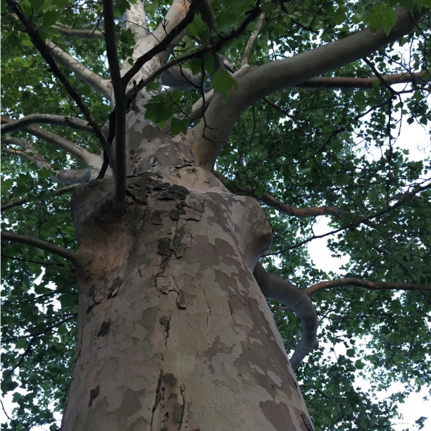
I've always been fascinated by the patterns on sycamore tree trunks with their mottled camo colors and shedding irregular curved patches making them somewhere between beautiful and surreal, certainly surprising. So when clients asked if I would develop art for their kitchen reflecting the sycamores lining the street outside their home, I was intrigued. sycamore bark

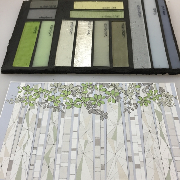
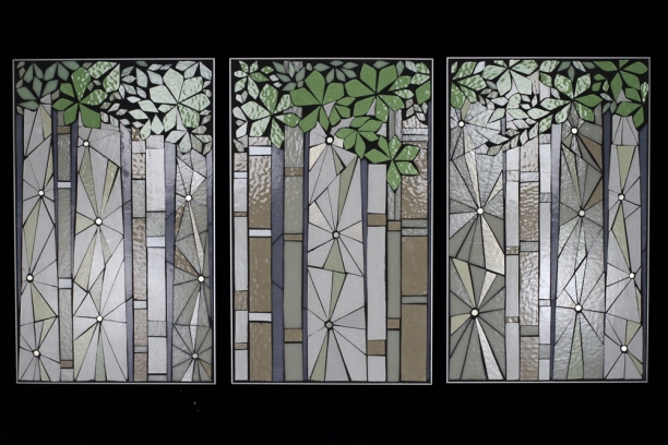
Rather than a literal approach to the patchy bark, I proposed an irregular ray concept for the bark to get at the visual surprise of encountering sycamores. The structural elements of transmission towers served as the visual inspiration for the bark, integrating natural with built world elements. A palette of warm neutrals and pale yellow and olive green for the bark element contrasts with the popping green foliage and sky blue background to bring color and interest to the client's kitchen.

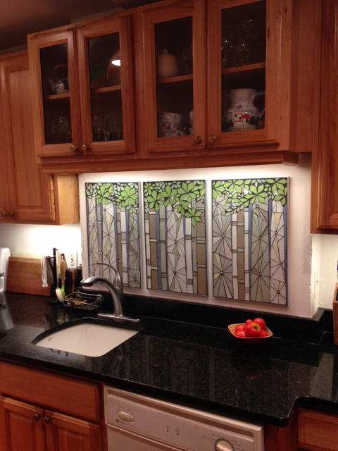
The pieces are edged in anodized aluminum and integrated hanging hardware for easy hanging.


Sycamore | art for kitchen backsplash | 3 @ 14"x22" c Heather Hancock 2015

sycamores | 3@14"x22" | photo credit: Laura Urban

More images of the Sycamore project

Open Studios Evanston 2015

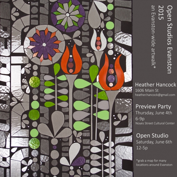
The second annual Open Studios Evanston event is this Saturday. New this year is the Made in Evanston preview party this Thursday evening at Noyes Street Cultural Center. My piece, Encode (Proust project) will be hanging. Stop by to see work by all participating artists while enjoying live music and refreshments. Print copies of the map will be available to plan your Saturday's studio stroll or download yours here Open Studios Map 2015.

Preview party | Thursday June 4th at 6-9pm | Noyes Street Cultural Center Open Studios Evanston | Saturday June 6th at 12-5pm | my studio will be open at 1606 Main Street + many locations around Evanston

Encode | proust project revisited

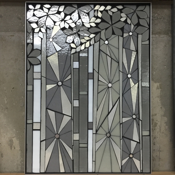
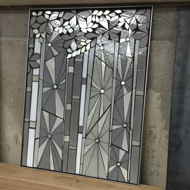
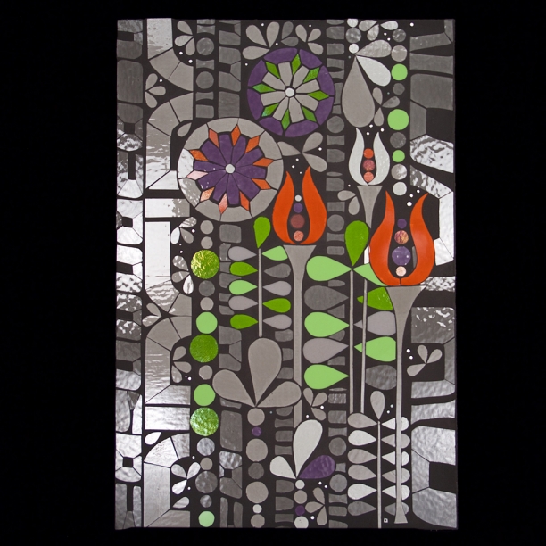
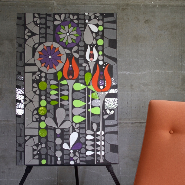
An exhibit of all artists participating in this year's Open Studios Evanston gave me the opportunity to explore the first of the Proust project concepts at larger scale. At 24"x36", Encode was originally developed as a visual concept for the Proustian concept "mind as flourishing garden." Aesthetics of the built world (line, repetition, symmetry) inform a graphic living wall which thrives and flourishes with information, structural and functional elements. A grayscale glass palette is punctuated by vibrant color to echo the role of nature as an alerter within the urbanscape. Encode can be seen in the Made in Evanston show opening at the Noyes Street Cultural Center on Thursday June 4th at 6-9pm with the show continuing through July 5th.
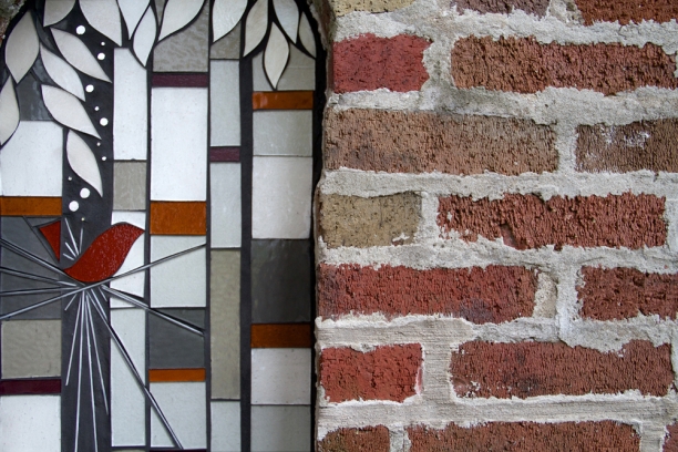
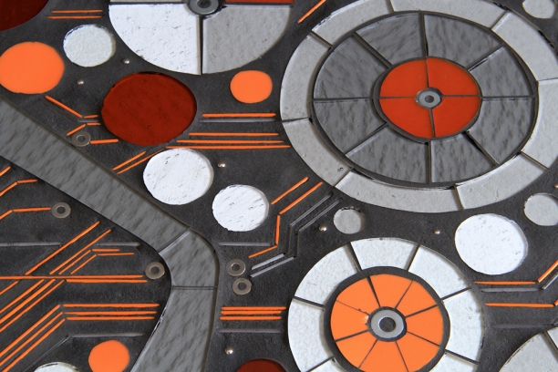
Encode | WIP | 24" x 36"

Encode | 24" x 36" | glass+grout | c Heather Hancock 2015

Encode | 24" x 36" | glass+grout | c Heather Hancock 2015

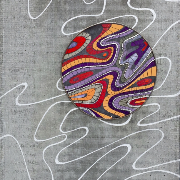
Live vibrantly | glass in grayscale

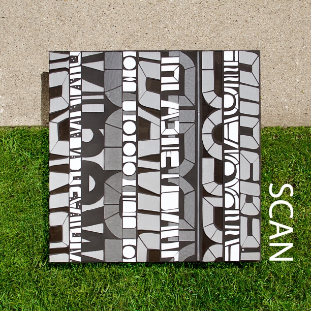
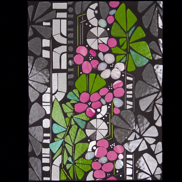
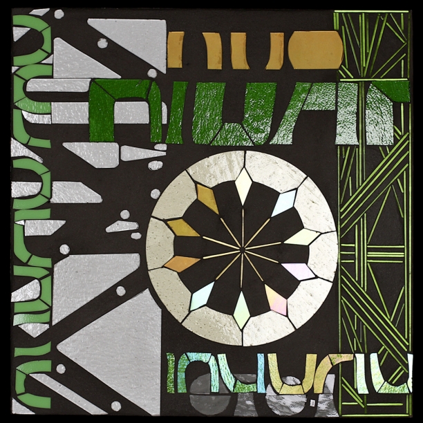
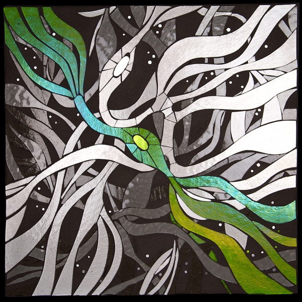
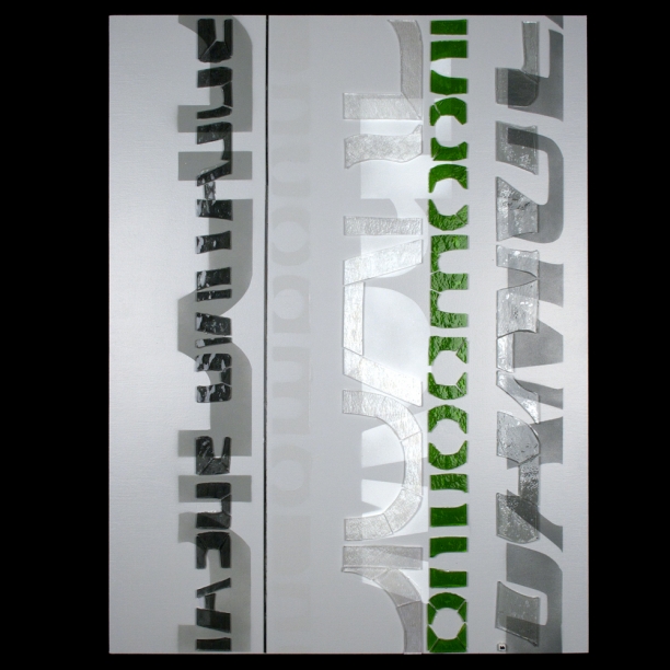
Over the past month, I have selected some series from my portfolio to explore in grayscale at a larger size. I am developing a range of linear+geometric and curving+organic pieces as part of my "art to be lived with" offerings. Impervious to light and water, glass is uniquely suited for kitchens, bathrooms and light-filled living spaces. live vibrantly | Scan | glass+grout c Heather Hancock 2015
I often recommend selecting a neutral or grayscale palette for permanent residential installations. Shimmering glass in a neutral palette offers timeless visual interest while avoiding ever-changing color trends. Or neutrals with a pop of color can bring in a color element without overpowering the clarity of a neutral palette. One of my favorite color accents is grayscale with green which makes a direct connection between the natural world and built world.

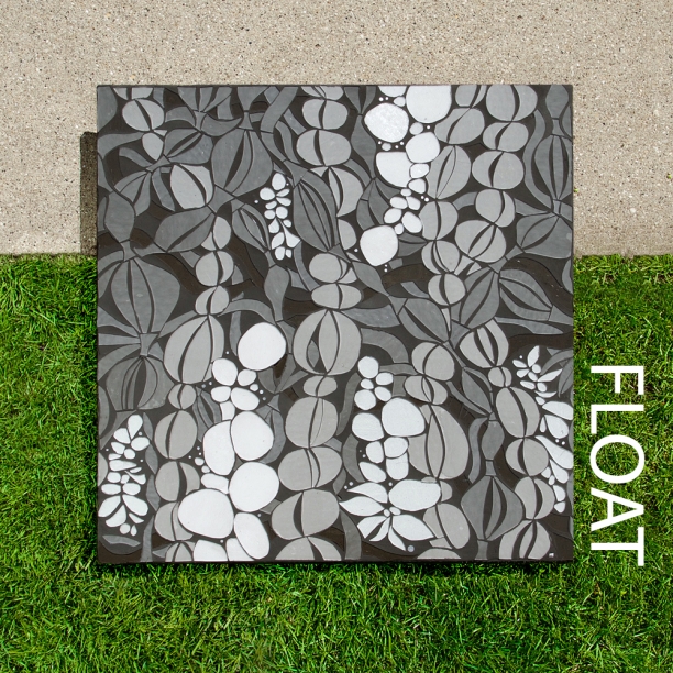
Float | glass+grout c Heather Hancock 2015


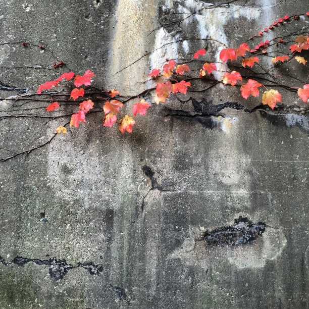
I love this connection between the raw beauty of buildings and architectural surfaces and the growing, blooming force of nature. Everything I make in glass is a sort of conceptual living wall. I wanted to photograph the pieces at the intersection between the built world of functional surfaces and technology and the often overlooked flourishing natural world. First concept image is of the graphic piece Scan which offers abstracted letter form as part encoded information, part writing on the wall, part thriving vines.

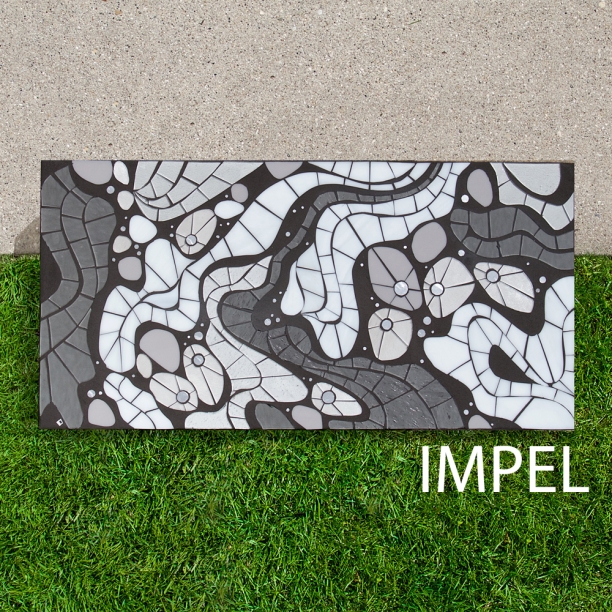
Impel | glass+grout c Heather Hancock 2015

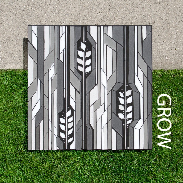
Grow | glass+grout c Heather Hancock 2015

Reflect: invited to participate in duckART

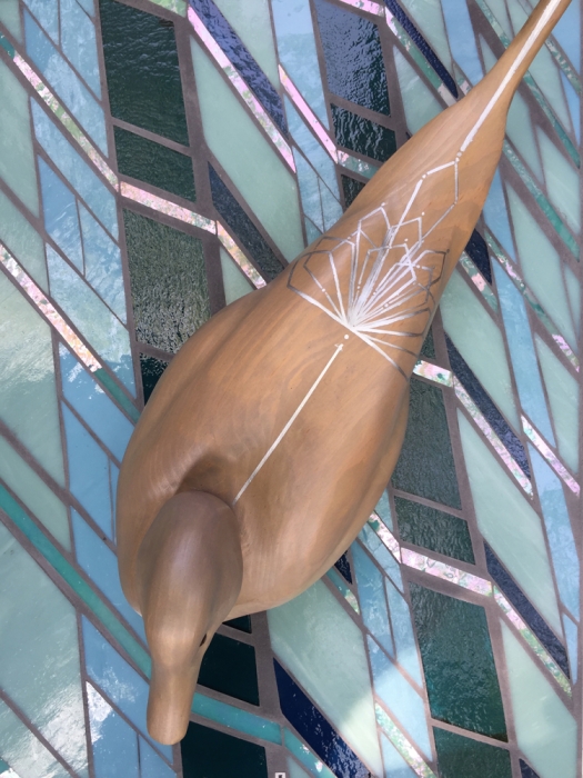
When Elisabeth Dunbar of the Lincoln Park Conservancy invited me to participate in the 8th annual duckART, the connection between urban dwellers and natural world caught my interest. Each year, a group of Chicago architects, designers, landscape architects and artists are invited to create a one-of-a-kind decorative duck for a silent auction. Other participants for this year include JAHN, makeArchitecture, luftwerk, Searl Lamaster Howe Architects, site design group and Ross Barney Architects. The Lincoln Park Conservancy is launching a park improvement project at the North Pond Nature Sanctuary to ensure this lakefront treasure remains a natural, healthy place for both people and wildlife. Ducks are a special part of the natural beauty of the pond with 26 duck species that rely on its clean water and native plants as a safe stopover during migrations. An additional 185 avian species, frogs, turtles, butterflies and dragonflies also make the pond their home. It is a true sanctuary where urban wildlife finds food and shelter and human urban dwellers find peace through nature.

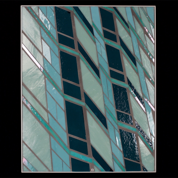
Reflect | glass and grout | 16" x 20" c Heather Hancock 2015

The water of North Pond is surrounded by high-rises and built world elements. In Reflect, water is re-imagined as a reflection of the surrounding built world. Form, variation and motion of the natural world are encoded in line, repetition and symmetry borrowed from the vocabulary of architecture. Living well in the urban environment requires new ways of finding beauty and staying connected to nature. This Lincoln Park Conservancy project offers an important vision for restoring and expanding our connection with the natural world in Chicago.

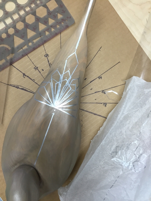
WIP | creating silver geometric elements for pintail duck


Reflect | duckART submission | 16" x 20" c Heather Hancock 2015

Art+Green Design

Architect Nate Kipnis of Kipnis Architecture was recently in the studio and we had a fantastic conversation about art+design+architecture. Nate has a thriving architecture practice with a focus on green design: high design/low carbon. He wanted to know in what way my work could be part of a green building project...and I had to do some research before getting back to him with this. detail | Transform 1.2 | 12" x 12" | glass, stringer and hardware c Heather Hancock 2014

1. Material sustainability. Glass is an (endlessly) recyclable, nontoxic material made from abundant raw materials (silica, soda ash + limestone). One of the major glass manufacturers, Kokomo claims that 99.9% of their glass is green. They are able to recycle 85% of their glass in the form of glass cullets (glass recycled into glass in an endless loop) and the other 15% is recycled by a local company. They also have optimized the efficiency of their furnaces according to EPA standards for factory emissions (via reburning exhaust). Furthermore, located in nearby Indiana, Kokomo is the closest glass manufacturer to Chicago minimizing carbon footprint for transportation.

While cut glass embedded in mortar and grout may not be easily recyclable (although entirely possible), the angle that's of interest to me is that glass is a timeless material with unparalleled physical longevity (no fading, corrosion, deterioration). My goal as an artist is to match this physical longevity with encoded conceptual content to engage viewers across time.

detail | Nest | 12" x 24" | glass+stringer c Heather Hancock 2014

2. Substrate. Cement backer-boards are the tile industry gold standard. Wedi board is my favorite being lightweight, 100% waterproof and superior bond quality compatible with any mortar. Green credentials include CFC-free and inert, recyclable with insulating properties that offer potential energy conservation. The product is lightweight for lower transportation costs.

3. And taking it one step farther...let's call it 'meta-material sustainability.' My own art practice centers around our relationship to the natural world. Living well in the built world depends on finding beauty and staying connected to the natural world--getting that balance of repetition and variation found in nature. EO Wilson's concept of Biophilia hypothesizes that humans have a deep affiliation to the natural world.

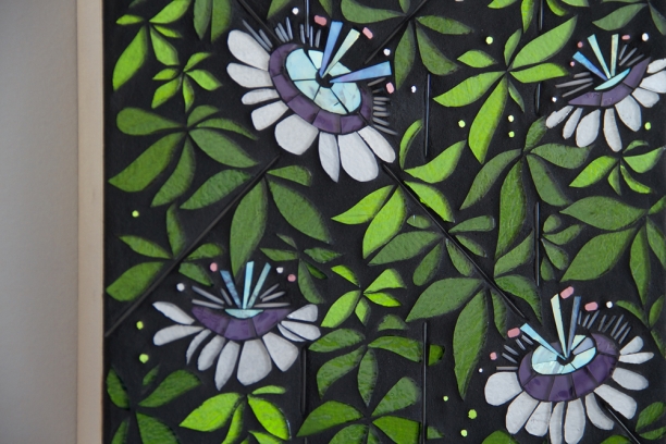
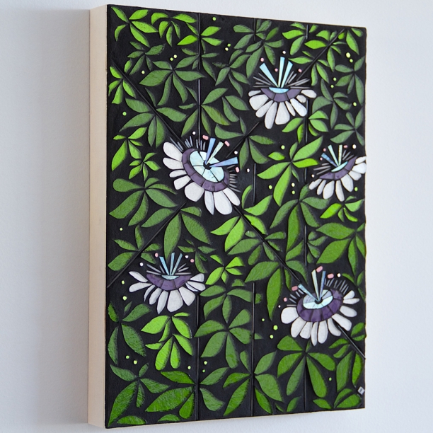
detail | Passiflora | 12" x 16" | glass c Heather Hancock 2014

Glass, drawing from the material vocabulary of contemporary architecture, can serve as a proxy for the natural world to create visually engaging environments. It is a zero-maintenance option for catching and reflecting light in interior and exterior space design. It might be a viable alternative to less durable surfaces/materials that will end up in landfill or energy-intensive visual features that are prone to failure (ie living walls, fountain walls).

This all means glass art offers tremendous versatility as a recyclable, non-toxic, zero-maintenance material that can create long-lasting visual vibrancy and interest for people-centric environments. Basically, life changing  ; )

FB art share | day 5/5

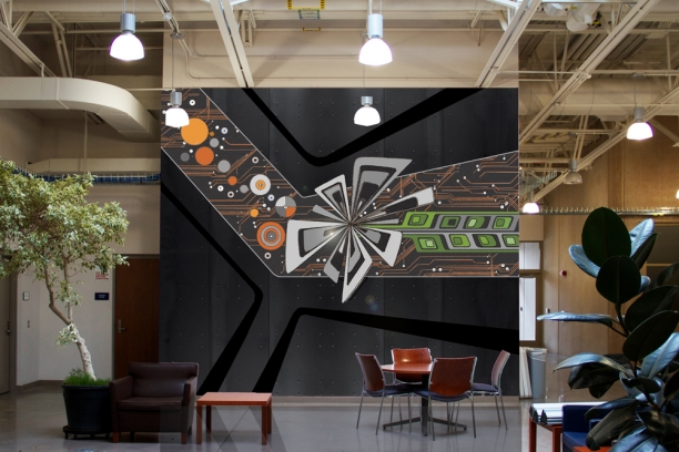
Enjoyed curating 5 selections of recent works for the FB art share so I'm adding here on the blog as well. I'm interested in creating visual experience. I see glass as a powerful medium for drawing viewers into participation with the work as glass shifts and shimmers with changes in lighting and motion. Here are two recent art commissions and renderings of how I can see these working as larger installations. Glass can work in interior and exterior settings making it an extremely versatile medium.

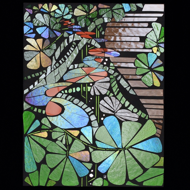
Proust project: Flourish | 12" x 16" | glass c Heather Hancock 2014

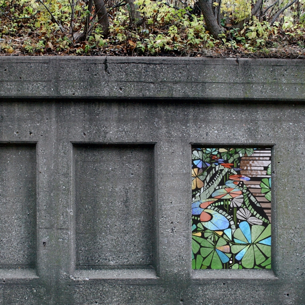
Proust project: Flourish | rendering as exterior installation c Heather Hancock 2015

Passiflora | 12" x 16" | glass and stringer c Heather Hancock 2014

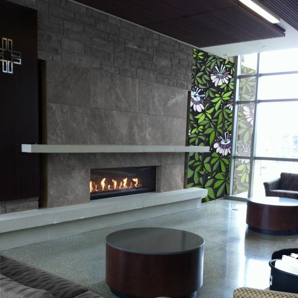
Passiflora | rendering as interior+exterior installation c Heather Hancock 2014

More renderings and concepts.

FB art share | day 4/5

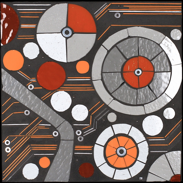
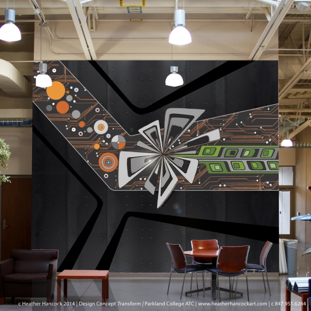
Enjoyed curating 5 selections of recent works for the FB art share so I'm adding here on the blog as well.well. A recent commission, Transform 1.2, was taken from an invited design proposal for State of Illinois Art-in-Architecture project for the Engineering Sciences department at Parkland College in Champaign. Hard-edged line and geometries of an industrial vocabulary are integrated with abstracted forms inspired by the surrounding natural world.

I'm interested in how our vocabulary of beauty is informed by the built world. There are many elements in the built world that offer parallel engagement to those found in the natural world. Possibly because their original design is nature-inspired; maybe because we are innately attuned to find points of order, symmetry, repetition as well as variation, complexity, roughness.

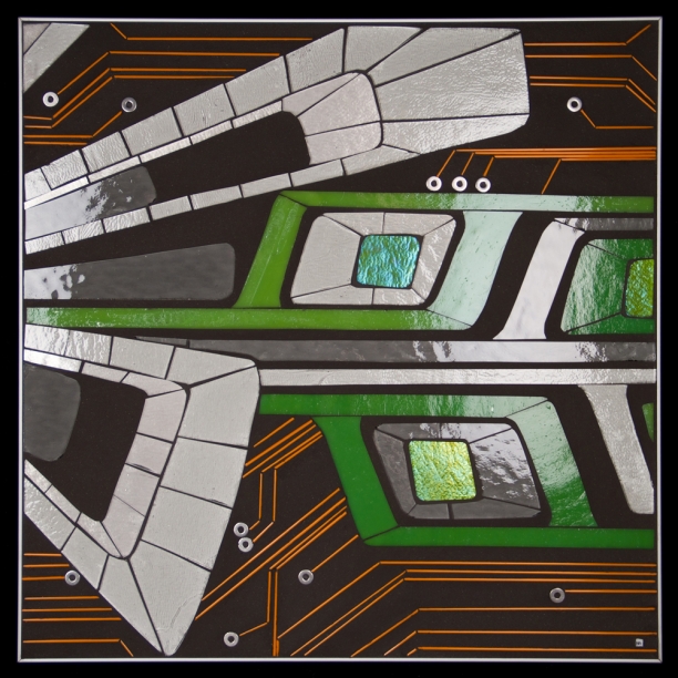
Transform 1.2 | 12" x 12" | glass, stringer, hardware c Heather Hancock 2014

Transform 1.1 | 16" x 16" | glass, stringer, hardware c Heather Hancock 2014

Invited design proposal | Transform c Heather Hancock 2014

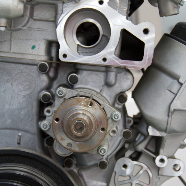
Transform | inspiration image c Heather Hancock 2014

More recent work here.

FB art share | day 3/5

Enjoyed curating 5 selections of recent works for the FB art share so I'm adding here on the blog as well. Given my interest in finding the points of intersection between the built world and natural worlds, I love glass alongside other architectural surfaces and materials...glass with brick, cement board and, of course, grout. I am interested in how nature radicalizes the picturesque with continually changing compositions and surfaces. Shimmering compositions in glass change with lighting and motion.

detail Link installation | glass elements on brick | c Heather Hancock 2013

detail Link installation | glass elements + paint on brick | c Heather Hancock 2013

Verge 4.2 | 24" x 24" glass on wonderboard | c Heather Hancock 2012

detail Realize 7 | 36" x 60" glass on wonderboard | c Heather Hancock 2012

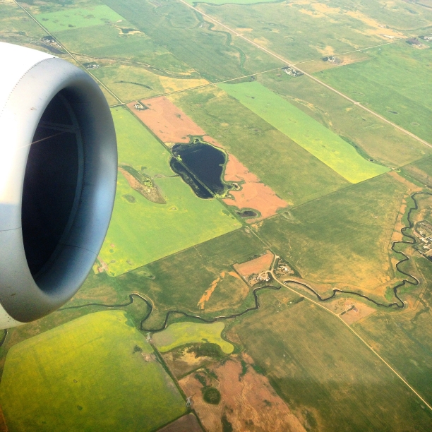
inspiration | nature meets built world

More recent work here.

FB art share | day 2/5

Enjoyed curating 5 selections of recent works for the FB art share so I'm adding here on the blog as well. I grew up on a grain farm in Alberta, Canada. Staying connected to nature in an urban setting is a regular theme in my work. I find inspiration in the vibrancy of both the natural and built worlds for my work in glass. The built world is necessarily based on repetition and precision; the natural world offers a balance of pattern and variation that humans are attuned to.

Bloom 4.2 | 12" x 16" | glass, stringer c Heather Hancock 2014

Proust project: Hawthorns | 12" x 16" | glass, stringer c Heather Hancock 2014

Scan 5.1 | 14" x 14" | glass, stringer c Heather Hancock 2012

inspiration | nature meets built world

More recent work here.

FB art share | day 1/5

Enjoyed curating 5 selections of recent works for the FB art share so I'm adding here on the blog as well. In a past life I was a speech language pathologist with a focus on neurogenic communication disorders. My work often explores how we engage with and process information...neurons, attention, abstracted text, dreams. Finding pattern within noise is deeply satisfying for the human mind. Spending more than a decade in healthcare environments also attuned me to the importance of our surroundings to well-being and quality of life. Humans thrive in engaging environments. Glass is a uniquely powerful media that shifts and shimmers with light and motion.

Trace 2.1 | 14" x 14" | glass+grout c Heather Hancock 2014

Scan 3.2 | 18" x 24" | glass+grout c Heather Hancock 2013

Proust project: Dreams | 12" x 16" | glass+grout c Heather Hancock 2014

More recent work here.

Art+function: Transform 1.2

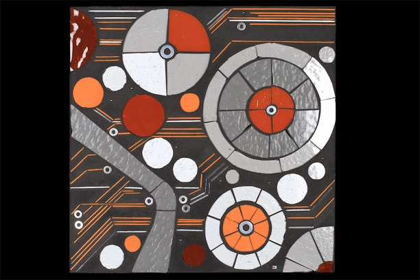
A recent commissioned project turned into a (retrospective) collaboration with my wonderfully talent father and took me full circle back to my starting point with mosaics. A 12" x 12" piece was commissioned from my Transform series as a top for a metal table built by my father. Transform was first developed as an invited design proposal for the Engineering Sciences program at Parkland College in Champaign, IL. It offers a nature-based visual metaphor for the creative process of automotive design/repair and industrial/manufacturing sciences. The imagery connects to the rolling prairie and farmland surrounding the college.

Transform | invited design proposal | c Heather Hancock 2014

Setting Transform1.2 within a metal table frame makes a material and conceptual connection consistent with the way I envisioned Transform as glass elements integrated within hot rolled steel.

Transform 1.2 | glass, stringer, hardware | c Heather Hancock 2014

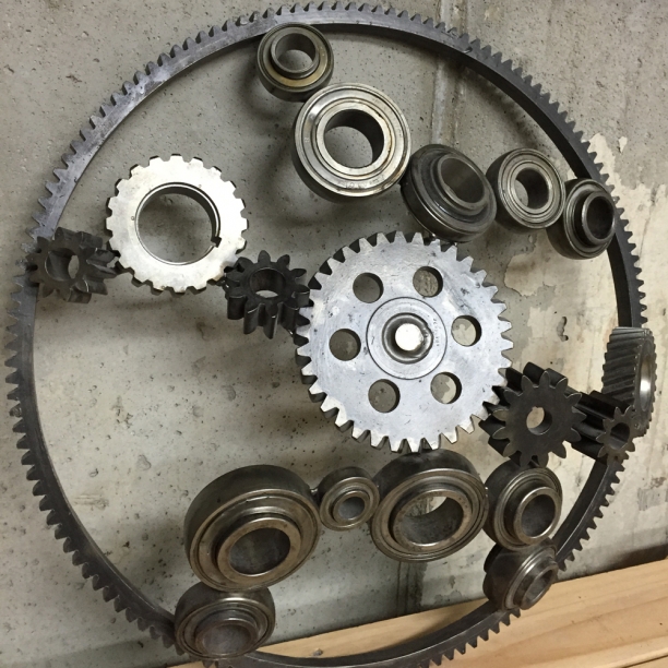
My father is a talented craftsman with a particular fondness for metals. Here's an example of his dimensional, industrial sculptures.

Gears | metal sculpture | Cam Hancock

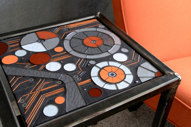
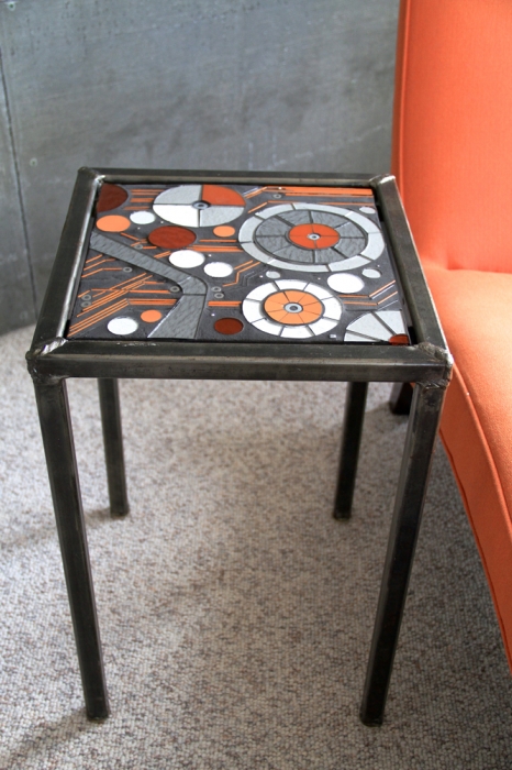
His sleek, industrial style metal tables were the starting point for my work with mosaics. Early mosaic pieces were created as tops for my own metal table until I transitioned to creating art hangings. It was great coming back to these wonderful metal tables. This time with a concept exploring beauty in techno-industrial structure and function for my pilot+aircraft maintenance engineer brother.

Transform 1.2 | glass, stringer, hardware | c Heather Hancock + table by Cam Hancock 2014


Transform 1.2 | glass, stringer, hardware | c Heather Hancock + table by Cam Hancock 2014

More about Transform design proposal.