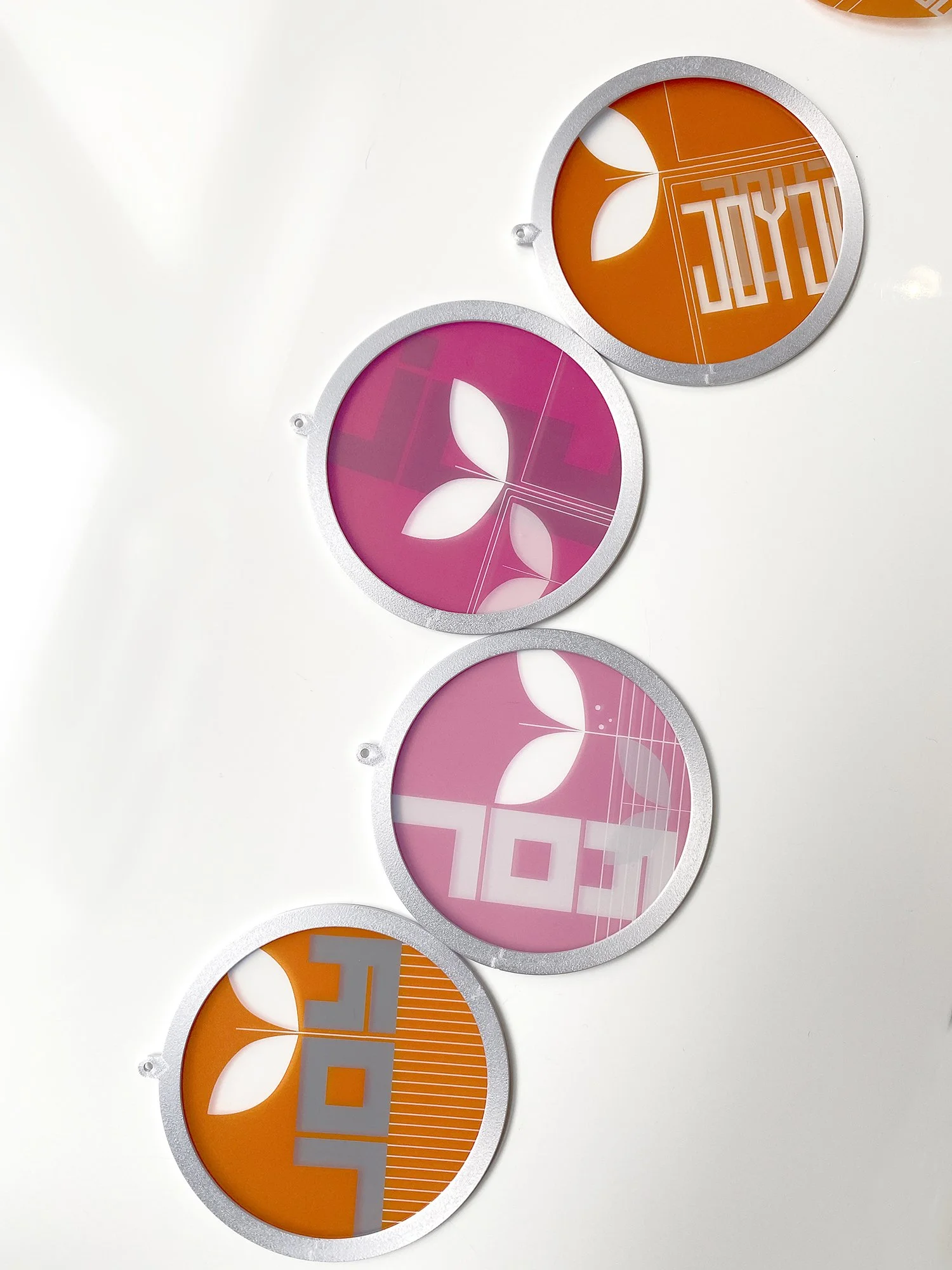
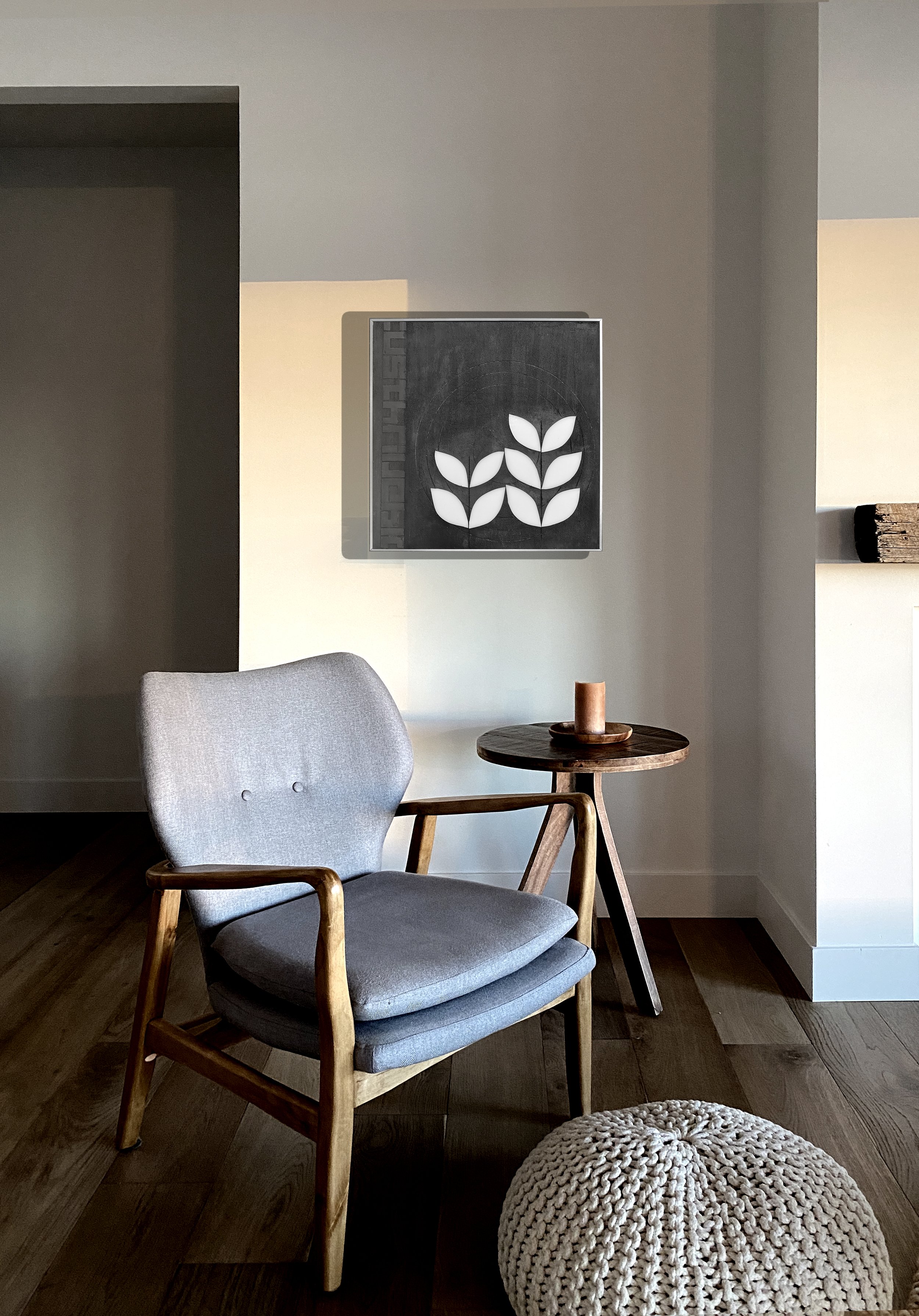
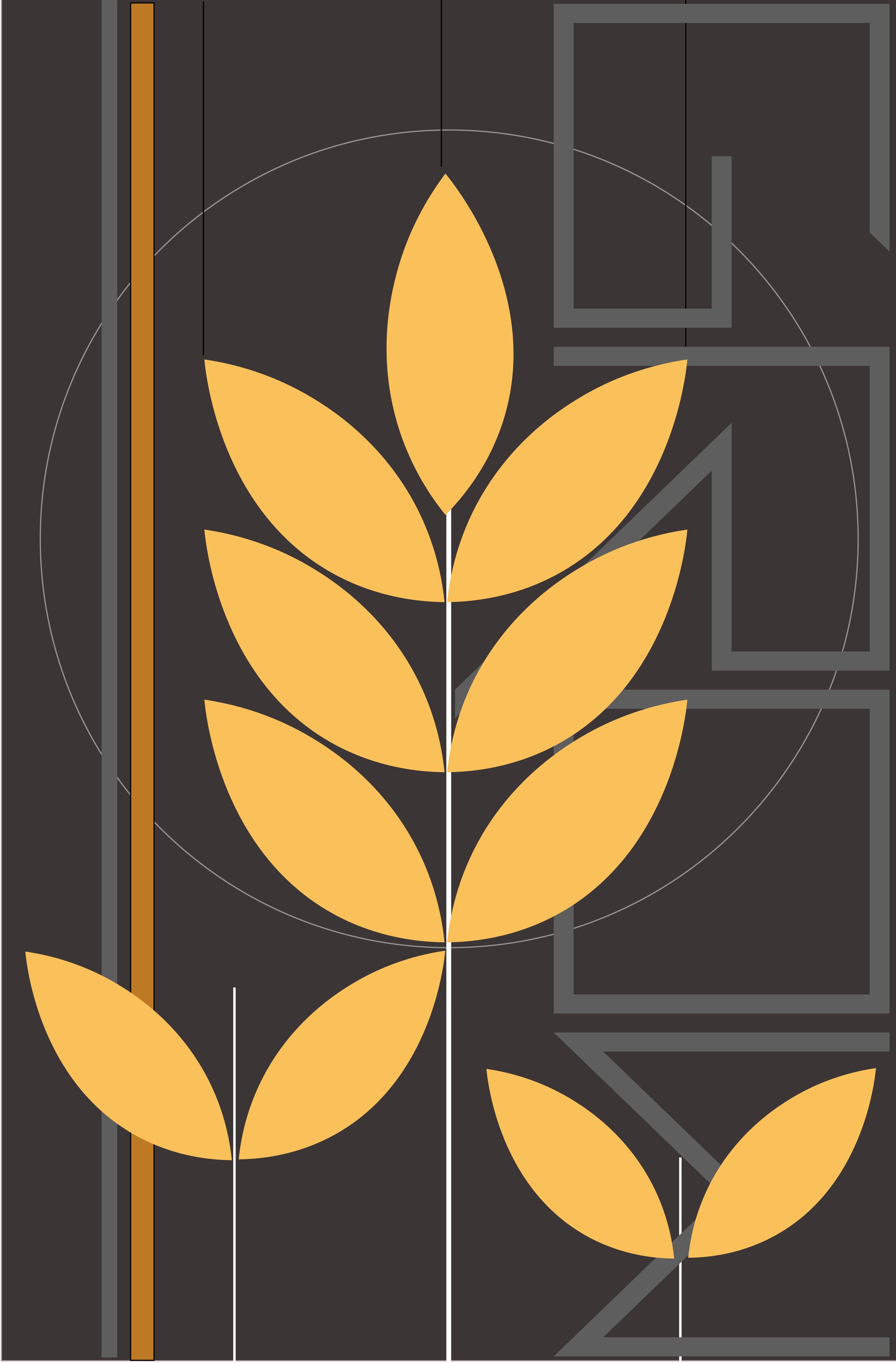
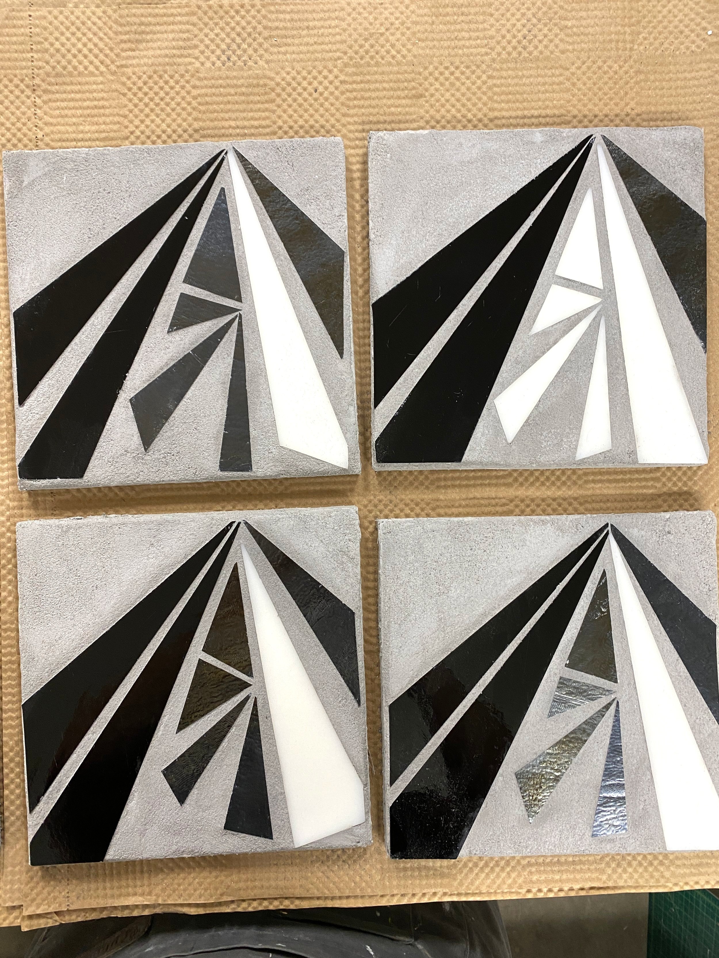
…continuing to think about playful botanicals…and experimenting today with dark/light blocks
JOY
Christmas creativity!!
JOY | concepts c Heather Hancock 2022
REFLECT X ENCODE
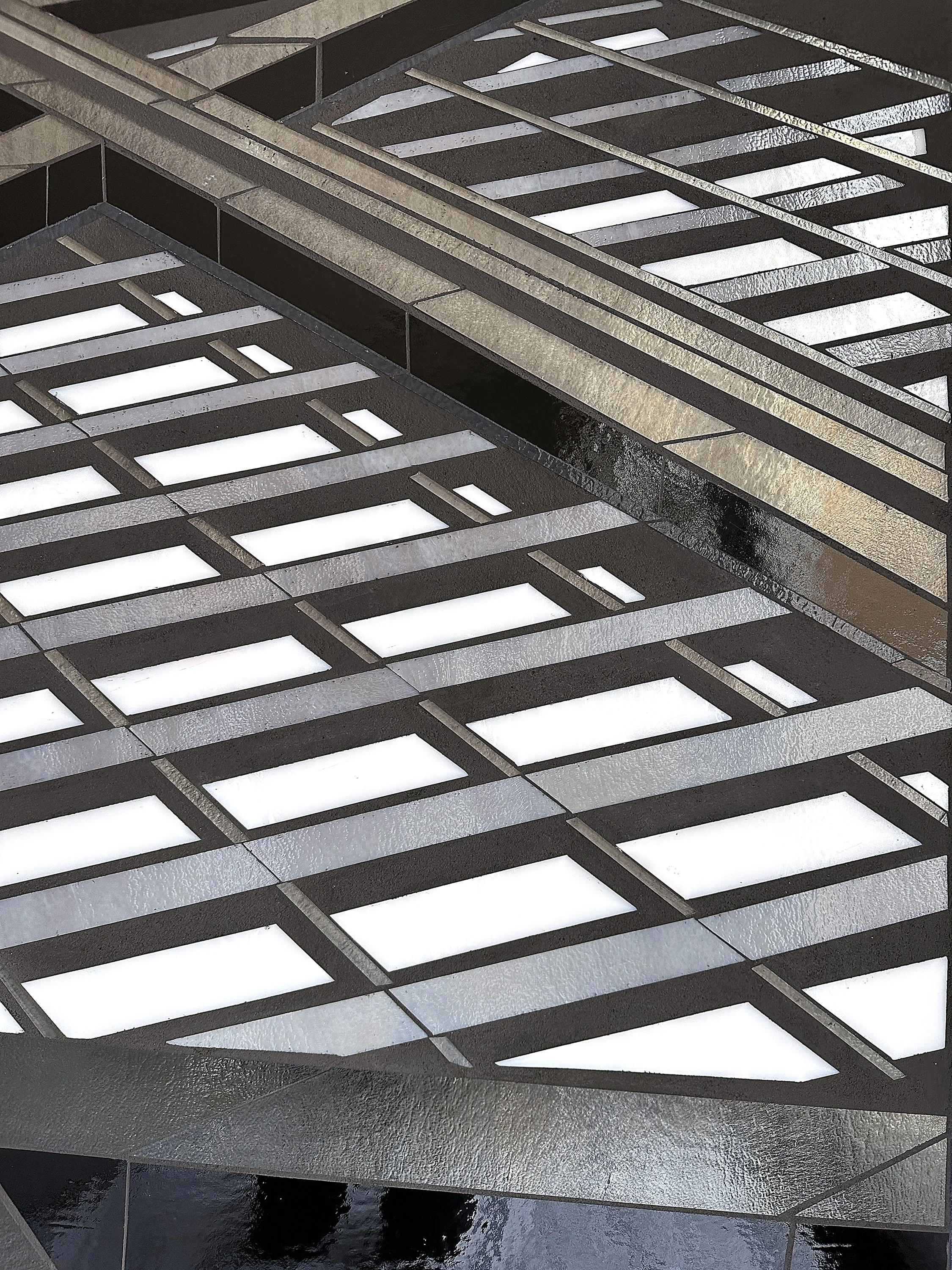
Continuing to explore architectural abstractions alongside big projects. Always start in grayscale with these.
REFLECT 6.3, 6.4 and ENCODE 3.4 each 20”x20” hand cut glass + concrete textures c Heather Hancock 2022
REFLECT 6.3 20”x20” hand cut glass + concrete textures c Heather Hancock 2022
REFLECT 6.4 20”x20” hand cut glass + concrete textures c Heather Hancock 2022
REFLECT 6.3 20”x20” hand cut glass + concrete textures c Heather Hancock 2022
west coast bound
Four juicy new pieces are headed to a conference room on the West Coast.
The art consultant for this project requested concepts for a set of four pieces that reflected the distinctly different landscapes within her clients’ service area.
4@ 2’x3’ hand cut glass + concrete textures c Heather Hancock 2022
Each piece needed to abstract from specific landmark views for a stand alone art piece and at the same time connect across the pieces for a compelling and cohesive hanging in an executive conference room. Clients provided reference images of the land/waterscapes.
I provided two different concept directions for preliminary presentation. I always work digitally which streamlines client communication. I can quickly sketch a vision or concept to help visualize ideas and then incorporate client feedback and preferences. Final drawings give clients a really good sense of how the finished pieces will look (minus the actual shimmer/matte contrasts that bring my pieces to life). This design phase took about 4 weeks to finalize.
preliminary concept1 specific views wetlands/city/lake/desert
preliminary concept2 abstracted color concepts wetlands/city/lake/desert
Additional versions were generated and ideas refined to get to the final selection. The clients had very specific imagery they wanted to see incorporated and we were able to back-and-forth to get to final concepts.
I created the 4 pieces based on the clients' final selection. Glass and concrete are integrated with paint and texture to create a lively contrast of matte vs shimmer. Pieces were created in ~2 weeks and shipped to arrive well in advance of receive by date.
4 views | lake/city/wetlands/desert 2’x3’ hand cut glass + concrete + paint c Heather Hancock 2022
detail 4 views | lake/city/wetlands/desert 2’x3’ hand cut glass + concrete + paint c Heather Hancock 2022
4 views | lake/city/wetlands/desert 2’x3’ hand cut glass + concrete + paint c Heather Hancock 2022
4 views | lake/city/wetlands/desert 2’x3’ hand cut glass + concrete + paint c Heather Hancock 2022
detail 4 views | lake/city/wetlands/desert 2’x3’ hand cut glass + concrete + paint c Heather Hancock 2022
4 views | lake/city/wetlands/desert 2’x3’ hand cut glass + concrete + paint c Heather Hancock 2022
detail 4 views | lake/city/wetlands/desert 2’x3’ hand cut glass + concrete + paint c Heather Hancock 2022
REFLECT 4.7
Ready to deliver this gorgeous new piece. So powerful. Will get in situ pix as soon as the piece is installed. I used a new frame with this piece which makes for a slimmer profile for the panel. Really liking it. Art consultants and designers often want pieces to have a low profile. Happy to figure out this option.
REFLECT 4.7 4’x2.5’ hand cut glass + concrete c Heather Hancock 2022
WIP REFLECT | architectural abstraction
A new architectural abstraction is in the works. The clients wanted a large piece for their family room, selecting a 4’x3’ panel size. All cutting is complete and waiting for frames to finish up.
rendering of concept at 4’x3’ c Heather Hancock 2022
WIP REFLECT | 4’x3’ cutting glass c Heather Hancock 2022
quick sketches | fun botanicals
As the color gradually fades outside, i get much more interested in color in the studio. I can see a mix of embossing and grayscale glass with some popping high contrast color.
abstracted botanicals | sketch 1 c H Hancock 2022
abstracted botanicals | sketch 3 c H Hancock 2022
abstracted botanicals | sketch 5 c H Hancock 2022
abstracted botanicals | sketch 2 c H Hancock 2022
abstracted botanicals | sketch 4 c H Hancock 2022
abstracted botanicals | sketch 6 c H Hancock 2022
urbanVine in multiples
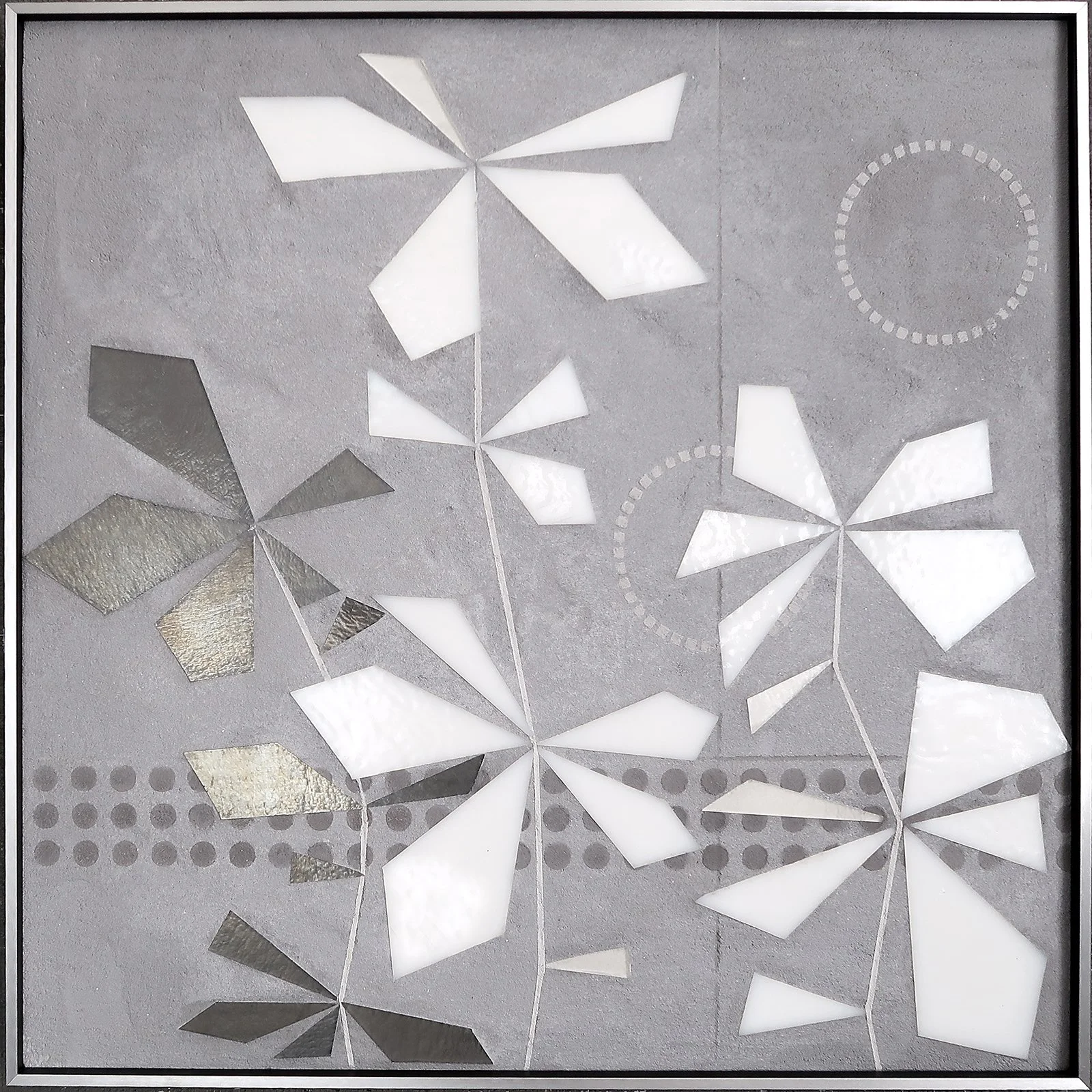
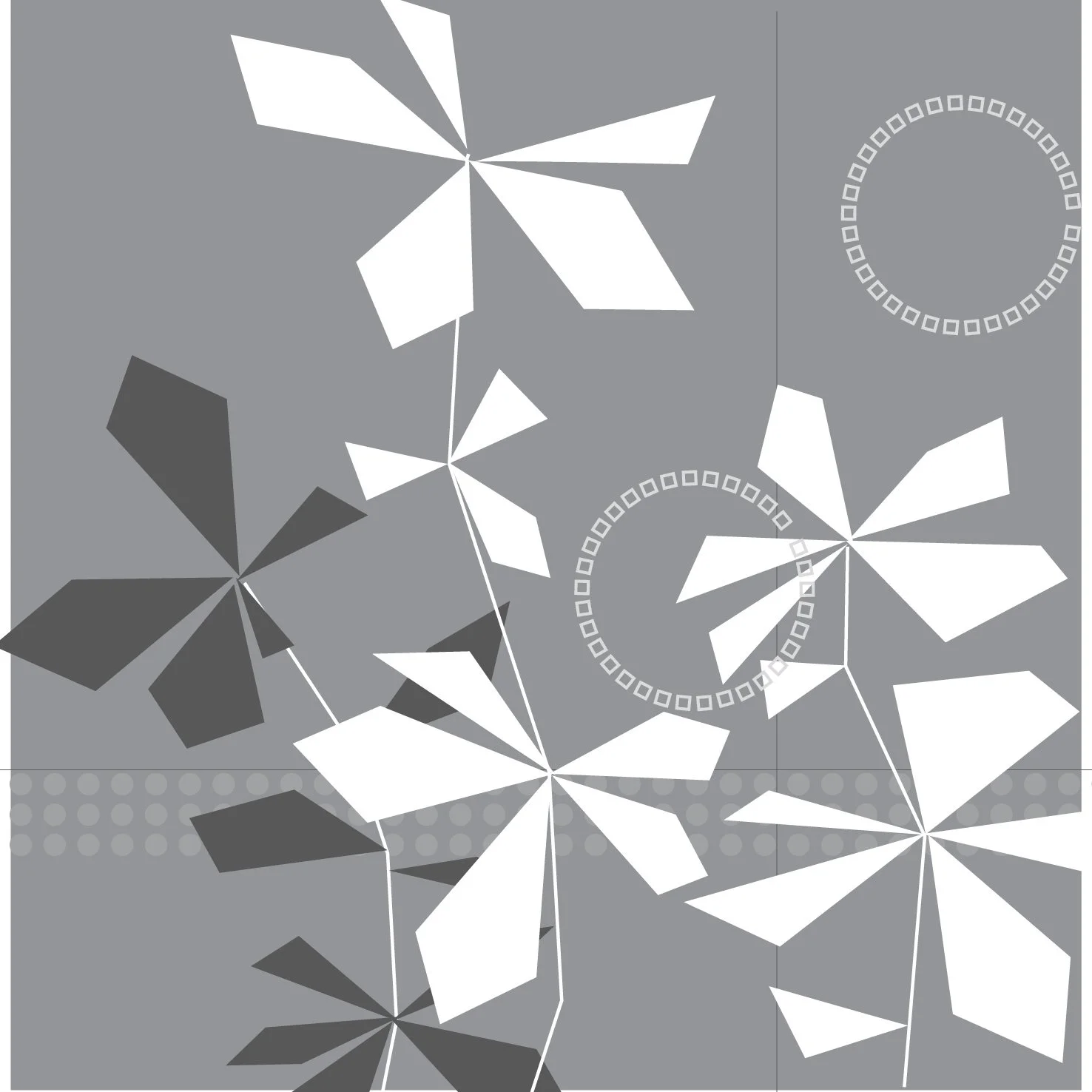
I always love working in multiples, making pieces that connect across multiple canvases. This project will hang in another country and so the art consultant understandably specified no text elements. Embossed and etched geometric abstractions were used in place of my usual text elements. These abstract botanicals shimmer in glass, suggesting constant transformation. I’m looking forward to seeing these hanging. For now, here are some images of them in the studio.
urbanVine 3.8, 3.9, 3.10 | 3@20”x20” hand cut glass + concrete c Heather Hancock 2022
detail | urbanVine triptych
detail | urbanVine triptych
urbanVine 3.8 | 20”x20” hand cut glass and concrete c Heather Hancock 2022
urbanVine 3.10 | 20”x20” hand cut glass and concrete c Heather Hancock 2022
urbanVine 3.9 | 20”x20” hand cut glass and concrete c Heather Hancock 2022
rendering of UrbanVine | hand cut glass + concrete 3@20”x20” c Heather Hancock 2022
ideas | architectural abstraction
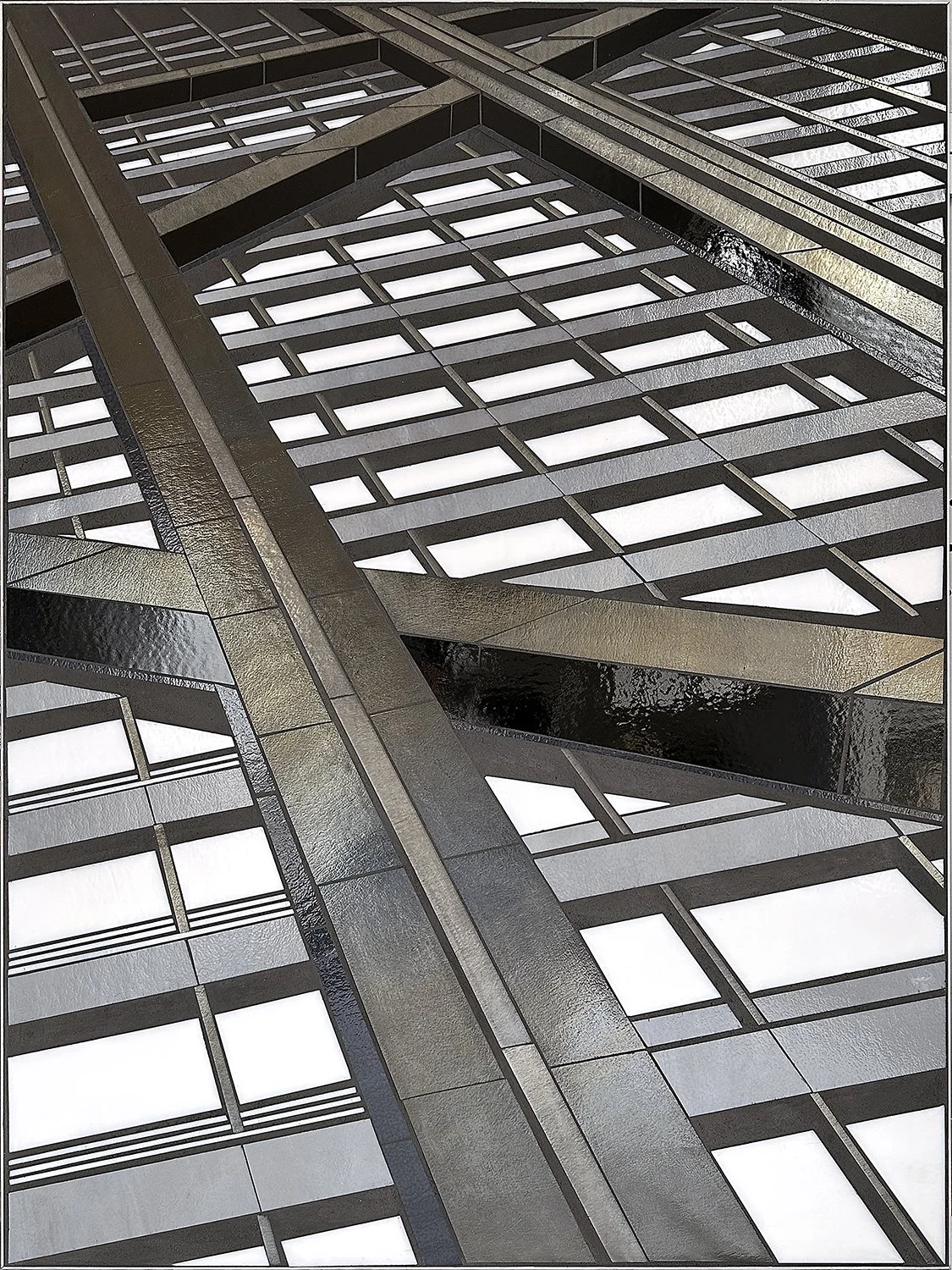
I recently was looking at images of a new building in NYC and could see a new set of pieces in the REFLECT series. I’d love to see what depth I could create using a limited palette of black, white, gray and concrete texture (+/- color accents). I like the overall lightness and brightness, with either silver or black concrete infill.
drawing | architectural abstractions c Heather Hancock 2022
PEAK
I’m excited to be heading to Colorado for a quick fall hiking (and remote working) trip. Growing up in driving range of the Canadian Rockies, mountains have always been a source of awe…ancient…monumental…vast.
I’m delighted with this summer’s new pieces PEAK which feel like a playful take on mountains. The hints of gold and bronze in the iridized gray alongside crisp black and white makes for a lovely subtle color palette.
PEAK | 2@20” x 20” hand cut glass inlayed in textured concrete c Heather Hancock 2022
detail | shimmer and reflectance makes for a dynamic art piece with texture and gloss contrasts adding another dimension
And that reminds me that I did a fun zoom background mountain mural last year integrated into the architecture of the work-from-home space. Perspective is all right for Cam’s computer camera.
mountain zoom background mural c Heather Hancock 2021
growing urbanVines
I’m happy to be realizing an idea that I’ve been thinking about for a long time. The image of a vine growing on a concrete or brick wall is the perfect visual metaphor for all of us finding our way, surviving and thriving in less than ideal conditions. I like the reminder that we are also in a state of constant growth and transformation.
drawing urbanVine 3@20”x20” c Heather Hancock 2022
drawing urbanVine 3@20”x20” c Heather Hancock 2022
drawing urbanVine 3@20”x20” c Heather Hancock 2022
fall making
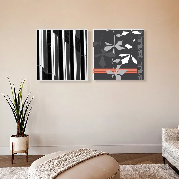
I’m planning for my fall studio making and find it helpful to work digitally at this stage to get to the feel and visual impact I’m wanting. One direction I’m interested in is creating sets of architectural and botanic- inspired (vine/encode…) pieces, exploring line in city and nature using a consistent palette and bold contrast.
rendering | abstract mies + urbanVine c Heather Hancock 2022
rendering | abstract mies + urbanVine c Heather Hancock 2022
rendering | abstract chase + urbanVine c Heather Hancock 2022
rendering | abstract mies + urbanVine c Heather Hancock 2022
rendering | abstract mies + encode c Heather Hancock 2022
rendering | abstract mies + urbanVine c Heather Hancock 2022
quick look...fall vibes
I’m getting geared up for fall studio time. Step one is to think about what’s currently available…what’s new this summer…and how my different groups of work are evolving and interacting.
ENCODE 3.40 thrive | 20” x 20” glass + concrete c Heather Hancock 2022
ENCODE 3.30 grow + ENCODE 3.20 build | each 20” x 20” glass + concrete c Heather Hancock 2022
ENCODE 3.7 aim | 20” x 20” glass + concrete c Heather Hancock 2021
new drawing | abstracting views
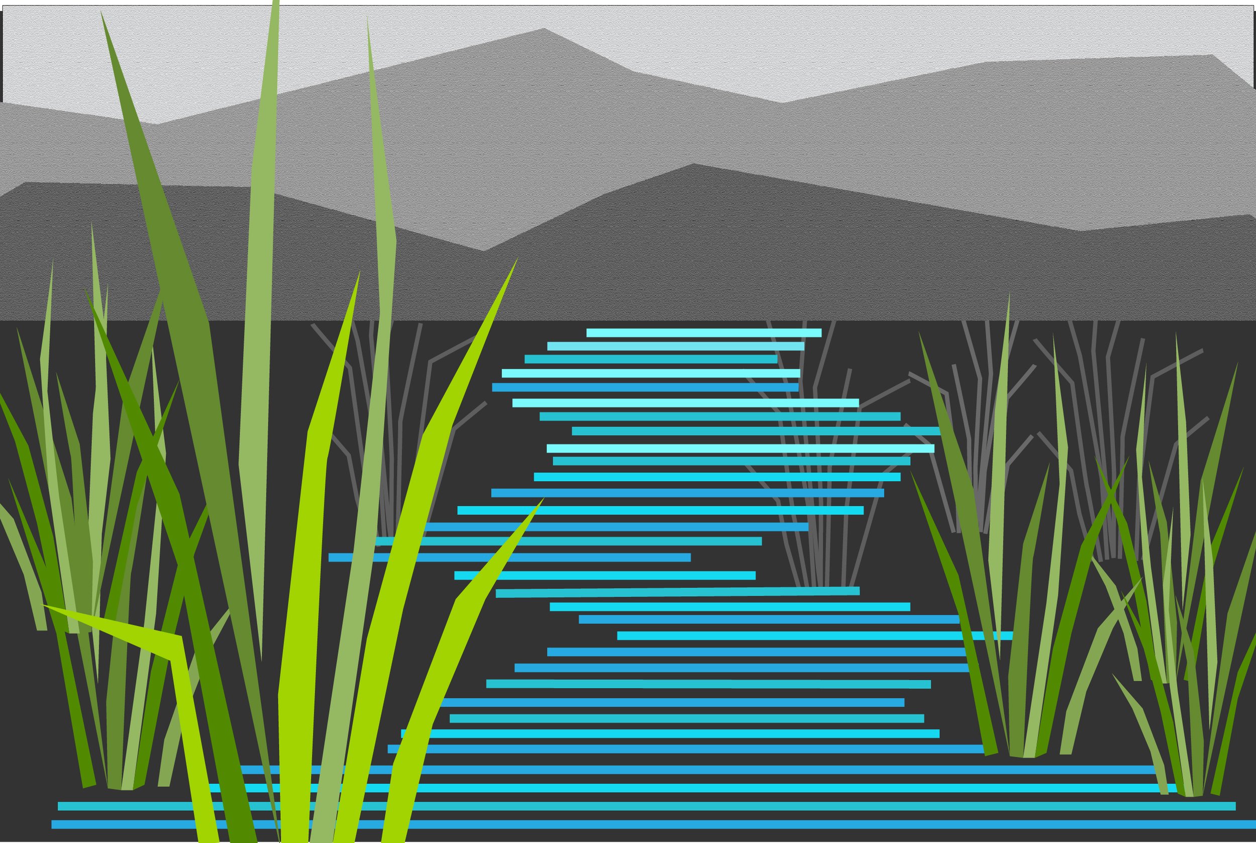
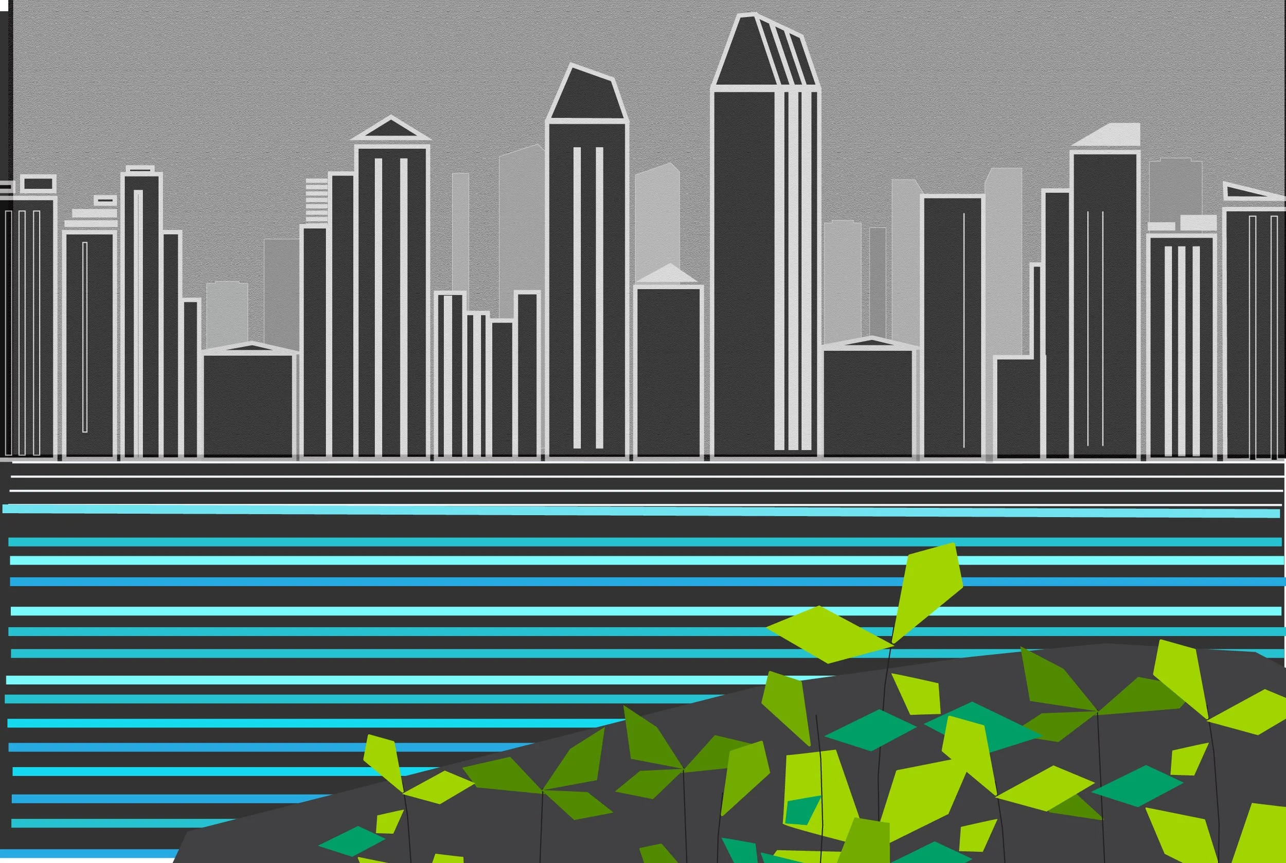
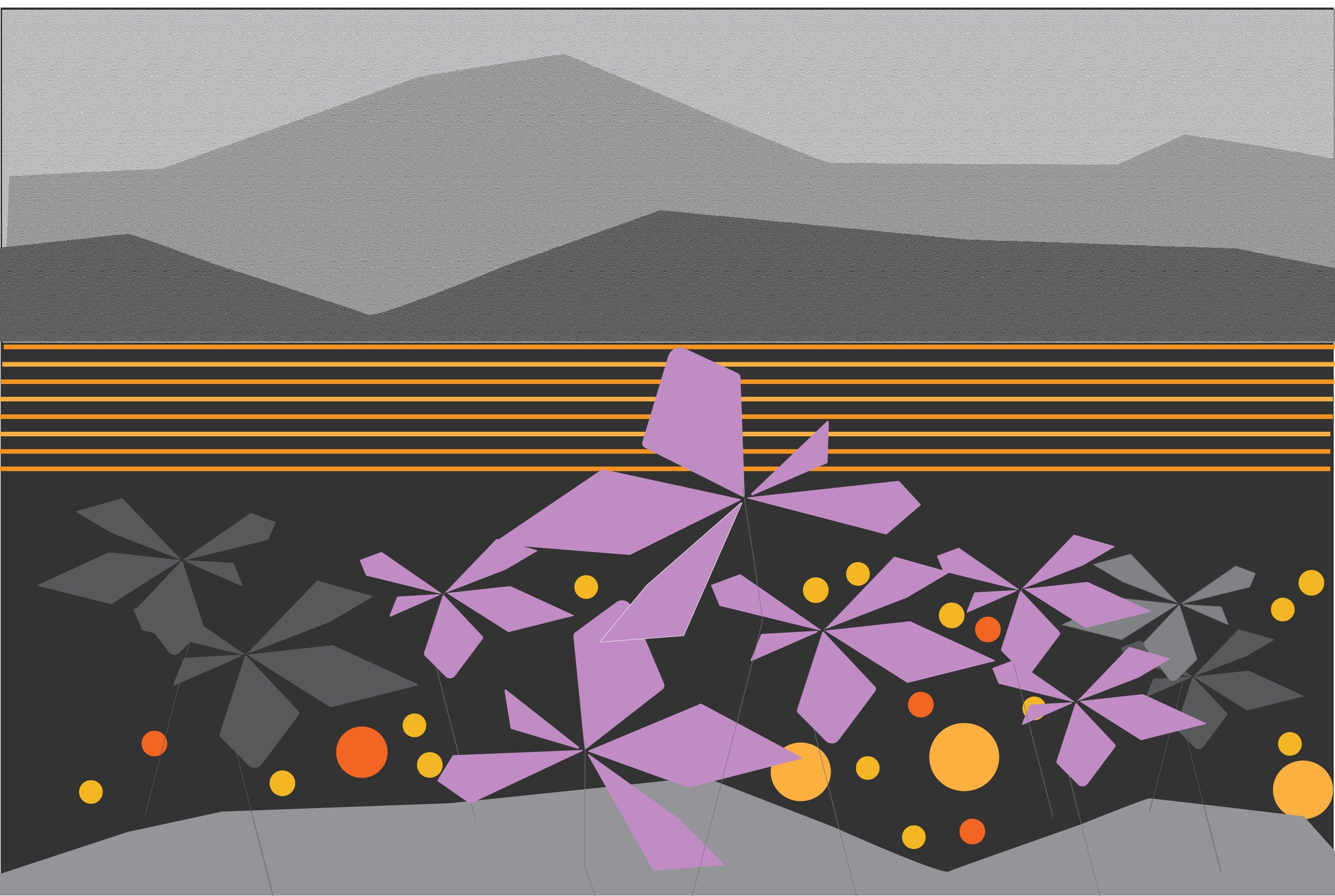
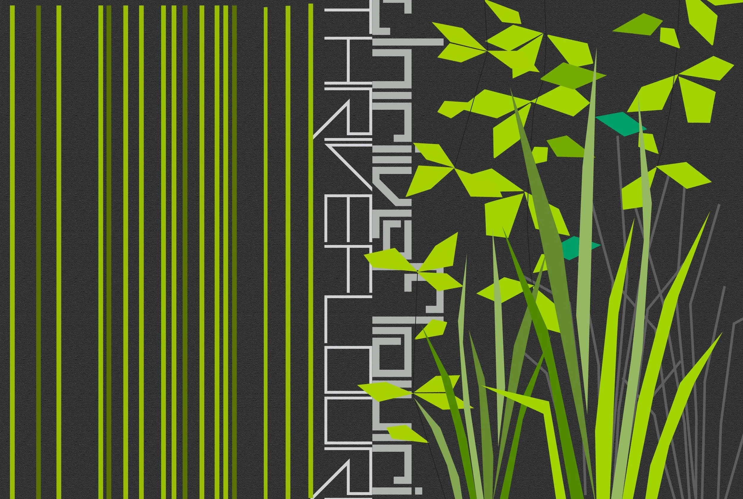
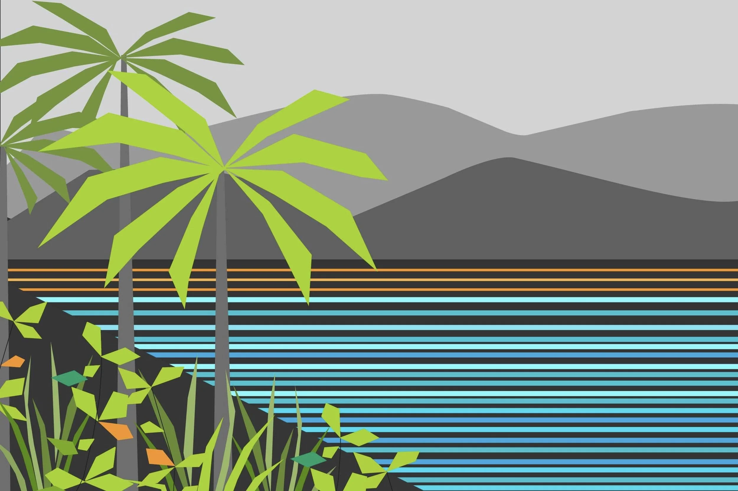
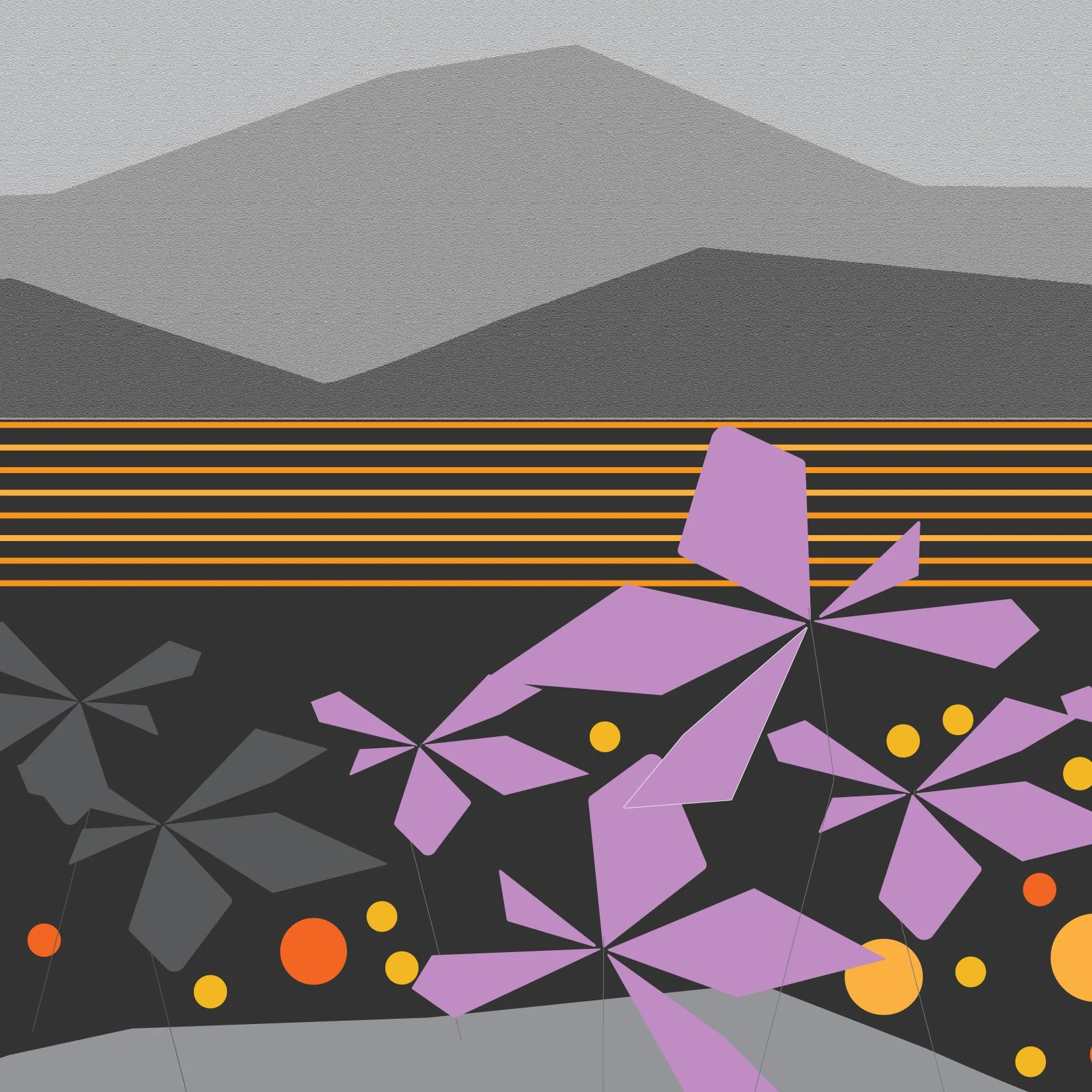
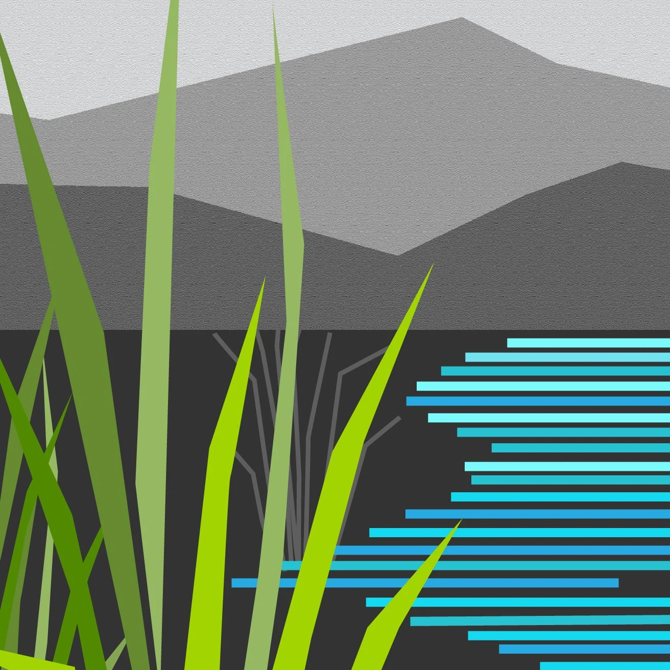
Over the past couple weeks I’ve been developing new concepts for graphic versions of client relevant environs. Four ecosystems are relevant to their community: city and lake, wetlands and desert. New technical solutions are supporting my interest in reducing visual ideas to their essence, distilling complexity into clean line, geometric form and simple repetition. This approach leaves room for a viewer to co-create the imagery. Here are some small sections of larger drawings still in the works.
detail
detail
detail
detail
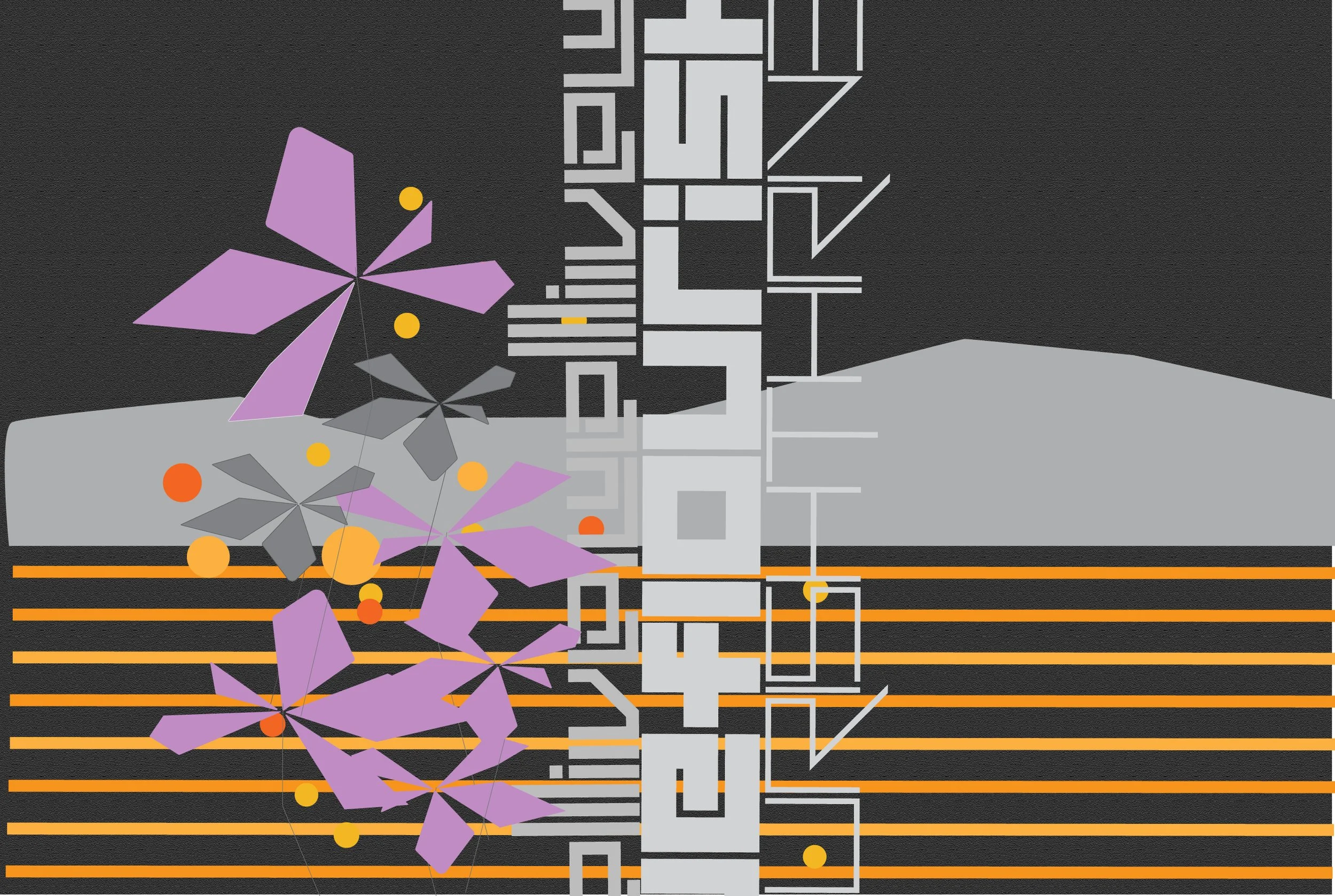
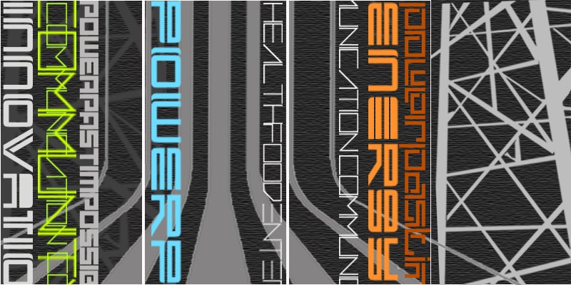
A second approach consolidates key natural and manmade elements into single panels—leaves/foliage, water (lake, ocean, estuary), city, desert—with abstracted text creating the structure in each panel. This is a fully abstract approach with the text elements offering viewers additional information to detect and decode. Below are small sections of larger drawings still in the works.
detail
detail
detail
detail
place making | site specific concepts
Many of my commission proposals develop site-specific concepts that abstract the views+topography or themes+ideas for a given company or client. I always learn something new when I’m exploring the imagery, palettes or views that will create a sense of common ground or shared purpose for a group.
I recently looked back at this project for an energy company. The project didn’t move forward but lots of good ideas for using text and imagery to connect with a given community. Watching for a chance to re-visit this approach.
concept | energy client c Heather Hancock
concept | energy client c Heather Hancock
commission: REFLECT 4.6
Fit in a lovely 20”x20” architectural piece over the past couple weeks and just received installation images. The client requested gold metallic tones alongside black and whites. Ties in with their wall covering beautifully.
Loving it : )
REFLECT 4.6 RHYTHM 20”x20” hand cut glass + concrete c Heather Hancock 2022
REFLECT 4.6 RHYTHM 20”x20” hand cut glass + concrete c Heather Hancock 2022
detail REFLECT 4.6 RHYTHM 20”x20” hand cut glass + concrete c Heather Hancock 2022
detail REFLECT 4.6 RHYTHM 20”x20” hand cut glass + concrete c Heather Hancock 2022
summer sketching
I am thinking about the sky in the new PEAK pieces. I can envision a super simple embossed element as a graphic cloud or sky. There’s a versatile line that I want to try as a sort of base concept that could be repeated and re-composed for endless variation. I could see a lighter gray textured line against the silver gray background. Trying it out digitally first.
simple sky concept test1
simple sky concept test3
simple sky concept test2
simple sky concept test4
summer sketching
Whenever I’m drawing foliage/vines, I often come back to wheat/grains with their upright structure and inter-connected repeating seed heads (deeply encoded from growing up on a grain farm!). Some days I’m thinking of lobby scale ideas. Others I’m thinking about small moments. This morning I wanted to see a 12”x18” composition with wheat…keeping the composition spare and graphic with imagery and text. Realized in shimmery glass (iridescent amber or green…or crisp white), this imagery takes on an almost sculptural dimensional quality that goes beyond 2D.
sketch01 grow/wheat c Heather Hancock 2022
sketch05
original concept in green+gray
wheat stems as tech lines
sketch02 grow/wheat c Heather Hancock 2022
sketch06
sketch03 grow/wheat c Heather Hancock 2022
sketch07
sketch04 grow/wheat c Heather Hancock 2022
sketch08
Handheld samples
Samples are super helpful in understanding how texture and glass function in my work. I keep a small inventory of 8”x8” hand held samples. Samples come in a presentation box for easy transport and sharing.
Samples are available for the following series:
ENCODE | text abstractions
Let me know what samples are most relevant to your clients/projects.
Custom samples can also be created for large scale commissions with design deposit.


