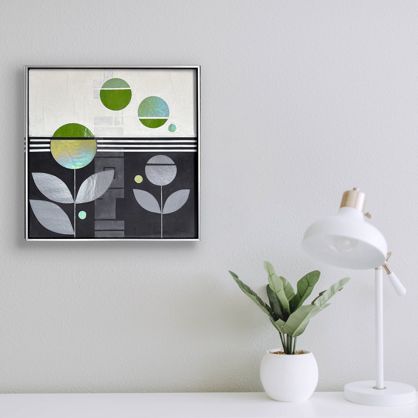
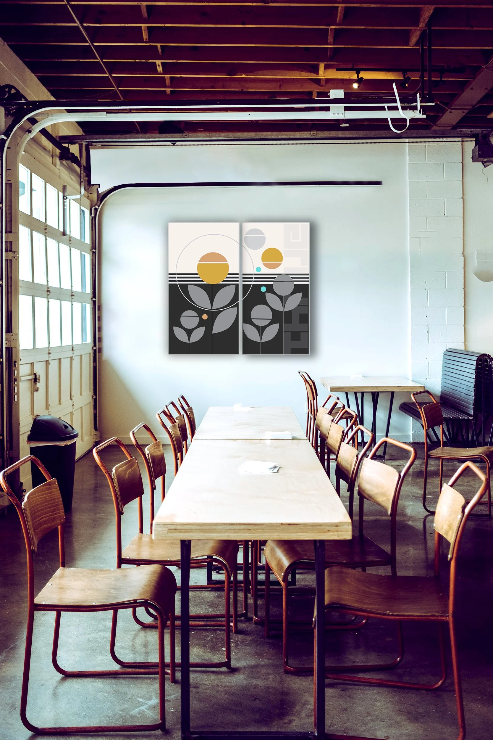
Several things are coming together in Grow5.0. Nature thriving in city. Clean line urban aesthetic to simplify nature’s astounding complexity. Dark+light contrast, concrete textures and structures, text fragments and layers and shimmering color all create endless possibility. I’m ready to exlore how these can work in new canvas proportions.
art for contemporary interior design
I came across an interior design portfolio so spectacular and clean and minimalist that I just HAD to curate some art hangings for these spaces.
The only pieces I modified were the Scan pieces which I turned into white glass on black background (from the original highly saturated greens+blues).
Thinking some more. Those pieces could also be so elegant done in white glass on white/palest gray background. I would love to see Scan as a pure abstract monochromatic installation somewhere, sometime. A few more experiments thinking about contrast and content in a contemporary interior.
VISTA series
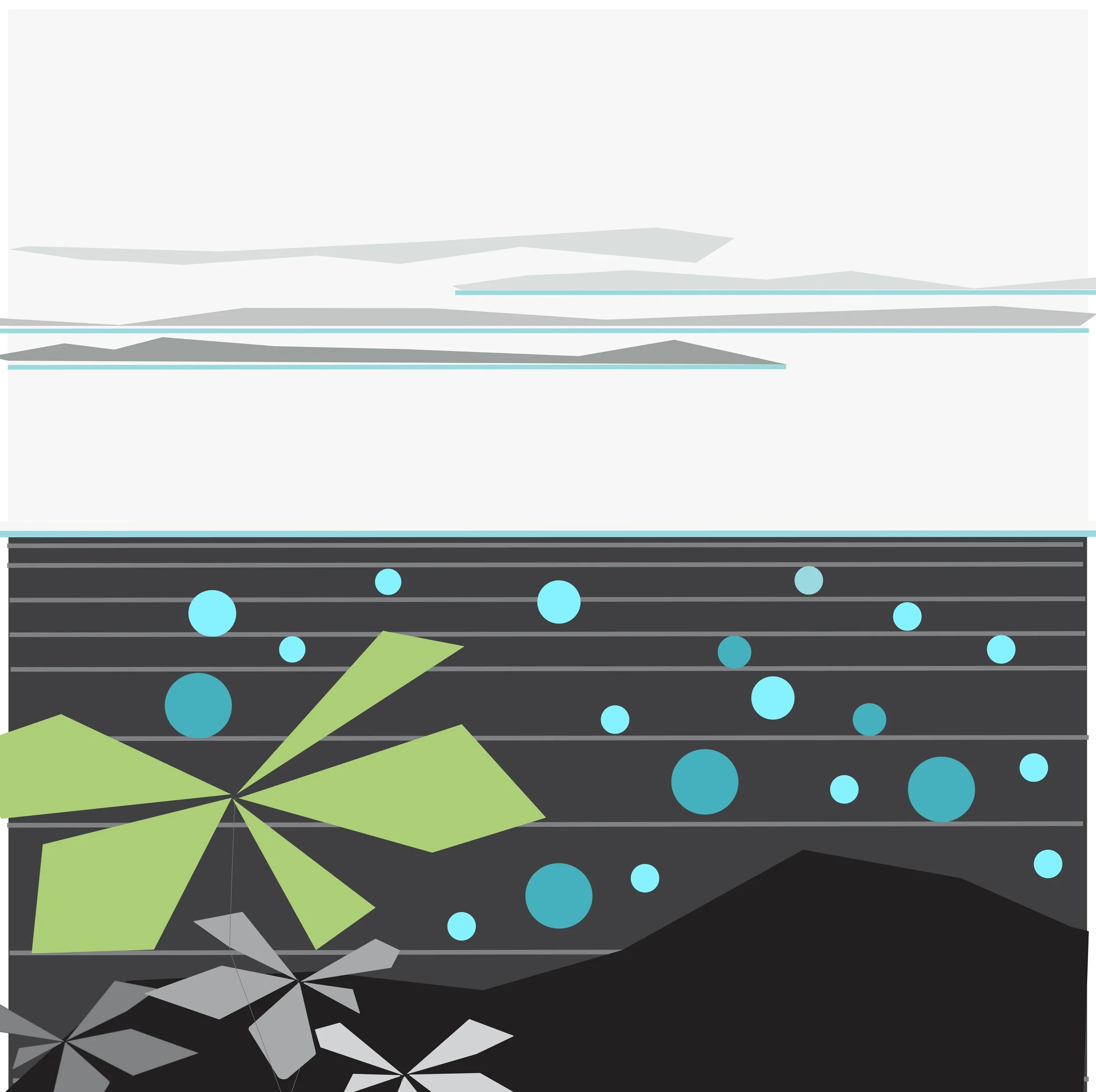
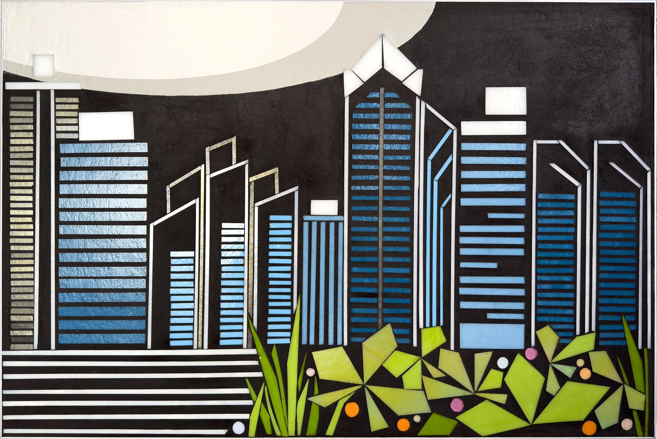
… so many ideas for the VISTA series. Now that I am expanding my lens beyond cityscapes/skylines to include natural imagery, landscapes, waterscapes, I can see tremendous potential to abstract familiar topographies into graphic clean line compositions. The San Diego VISTA pieces progressed the approach of foregrounded glass elements and painted backgrounds. I love working from reference images to get to simplifiied elements and concepts that look both familiar and fresh.
Some details from preliminary sketches … from places I’ve recently visited.
urbanVine in color | layers and fragments: nature + city
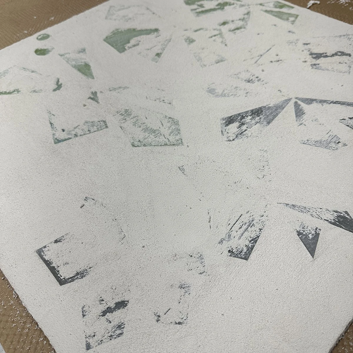
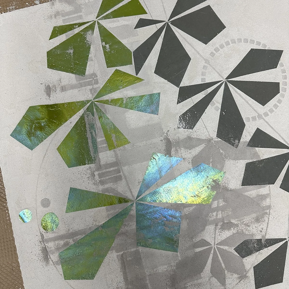
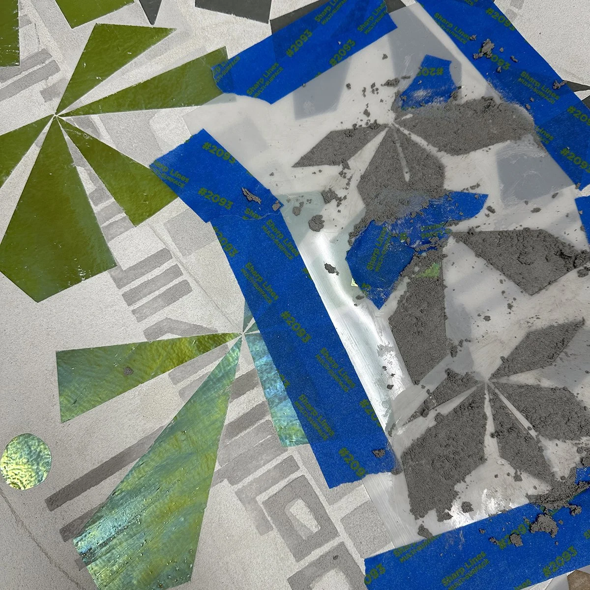
I’m working on another ‘urban lens on natural imagery’ concept bringing color into the urbanVine concept. This time I’m trying a bright white textured background. Same leaf/vine shape in color glass and exploring the layering, shadows, fragments of information and text and hints of architecture contrast with luminous glass inlays. Here are some WIP pix from this week.
glass palettes
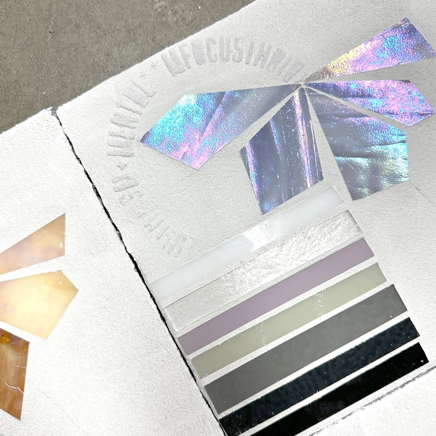
I have color commitment issues when it comes to glass. Color palettes are limited with big gaps in hue and saturation. Some of my favorite glass can vary widely by dyelot. The wispy glass patterns feel busy. Iridescence adds another layer of complexity. It can be spectacular in a piece and add so much interest as it is highly reflective. But it generally brings in multiple additional hues on top of the base color.
At some point I shifted to primarily grayscale glass, partly because supply chain issues over the past 5 years have significantly reduced reliability of glass supply, and partly because black, white and grays are highly consistent colors. Finding the right contrasts (interactions with background concrete) has been a simplified. Bringing color in with paint was a recent strategy with the ENCODE series.
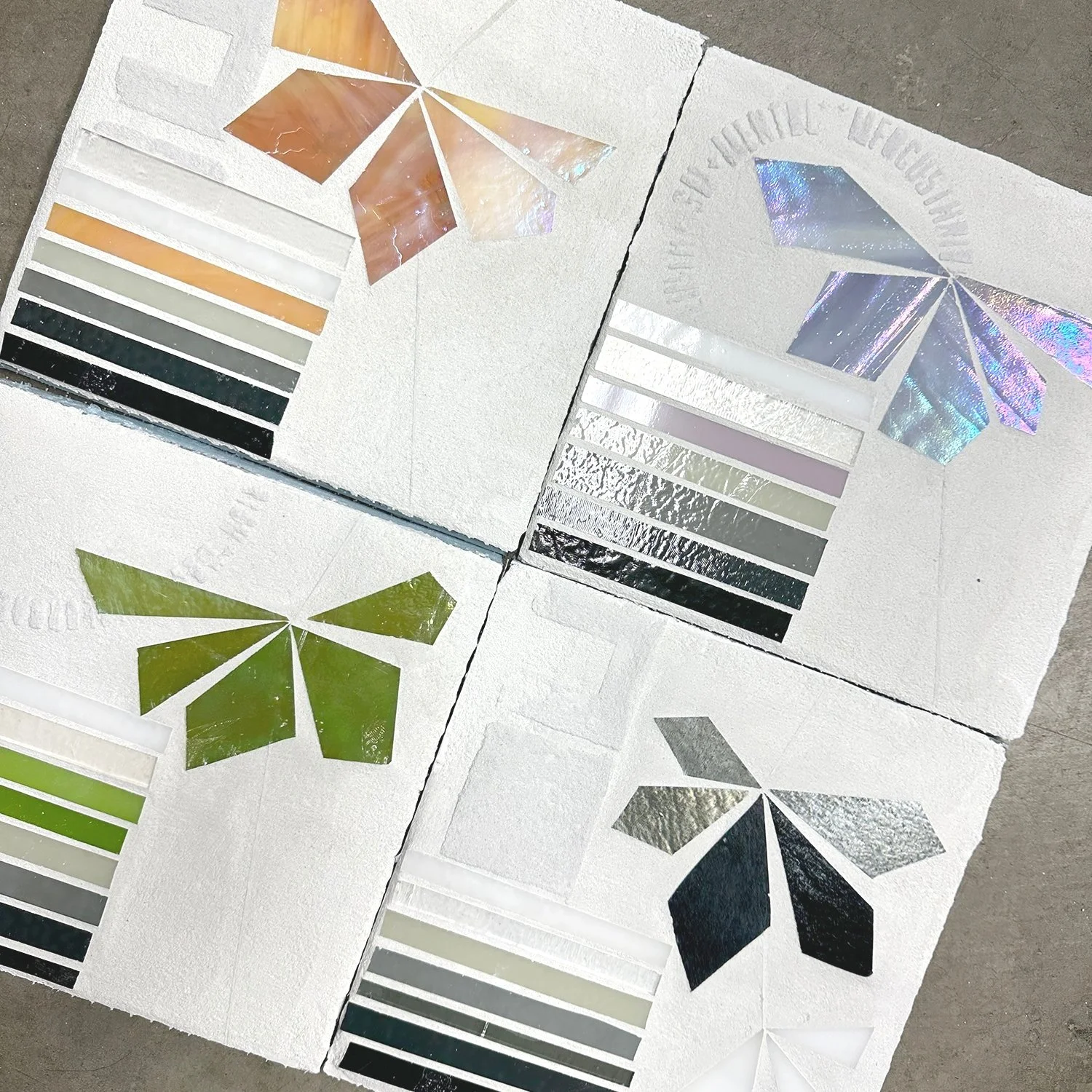
I have been focusing on natural imagery recently and exploring limited color glass accents alongside grayscale palettes. As I move toward using white backgrounds, I am relying on glass palettes to see how glass and background will interact. These give me quick and rough preview of how elements could interact. Of course, I really love the grayscale one. : )
hi or lo contrast?
One of the interesting challenges with using glass an an inlay is that foreground (glass) and background (concrete) are created in different and permanent steps in the making process. The interaction between foreground and background is, just like in any painting, critical to the success of the piece. But unlike painting, all decisions are made a priori and aren’t easily modified. The result is slow progress toward new contrasts.
I have typically started with a black background for high contrast, high drama, high impact. But I’m doing more with lighter backgrounds. The entire ENCODE series features silver gray concrete, a palette choice very directly linked to what I consider the ‘urban palette’ (think: concrete, signage, asphalt, traffic markings…). One of my strategies for getting to the right contrast is using white, black or dark gray glass. In the ENCODE series color could be added via saturated paint that I could modify and edit until it was in balance with the mid-tone gray background.
I’m now exploring white as a background to create a lighter, airy piece that still features clean crisp glass form and line and shadowy, embossed layers. These pieces are more subtle than the high contrast version. I love the idea of monochromatic or limited grayscale palette.
I can also see cutting glass forms in color for a truly gorgeous, fresh visual experience.
The challenge is conveying in a drawing how the glass will continue to catch light and shimmer for a dynamic bold visual experience. A quick first step is a glass palette sample.
when b+w is the perfect thing
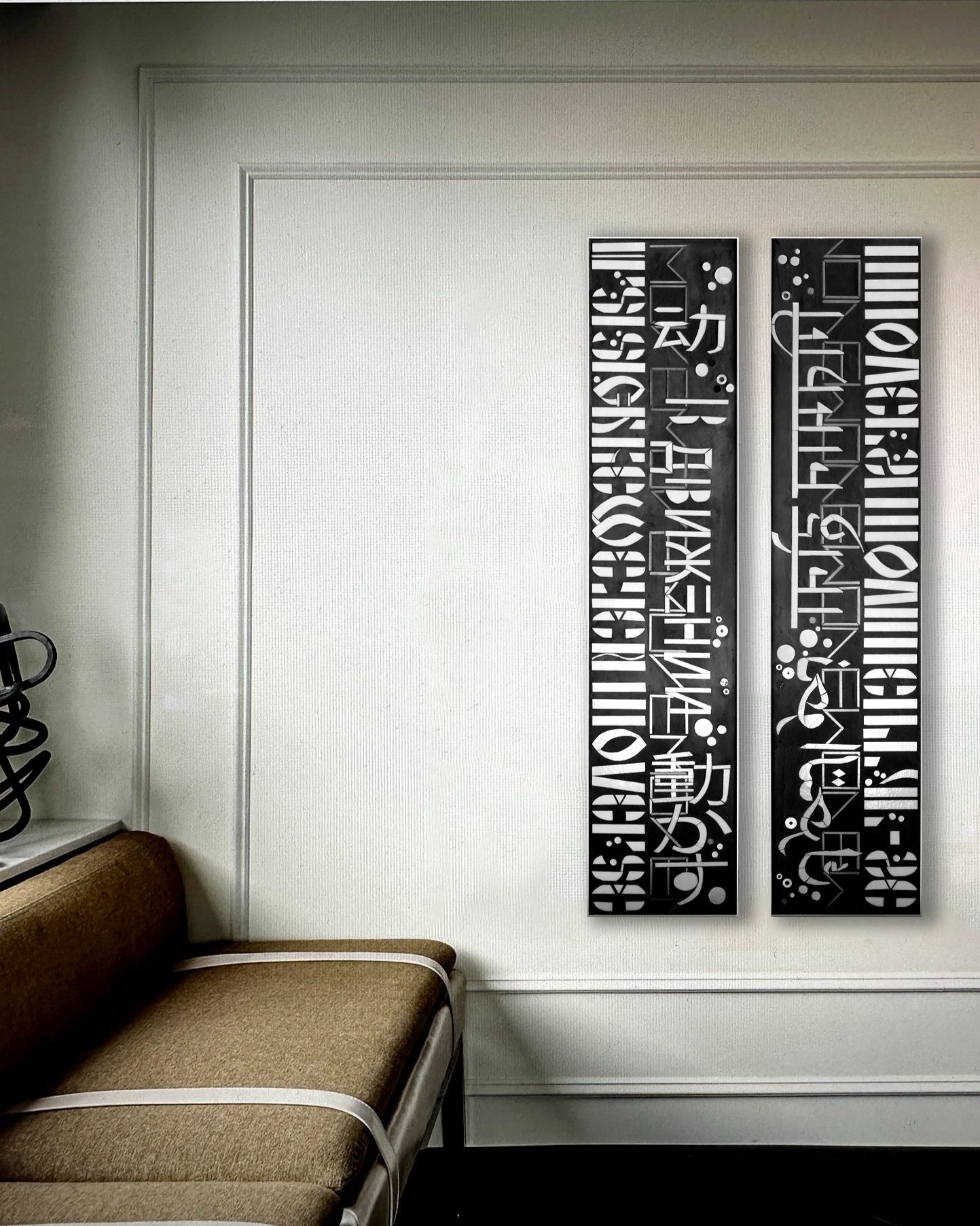
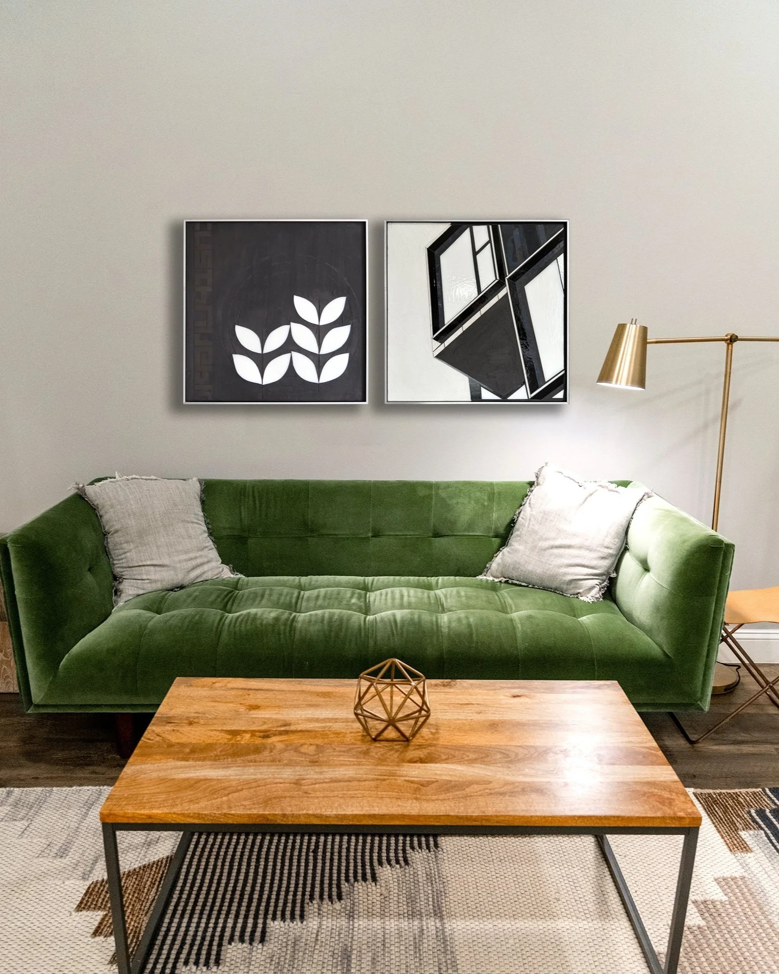
I love trying different hangings for beautiful spaces. This green sofa called for crisp b+w.
Ideas for industrial design spaces.
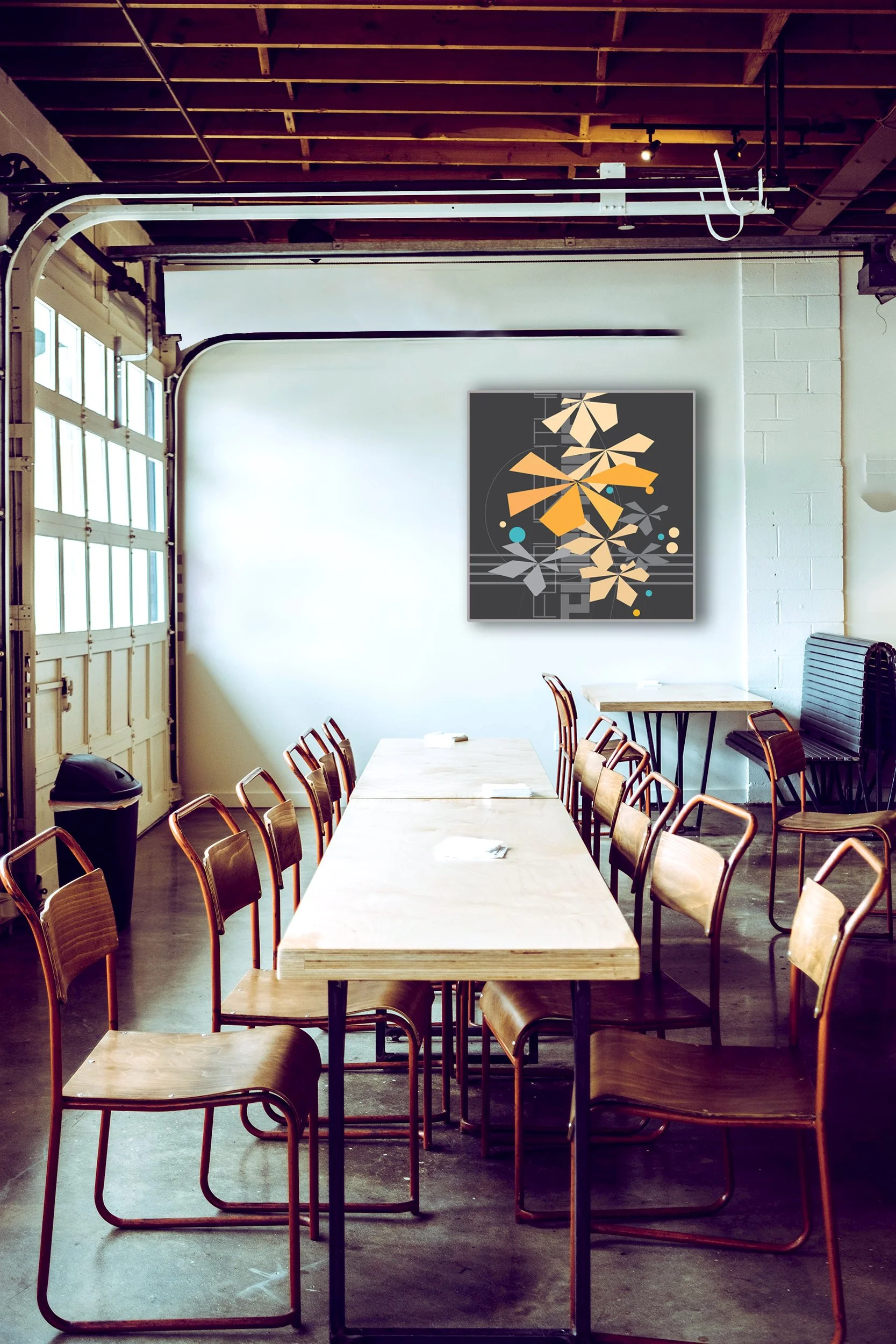
What would I do in this incredible space?
A single bold art piece could hold that wall. And there’s no worries about sun on art here. Glass+concrete are impervious to light and moisture.
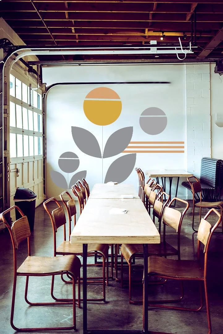
Or. Take it right off the canvas onto the wall with laser cut vinyl.
Ideas for office space
What would I do in this office? I feel like bringing nature in could be nice in this spare space which quite possibly doesn’t have natural light. Natural imagery could take a couple different forms. Either approach sees nature through an urban aesthetic lens for a crisp graphic reduction of nature’s complexity. Fun thinking about different sizes and proportions that will hold that space. High contrast/black background would be high drama. And now imagine these shimmering as you walk past. And iridized amber bringing in many additional layers of color.
Here’s a more minimalist approach with GROW5.0. Contrast blocks gives both lightness (could be ideal if there’s no natural light in the space) and the bold dark drama.
What if there’s limited budget for original art but we could stretch by printed vinyl at floor-to-ceiling scale. Interesting. I am interested in thinking about mixing larger originals with prints as a way to do more with a budget.
starting to think spring | sketches
Starting to think about color in a little different way…within a month of things starting to sprout…exciting.
urbanVine growing in NYC
I am thrilled to have a large UrbanVine framed and hanging in a new luxury condo building in Manhattan. The art consultant specified 42”x38” piece to create an engaging viewpoint.
UrbanVine combines precision cut geometric botanicals with a textured irregular concrete background and layered, shadowed elements in paint.
Vines on concrete are my favorite metaphor for resilience, transformation and thriving. Finding nature in city is endesssly fascinating for me given my farm girl roots. Bringing an urban aesthetic to natural forms has become my way to simplify nature’s complexity in a fresh way.
This piece shipped unframed and was framed by the art consultant. Work up to ~12SF can ship unframed if preferred. Larger than 12SF we can either use my panel presentation or integrate a lightweight wood structure to ensure the piece doesn’t flex en route to a framer and wall.
Got a snapshot of framed piece by elevators. Loving the frame with silver edging.
Winter color | first up iridescent green
Found some time in the studio this week. There are lots of elements coming together in this piece. There are definitely echos from the San Diego Vista series where clean horizontal lines do much of the work. I regularly circle back to natural imagery, using an urban aesthetic to simplify nature’s complexity in a new way.
evolving concept | abstract FLOURISH
Sketching. Circling back to a graphic concept that I developed as part of a recent project proposal. This concept is sticking with me…and I want to explore where this could go. I am interested in how my favorite text forms can interact with other elements, ranging from complete abstractions to hints of space/vistas. Step 1 free form exploring with color and contrast, line and form.
framed and hanging
Got a pic of urbanVine now framed and hanging in a multi-fam development in NYC. This piece shipped unframed. I love the silver edging on the frame they chose.
four views | line+form, color+grayscale
Case study: architectural artifacts
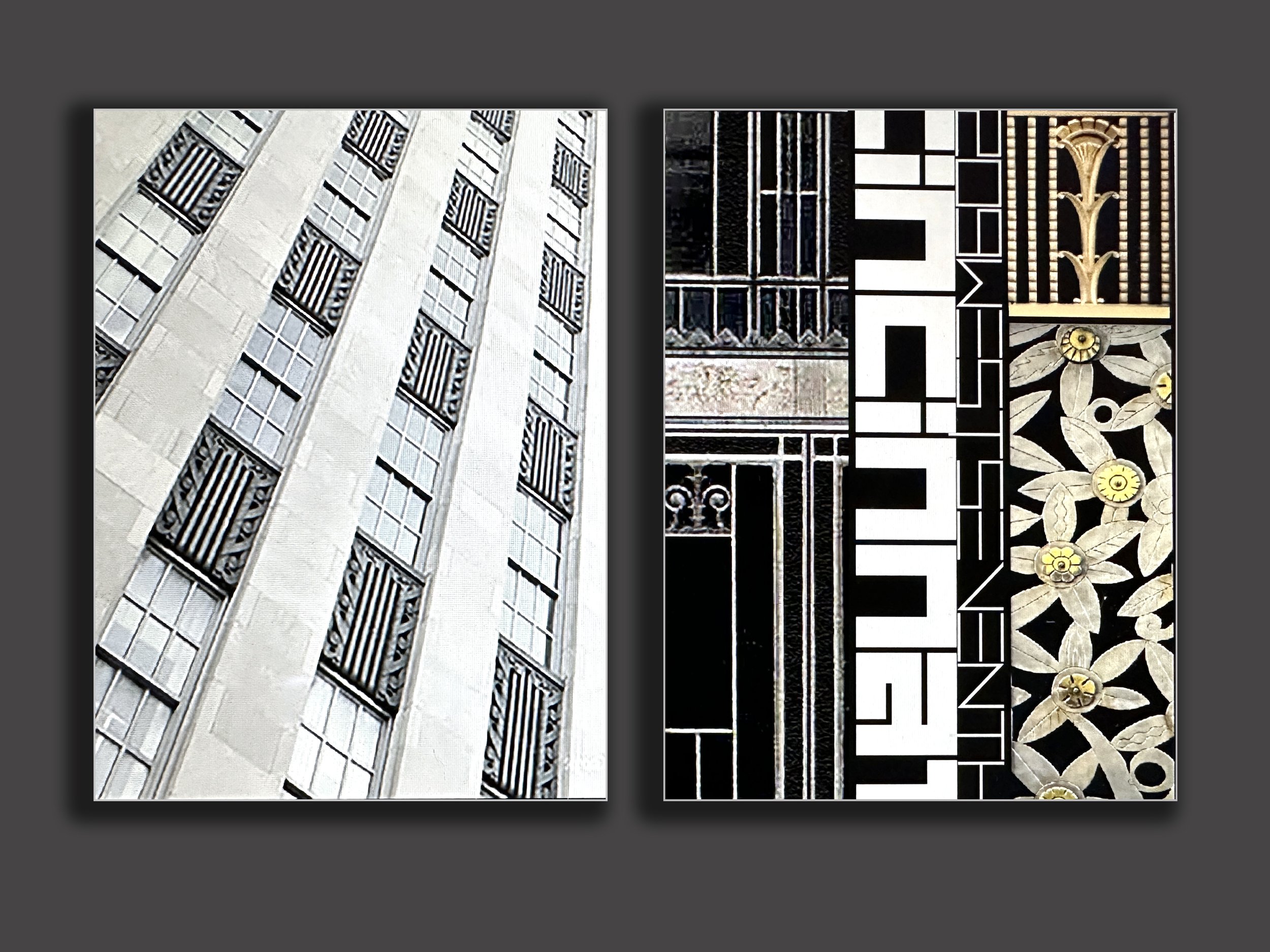
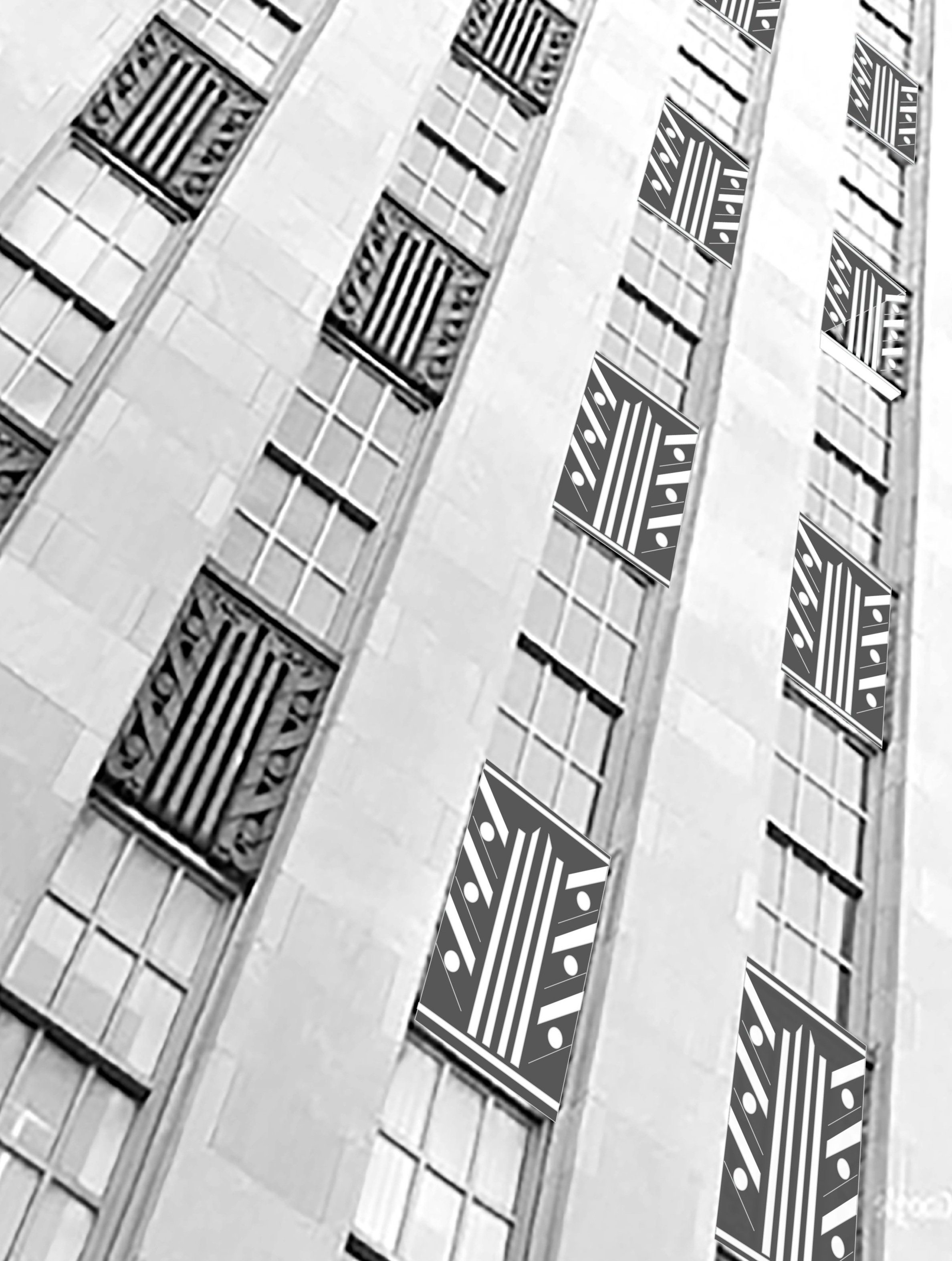
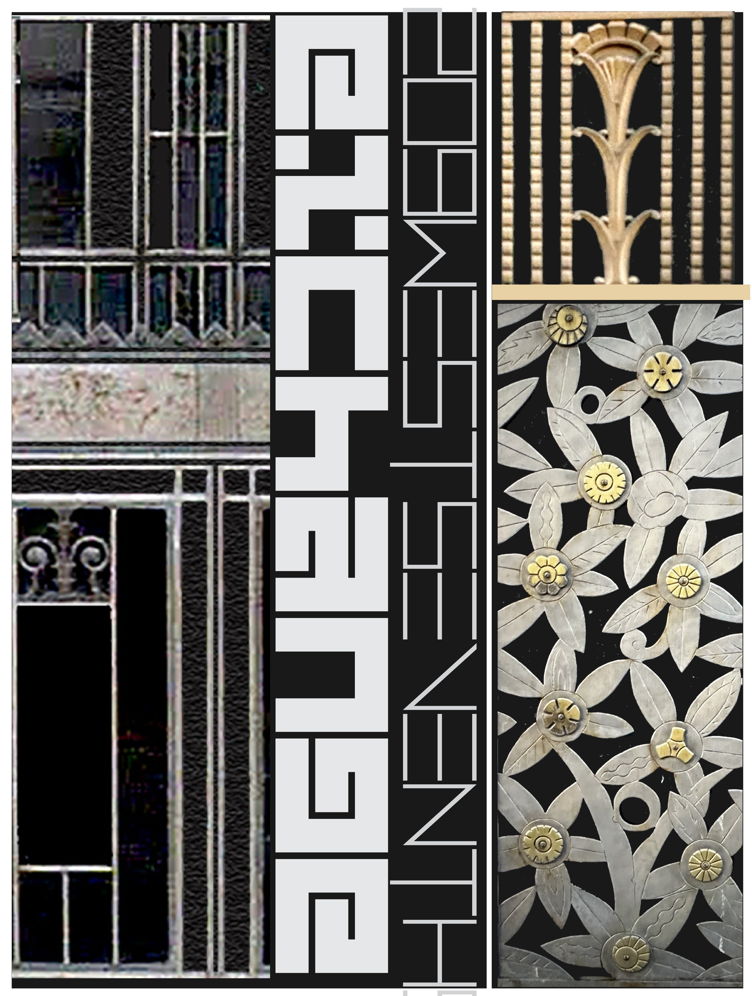
A recent design proposal involved some interesting architectural research. An 1920s art deco building was demolished and replaced with a multi-family development. The art consultant requested a design concept from my architectural series that connects the historic 1920s building with the newly constructed multi-family building. Archival images of the building were sourced and a 2 panel installation was proposed to point to the beauty and detail of the previous building on the site. One panel offers a looking up perspective while the second panel offers art deco details and information from and about the original building.
So much to explore in this approach to architectural work. Making physical world objects inspired by physical world objects creates an intriguing opportunity to explore the relationship between the built world and our understanding of information and place.
mood. jan 2 2023.
hello2023
Excited for new projects and ideas…so much to explore in 2023…let’s go!!!
winter break sketching
…continuing to think about playful botanicals…and experimenting today with dark/light blocks