Commissioned Encode: SOULMATES

Loved making this commissioned ENCODE a couple weeks back.

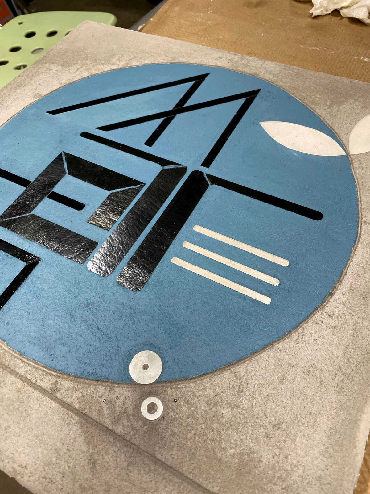
WIP ENCODE: SOUL MATES 2@20”x20” c Heather Hancock 2020

WIP ENCODE: SOUL MATES 2@20”x20” c Heather Hancock 2020

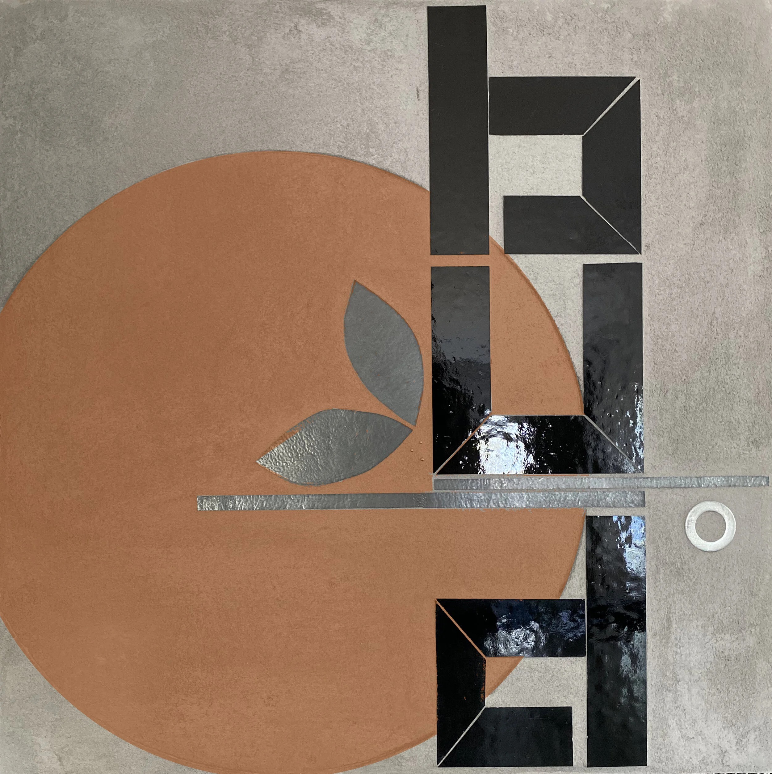
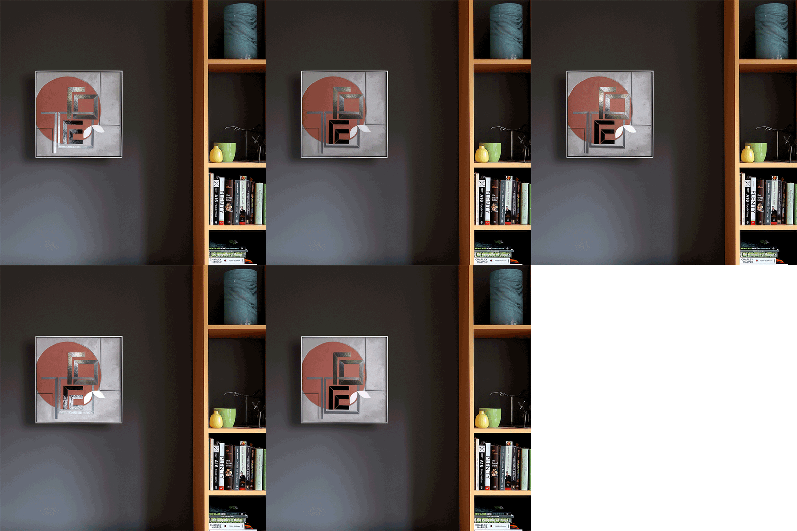
This set of two pieces was commissioned as an anniversary gift. The client provided a couple of options for sets of words that could be designed into an integrated composition across two panels. After preliminary exploration I picked one set, SOUL MATES, to focus on. Working across panels creates all sorts of new compositional opportunities to have two free-standing but integrated pieces.

glass cutting | WIP ENCODE: SOUL MATES 2@20”x20” c Heather Hancock 2020

glass cutting | WIP ENCODE: SOUL MATES 2@20”x20” c Heather Hancock 2020

WIP ENCODE: SOUL MATES 2@20”x20” c Heather Hancock 2020

WIP ENCODE: SOUL MATES 2@20”x20” c Heather Hancock 2020

WIP ENCODE: SOUL MATES 2@20”x20” c Heather Hancock 2020

WIP ENCODE: SOUL MATES 2@20”x20” c Heather Hancock 2020

I absolutely love these rounded and interconnected text forms. Having elements with multiple purposes is part of what makes ENCODE pieces interesting and engaging, a kind of visual puzzle.

WIP ENCODE: SOUL MATES 2@20”x20” c Heather Hancock 2020

WIP ENCODE: SOUL MATES 2@20”x20” c Heather Hancock 2020

I went looking for the warm orange I envisioned for first panel. Raw sienna and red oxide with just a touch of primary yellow to stay in the orange (rather than red) range. It’s still a new concept for me to be able revise until it matches my vision.

glass cutting | WIP ENCODE: SOUL MATES 2@20”x20” c Heather Hancock 2020

glass cutting | WIP ENCODE: SOUL MATES 2@20”x20” c Heather Hancock 2020

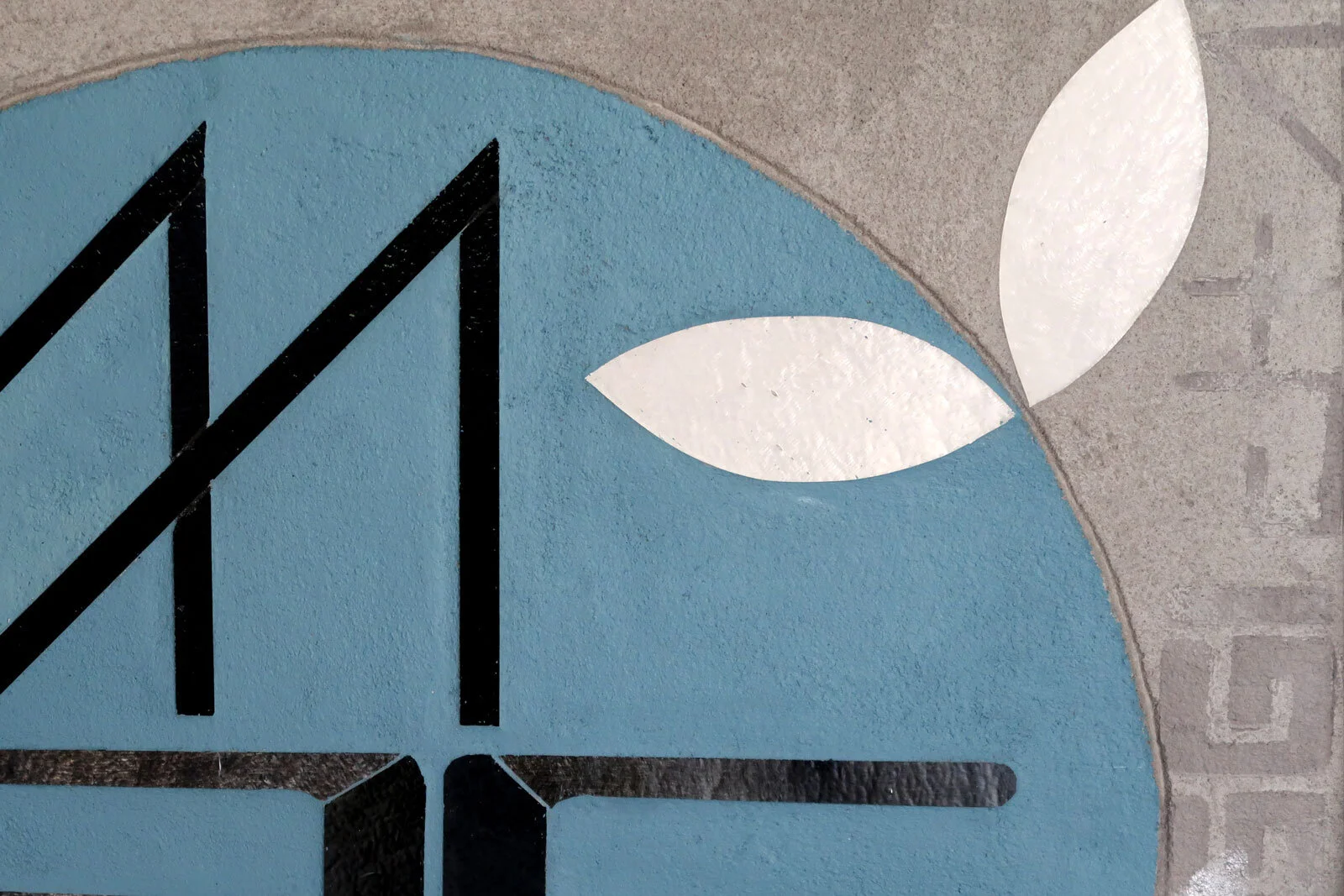
I wanted some subtle additional painted elements for this set. Some encoded information relevant to the clients can be puzzled out on the right side of the second panel. Additional leaves appear and disappear at different angles adding to the dynamic nature of the work.

ENCODE: SOUL MATES 2@20”x20” c Heather Hancock 2020

ENCODE: SOUL MATES 2@20”x20” c Heather Hancock 2020

detail ENCODE: SOUL MATES 2@20”x20” c Heather Hancock 2020

detail ENCODE: SOUL MATES 2@20”x20” c Heather Hancock 2020

detail ENCODE: SOUL MATES 2@20”x20” c Heather Hancock 2020

detail ENCODE: SOUL MATES 2@20”x20” c Heather Hancock 2020

Color planning

I have a complicated relationship with color. Maybe it’s more accurately described as color commitment issues. I am admittedly a bit obsessed with gray. My years living in and around Chicago have undoubtedly informed this preference. I find grayscale palettes subdued and understated, encouraging focus on texture and surface and reflectance.

01_build gray.jpg

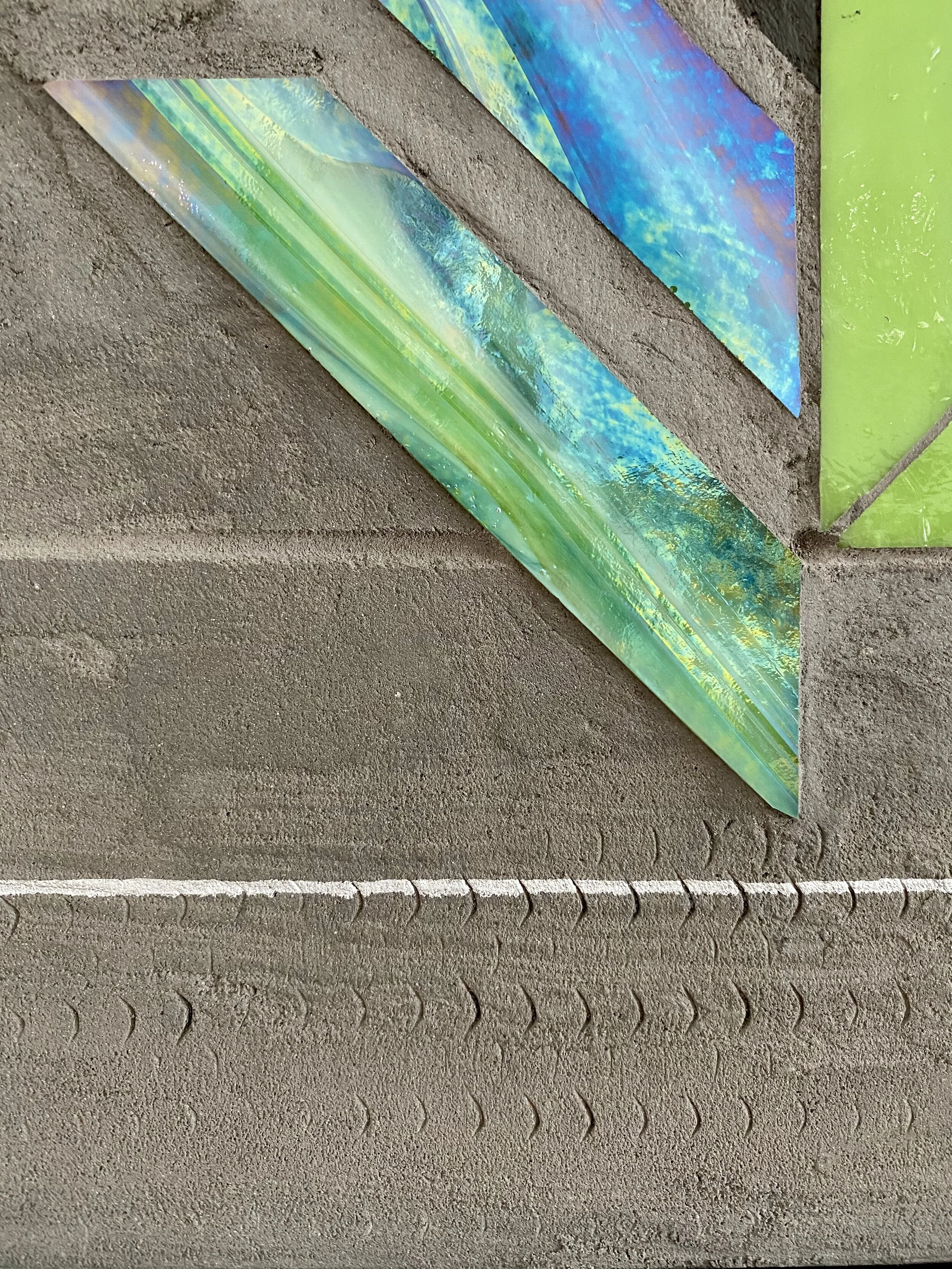
Working with glass for so many years has shaped my understanding of color. Color in glass can be unlike color in any other medium: astonishingly varied and shifting depending on lighting and viewer position. At the same time, I have often struggled to find exactly the right hue/saturation/intensity in glass. There are significant gaps in hue and saturation. And when the color I want is made, it’s not always available. I went two years recently without being able to get any blues or greens. This was part of the impetus behind my shift to grayscale glass palettes. For my architectural series REFLECT, a grayscale palette meant readily available glass that connected well with the compositions I was exploring. Now that I am ready to explore color again I am using paint to introduce color to these textured canvases. It’s been a lot of experimentation to find the palette range I was imagining. Getting there. And love how the paint works on the textured surface. There’s a deep connection with the functional painting associated with city information: street markings, signage, way finding. So much information in the city guides our behavior and directs our attention even when we generally don’t consciously focus on it.

color modeling: SLATE blue

color modeling: SLATE blue

color modeling: SIENNA

color modeling: SIENNA

color modeling: BURNT ORANGE

color modeling: BURNT ORANGE

color modeling: VIOLET

color modeling: VIOLET

Encode | Concept for Environmental installation

Invited design concepts for a large interior wall of local business. Creating a playful version of “(re)BUILD” connects with their story and mission.

Design concept | reBUILD 14’ x 20’ vinyl/lightweight plywood on paint + cinderblock c Heather Hancock 2020

Design concept | reBUILD 14’ x 20’ vinyl/lightweight plywood on paint + cinderblock c Heather Hancock 2020

ENCODE invites viewers to detect and decode information. The starting point for my art practice is that humans thrive in engaging environments. I am interested in re-purposing urban aesthetics and information to offer an uplifting and engaging visual experience.

This proposed concept combines fabricated elements in vinyl (or lighweight plywood) and paint on the cinderblock wall. The original cinderblock is given new life as an important texture telling the story of this building.

Design concept | reBUILD 14’ x 20’ vinyl/lightweight plywood on paint + cinderblock c Heather Hancock 2020

Design concept | reBUILD 14’ x 20’ vinyl/lightweight plywood on paint + cinderblock c Heather Hancock 2020

Commissioned Encode: SEED GROW GATHER

Encode: SEED GROW GATHER hand cut glass inlay + paint 22”x22” c Heather Hancock 2020

Encode: SEED GROW GATHER hand cut glass inlay + paint 22”x22” c Heather Hancock 2020

Prairie farm imagery took central role in this commissioned triptych. Words and imagery with deep personal relevance to client were developed into a narrative of growth and maturation across 3@22”x22” pieces. Earth toned color palette was developed in collaboration with client to support the narrative and to connect with the palette in the client’s home.

Encode: SEED hand cut glass inlay + paint 22”x22” c Heather Hancock 2020

Encode: SEED hand cut glass inlay + paint 22”x22” c Heather Hancock 2020


SEED

Encode: SEED (detail)

Encode: SEED (detail)

Encode: GROW hand cut glass inlay + paint 22”x22” c Heather Hancock 2020

Encode: GROW hand cut glass inlay + paint 22”x22” c Heather Hancock 2020


GROW

Encode: GROW detail

Encode: GROW detail

Encode: GATHER hand cut glass inlay + paint 22”x22” c Heather Hancock 2020

Encode: GATHER hand cut glass inlay + paint 22”x22” c Heather Hancock 2020


GATHER

Encode: GATHER (detail)

Encode: GATHER (detail)

triptych-angle_7697-WEB.jpg

REFLECT 3.6 curved grid

Recent piece in my architectural series. This piece is inspired by the curved grid of Chicago’s Lake Point Tower. The starting point for my art practice is how the human mind is engaged by information in the environment. The natural world gives us perfectly complex and comprehensible information which is fundamentally restorative. In the city we sort through layers and fragments of explicit and implicit information. We filter, decipher and decode and are occasionally rewarded with moments of discovery, surprise and beauty.

REFLECT 3.6 curved grid | hand cut glass inlay 48”x30” c Heather Hancock 2020

REFLECT 3.6 curved grid | hand cut glass inlay 48”x30” c Heather Hancock 2020

DETAIL

DETAIL

REFLECT | Cadence

A new commissioned architectural piece is headed to its home in AZ. REFLECT is inspired by our everyday experience of moving through the city. Light and shadow play across architectural surfaces offering moments of surprise and discovery.

rendering of completed piece for new home

rendering of completed piece for new home

The client has a new architect designed home under construction. The client had a vision of an abstract architectural rhythm connecting with the clean lines of their new home. The client provided architect renderings to help visualize the space and determine optimal size and proportions. We worked remotely to identify an overall approach and then the client selected the final composition from a curated set of options.

REFLECT 4.4 | Cadence 56” x 30” hand cut glass + concrete

REFLECT 4.4 | Cadence 56” x 30” hand cut glass + concrete

Architectural rhythms are realized by our embodied interaction with predictable material elements and ambient light. Our own movement and visual perception completes the dialogue, creating a comprehensible and grand cadence.

[detail] REFLECT 4.4 | Cadence 56” x 30” hand cut glass + concrete

[detail] REFLECT 4.4 | Cadence 56” x 30” hand cut glass + concrete

REFLECT 4.4 | Cadence 56” x 30” hand cut glass + concrete

REFLECT 4.4 | Cadence 56” x 30” hand cut glass + concrete

encoded optimism

A new collection, ENCODE, has been taking shape in the studio since last fall. I wanted this series to feature the industrial textures of concrete that I find extremely satisfying.

ENCODE grow may 13 | 20” x 20” | glass + paint c Heather Hancock 2020

ENCODE grow may 13 | 20” x 20” | glass + paint c Heather Hancock 2020

My work depends on the strong textural contrast of shimmery glass against matte grout to highlight the dynamic nature of glass. At the same time, I love that sanded, varied matte texture of concrete as a material in its own right.

In ENCODE the variations in the concrete surface contrast with the precision of etched lines and cut glass. Abstracted words of optimism and hope and strength are cut in glass and inlayed in the matte grout. A painted element brings in playful color and form. Different lighting conditions and viewer motion make for infinitely variable views.

new collection in progress | ENCODE

I’ve been thinking about an approach that falls somwhere between my architectural abstractions/REFLECT and graphic/text abstraction series/SCAN.

ENCODE | DETAIL WIP glass+paint+concrete texture 20”x20” c Heather Hancock 2020

ENCODE | DETAIL WIP glass+paint+concrete texture 20”x20” c Heather Hancock 2020

We thrive in engaging environments. I’ve always believed this—and it’s more true than ever right now.

ENCODE features shimmering hand cut glass alongside matte industrial textures with a bold painted circle.

Glass encodes abstracted words that reflect the positive mindset I’ve been cultivating during this challenging time. I take plenty of artistic freedom with letter forms to develop each unique and coherent composition.

Intertwined letter forms also refer to how we are surrounded by information—alerting, directing, constraining, expressing. Additional information is encoded in the negative space of etched concrete and painted graphic elements. Interactions between matte and gloss surfaces with light creates the final layer of information, an ever-transforming visual experience.

So much to explore here! More coming soon.

ENCODE v3 20”x20” mixed media glass + paint

ENCODE v3 20”x20” mixed media glass + paint

detail ENCODE 2.3 20”x20” encoded optimism c Heather Hancock 2020

detail ENCODE 2.3 20”x20” encoded optimism c Heather Hancock 2020

New project | CITYscape

I’m excited to re-visit my CITYscape series for my next project.

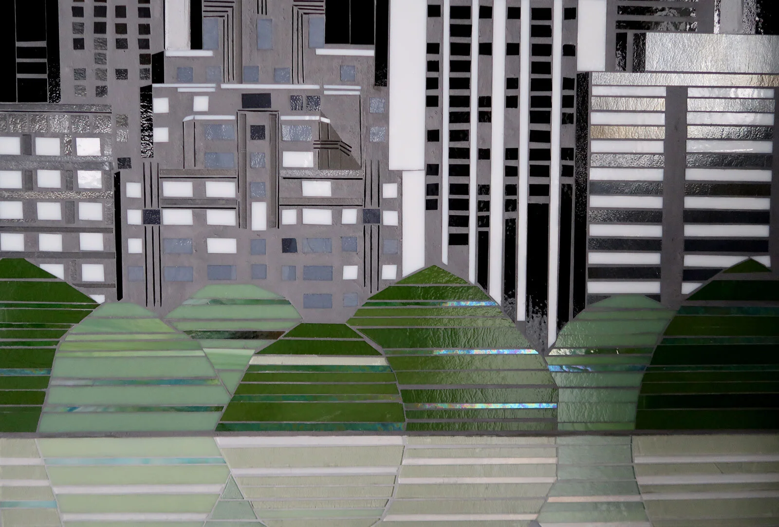
A consistent theme in my work is finding moments of urban beauty. My REFLECT series explores the impact of urban line, rhythm and materials at close range. CITYscape takes a more distant vantage point to see the natural composition of city skylines. Buildings at a distance become rhythms and repetitions, abstracted from the detailed richness of windows and architectural elements. Skyline views generally highlight a city’s connection with the natural world. Water, urban forests and sky balance the repetitive and segmented built world.

CITYscapes first started with work I made as visuals for a book on Marcel Proust and the neuroscience of smell. I created Proust’s village of Combray with rudimentary building forms, approaching them as a sort of font. They read as an ambiguous grayscale font in the first piece and then bloom into a full color memory of the village in the second.

MADELEINES | CITYscape as font

COMBRAY | CITYscape as font

The next commissioned project for a lobby in downtown Evanston features the city’s urban forest and connects to the building’s foliage inspired architectural ornamentation. The imaginary city composition features Lake Michigan’s blues in tech inspired graphic lines.

CITYscape Evanston | commission for building lobby 2@30”x30” hand cut glass and concrete c Heather Hancock 2015

In 2016 I created an imaginary San Diego skyline for placement in a healthcare facility. The buildings evolved to be composite forms based on actual San Diego downtown buildings. A lush palette of grass+lime green and turquoise+peacock blue connects with the space colorways.

CITYscape San Diego skyline 3@24”x24” | hand cut glass and concrete c Heather Hancock 2016

The next CITYscape project completed in 2018 features silhouetted buildings from the San Francisco skyline with simple facade detailing. The background “sky” was inspired by a gum tree leaf form and cut in iridized green/blue glass to create a shimmery dual purpose forest+sky.

CITYscape San Fran 3@24”x24” | hand cut glass and concrete c Heather Hancock 2018

I am now working on a CITYscape project based on the Upper West Side skyline as seen from Central Park reservoir. At 4’x3’, these 3 panels allow much more intricate architectural elements and segments. I love the idea of using glass as a stand in for natural, dynamic/reflectant elements. The foregrounded water in this project will be a shimmery reflection of tree and buildings. Lighter grout and a painted sky create additional new creative opportunities for this project. Check back for WIP updates. Or follow along on Instagram @heatherhancock.art.studio

drawing | CITYscape 3@4'x3’ c Heather Hancock 2020

detail of CITYscapeNYC 3@48”x36” | hand cut glass + paint c Heather Hancock 2020

detail of CITYscapeNYC 3@48”x36” | hand cut glass + paint c Heather Hancock 2020

detail of CITYscapeNYC 3@48”x36” | hand cut glass + paint c Heather Hancock 2020

detail of CITYscapeNYC 3@48”x36” | hand cut glass + paint c Heather Hancock 2020


Contrast | Light<>Dark

Light <> dark background contrast is another key element in the aesthetic impact of my work. Light glass against a dark matte background creates a bold and striking visual experience.

I still remember the undergrad psychology lecture—I came to my art practice via a first career in healthcare as a speech language pathologist—when I first learned about Hubel and Wiesel’s groundbreaking research into visual perception. They found that the human visual system is engineered to respond to areas of high contrast. “Edges”—areas with highest change in luminance—are information rich and therefore more attention is allocated to processing these areas.

Ramachandran and Hirstein connected this understanding of cognitive architecture to aesthetic experience, identifying contrast as one of the key elements in the brain’s processing of art in their 1999 article Science of Art: Neurological Theory of Aesthetic Experience (Journal of Consciousness Studies, 6, No. 6-7, 1999, pp. 15–51).

I generally use black grout as a default high contrast background for glass elements. Given how glass palettes—unlike paint—are highly discontinuous in terms of color saturation with huge gaps in gradations there is value in adopting dark/high contrast background and then finding the glass saturations that offer the biggest visual impact. I have also adopted an approximation of grayscale shading using black matte grout as the absence of light to create dimension and perspective in architectural work.

There are other projects where “clean and bright” is the goal and light/pale gray backgrounds accomplish this beautifully. A light background requires a re-thinking of creative goals and visual impact. Contrast can essentially be inverted with dark/saturated glass popping against a pale gray background and creating a bright, bold visual experience.

pale gray grout with dark+saturated glass | Mountains 5@12”x30” c Heather Hancock 2016

detail | Mountains pale gray FROST grout c Heather Hancock 2016

sneak peek | detail from recent commission using pale gray RAIN grout c Heather Hancock 2020

Or low contrast background can offer a softer, floaty effect. Recent conversations with art consultants around the country suggest that this might be a good option for healthcare settings where hard contrasts and edges may be contraindicated. The overall effect is very clean and bright. Lots to explore with low contrast ideas.

Hand held samples are available for client meetings to demonstrate the difference in high vs low contrast background.

8”x8” glass+concrete hand held sample | high vs low contrast background

CITYscape SPRING | pale gray FROST grout c Heather Hancock

Contrast | Texture

One of the key aesthetic elements of my work is contrast. Contrast varies in my work along two dimensions: texture and dark/light background.

I’m forever inspired by the ubiquitous concrete grid context of the urban world providing a textured canvas for light and color and form.

Concrete provides the ideal industrial, matte contrast to shimmery glass. The contrast of ‘no shine’ within a composition is key to appreciating the full dynamic quality of glass. Without that matte stillness in the piece, the luminance of glass becomes overwhelm. Shine/no-shine creates interesting visual information. This is amplified by light and motion for an endlessly variable visual experience. Matte concrete infill is the final step in the process with my work once all glass is hand cut and set in mortar bed.

detail | Scan+ 2.2 hand cut glass with matte grout 20”x20” c Heather Hancock 2020

detail | Scan+ 2.3 hand cut glass with matte grout 20”x20” c Heather Hancock 2020

Scan+ 2.0 series 20”x20” hand cut glass + matte concrete c Heather Hancock 2020

Color rhythms

I love it when projects bring together previous ideas and palettes in new ways.

The next project in the studio is a commissioned 3 panel visual feature featuring a bold glass-forward color rhythm with an inset of text forms. Client relevant information is incorporated in text form and their graphic chevrons are cut in glass.

I’ve seen the chevron as a short hand signifier for movement and motion and momentum. I created sketches a number of years ago using a color rhythm with chevron as negative space.

CITY | 14”x14” hand cut glass c Heather Hancock

CITY 2.1 22”x22” hand cut glass c Heather Hancock

I’m loving coming back to the chevron shape—this time hand cut in glass—and color rhythm and also integrating my SCAN concept with inset text elements with content relevant to the client’s team.

WIP | 3@48”x36” hand cut glass c Heather Hancock 2020

Embracing the materials of contemporary architecture—glass and concrete—my work captures the energy of the urban environment. I use glass because of its unique capacity to catch light and engage viewers.  The interplay of glass and light is ephemeral but the pieces themselves are enduring.

Structural Rhythms | REFLECT series

REFLECT is inspired by finding beauty and information in the urbanscape. With Mies’ perfectly distilled vocabulary viewers immediately understand construction materials and structural system. Approaching facades as information, I use a desaturated approach to isolate the basic unit of information that interacts with light and motion to offer endlessly intriguing rhythms. 

REFLECT 1.36 Mies abstraction 24”x24” hand cut glass inlay matte concrete c Heather Hancock

REFLECT 1.24 Mies black grid 24”x24” hand cut glass inlay matte concrete c Heather Hancock

REFLECT 1.19 Mies black grid 24”x24” hand cut glass inlay matte concrete c Heather Hancock

hand held samples | because it has to be seen in person

I am well aware of how important it is to see my work in person. Holding a sample in your hand you immediately understand how glass interacts with light and movement; how matte concrete offers an important textural contrast to shimmering glass; how surprisingly light the work is. You understand how the surface imperfections of glass and hand cutting makes the work accessible and engaging.

SCAN+ 8”x8” hand held sample

I now have 8”x8” samples available for client meetings and presentations.

  • black and white sample of REFLECT/architectural abstractions

  • color sample of SCAN+GROW/geometric abstractions

Custom boxes arrived this week to frame the samples, providing a clean edge and way to handle the pieces easily. Gotta say. I love the magnetic close.

8”x8” hand held sample REFLECT | architectural abstraction

8”x8” hand held sample SCAN + GROW | abstracted geometrics

Let me know if you need a sample to make a final decision or for your client meeting.