Kiln Magic

I have my fuchsia and coral glass. Gorgeous! I know very little about kiln-formed glasswork so I was excited to head to Turtle Bay Glass last weekend to pick up my freshly fired pinks and corals and at the same time to get a studio tour and visit with glass artist Paul Messink. With an impeccably organized workspace filled with natural light, plenty of technical equipment and tons of glass, Paul is Exhibit A of Art Meets Science. An IT engineer by day, Paul has been working with glass for several years. I met Paul a number of years ago at an art festival in Chicago when I was first starting to exhibit my work. While I was learning the magic of glass and grout, Paul was exploring the magic of glass and heat. Keeping meticulous notes on technique, Paul has explored many different types of fused and kiln-formed glass.

Paul has mastered the technique to realize his current artistic goals which feature enchanting compositions of spare landscape imagery. Trees recede into the distance and fog with amazing perspective achieved using color, size and literal depth. The muted blues or greens or grays encased in glass contribute to the ethereal quality of the compositions. To create these pieces, Paul paints various elements of each composition onto individual layers of glass. The piece he was working on while I was there involved 6 separate layers of glass and involved precision painting of many many tiny branches with a customized paintbrush. Once all painting is complete and cured, the glass layers are fired into a single solid glass piece. The piece is fired at the target heat for a relatively short period of time (a matter of a few hours) but the cooling down or annealing is where it gets tricky. Annealing is the process of cooling glass to return it from liquid to solid state. Without proper annealing, the glass can cool unevenly. This stress can cause the glass to crack or break while in the kiln or leave it brittle, potentially breaking days, months or even years later. Bottomline: you need your kiln-form artist to be equal parts artist and engineer.

I love the contrast between permanence and ephemerality in Paul's current work: a satisfying, solid block of glass containing a floating, diaphanous world.

See the complete piece "Blue Trees" and other pieces by Paul Messink at Turtle Bay Glass.
Finding Fuchsia

The color I'm craving right now is fuchsia. This specific color need hits at the beginning of winter every year and I begin to search for fuchsia in any form. I study the withered vines on my fence that have turned bright pink. I buy pomegranates in bulk without actually eating them. I find the fuchsia element in street art. Sometimes I have to paint things fuchsia. What I really want is fuchsia glass. There are plenty of plums, violets, mauves and lilacs but blue-toned pinks are rare. Bullseye creates some eye-popping pinks and purples but according to the catalog many of them are considered "strikers" which require firing to achieve their full color. I generally ignore all glass samples marked "pre-fired" but this time as I pored over the sample box, I realized that these are exactly the gorgeous pinks (and corals) I'm craving. So I picked up the phone and met the very helpful Sarah Givens of Bullseye glass. Sarah explained that true (blue) pink is challenging to manufacture owing to its volatile gold-based chemical composition. Many of the purples and pinks are more sensitive to heat so Bullseye avoids applying too much during production of these colors. Given that the majority of their glass is used by kiln-form artists, "strikers" can tolerate additional kiln-work, giving the artist longer working time with the glass and more control over the final color.

But where does that leave the cold/cut glass artist?! Sarah suggested tracking down a local kiln-form artist who might be able to fire the glass for me. So I contacted my friend Paul Messink of Turtle Bay Glass. I met Paul a number of years ago at an art festival in Chicago. I was starting to exhibit my work and he was finding his way in the kiln-formed glass world. We've kept in touch. Apparently there's room in his kiln schedule right now so there are 8 sheets of intense fuchsia and vivid coral en route to his studio. He'll fire it and I'll go for a studio visit early in the New Year to see what I can learn about his process and current work. Looking forward to catching up with Paul and to having these lush glass colors.


Treasure Hunt for Form

Alongside hunting for color these days, I'm noticing dried grass and flower forms. I regularly run by a lovely wildflower garden and love watching it change across the growing season. The gardener doesn't deadhead the flowers and it just struck me how gorgeous these dried forms are now in the late fall. Seeing these forms in neutral colors lets me focus on their complicated geometry and over-the-top repetition. Entangled plants and twisted stems create even more complicated forms and patterns than I noticed at first glance. Looking at images, I also see that I have been overlooking a subtle but striking winter palette of ecru, wheat, sand, tan and dark browns and blacks. These colors are interesting and rich in their own way. It will take some restraint but I'm going to have to experiment with this palette.


Treasure Hunt for Color

It’s fascinating how late fall forces a different kind of visual attention. Moving from the abundance and even overwhelm of color in spring through fall, I am now on the hunt for micro-points of color in the bleak gray of late Chicago fall. I'm finding surprisingly vibrant color still. Against the bare, black trees, the grass still reads as green. I’ve been watching my neighbor’s clematis transform from a cloud of sparkling white-star blooms in early fall to these amazing spiraling deadheads with deep pink centers. Within minutes of home, crazy orange seeds are popping out of white berries. On a run at the lake, I noticed a carpet of crushed red berries and had to go back to take some pictures. And then I found the ultimate color treasure: fuchsia. My helleborus sent out a random, post-season fuchsia bloom and I could not take my eyes off it until a hard frost finally put a stop to the show. These micro-discoveries are tremendously rewarding, treasures popping out from the stark gray Chicago palette.  

Photoshoot: Modern Ruins

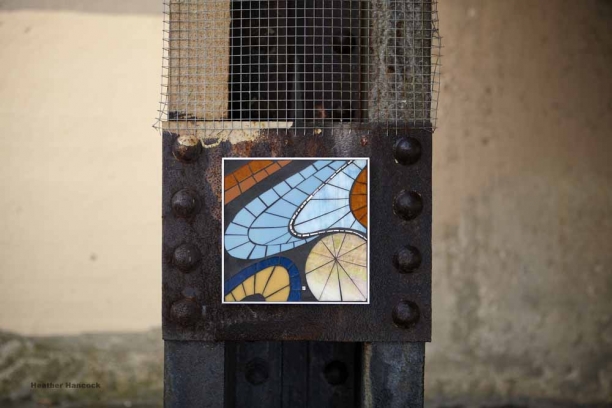
Location #1 Mulford viaduct | 10:00am | 37° | windchill 28°  | Cloudy It’s cold. Really cold on bare hands but off to a good start. The mounting tape is totally working despite the damp and cold—in fact, don’t use any more of this marvelous 3M Outdoor Mounting tape than the required 4”. Prying Mosaic Elements off the walls with cold fingers is turning out to be Challenge #1. Tiny lush BLOOM against the vast deteriorating manmade structures is exactly the visual surprise I imagined.

Location #2 Greenleaf viaduct | 11:30am | 39° | windchill 30° | Partly Sunny

Setting up at the fabulous metal grid at the Greenleaf viaduct. There are remnants of graffiti showing through the buffing; along with the rusting metal and hardware it’s a piece of abstract art in its own right. The monochromatic GLYPHS are perfect on the gorgeous patina, making an interesting connection with the tagged surface.

Challenge #2 is reaching high enough on the grid to create an interesting composition of GLYPHS. Climbing a Dr Seuss-worthy stack of crates teetering on top of stepstool perched on top of a tree root counterbalanced by concrete debris, I manage to get the top GLYPH affixed. An Evanston Police Officer stops by. He’s mostly interested in my plans for the viaduct. With the guarantee that we’re not permanently contributing anything to the existing patina he’s off. Challenge #3: The sun has come out and we’re getting hard shadows. So we wait, squinting and frowning at the brave November sun and cheering on the wisps of cloud.

Location #3 Clark Street Breakwater | 1:00pm | 36° | windchill 26° | Snow

I found the breakwater on a warm sunny day a while back. In dry conditions, it has a gorgeous rich patina of blacks and browns with rust accents. I loved the idea of photographing FLOAT in its natural habitat of sky+water. The breakwater looks totally different today. There’s no patina; just blackhole steel. And I begin to understand its function as the wind whips up from the north, tiny snowflakes swirl and waves crash over and through the massive steel barrier. We move farther along the breakwater in search of a section with less water pouring down it. We find a small useable section. I affix FLOAT. It’s funny to be in the snow with waves crashing around us. We’re laughing. We're trying to take pictures. Challenge #4: And then our funny snow shower turns evil and it’s a full-on winter blizzard with ice pellets pouring down and the wind roaring. Cameras won’t focus and things are getting wet.  We call it, grabbing art and cameras and gear and scramble off the beach. Sigh. Back to Location #1 to take a few last images of FLOAT, a little forlorn away from its majestic aqueous setting. For now, we have to settle for dripping water and stalactites. But I know I’m going back to finish FLOAT.

Home | 2:00pm

Done. Back home. Great day. And it only takes a few hours for the feeling to return to my fingers. Can’t wait for proofs.

* No mosaics were harmed in the making of these images.


See more Mosaic Elements

Glyphs heart silver sharpie

While shooting GLYPHS last Thursday on this fabulous decaying metal grid, I noticed and loved the tag in silver sharpie. I even asked the photographer to work it into her shots. First let me say I'm a sucker for silver sharpie. It works the same way as white gold against grout: pure, reflectant shimmer.  It pulls me in and makes me look again. It disappears at certain angles and pops again with the right lighting or movement. It leads to the same embodied interaction between viewer and context that I love in glass and gold.

Second, I do admire an artful tag--not going there on the 'art vs. vandalism' thing. I get this basic human impulse to transform a simple 'I am here' into a beautiful calligraphic form which exists objectively in the world as a physical mark. For me the egocentrism of the act is mitigated by the flowing, rhythmic script--rendered in sparkling, shimmering sharpie.

Modern Ruins

Step 3. Finding the Perfect Modern Ruins Turns out location scouting takes a ton of time. I need prime examples of urban wastelands ripe for transformation by Mosaic Elements--because, of course, art is the antidote to urban decay. There needs to be enough space for a photographer to work without dodging traffic. Ideally there will be range of different surfaces to photograph. Some overhead covering would be helpful in case of rain. And I want to stay in Evanston. Over the course of several scouting expeditions, I explored the EL viaducts and tracks, I surveyed the lakefront breakwaters and retaining walls, and I scanned many many back alleys, sidestreets, crumbling buildings, stone fences, concrete walls.

And then, cue the choir, I found it: an EL viaduct I'd never noticed before at the south end of Evanston.

The EL and Metra rumble by intermittently and the occasional pedestrian drifts through but otherwise it's closed off to traffic and a perfect deserted viaduct with a huge range of surfaces for hanging work in any weather or light conditions. It has the feel of a crumbling cathedral with rusting metal supports and disintegrating concrete pillars and the water dripping down from arches and vaults forming stalactites. Pale November light filters down between the tracks. Dusty leaves rustle around random aerosol cans and gray-green mildew is growing up the walls. It's clearly a graffiti haven, all thoroughly buffed with gray-beige paint. It's definitely the stark, raw urbanscape for which I've been searching.

Here are some mock-ups I gave the photographer as a starting point for the photo shot. Next step: Photo shoot.

Coming Soon to a Wall Near You

The Mosaic Elements are all ready to go. Now I need to figure out how to present this new offering. I want to convey that Mosaic Elements can transform your space, like magic. Your glance is rewarded with a moment of surprise and discovery as you decipher the sparkling forms. The image in reflectant glass and gold shimmers and shifts as you move. You can transform your space in an instant by hanging Mosaic Elements just the way you want—in singles, multiples, as repeated motifs—and by changing it up as often as you like. Step 1: The Concept

Short of traipsing to every last friend’s home to snap pictures of Mosaic Elements perched precariously in kitchens, bathrooms and living rooms I’ve been stumped by how to communicate this vision. My idea-guy husband suggested testing these magical properties of Mosaic Elements by transforming something that’s clearly un-transformable. Say an EL viaduct or a crumbling concrete bridge or steel girder or construction fence. Take away the distraction of a limiting, specific context and let the Mosaic Elements work their magic on a fully imaginary, technically impossible setting. Love it. Game on.

Step 2: How to Temporarily Affix the Mosaic Elements

Today was spent figuring out how to affix the Mosaic Elements to crumbling concrete. Several products and as many trips to Home Depot later, I discovered the wondrous 3M Scotch Outdoor Mounting Tape. The tape is weather resistant and works on rough exterior surfaces. Four inches of the tape holds up to 5 lbs. Weighing in at a pound, the Mosaic Elements are light and need just a couple inches of tape. Tested it. Perfect! One giant roll is now en route from Amazon.

Here are the concept pictures shot on the cement wall outside my studio door.

Stay tuned for Step 3: Locating the perfect urban wasteland.

See all Mosaic Elements

About Glyph

Glyph. n. Any computer-generated character regarded in terms of its shape and bit pattern. An image used in the visual representation of characters; roughly speaking, how a character looks. A font is a set of glyphs.

I love letter forms. Interesting fonts and typefaces, elegant calligraphy, letter stencils, text-based street art, even a well-crafted tag will catch my eye.

The power of language to inform, connect and create is a longstanding obsession for me. In my previous career as a speech language pathologist, I worked with adults to rebuild communication skills after illness or injury. The structured combination of sounds or letters forms the basis of information exchange and social connection. So as I see it, these minimal information units possess potential energy.

It was after I saw the documentary Helvetica that I realized the key to addressing this idea of potential linguistic energy lay in the letter’s visual form. Helvetica, directed by Gary Hustwit and released on the font’s 50th anniversary in 2007, is a marvelous story of the font’s creation and subsequent domination of public space owing to its fresh, rational form with balanced positive and negative space. In this documentary, something easily overlooked as trivial or mundane is re-framed as a powerful, even controversial tool: visual form matters.

In the Glyph series, the potential creative energy of the letter is explored using abstracted letter forms (yes, in Helvetica) re-envisioned as organic shapes. Positive and negative space is reversed with glass coursing out from the negative space letter form. The viewer is offered a visual puzzle: a letter fragment from which to discern the whole.

Pieces in the first Glyph series in 2007 were cut from vitreous glass tile in a palette of steel blues and grass greens.

Coming back to Glyph recently, I have refined the work by using sheet glass, clarifying the cutting and adding a tiny 24k gold element in the negative space. As one of my Mosaic Elements series, Glyph is a bold graphic composition with endless creative potential.

About Bloom

Bloom happened one cold-and-white February afternoon a couple years back. I had recently come across Rex Ray’s playful, bold abstracted botanicals and needed my own lush, exuberant flower garden to get me through that winter afternoon. Bloom is the first piece I made using sheet glass in my transition away from glass tile. The cutting was primitive and I wasn't clear on how it connected to the rest of my work but I was immediately addicted to my new-found freedom to cut larger forms. I made two, survived February and then moved onto other things. Bloom keeps coming back to me though: I can’t resist its exuberant color and geometric forms. And so a new and revised Bloom has become one of my Mosaic Element series. There are now three Blooms. Compositions are tightened and filled out. Color combinations vary between the three with a happy symmetry. The cutting has progressed. I've kept a tiny meander of white gold smalti—each line cut spontaneously, threading around the leaves and stems in a sort of garden path or bee’s flight or delirious ray of energy.

Pale yellows, ambers and olive greens in the ‘Fresh’ palette are based on my beloved “Golden Sunrise” helleborus. The 'Vivid' palette with intense orange, aqua, peacock and grass greens is my original mid-winter color-crave palette. And I still crave it.

Lake Effects: Byron Gin and Heather Hancock

New works by Byron Gin and Heather Hancock

August 15 - October 3, 2011

Lake_Effects_Front_2


Uncommon Ground on Clark

3800 N. Clark St.

Chicago, IL

773.929.3680

uncommonground.com

Work from my new series, "Verge" will be hanging at Uncommon Ground on Clark August 15 - October 3rd, 2011 as part of a 2-person exhibition with Byron Gin titled "Lake Effects."

Working in our separate media and styles, we have developed new pieces that clearly connect to one another with lake-inspired forms and restrained palettes of blues through grays and whites. In Byron's spare compositions the viewer is invited to take a second look at familiar lakeshore objects and birds which float on textured, layered backgrounds. Abstracted from their complex visual landscape, these familiar forms take on new significance.

My work is similarly spare in composition, glass floating in cement board. My interest is in considering the function of the lake as a blank yet dynamic palette, marking the space between sky and land. The lake is read as a transitional space: water at the verge of sky and land.

About Verge

Two commissions in the past year have given me the chance to think about place and landscape. I took as the starting point for Inscribe (2010) the form of the tiny oxbowed prairie river that meandered by the farm where I grew up in Canada. I became captivated by this little river's marking of time: first, in the constant moment-to-moment flow that invites the floating of twigs and leaves, watching until they disappear around the bend; and second, the glacially paced century-by-century erosion that changes the river's form and path, ultimately creating the gorgeous yet self-defeating oxbows. To use Andy Goldsworthy's term, this oxbow I grew up on has definitely become one of my 'obsessive forms.'

Inscribe_detail10_0570

Inscribe 2010 (detail)


The second project, Enfold, also involves water marking time.

Enfold_7685_detail8

Enfold was commissioned for a cottage on a cliff overlooking the Bay of Fundy in Nova Scotia, Canada. With the highest tides in the world, there is a never-ending cycle of water rising and falling. This along with the highly changeable coastal weather patterns creates an extremely dynamic outdoor experience.


When established painter Byron Gin invited me to develop a 2-person exhibit at Uncommon Ground, we decided to use the local land/waterscape as our visual starting point and see where our two different media, styles and interests took us.

Lake Michigan has a very different function for me near my Evanston-based studio and home. There are no tides, no constant flow, nor pounding surf and only occasionally crashing waves. The lake is primarily about space and color/reflectance rather than time. In the Chicago area, the built environment borders the lake, containing and even encroaching on the lake's shoreline. At its margins, water reflects sky and splashes rock. It is these interactions at the boundaries that catch my attention.

Calling the show "Lake Effects," Byron and I have developed new pieces that clearly connect to one another with lake-inspired forms and restrained palettes of blues through grays and whites. In Byron's spare compositions we are invited to look again at familiar lakeshore objects and birds which float on textured, layered backgrounds. Abstracted from a complex landscape, these familiar forms take on new significance.

My work is similarly spare in composition, glass floating in cement board. My interest is in considering the function of the lake as a blank yet dynamic palette, marking the space between sky and land. As I focused on the blues of lake and sky, I was captivated by the limitless variations in blues and grays, sometimes changing moment-to-moment, sometimes day-to-day. Verge offers discrete views of moments in time, reading the lake as a transitional space: water at the verge of sky and land.

Lake_Effects_Front_2

Exhibitions

Solo Exhibitions

Imagining Mind. Montgomery Ward Gallery, University of Illinois at Chicago, Chicago, IL. Jan - Feb, 2011.

Mosaics at St Matthews Gallery. Evanston, IL; October 2008 - September 2009.

Unicorn Coffehouse. Evanston, IL; February 2008.

Animated Urban: New Work. The Writers WorkSpace, 5443 N. Broadway, Chicago, IL. Mar 16 - Sep 30, 2007.

New Work. The Brothers K. Evanston, IL. Jun 4 - Aug 3, 2007.

Group Exhibitions

Lake Effects. 2-person show with painter Byron Gin. Uncommon Ground, 3800 N. Clark St., Chicago, IL. August 15 - October 3, 2011. Opening reception: Thursday, August 18th @ 6-8pm.

Art Under Glass. Juried exhibition. Downtown Evanston storefronts, Evanston, IL; October 21 - February 10, 2010.   

The Artist Project. Juried exhibition. Merchandise Mart, Chicago, IL; April 24-28, 2008.

Around the Coyote - Fall Arts Festival 2007. Juried exhibition. Flat Iron Arts Building, Chicago, IL; Oct 12-14, 2007.

Curator's Choice at Chicago Art Open. Iron Studios, 3636 S. Iron St., Chicago, IL; Oct 4–27, 2007. 

4mosaicists. Group show. Uncommon Ground, 3800 N Clark, Chicago, IL; Oct 16-Nov 13, 2006.

Around the Coyote - Fall Arts Festival 2006. Juried exhibition. Flat Iron Arts Building, Chicago, IL; Sep 8-10, 2006.

Beneath the Surface. Society of American Mosaic Artists 2006 Juried Exhibition. High Risk Gallery, Chicago, IL, March 9-31, 2006.

Around the Coyote - Fall Arts Festival 2005. Juried exhibition. Flat Iron Arts Building, Chicago, IL; Sep 9-11, 2005.

A More Perfect Union: Mosaic Aspirations. Society of American Mosaic Artists 2005 Juried Exhibition. Ellipse Gallery, Arlington, VA, March - May, 2005.

American Mosaic Project. South Carolina, Texas and Washington, D.C., 2004-2005.

In Pieces. Midwest Mosaic Invitational. TZ Gallery 1834 W. North Ave. Chicago, IL Nov 3 - Dec 2, 2004.

Opus Veritas: Fragments of Truth. An International Juried Exhibition of Mosaic Art (presented by the Society of American Mosaic Artists). Museo ItaloAmericano, San Francisco, CA; Jan - Apr 2004.

Enfold

Enfold is a recent commission for clients from the Bay of Fundy, Nova Scotia, Canada.

Enfold_7685_detail8 Enfold (2010) 17" x 20" glass, gold, grout on MDF

Enfold offers an abstract connection with the raw, spectacular beauty of the Bay of Fundy—incorporating forms inspired by sky, rock and water. The shimmer and shine of glass and gold reflects the constantly changing tides, mists and weather at Ross Creek.

Enfold refers to both the visual experience of being surrounded by sky and water and to the warmth and shelter enjoyed by those staying in the clients' cottage perched at the cliff's edge at Ross Creek overlooking the Bay of Fundy, Nova Scotia.

Full and additional detail images available on my fine art portfolio.

Art and Healthcare

I am very interested in art and healthcare. Having spent more than a decade working in Chicago area hospitals, first as a speech-language pathologist and then as a rehab program adminstrator, I have thought a lot about optimizing recovery and outcomes in healthcare settings. Focusing on creating optimal 'healing environments' makes so much sense. Hospital environments are impersonal and intimidating, patients often expressed the feeling of a loss of control in this unfamiliar, regimented setting. And, as a healthcare employee, I was constantly aware of the aesthetic void of hospitals, literally craving natural elements, fresh color palettes and real art (badly framed prints of sunflowers and water lilies didn't cut it).

So I was delighted when Float was commissioned for the new Loyola Medical Center in Burr Ridge, Illionois.

Float3_8943_detail2
Float (2011) detail from panel 3

I believe art can play an integral role in healing and recovery, providing important visual input that encourages cognitive engagement. Thinking beyond what we can see and exploring the world of the possible forms new synaptic connections, changing the brain and contributing to a rich life experience. Compositions in glass are uniquely able to capture and sustain visual attention owing to intense color saturation, literal depth in the glass and extreme contrasts between matte grout and sparkling glass. Glass compositions are dynamic as ambient light interacts with the work causing different patterns of reflectance.

As I've been reading about current trends in healthcare and arts, I am excited to find that art is being prioritized and funded in healthcare architecture and design. Art is being recognized as an important tool in the healing and recovery process. Using patient survey methodologies, researchers are investigating patient art preferences and developing 'evidence-based art programs' accordingly. Recent research by Upali Nanda et al of American Art Resources is finding patient preferences for representational, nature imagery. These researchers are concluding that art in healthcare should be drawn from this genre. In article abstracts, there is mention of art as a means of 'escape' and 'distraction' for patients.

Clearly such research initiatives are of value given both the data-driven nature of the health-care industry and the challenge of developing art programs that meet a wide variety of patient and employee preferences, as diverse as those of the general population. However, given my background in cognitive rehabilitation and my decade working in that environment, I contend that there is another angle to consider in researching and designing art programs: art as a mechanism for cognitive stimulation which goes beyond distraction to engagement. In the same way that healthcare professionals have attended to the negative effects of bedrest, we need to explore the potential neurophysiological benefits of cognitive engagement in the hospital setting. Artists are uniquely suited to offer novel stimuli to engage another neurological system. Limiting art in healthcare to a very specific genre is a lost opportunity for the creative engagement of artists and viewers (both patients and healthcare workers) in exploring new dimensions and realms that could simultaneously offer cognitive stimulation and respite from the impersonal hospital environment. I would love to see progressive, engaging art programs become an integral part of healing environments.

Float

Float is my first commission for a healthcare setting and it was a first in developing a concept for an unbuilt space. Most commissioned projects start by considering ways to refer to elements in either the external, physical surroundings or an interior, conceptual context. In this case, the project art consultant gave me general parameters: she identified pieces from the Flow series as the starting point for the project. Together we developed a color palette to coordinate with the planned palette for the space. And then she set me free.

One of my interests about art in healthcare is whether cognitive stimulation can become an integral part of a healing environment. My work is always about finding that balance between aesthetic appeal and cognitive engagement. Float is a simple, flowing pattern (certainly making reference to flowing water) with a shimmering sphere that literally floats through the 5 separate pieces in the composition. At a glance, a viewer might see shimmering glass, strong contrasts of matte grout and gloss glass and a saturated palette of earth tones. With further attention, a viewer may see that the same shimmering sphere is present in each panel and trace its trajectory across the pieces. A tiny trace of white gold offers yet another abstract connection between the 5 pieces, another visual path to explore. In offering a coherent visual pattern, I hope that Float serves as both respite from the stresses of a medical setting and as a new imaginative context that can engage another mind.

Float composite1_8852

Complete set of images of Float can be seen at: heatherhancockart.com