Studio experiment: Trace

I've been collecting images of ice: lines, crystals, icicles. I am studying the elegance and variation of ice lines and using these fluid, coherent solutions as the basis for new drawings. Ice offers a mineral world parallel to glass: a material that flows when heated but rigid and breakable when cold. The ice images are also informing my understanding of the aesthetics of winter. I see myself as an expert on winter. I grew up on the Canadian prairies where winter is long and cold and unrelenting. In Alberta, blue skies and sunshine add color and sparkle to the winter world. Chicago is typically a much grayer winter; dark and drab with on-and-off snows. Forms are reduced to stark lines and palettes pared back to grayscale with occasional pops of sienna and burnt orange. It forces us to look more carefully to find beauty and interest in the outdoor world.

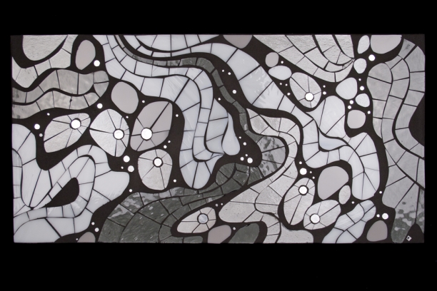
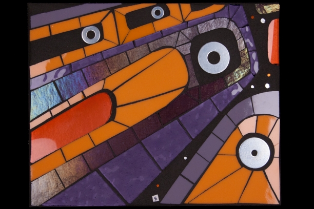
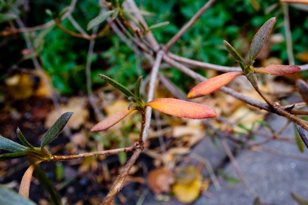
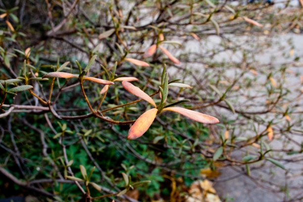
Trace is inspired by the tessellation of ice around fall leaves. Still beautiful, these organic forms are outlined and highlighted by the mineral world to create a striking composition.

glass mosaic art

Trace 2.1 | 10" x 10" | glass, 24k gold smalti, grout on cradled art board


Emblems

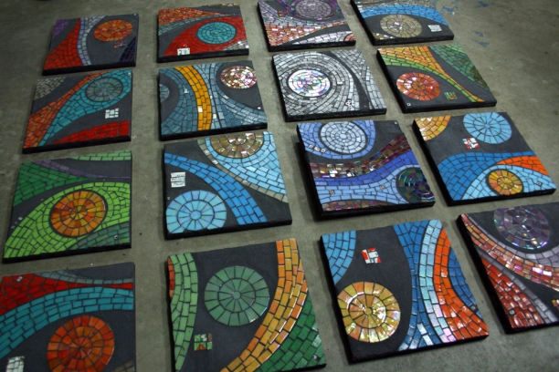
I found this set of Emblems in a corner of my studio during a clean-up last week. I made these pieces in 2006 and 2007 as color studies, cropping compositions from a larger piece, Trace. These pieces were very time-intensive. Tiny cuts from 1"x1" glass tile gradually created the lines and forms I envisioned. Initially, tiny elements from ceramics and hardware were incorporated into the tessellated patterns. At some point, I opted to create a self-contained element in the grout so the tessellation was not interrupted. These pieces represent an important step in my journey: thinking about color, form and accessible wall art all moved forward with this series. They were well-received at Around the Coyote years ago and they were warmly received as a recent post on Facebook. There is something compelling about the exuberance of these bright colors and simple forms.  

Inscribe 2.0

Inscribe 2.0 takes me back to a concept I first developed as a fireplace installation in 2010. The tiny meandering Vermilion river in eastern Alberta is the central form in the piece. Inscribe 2.0 | inspired by the land

Inscribe 2.1 and 2.2 will hang on adjacent walls in the home of my brother Geoff, a true Northern Albertan adventurer. Geoff is a pilot and mechanical genius who's precision skill in aircraft mechanical engineering, fabrication and painting has significantly informed my work. Full images can be seen here.

Ice Lines

Starting to think about the next studio experiment. I photographed these ice compositions a couple weeks ago. I've been thinking about winter and art and the mineral world and ice crystals. There is a sense in which art becomes more relevant or necessary in winter. There's no competing with the natural world in spring, summer and fall but the winter world of ice and crystals and snow and grayscale requires a different kind of looking to find the pattern and line and beauty in the relative absence of color. I find ice lines endlessly fascinating. Continuous lines flow around obstacles and easily shift from line to form and back again in a coherent way. I'm always trying to make negative space as compelling as the positive spaces in my compositions. This will be another look at grout as an element in their own right.


Color notes: chicago in black+white

Heavy, wet snow outlining every black branch is about as close as we get to hoarfrost in Chicago. There's no sparkle, no glitter, no blue sky background but there is an awesome amount of rhythm and repetition. There's also a visual reversal if you focus on the white snow line, the branch becomes the drop shadow.


Color notes: Yellow berries

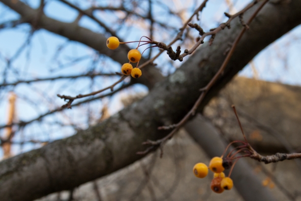
I've been running past this tree forever but just noticed how at a certain point coming toward this tree when it is leafless in late fall the tiny yellow berries suddenly pop into focus and the whole tree is outlined in tiny circles of yellow. inspiration for glass art

And now that I write this I realize that I need to go back and try to capture that 'zoom in' with my camera. I'm guessing it's too subtle to get but off I go to see.

Studio experiment: Connect 2.0

I'm not sure what I'll end up calling this series. For now, I see it as the next iteration in the Connect series. Connect 2.1 is inspired by a recent ride on the El to re-live the experience of seeing Chicago via El as when we first moved here in the mid-1990s. I think part of my interest in creating a moment of surprise and discovery comes from learning to see Chicago from the El. The windows of the El frame fleeting glimpses of other lives and spaces and lines. My drawing practice is generally inspired by forms and lines found in nature. Curves and foliage and growth potential are in evidence. But a new set of lines is emerging. These feel like urban forms with motion and direction and angular geometry that I associate with the built environment at various scales, possibly as seen through a window.

Growing up on a farm in Alberta with a full shop and many little drawers filled with washers and bolts and nuts and other fascinating metal objects is clearly another formative experience. I finally found my opportunity to use these gorgeous oversized washers, sourced from the many little drawers at Ace Hardware.

contemporary glass art

More pieces in the works.

Views from the El

I learned to see Chicago from the El. As I journeyed from my home in Rogers Park to work at Weiss Memorial Hospital, the windows of the El framed my transitory view of the city. Glimpses of back-porch gardens, ornate details in terra cotta, and elaborate chalk drawings interrupted the visual monotony of brick, concrete, and wood. It is these moments of surprise and discovery that animate my art. The conceptual underpinning of my work lies with my ideas about attention, identity, and place—ideas that first emerged during my decade-long career in health care. My compositions contrast luminous glass with matte settings, directing the viewer’s focus through line and form. The materials I use are as durable as they are beautiful. Glass comes to life by motion and interplay with light. Viewers passing by glass mosaics become participants in interaction with a series of moments that illuminate a shared space.

New work at Water Street Gallery

Had a lovely evening at the opening of the annual group glass show at Water Street Gallery in Douglas, Michigan last weekend. Pieces from the Impel and Scan series are featured in the show.

Loved to see how gallerists Maryjo and Anne paired wall art with art objects to create an interesting mix of art. Enjoyed meeting Water Street Gallery regulars as well as meeting some Michigan area Facebook contacts.

Take a gallery stroll at the Water Street Gallery website.

An information-scape at coLab Evanston

Amanda Bryant of HangItUp Chicago has invited me to hang work at coLab in Evanston. Amanda is bringing high quality original fine art into homes and offices using a rental model. She partners exclusively with Chicago area artists to connect with local clients, another angle on staying local. I met Amanda at Gallery, Now! and am delighted that she thought of my work for this light-filled, ideas-intensive workspace. coLab is a coworking and collaboration space for independent professionals and digital entrepreneurs. Working with coLab cofounder Miguel Wong has been fascinating. He has a clear vision of how art+aesthetics contribute to creating an inviting, energetic workspace. From programmers fixated on laptops to informal chats over coffee to afterhours events and meet-ups it's clear that Miguel and his partner Eric Harper are building the vibrant business community they envisioned for coLab.

Pieces from the GLYPH and Scan series form an interesting conceptual connection with coLab where it's all about about information filtering, decoding and encoding. GLYPH's abstracted letter forms point to the creative potential of language. Scan considers our inherent interest in letter forms, offering abstracted text for our pattern-detecting, information-decoding minds. And they look pretty awesome lit up in the front windows at night.

More on coLab here: coLab 900 Chicago Ave | Suite 104 | Evanston, IL | 847.440.4880

More on HangItUp Chicago here: HangItUp Chicago

About Scan

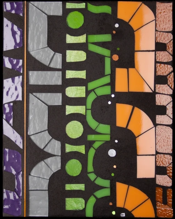
I have been developing prototypes in a new series Scan over the past couple months. contemporary glass art I first started work on Scan in 2009. I had recently transitioned to using sheet glass and could envision a series of scrolling abstracted letter forms. As a speech language pathologist, I have a longstanding interest in language and cognition. Letter forms are inherently engaging to our pattern-detecting, information-decoding minds. With Scan, the viewer is enticed to decipher the abstracted letter forms. Using unfamiliar product names from construction materials reduces the contextual linguistic information to the point where decoding is impossible. Selective attention is activated to find pattern in the randomness. A seemingly simple act of reading is transformed into a cognitively demanding visual puzzle. In this way, the viewing experience points to that of the many people I encountered in clinical practice.

The first prototype of Scan was ungrouted glass on a painted background. The cutting was completely unfamiliar with radically new forms and shapes. I struggled to find a rhythm and ended up setting the piece aside, unfinished, and moving on to other projects.

Two things happened to bring me back to Scan this year. First, I started photographing labels from construction materials found around the studio and in my Home Depot wanderings. As I explored these images, I realized that the graphic retro fonts were perfect for Scan. The forms are solid, like building blocks and cropping these letters created lovely rounded, almost organic shapes.

Second. I read James Gleick's The Information. I am fascinated by effective information exchange between speaker and listener; that is, of the highly contextualized and personally relevant message. Gleick explores the history of information, information as message (the calculable point between randomness and pattern) and information systems and control. The centrality of information to technology and human life itself, shaping our daily lives and conscious moments renewed my interest in Scan as a visual exploration of information filtering and decoding.

Sectile cutting from strips of sheet glass lets me create these solid forms. The color palette was inspired by the original construction labels, a range of industrial greens, rusts and grays was translated into a popping bold palette of persimmon, burnt orange, spring and apple green and violet against charcoal gray. A sparkling line of gold circles suggests the bit, the smallest unit of information and the basis of computing technology. Language as information is beautiful and powerful and complex.