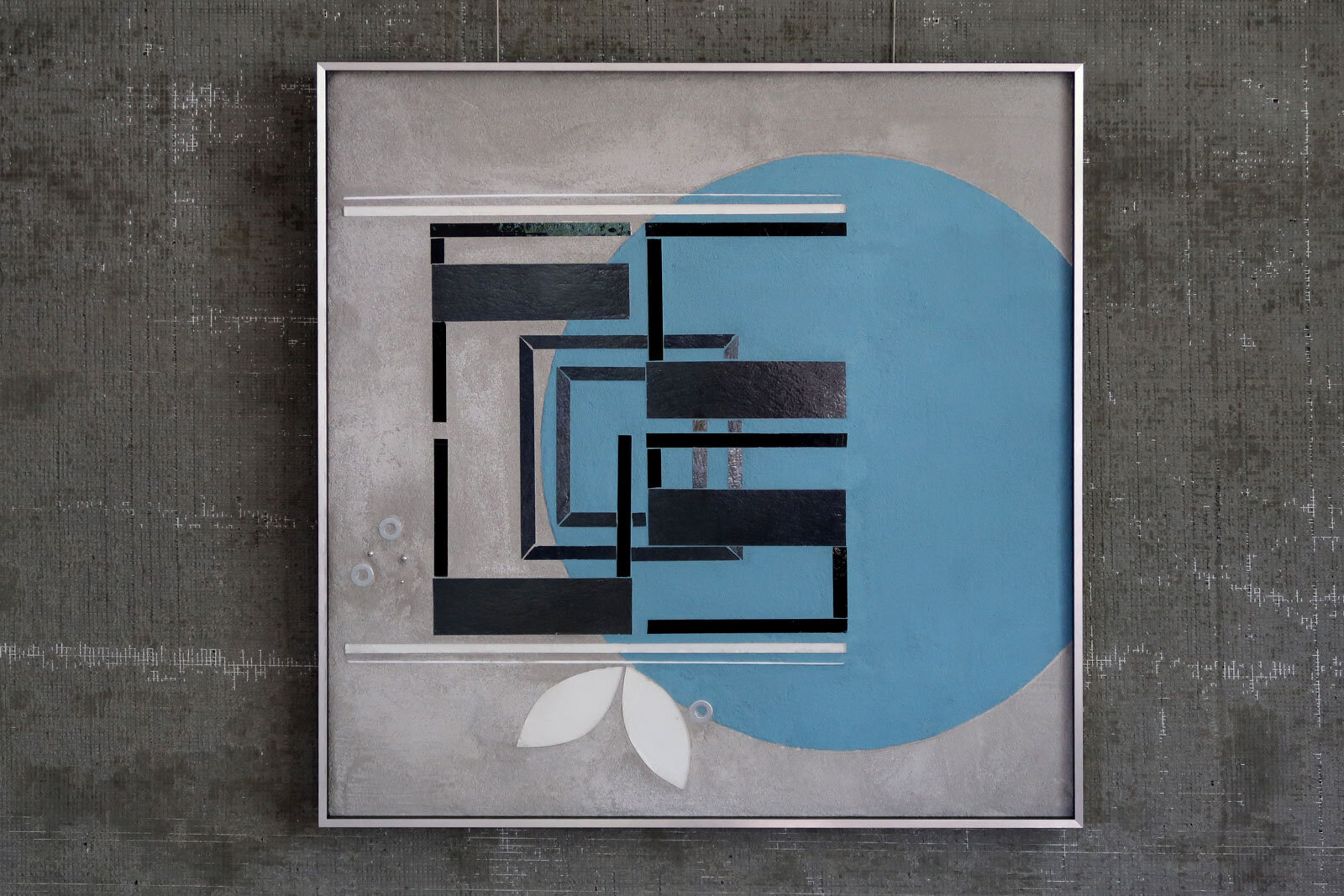
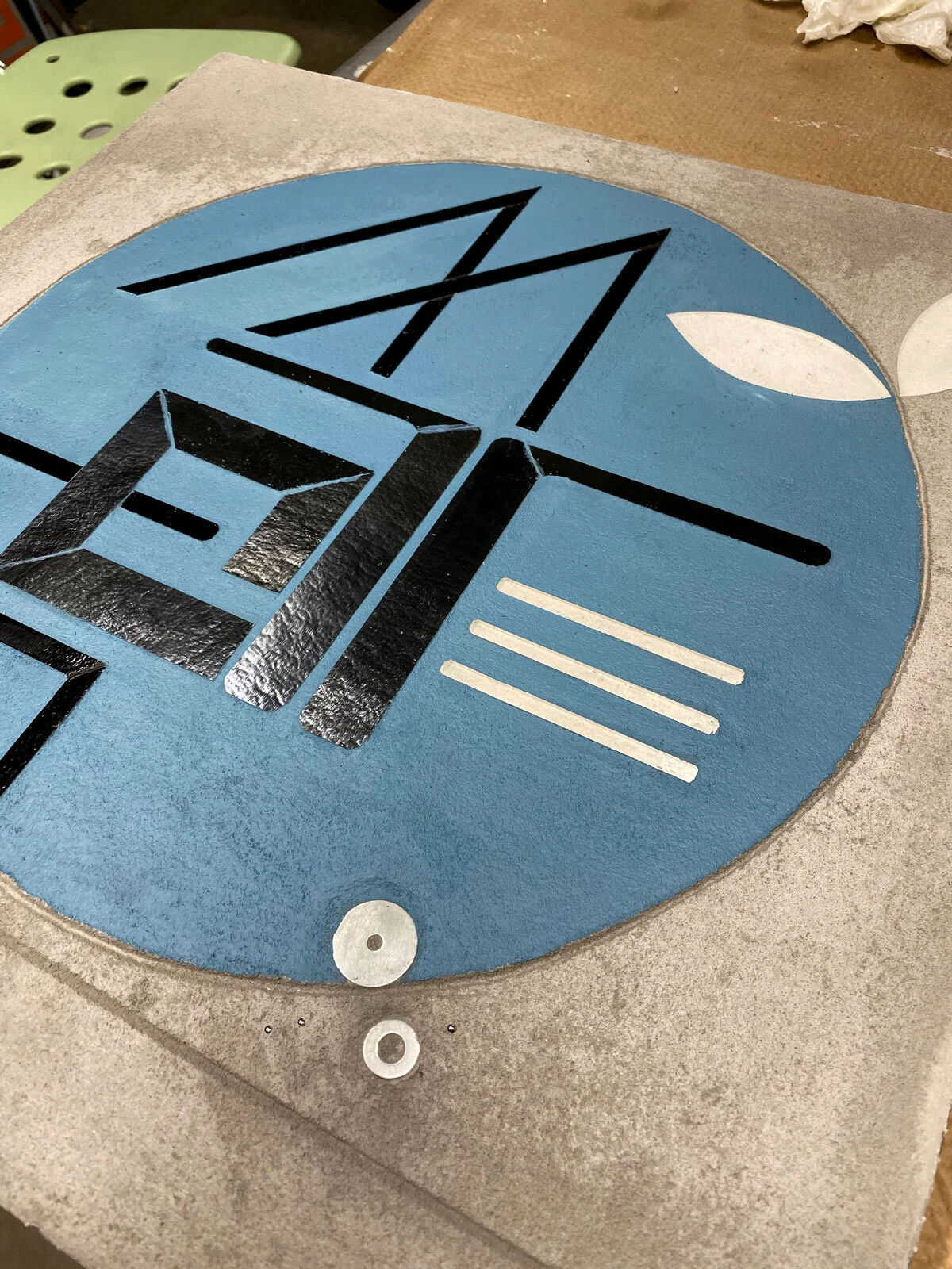
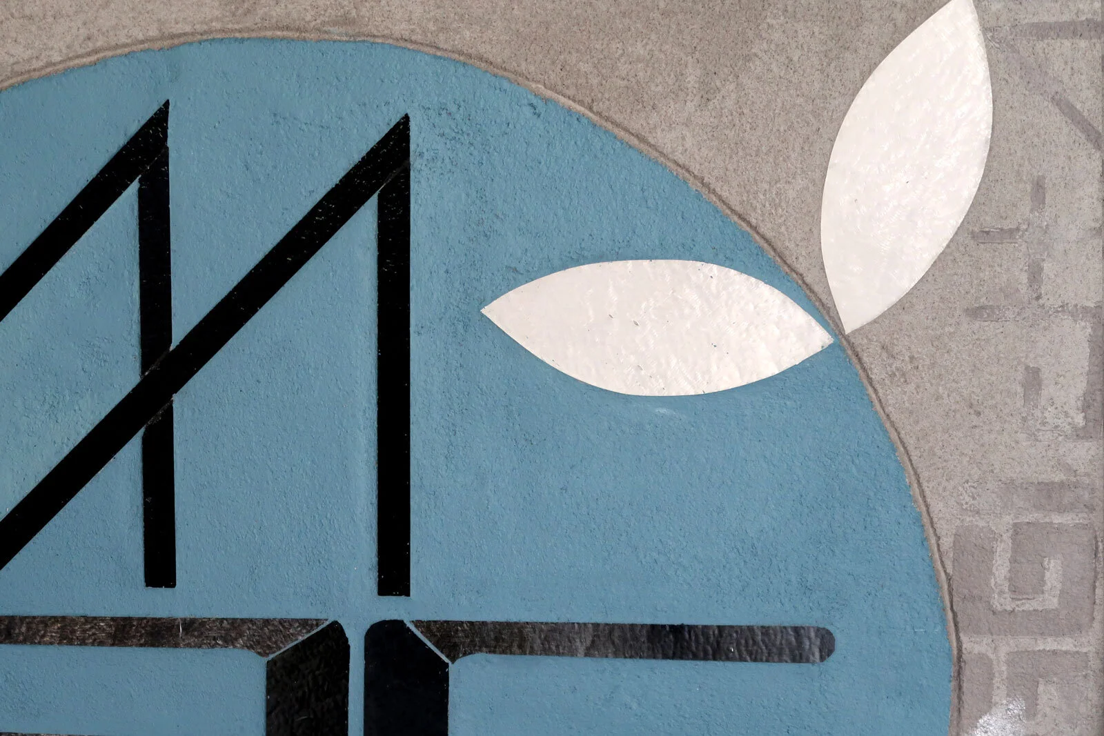
Feels like a whole new start today. Staying focused on THRIVE. How do we make space for everyone to thrive? Looking forward to big ideas and renewed energy in 2021.

Green for white+gray January
I come back to green + gray again and again in my work. Nature finding a way to thrive around the hard cold urban textures of concrete and asphalt and brick serves as a model of resilience.

Winter Survival Edition | art prints (January THRIVE)

Winter Survival Edition | art prints (January THRIVE)
Encode art postcards | packaging up
The January prints arrived. So happy with how the texture and reflectance in my work translates into ink and paper. Now for packaging up.

Winter Survival Edition art prints | January

Winter Survival Edition art prints | January

Winter Survival Edition art prints | January
Encode art postcards | Winter Survival Edition
I’m thrilled with a new art subscription option that offers an easy way to live with art every day. Less ephemeral than Instagram…and not the full commitment of an original...one art postcard arrives per month for three months. The first print ships mid January with a gorgeous little maple photo stand crafted by Evanston woodworker Tony Sosa.
I see this as a new space for curation and innovation, taking work offline and back into the physical world. It gives me the ‘conversation’ over time I crave as an artist. I love how the prints translate texture and reflectance into ink and paper for a completely new experience of my work.

Winter Survival Edition 8”x8” art postcards | sent 1/month for 3 months

maple photo stand comes with 1st art postcard delivery

maple photo stand

Winter Survival Edition | art postcard series
REFLECT inspo
in Fine Art
And I have thousands of images of built world moments that inspire my REFLECT series. It is our interaction with the line and transitions in the streetscape that creates infinite unique perspectives and rhythms.


Sample inspo | REFLECT series

REFLECT 3.9 edge | 2@48”x30” glass c Heather Hancock 2019
ENCODE insp
in Fine Art
I’m updating my portfolio for 2021 with new work. As I scroll back through my iPhone pix I can see inspirations for color, composition and texture from visual moments I’ve noticed over the past several months. Here’s a small sampling of the every day moments that inspire my work.

Encode: BLOOM 20”x20” glass + paint c Heather Hancock 2020


Encode FOCUS | glass + paint c Heather Hancock 2020
Happy New Year
in Fine Art
HNY cards going out today. Excited to be diving back into new projects. New ideas to build!

Encode BUILD + AIM | 20”x20” | glass + paint c Heather Hancock 2020

Holiday season making
Every year I love experimenting with a new tree ornament idea.
This year, I had a huge supply of gorgeous silver Neenah paper to work with. And wanted a simple curving shape. Look at it straight on and the lines almost disappear and then re-appear as move to angle view. Simple. Beautiful. Catching light.


ENCODE: AIM 20”x20” glass + paint c Heather Hancock 2020
Grayscale kind of day
in Fine Art
Some days call for gray on gray.

ENCODE: Focus | hand cut glass + paint | 20”x20” c Heather Hancock 2020
I regularly cycle between popping saturated color and grayscale. I ended up working in mostly with grays, blacks and whites a few years ago when certain colors of glass were not readily available. I was exploring architectural form+line at the time so grayscale was an easy and logical simplification of my glass palette. I’m ready for color again, and finding my paint palette with ENCODE but I’m also mixing in some grayscale pieces and love how these look.

grayscale | ENCODE + REFLECT c Heather Hancock
I especially love to see the dialog with the architectural series. I can see that these different approaches to beauty and information in the cityscape are connected. There’s something so clear and crisp…helps me focus.

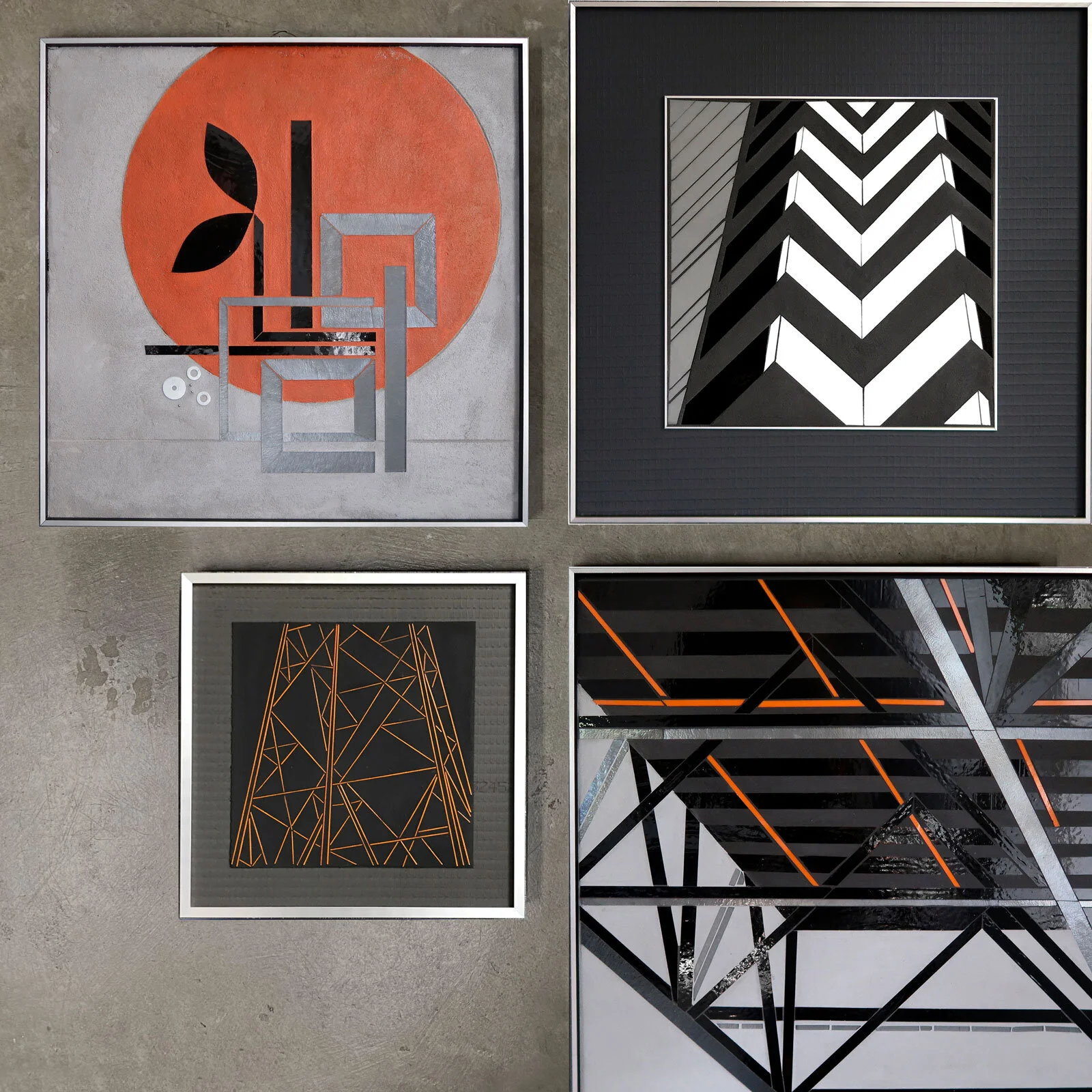
BUILD mix and matching
in Fine Art
Encode pieces offer a playful new approach to seeing the city. This work understands information as a key element of cityscapes and offers three types of information.
First, the material and dimensional nature of hand cut glass is understood in contrast with the textured, etched and painted canvas. This object-ness is surprising and satisfying in a 2D art hanging. Glass, concrete and paint are borrowed from the material vocabulary of contemporary architecture.
Second. The viewer is invited to decode an abstracted word form. Encode subverts the signage and information ubiquitous in the cityscape where it functions to control or limit behavior and repurposes it with a personal message of optimism and hope.
Third. The pieces shift and change with motion and light for a constantly changing visual experience. A viewer is invited into participation, co-creating the work with infinite variability. This enaction points to the idea of embodied cognition with mind, body and environment acting as an integrated system.
Art in conversation

top L R2.6 flow 22”x22” top R spring 14”x14” bottom R ENCODE: BUILD 20”x20” bottom L R2.7 flow
As I put together some art ‘gift guides’ I realized how often small pieces from over the years provided some specific learning that was made subsequent work possible. It makes sense that work would be in conversation but it sometimes takes looking back across series to see these connections. It makes me deeply happy to see this consistent aesthetic impulse to animate a number of ideas about what it means for us to thrive.
GIFT GUIDE
in Fine Art
Art makes a very special and enduring gift.

top L Encode: FOCUS (20x20) | top R Reflect 2.51 grid (22x22) | bottom R Encode: FOCUS (20x20) | bottom L urban vine (14x14)
There are lots of ways to make choosing a piece for someone else (or yourself) easier. We can jump on a call to talk about your space. I am happy to create visuals of possible hangings in your space to visualize how a piece could work on your wall. I can help you think about lighting for the work—these pieces love love natural light…and light at a 30-45 degree angle makes them sparkle!
If you are shopping for someone else we can make a presentation piece available and then let them make a final selection. Or I can get you a custom gift certificate. We can work together to make sure the art piece is exactly right.
I can also point you to any number of talented artists in my world.
Another idea is to connect you with an art professional from my network. Art consultants and gallerists have a broad understanding of art and what’s available out there (which, let’s be honest, is overwhelming!) and how art can bring a space to life. I probably know an art professional in your area and am happy to connect you.

top L Encode: BUILD (20x20) | top R Lake 1.13 (14x14) | bottom R Reflect 1.54 (24x24) | bottom L Lake 2.4 (22x22)

top L Encode: BLOOM (20x20) | top R EncodeL BUILD (20x20) | bottom R Encode BLOOM (20x20) | bottom L Reflect 1.43 grid (24x24)

top L Encode: FOCUS (20x20) | top R R2.39 (22x22) | bottom R Encode: THRIVE (20x20) | bottom L urban vine sketch (14x14)

top L Encode: AIM (20x20) | top R City stringer drawing (14x14) | bottom R Encode: BUILD (20x20) | bottom L Reflect 2.44 concrete rhythm (22x22)
top L Encode: BUILD (20x20) | top R Reflect 2.39 chevron (22x22) | bottom R Reflect 1.59 truss study (24x24) | bottom L tower stringer drawing (14x14)

top L Encode: ACT (20x20) | top R urban vine stringer drawing (14x14) | bottom R Encode: FOCUS (20x20) | bottom L Reflect 1.43 grid (24x24)
I’d love to hear from you! Art makes life better.
Commissioned Encode: SOULMATES
Loved making this commissioned ENCODE a couple weeks back.

WIP ENCODE: SOUL MATES 2@20”x20” c Heather Hancock 2020
This set of two pieces was commissioned as an anniversary gift. The client provided a couple of options for sets of words that could be designed into an integrated composition across two panels. After preliminary exploration I picked one set, SOUL MATES, to focus on. Working across panels creates all sorts of new compositional opportunities to have two free-standing but integrated pieces.

glass cutting | WIP ENCODE: SOUL MATES 2@20”x20” c Heather Hancock 2020

WIP ENCODE: SOUL MATES 2@20”x20” c Heather Hancock 2020

WIP ENCODE: SOUL MATES 2@20”x20” c Heather Hancock 2020
I absolutely love these rounded and interconnected text forms. Having elements with multiple purposes is part of what makes ENCODE pieces interesting and engaging, a kind of visual puzzle.
WIP ENCODE: SOUL MATES 2@20”x20” c Heather Hancock 2020
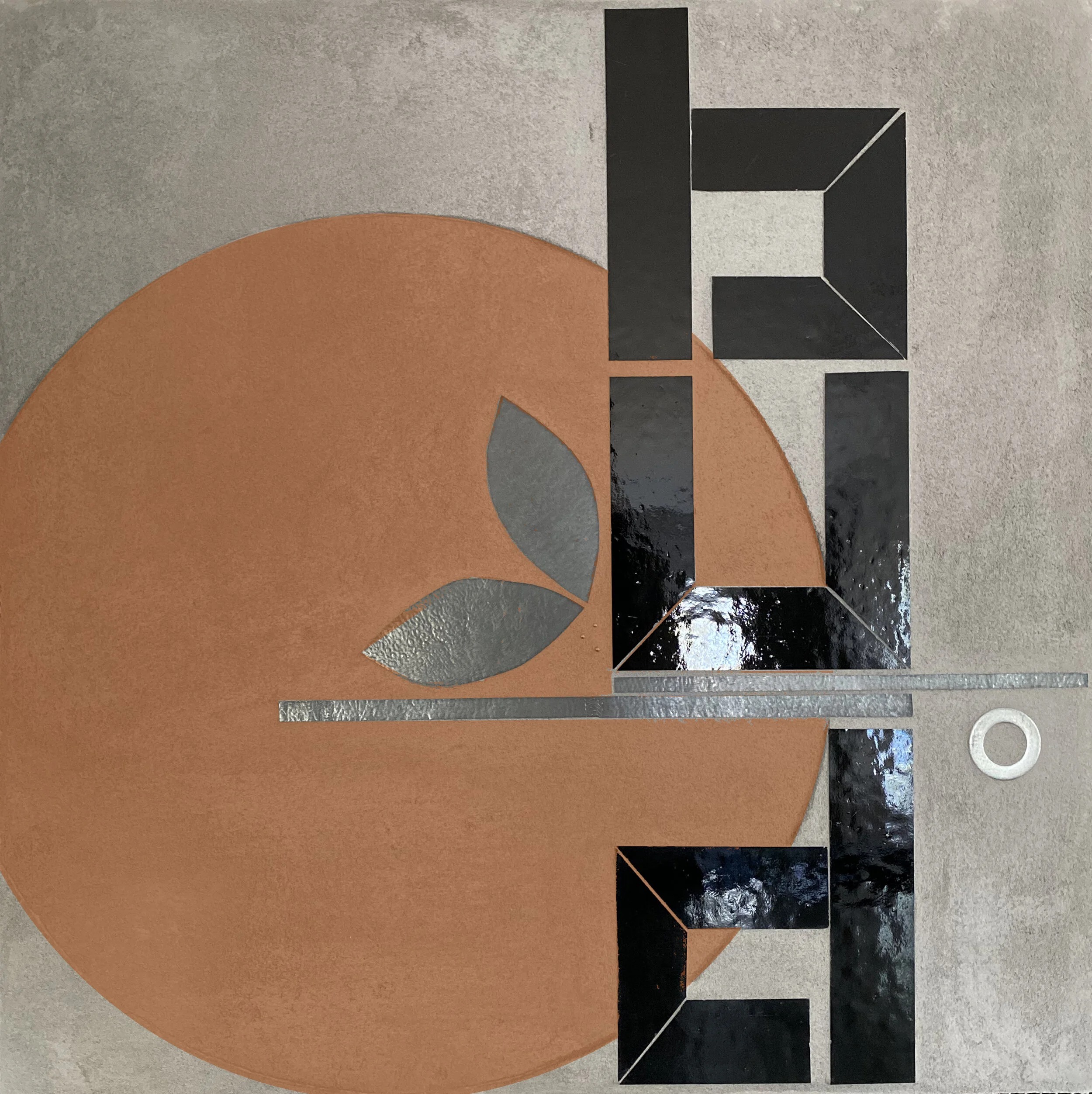
I went looking for the warm orange I envisioned for first panel. Raw sienna and red oxide with just a touch of primary yellow to stay in the orange (rather than red) range. It’s still a new concept for me to be able revise until it matches my vision.

glass cutting | WIP ENCODE: SOUL MATES 2@20”x20” c Heather Hancock 2020
I wanted some subtle additional painted elements for this set. Some encoded information relevant to the clients can be puzzled out on the right side of the second panel. Additional leaves appear and disappear at different angles adding to the dynamic nature of the work.

ENCODE: SOUL MATES 2@20”x20” c Heather Hancock 2020
detail ENCODE: SOUL MATES 2@20”x20” c Heather Hancock 2020

detail ENCODE: SOUL MATES 2@20”x20” c Heather Hancock 2020
Encode: BUILD
I committed. Adding this new desaturated violet to the palette. Love it.

Encode: BUILD 20”x20” glass + paint c Heather Hancock 2020


DETAIL Encode: BUILD 20”x20” glass + paint c Heather Hancock 2020
Color planning
I have a complicated relationship with color. Maybe it’s more accurately described as color commitment issues. I am admittedly a bit obsessed with gray. My years living in and around Chicago have undoubtedly informed this preference. I find grayscale palettes subdued and understated, encouraging focus on texture and surface and reflectance.

Working with glass for so many years has shaped my understanding of color. Color in glass can be unlike color in any other medium: astonishingly varied and shifting depending on lighting and viewer position. At the same time, I have often struggled to find exactly the right hue/saturation/intensity in glass. There are significant gaps in hue and saturation. And when the color I want is made, it’s not always available. I went two years recently without being able to get any blues or greens. This was part of the impetus behind my shift to grayscale glass palettes. For my architectural series REFLECT, a grayscale palette meant readily available glass that connected well with the compositions I was exploring. Now that I am ready to explore color again I am using paint to introduce color to these textured canvases. It’s been a lot of experimentation to find the palette range I was imagining. Getting there. And love how the paint works on the textured surface. There’s a deep connection with the functional painting associated with city information: street markings, signage, way finding. So much information in the city guides our behavior and directs our attention even when we generally don’t consciously focus on it.

color modeling: SLATE blue

color modeling: SIENNA
color modeling: BURNT ORANGE

color modeling: VIOLET

Home office rendering with Encode: BUILD 20”x20” glass + paint c Heather Hancock 2020
Encode: BUILD

Encode: BUILD 20”x20” glass + paint c Heather Hancock 2020

Encode: BUILD 20”x20” glass + paint c Heather Hancock 2020
New work in ENCODE series using a slightly desaturated sienna/yellow (inspired from “construction yellow”…the yellow used for street and highway markings). The starting point for my art practice is exploring what information engages the human mind. While the natural world provides the ideal amount of repetition and variation, the built world requires some closer attention to find overlooked beauty and information at a point between repetition and chaos.

Encode | Concept for Environmental installation
Invited design concepts for a large interior wall of local business. Creating a playful version of “(re)BUILD” connects with their story and mission.

Design concept | reBUILD 14’ x 20’ vinyl/lightweight plywood on paint + cinderblock c Heather Hancock 2020
ENCODE invites viewers to detect and decode information. The starting point for my art practice is that humans thrive in engaging environments. I am interested in re-purposing urban aesthetics and information to offer an uplifting and engaging visual experience.
This proposed concept combines fabricated elements in vinyl (or lighweight plywood) and paint on the cinderblock wall. The original cinderblock is given new life as an important texture telling the story of this building.

Design concept | reBUILD 14’ x 20’ vinyl/lightweight plywood on paint + cinderblock c Heather Hancock 2020
Encode: FOCUS + AIM
in Fine Art
Mix and match pieces from ENCODE series by color, composition or idea themes.

Encode: FOCUS + AIM 20”x20” hand cut glass inlay + paint c Heather Hancock 2020

DETAIL
Encode: EQUAL
in Fine Art

Encode: EQUAL 20”x20” hand cut glass + paint c Heather Hancock 2020