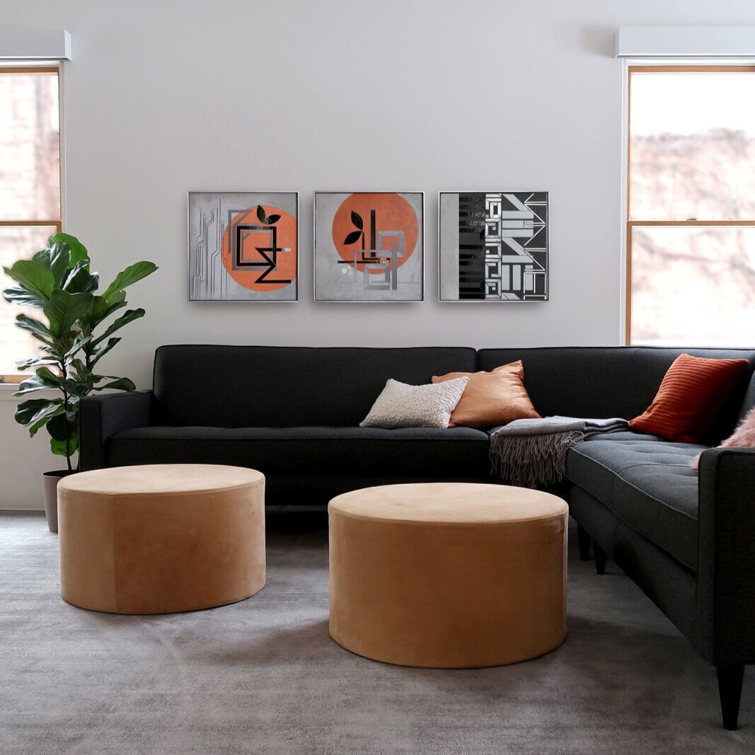
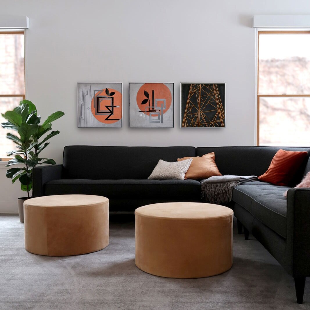
I recently started grouping art across series and have noticed 3 things.

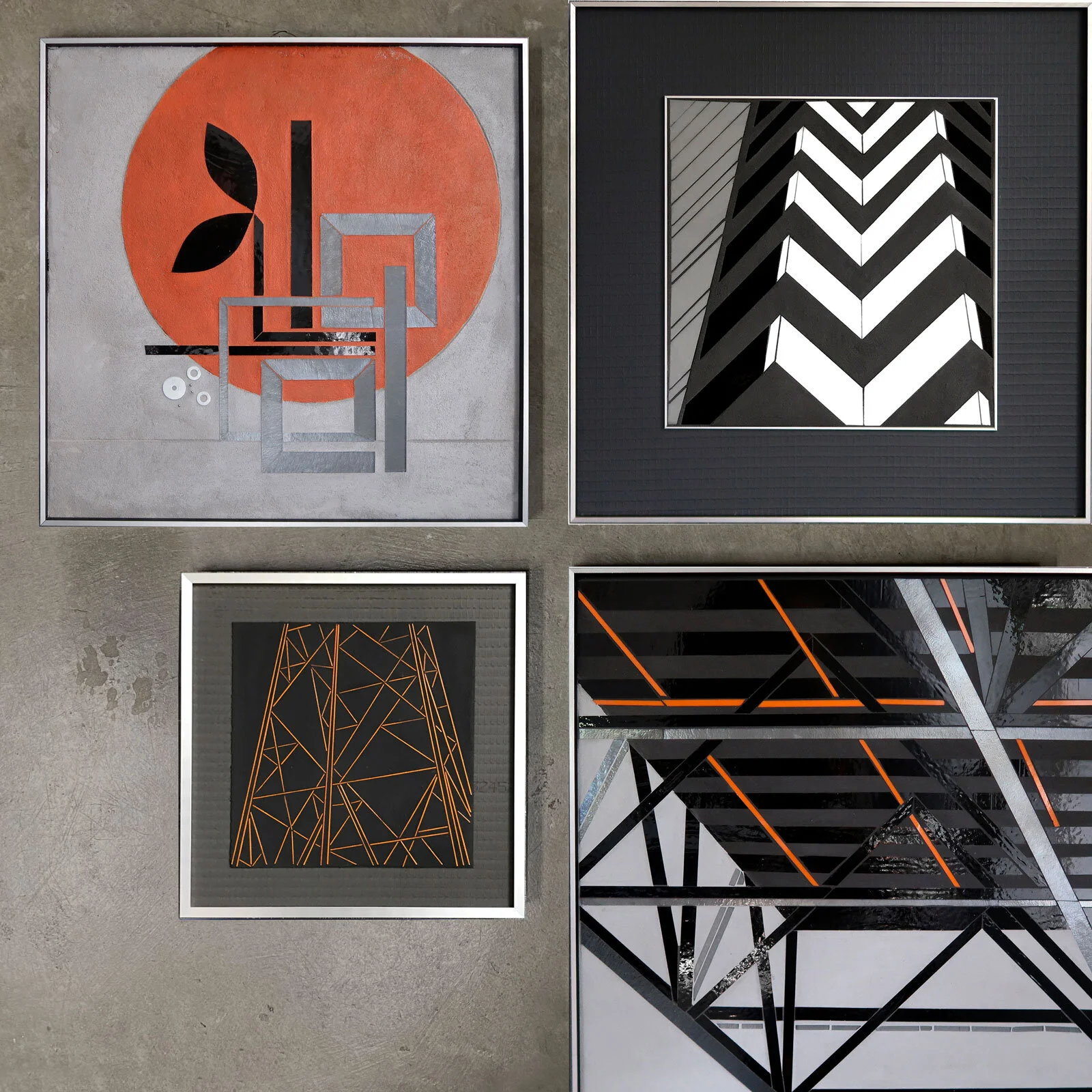
ENCODE: BUILD | REFLECT 22x22 | REFLECT Truss Study 24x24 | stringer sketch | power tower study
Concepts and motifs are starting to weave together and interconnect. I can see how small explorations have been incorporated in my visual vocabulary to be used in different ways in other work.
There is a common underlying theme of “seeing the city’"…or maybe more accurately “reading the city.”
Approaching the city as information, I have explored the vocabulary of architecture in REFLECT. Add in the human body+mind and regular architectural line and form is distorted by visual perception.
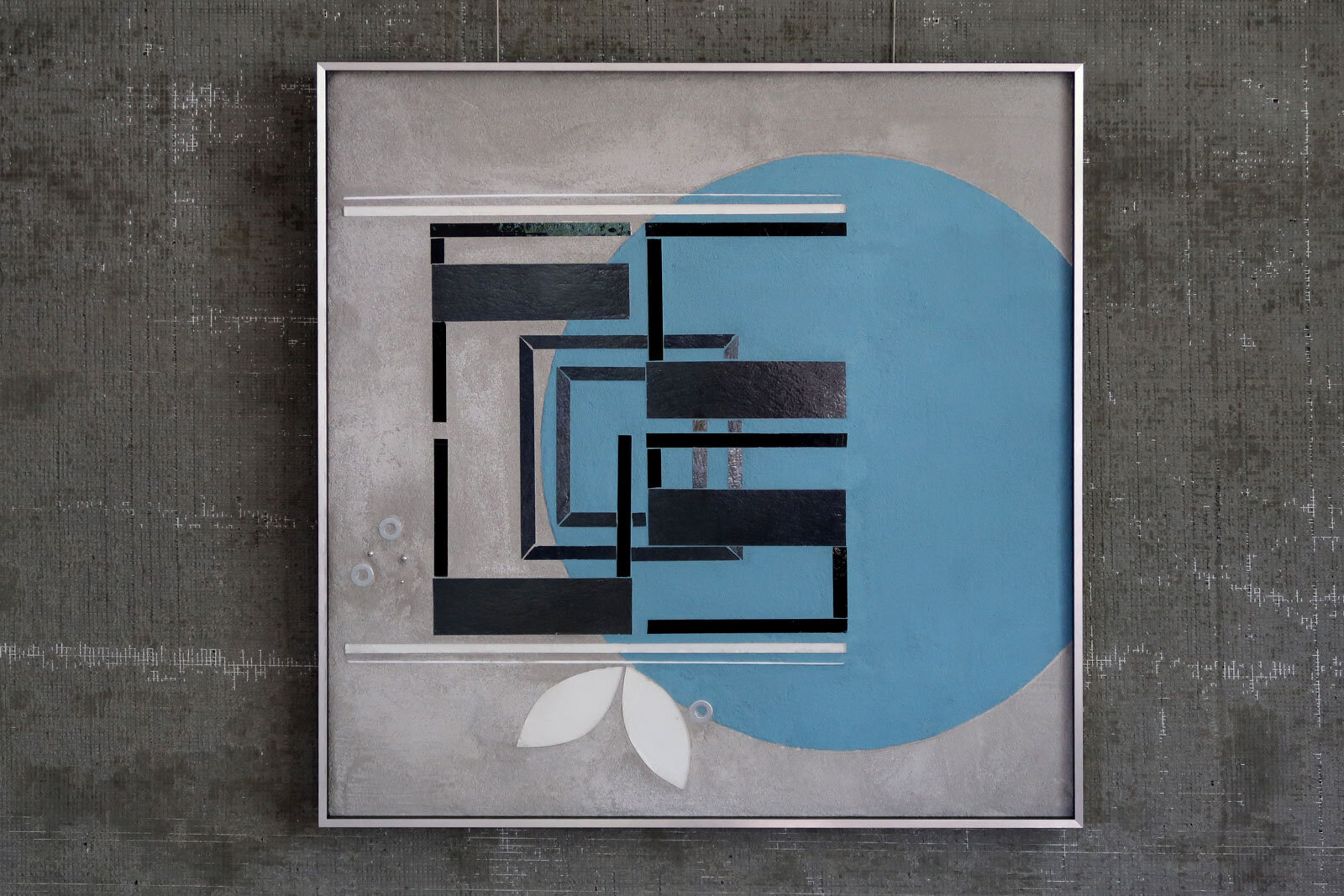
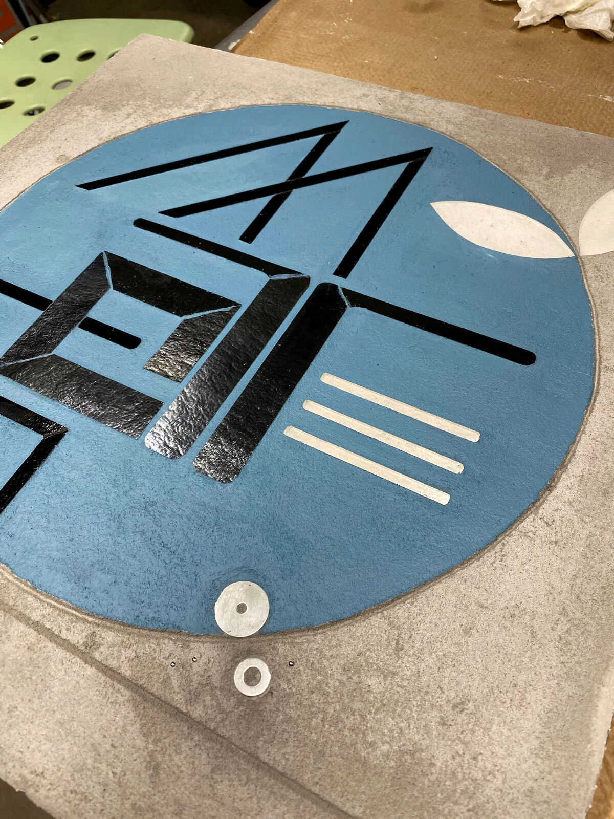
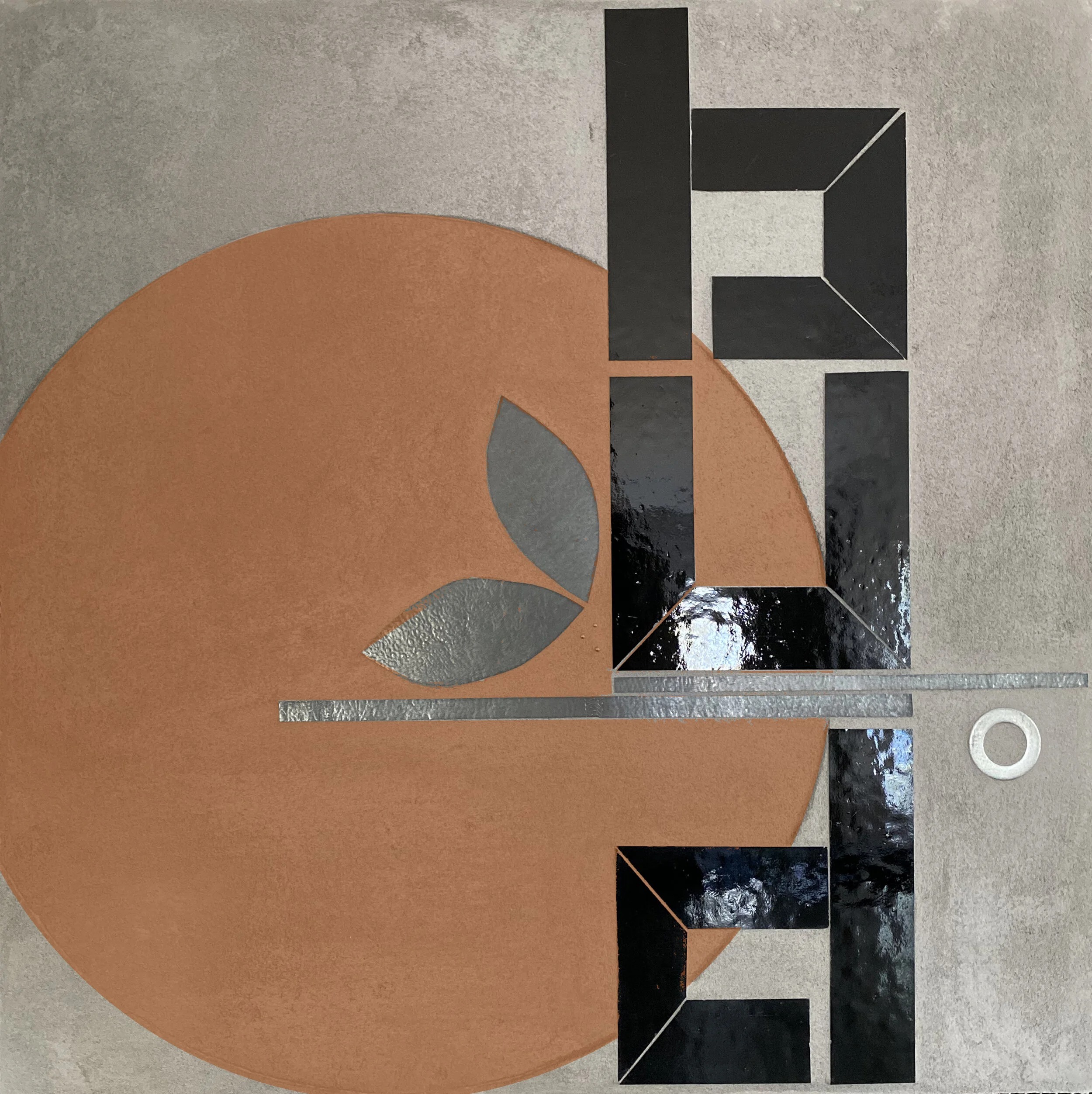
In ENCODE I am again exploring information. There’s implicit information in surfaces and textures and transitions (ie thinking city infrastructure: roadways, sidewalks, buildings). And there’s explicit information in signage and markings that guide, direct and limit behavior. ENCODE re-purposes this material and typographic vocabulary. Approaching language as a generative force, compositions use both form and content to offer new information. Inspiring ideas are presented as a partially abstracted sculptural form and embedded in enduring concrete.
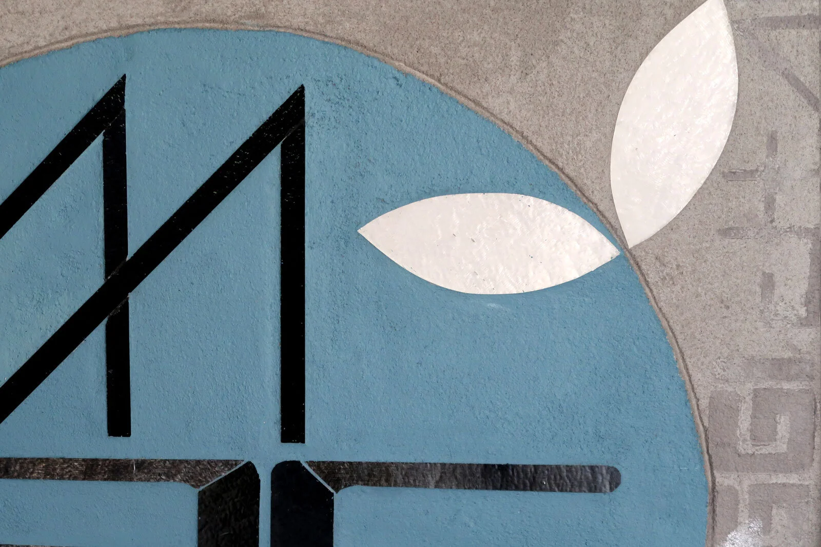
The other piece to ENCODE is that reference to nature in the graphic leaf element. I often talk about the points of intersection between city+nature. But I’ve been thinking of a false dichotomy between city and nature, or an artificial boundary that simply doesn’t exist. Every city is plunked on top of nature…and nature rebounds and grows and does its best around our engineering. It is the ultimate model of resilience. Transforming and thriving in hard environment. There’s more to explore here for sure but for now, nature is fully integrated into this vocabulary. I struggle with whether this reduced/graphic approach is the right idea. Lots to think about here.
Adding in the circle seems to be all about joy for me. I’ve often incorporated circles into my work. I love how simple this painted circle is. It makes me happy.
I can start to see how work from different series is in interesting dialog.