Art walk in Evanston
I am looking forward to being part of the first ever Open Studios Evanston event next Saturday, June 7th at 3-8p. Photographs simply can't capture the experience of seeing glass in person. Glass shifts and shimmers with light and motion, catching our attention and bringing us back to a moment. And this shifting and shimmering is exactly why I work with this powerful medium. In the studio, you'll get an overview of the techniques I use to create the effects I love with glass and be able to see how it works in all kinds of color studios and studio experiments and prototypes.
On the main floor, I'll be showing the first 7 pieces from the Proust series I have been working on with Dr. Virginia Barry. Bringing together many of my favorite topics, this project explores the neuroscience behind Marcel Proust's In Search of Lost Time. More on this project can be found here.
Come on the early side with the kids to give them a peek of a glass studio. Or stop by later for a visit and a glass of wine. Looking forward to an Evanston afternoon and evening of art and friends.
Proust ❤︎ Instagram
The voyage of discovery is not in seeking new landscapes but in having new eyes. Marcel Proust | In Search of Lost Time I have been using Instagram for about a year now. It has become a valuable visual notebook, a quick way to document the visual moments that catch my eye: light and shadow; color and surface; transition, line and form. I love the freedom of capturing these inputs without necessarily analyzing them. No need for a coherent written narrative on Instagram. For me it's about seeing the ordinary in a new way. And about realizing that even in an urban landscape, there are infinite visual inputs that can lead to new ideas and art. Synthesis comes later as these visual inputs accumulate and themes emerge and compositions come to mind. My work centers around finding the points of intersection between the built and natural worlds, so my own concocted hashtags include #beautyinnature #natureinthecity and #structureinbeauty.
This past winter psychoanalyst Dr Virginia Barry invited me to develop visuals for her book on the neuroscience behind Marcel Proust's In Search of Lost Time. One of my first thoughts after reading Marcel Proust's Swann's Way was that Proust would totally get Instagram. In Search of Lost Time comes as close to "following an instagram" feed as one might hope to find in an early 20th century autobiographical novel. Of course Proust goes far beyond an Instagram feed with his sheer brilliance in using language to reconstruct these elaborately detailed and intricately layered sensations and memories, creating an entirely new work of art. But I like to think that Proust would approve of the vast array of visual moments captured on Instagram which have the potential to extend our collective cultural memory in new ways, and will undoubtedly lead to new art.
Come join the adventure on Instagram
Proust project: madeleines and Combray
The next two pieces in the Proust project address the famous tea and madeleines section. A random cup of tea and a cookie trigger a long-forgotten memory of the village of Combray where the narrator spent summers as a child. This passage establishes the framework for accessing the childhood memories that form the basis of the Proust narrative. Memories are often evoked initially by smells and tastes and then recreated as fully embellished, detailed moments, linked together into a drifting, meandering text. And the whole of Combray and of its surroundings, taking their proper shapes and growing solid, sprang into being, town and gardens alike, from my cup of tea. Swann's Way. Marcel Proust.
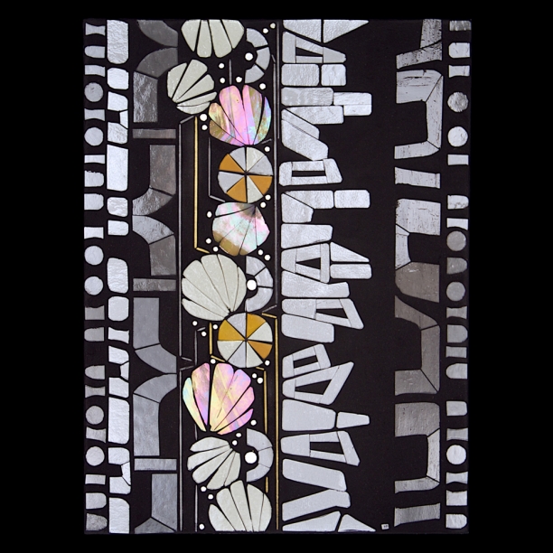
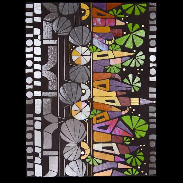
I developed two concepts for this passage. The first featuring the lovely scallop shape of the madeleine cookies realized in pale and iridized ambers with the other conceptual elements realized in grayscale glass. A new element is introduced in this piece, potentially evoking stacked or piled old book or another new abstracted font. This 'font' is the basis for the village of Combray that comes into full form and color in the second piece as the memory is accessed and consolidated.
Fieldtrip: under the Chicago Skyway
Scan 5.1 was a 2013 commission based on the industrial view from the skyway. Structural and functional elements were re-envisioned as organic shapes and forms.
A recent re-reading of EO Wilson's Biophilia, reminded me that he argues that our interest in mechanical forms is another form of biophilia, defined as our innate "focus on life and lifelike processes." In the absence of sufficient novel and diverse natural inputs, it may be that we rely on built world elements to augment our visual experience, reading mechanical forms as potentially changing, evolving elements. Natural world inputs feature the novelty and unpredictability that engage our information-seeking minds. The repetition and precision in the built world, necessary from the point of view of structure and function, make this insufficient as a sole visual input. But connecting with both natural and built world elements might be an important part of visual experience in the urban landscape, and ultimately a factor in quality of life.
More about Scan 5.1
More about South Chicago's industrial history at this great blog ForgottenChicago.com
Bloom at Creative Coworking
Spring show at Creative Coworking
I am delighted to be hanging work at Creative Coworking in Evanston. When owner Angela Valavanis invited me to come see the space last fall, I discovered an inviting office space filled with art by area artists. A wonderful rugged brick wall runs the length of the space and provides an interesting architectural surface to contrast with polished glass.

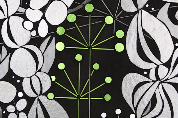
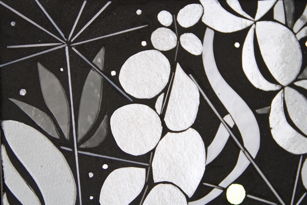
Between other projects, I have been working on additional pieces in the Bloom 4.0 series through the winter months. My goal is to to create collaged compositions which are both playful and engaging. Abstracted foliage forms are imaginary, almost otherworldly, floating and vining and tangling. Graphic lines and elements in glass stringer and hardware contrast with the lush glass forms. The organic forms are realized in shadowy grayscale, suggesting the overlooked but ever-present and powerfully regenerative natural context for the urban world. Living in urbanized settings requires new ways of seeing and connecting with nature.
I also plan to hang some pieces from my series Scan 3.0. Scan considers the power of linguistic forms to engage. We are attuned to finding and decoding information in the environment. I have never shown these pieces before but think they will be an interesting minimalist counterpoint to the grayscale Bloom series.
Hope you can stop by the opening reception.
Friday, March 28, 2014 | 5-8pm
Creative Coworking | 922 Davis St | Evanston, IL
Proust project | Hawthorns
I found the whole path throbbing with the fragrance of hawthorn-blossom. Marcel Proust | Swann's Way
Proust was obsessed with the over-the-top beauty of the hawthorn blossoms. Clouds of white and pink scent the air and create a visual feast of color and form and extravagance. At one point, he notes a brave solo poppy ("the sight of a single poppy hoisting upon it slender rigging and holding against the breeze its scarlet ensign..." p. 195). More often he is enthralled by myriad small blooms forming a massive, exuberant whole. He writes of perceiving a meadow of flowers as "a golden expanse, until it became potent enough to produce an effect of absolute, purposeless beauty" (p. 237).
The challenge in creating the 'hawthorns' piece was to find a lush palette and bountiful composition that avoided sentimentality or pure nostalgia. Proust created these elaborately embellished moments and places from his childhood, engaging with hard and sorrowful moments as well as happy and blissful ones. The complexity and detail he incorporates keeps these from being sentimental. Creating a visual experience of abundance while maintaining the conceptual framework of our fragmented memory-mediated-by-language gave me the approach to developing a composition that connects with the literal imagery of hawthorn blossoms and with the larger overall themes of language and signaling and constructed memories. My interests lie in 'becoming' or the continual change that favors irregularity and imperfections and variation over perfect forms and pure symmetry.
A palette of iridized whites and fuchsia tint glass along with popping spring greens is balanced with grayscale foliage and the central mechanical structure of the piece.
Activation and signaling is present with gray and green stringer, doubling in some cases as a sort of stem. The central constructive element is backgrounded this time at smaller scale and realized in shimmering grays.
Preliminary images after grouting.
Next up: stairs...and the sense of sorrow and despair of a child having to leave his mother and go up these dreaded stairs to bed.
A patch of sky
Always try to keep a patch of sky above your life. Marcel Proust | Swann's Way
Old Books | Proust project
The first image in the Proust project is old books. An excerpt of the introductory quotation: For a long time I would go to bed early. Sometimes, the candle barely out, my eyes closed so quickly that I did not have time to tell myself: “I’m falling asleep.” And half an hour later the thought that it was time to look for sleep would awaken me; I would make as if to put away the book which I imagined was still in my hands, and to blow out the light. Marcel Proust Swann's Way
Visual prototypes for this section are underway. Drawing on the palette of wines and ambers of old books, the notion of activation and accessing fragments of long-term memories is conveyed using a combination of color and grayscale.
Next up in the series: hawthorns in pink. Read more about this project here.
New project | Visuals for book on Proust
I have long had a vague feeling that I should read Proust. I notice Swann's Way on the bookshelf and wonder what I'm missing out on. But I also gathered that reading Proust would be a long, slow slog. And so I had not read Proust...until this past month when I was asked to develop visuals for a book on Proust. The author of this project, Dr. Barry, is a long-time acquaintance. Dr. Barry has followed my work for a number of years. We had an immediate connection given that as a psychiatrist Dr. Barry has a deep understanding of the concepts that drive my art: consciousness, memory, the autobiographical self, embodied cognition.
I read Swann's Way over the winter break. It's a long read. It took a while to get comfortable with the rhythm. And there are sections that drag. But, there's plenty of pure magic. Proust creates a shimmering work of art with words. He gives linguistic form to the fleeting sensations and impressions of consciousness, reconstructing long term memories into layered visual metaphors. There are numerous reflections on creativity and the creative process. And his narrative is deeply informed by visual experience. He is attuned to light and dark, shadows and contrast. Color and form in the natural world are noticed, as are textures and surfaces of the built world. Proust notices sunlight weaving threads of golden silk, ribbons of moonlight splintering across the surface of water, the shifting visual images of sunlit stained glass windows.
The art pieces will offer visual metaphors to connect with both literal images and concepts about which Dr. Barry will write in each section. It is an interesting challenge to think about how art images will read as static photographs on a page. I proposed a 2-page layout for each section. On one page, an introductory quotation by Proust will be accompanied by 2-3 instagram-style images of the literal object or image associated with the quotation. The photographs are to be gestural, abstracted glimpses that evoke the literal imagery. For the glass pieces, I wanted to create a series that was conceptually and visually coherent; for the 8-10 art images to make sense across the sections of the book. I developed a collaged composition that gives me flexibility to weave together the various visual elements that will recur across the pieces.
The central motif of the constructive nature of memory is represented in a mechanical or structural form of circles and half-circles.The concept of synaptic transmission and signaling is reduced down to its essence with straight lines of glass stringer and pops of gold. Abstracted text elements point to the written form of Proust's art. It also connects to the mediation of memory by language. Recall and reconstruction of memories is dependent on the symbolic code of language. Abstracted foliage elements point to Proust's passion for the organic world; the flourishing gardens and vines and blossoms serve as an extended visual metaphor for the creative process throughout the text. Other elements are introduced section-by-section.
First up: old books.
Transform | prototype
Transform Invited design proposal | Art-in-Architecture Program | State of Illinois
16" x 16" prototype | glass with glass stringer and hardware
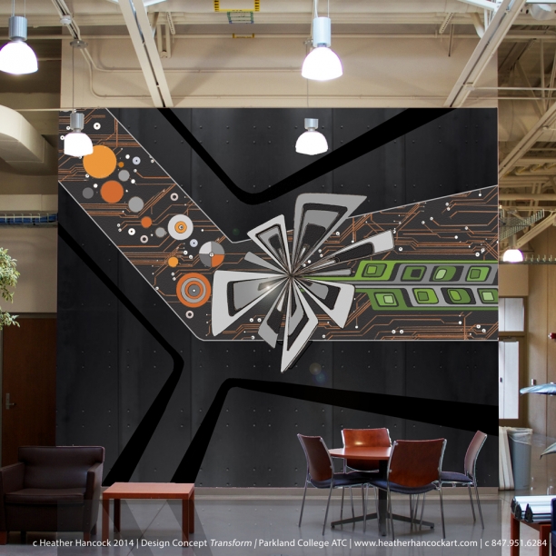
Design proposal for a feature wall installation for the Engineering Sciences and Technology program at Parkland College, Champaign, IL. Hard-edged line and geometries of an industrial vocabulary are integrated with abstracted forms inspired by the natural world.
I created a 1/3rd scale prototype of a small section of the full 66SF glass composition to help visualize the color and glass palette of the proposed piece. I used thinner glass stringer rather than glass rod to keep the proportions appropriate for the smaller scale piece. A laser level was used to set the stringer.
Transform re-imagines forms and processes of the Engineering Sciences department as a visual narrative. Transform celebrates the extraordinary technical expertise that is learned and applied at Parkland College. This visual abstraction draws on modernist visual tropes of beauty in structure and function, making it accessible to viewers by connecting them with imagery from the natural world. Transform connects art and design with manufacturing and production at both a conceptual and material level.
Full set of images of Transform prototype can be found here.
Transform | invited design proposal
Invited design proposal Art-in-Architecture Program
State of Illinois
The last number of weeks have been focused on developing a design proposal for a ~225SF feature wall for the Engineering Sciences Department at Parkland College in Champaign, IL. I was one of four artists invited to submit proposals for the space. The creative brief stipulated only that durable materials be used to ensure a low-maintenance installation and that concepts need not be limited to the industrial arts in theme.
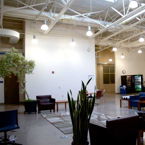
When I toured the building in early December I found a spectacular architect-designed industrial chic space with functional elements used as design features, gleaming polished concrete floors, and white ceiling and walls flooded with natural light from a huge skylight. The lighting conditions are perfect for that materials I use in my work.
The concept that began to take shape was one of transformation. The story is about raw materials transformed into finished products; a spark transformed into velocity. Or the story of human creativity transforming information into knowledge and expertise. Ultimately given the bucolic setting of the surrounding farmland, it is also a story about the land: light transformed into grain.
For the full composition, I re-purpose industrial materials as conceptual media. Glass, paint, metal cladding, MDF insets and hardware all echo the industrial aesthetic of the technical equipment and workspace I observed during my December visit. Hard-edged beauty of the geometry, precise lines, and perfect forms of engineering sciences technology are imagined as flowing elements inspired by the social and natural world of Parkland College. This visual abstraction draws on modernist visual tropes of beauty in structure and function, making them accessible to viewers by connecting them with imagery from the natural world.
Transform connects art and design with manufacturing and production at both a conceptual and material level.
I presented this concept to a panel of 12 jurors in Champaign last week. While my concept was not selected, this project pushed me way forward in figuring out how glass can be integrated alongside other architectural surfaces and materials. It creates all sorts of interesting possibilities. Meeting with metal fabricators and millworkers has given me a whole new range of ideas about using architectural materials as compositional elements.
I will say that the process of essentially blindly pitching an idea was less than ideal. While I saw the space and got to ask a few questions about the community, the Arts-in-Architecture process doesn't allow for dialogue with the architects and community of users. In the end, the feedback was that the metal cladding was too dark in the space. There are multiple other materials that I could have proposed but after literally weeks of work there is no opportunity in the process for this kind of dialogue with the clients. So. I will continue on my quest to collaborate with designers and architects, developing site-specific art solutions that infuse a space with meaning and interest. Onward.
Jason Peot was awarded this commission and his light installations are simply stunning. I was in good company with ceramic artist Jason Messinger and my longtime friend mosaic genius Jim Bachor.
Bloom 4.3
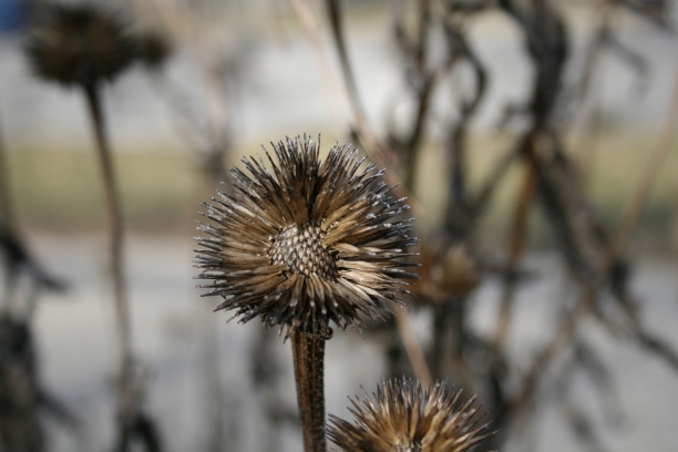
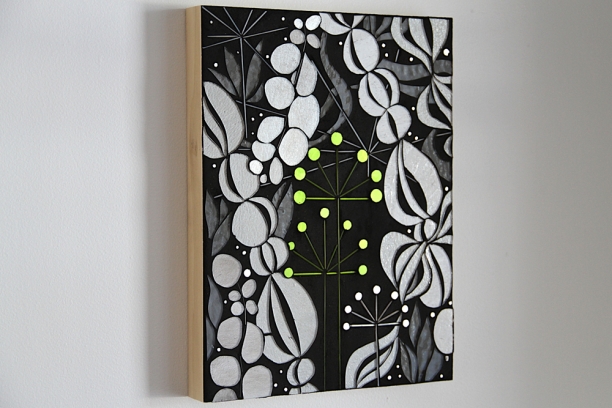 I often find myself drawing foliage and botanical forms in the dead of winter. Partly because I love deadheads; forms reduced to their structural essence.
And partly because I believe in E.O. Wilson's concept of Biophilia--we are naturally attuned to things that are alive and vital and vibrant. In the middle of (a particularly long) winter, I crave growing, curving forms. Bloom 4.3 is another experiment with glass stringer. Those tiny threads of glass create lovely structural lines within the flowing organic shapes. I see this work as part of my inquiry into how to live well in an urban environment. We need to find new ways of seeing beauty and staying connected to nature.
More pieces are coming in this series in preparation for a hanging at Creative Co-Working in Evanston later this spring.
Winter color
studio inventory | Bloom
This week I'm cleaning up the studio and completing an up-to-date art inventory to prepare for the start of the new year. These are the Blooms that are left in my studio. I love my urban flowers. I first started working on Bloom in the dead of winter a number of years ago and literally was craving color in the dark, black+white winter. The popping squared blooms with the graphic foliage belong as much to the urban, built world as to the natural world, a point of intersection that I'm always exploring.
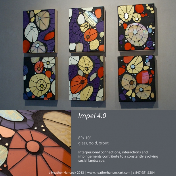
Impel 4.0
Ornaments you get to keep up year round.
Impel is a series I've been exploring for a number of years. It started as a tiny inset in a friend's backsplash with turquoise and spring green and ambers. The concept came from the thinking about how the social landscape is constantly evolving: we change and are changed by others around us. For Impel 4.0, I used tightly cropped images of the interacting elements. This was my first time to use this lovely coral glass. The glass comes clear and requires kiln firing to realize the rich coral color (many thanks to my glass artist friend Paul Messink for firing it for me). The palette of purples and corals and ambers are luminous against the black grout.
See more about Impel 4.0 here.
The problem with public art
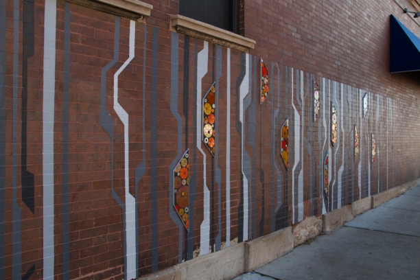
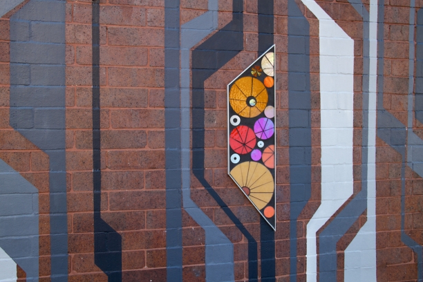
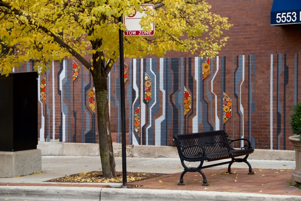
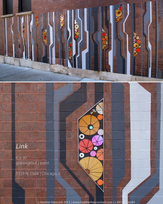
My first public art mural, Link, is complete. I think Link succeeds in creating an engaging visual experience. I had creative freedom and the chance to realize the my largest piece yet in a short period of time. The problem with public art, however, is what exactly is the point of doing a large exterior piece for a less-than-market-value stipend that some community members will love, some will hate and many will never notice? Here's my thinking:
1. Andersonville has long been a favorite neighborhood for me. Andersonville has always had an appealing cohesive urban aesthetic. It's the closest go-to place for those of us in the far north neighborhoods needing art galleries and interesting design shops and good scones. During my previous career in healthcare, I worked at nearby hospitals, first Ravenswood then Weiss in Uptown with a satellite clinic in Edgewater. Andersonville was an inviting destination for post-work happy hours and dinners out. I love the idea of being back in Andersonville to make art and contribute to well-being in a completely different way.
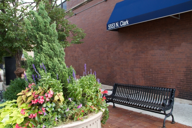
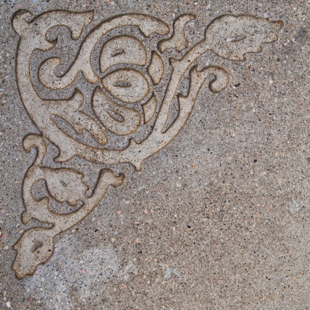
2. Andersonville has a longstanding commitment to creating inviting public spaces. The corner of Clark and Bryn Mawr features signature Andersonville wrought iron benches, a beautifully maintained concrete planter and lovely tile and concrete insets in the sidewalk. An art piece could extend this compelling public space along the span of the building.
3. The masonry wall itself is lovely with smooth, uniform dark red brick. I am obsessed with connecting my work with industrial surfaces. While I love the symmetry and regularity of industrial surfaces, we also need variation and difference. In the natural world, we find the perfect balance of repetition and variation. Rather than treating the masonry wall as a canvas to be covered, I love the idea of the masonry wall being an element in the piece. Varying the repetition of brick and concrete, viewers can be re-connected with an overlooked surface in the streetscape. From either end, the painted lines virtually disappear against the brick.
4. This is a busy pedestrian corridor and the majority of viewers will see the piece as they walk by the 35' span of the building. I am passionate about the power of glass to engage a viewer. Glass comes to life with light and movement. I could see a fantastic creative opportunity to create a compelling walk-by experience, offering coherent changes in form and intensity of painted elements animated by glass elements in lush shimmering color.
5. The project budget was small and necessitated a mixed media concept that could be executed quickly. This is a difficult topic for public artists and I fall decidedly on the side of creative content being properly valued and artists paid at market value. Tim Kreider's recent opinion piece in the New York Times provides an excellent synthesis of this issue: Slaves of the Internet Unite. My decision to take on this project was a calculated gamble that realizing a 200SF art piece will lead to more opportunities. I developed a composition primarily for paint with a small number of glass elements floating in relief along the wall. This mixed media approach kept costs down while at the same time creating strong visual contrasts and bringing dimension to the piece.
Overall, my approach to public art is rooted in my understanding of cognition--humans thrive in engaging environments. I see public art as an opportunity to create moments of surprise and discovery. Living in urban landscapes requires new ways of seeing beauty and finding the variation we need to offset the predictability of the built environment. In the case of Link, coherent changes in form and intensity punctuated by shimmering glass elements across the 30′ span are intended to vary the repetition of the masonry. This hopefully creates an engaging walk-by experience, infusing pedestrian commutes with interest and meaning. Upon final analysis, I am delighted to have been able to make a tiny contribution to Andersonville's lovely urban landscape, maybe even helping others 'live well' in our urban world.
mural Link | process | glass installed


