mural Link | process | color palette

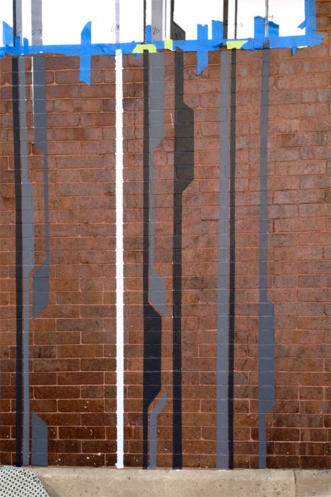
The original drawing of Link featured layered blues with pops of orange and amber. Running at the lakefront has made me see blues in a new way. Water and sky is endless dynamic with infinite numbers of different blues and in infinite combinations. The RFP called for a concept that evoked water. So I had blues as the starting point for my drawings. Link | rendered in layered blues+gray paint | c Heather Hancock 2013


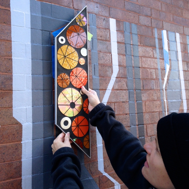
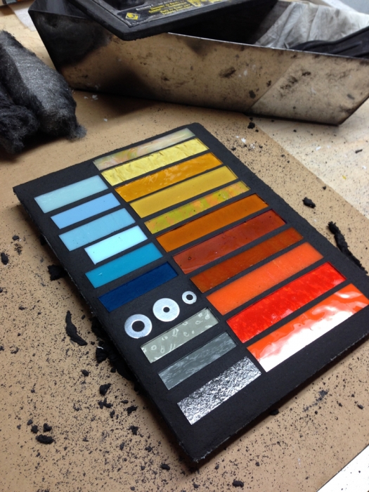
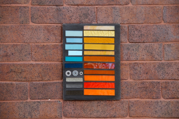
I created a sample glass palette to help visualize color--even went and attached it to the masonry wall to see how the colors worked with the red brick.

[image]

glass palette on brick wall at 5553 N Clark

The translation of color from glass to paint was hard. The dynamic nature of glass--shifting and shimmering with light--makes it completely different from paint. I loved the color palette on the glass sample board but as we started painting blues, the flat, intense colors seemed at odds with each other and the brick. We tried graying the turquoise down. We tried taking out some of the light blue lines. I brought a glass element to hold against the blues. The blues seemed busy and heavy behind the glass rather than floating on the brick as envisioned. As soon as I saw the finished untaped grayscale lines at either end of the mural I was super happy. (Notice the one remaining line of pale blue...that was soon repainted pale gray.)

grayscale lines at endpoints helped us get to grayscale for all painted elements

And the glass was super happy too.

glass elements against the grayscale lines

Sarah was game; she'd had similar experiences with previous projects and getting to paint colors that worked at wall-scale. Grayscale would be a sophisticated counterpart to the sparkling glass elements.
Link | rendering in grayscale | c Heather Hancock 2013


Public art project: Link

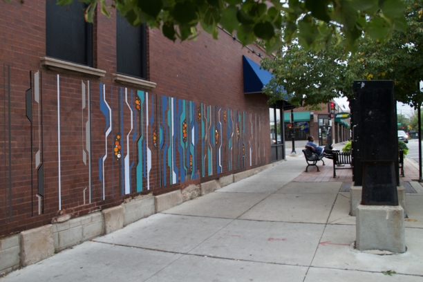
I am thrilled to get the chance to think bigger. Link has been selected for installation along the north wall of the Adriatic Cafe at Clark and Bryn Mawr in Chicago, IL. Link comes from my recent work in exploring the points of intersection between the built and natural worlds. Each graphic element, abstractions of both natural (sky, waves, foliage) and built world forms (circuit boards, maps, traffic markings), has a unique geometry and yet is inter-connected with the surrounding elements.  Spare, grayscale elements at the far endpoints increase in density, vibrancy and inter-connectedness into the focal point of the mural to create an overall rhythm and sense of resonance. The glass brings energy and vibrancy in popping oranges and ambers and hardware in self-contained interior forms that inter-lock with the linear elements. The elements will float along the existing brick wall, offering a visual narrative to engage pedestrians. Link | 30' x 6' | rendering


Link | 30' x 6' | c Heather Hancock 2013

A month ago, artist Sarah Laing forwarded me the RFP issued jointly by the Andersonville Development Corporation and Good News Only. It was a tight timeline and given the budget constraints would necessarily be a painted composition with a small amount of integrated glasswork. Given Sarah's background in public art and painting I asked if she'd be interested in helping me navigate the world of painting on brick. Sarah has trained with several local public artists and has served on the board of the Chicago Public Art Group. Her recent projects include the Main St. Metra station mural in Evanston, a pedestrian underpass mural in West Andersonville and a current piece at Lincoln Elementary School in Evanston.

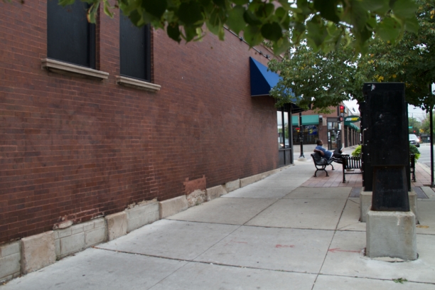
The exterior brick wall of the Adriatic Cafe is the first of a number of Andersonville sites identified for public art installations. This building is a beautiful 3-story brick buildings with curved corner windows that repeat at similar corners throughout Andersonville. The benches and plantings and generous sidewalk already create an inviting public space alongside the building. The goal is to create an engaging visual experience with coherent changes in form, velocity and intensity across the 30' span.

wall at 5553 N Clark | Chicago, IL


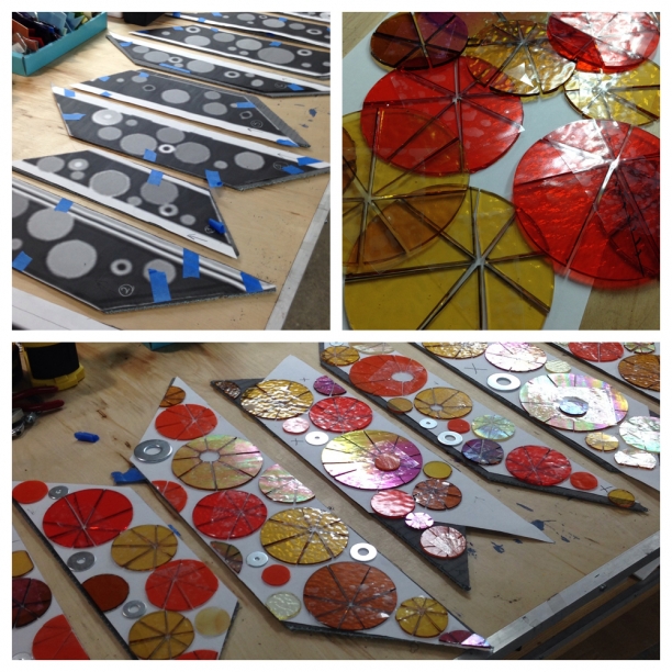
mural Link | process | cutting glass

The glass work is complete and ready to be framed in anodized aluminum which manages the transition between paint+brick and glass+grout.  Popping circles were subcut for a safe, durable installation and then floated on the panels to suggest the energy and light of the urban world. I mixed in iridescent glass to catch light in evening and low-light conditions. It'll be interesting to see how the glass functions at different times of day and in different light conditions. Glass templates and cutting


mural Link | process | color palette

Planning for glass elements to be cut in ambers and oranges. The graphic lines will be painted in grays and blues. color palette | glass samples

The unpainted brick is considered part of the composition in Link. The brick wall is in great condition so love the idea of paint+glass elements floating over existing brick, creating a composition that is fully integrated with the entire wall. The palette should both tie-in with the brick wall and also pop against it.

color palette on the brick wall

Impel 5.3 featured in Make it Better

I am delighted that Impel 5.3 is featured in an article, House to Home, by Kelly Konrad in the October edition of Make it Better Kelly was looking at how custom elements and finishes can be used to create a unique space. Kelly wrote a fantastic introduction to my art practice, including my interests in the importance of living with art and its role in engaging us on a daily basis.  

Impel 5.3 installed

Impel 5.3 | Featured in Make it Better

More about Impel 5.3 can be found here.

Studio experiment: prairie meets urban

Fall was all about harvest on a grain farm in Alberta. Harvest was equal parts stress and excitement. There was a huge amount of timing, equipment and logistics to coordinate. All alongside the often uncooperative weather. As a kid, harvest meant eating picnic dinners in the field; riding in the tractor mesmerized by the swath of grain feeding into the combine; and studying the tessellated rows of freshly cut, pale yellow stubble that were left behind.
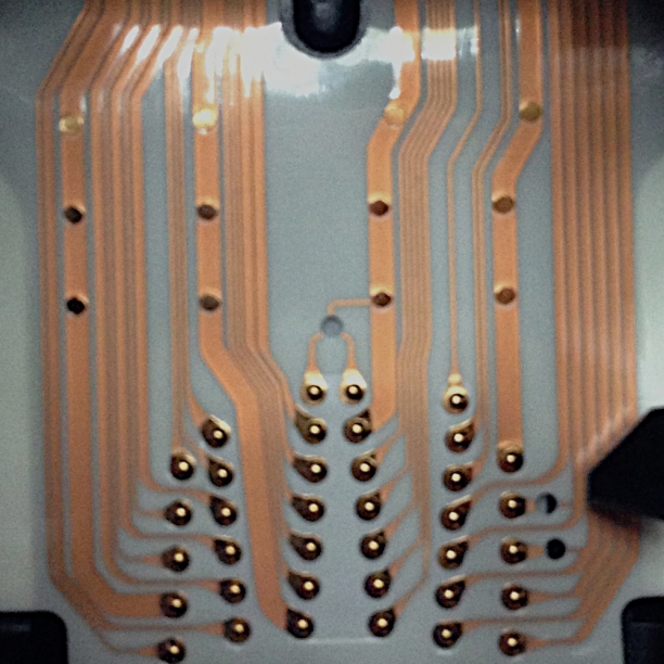
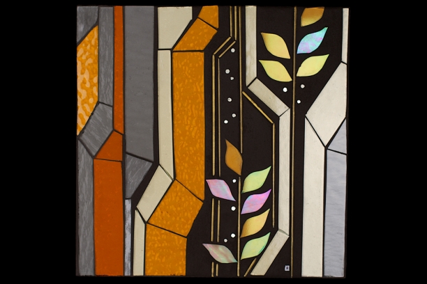
A new visual experiment is taking form: prairie forms meet urban lines.The visual inspiration for this studio experiment came from another circuit board. The graphic lines linking 'organic' forms offered me the solution I've needed to address prairie imagery. Placing organic forms alongside tessellated circuitry-inspired lines connects with the idea about finding unexpected points of beauty in the urban landscape. Living in urban settings requires new ways of finding beauty and connecting with nature.


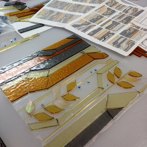
cutting glass | prototype 1


inspiration image | prairie meets urban


WIP_studio experiment_10"x10"

Porcupine Mountains, MI: rock, water and sky

Porcupine Mountains, MI Squeezed in a long weekend of camping and hiking in the UP before settling into fall here. We camped on a bluff overlooking Lake Superior. Root-lined paths took us through ancient hemlock stands, along waterfalls and intriguing rock formations and to the rocky shoreline of Lake Superior. Another hike gave us views into Lake of the Clouds on one side and the vast great lake on the other. Definitely the best hiking experience yet in the midwest. We'll need to go back for more.

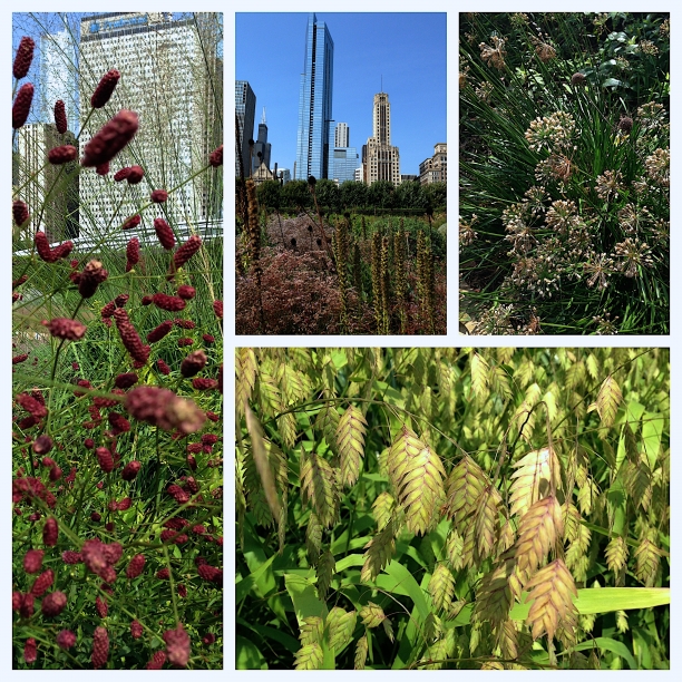
Lurie gardens | urban gardens

A last minute cancellation of a downtown meeting left me with time to wander in the Lurie Gardens at Millennium Park this morning. The gardens are truly amazing against the backdrop of downtown Chicago. The color and foliage is still impressive in early September and the sheer variety in plantings is incredible. I need to get back there with my Canon. But today it felt like my morning was salvaged by a stroll through the gardens and a Grant Park Orchestra concert. Lurie gardens at Millennium park

creative inspiration thanks to eighth blackbird at Millennium Park

on the lawn_Pritzker pavilion Trying to keep summer going as long as possible. An 8:30pm swim on a 95-degree evening helped on Tuesday. Taking in the eighth blackbird et al concert at Pritzker Pavilion was last night's keep-summer-going activity.

3 take-aways from the evening:

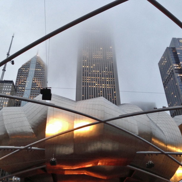
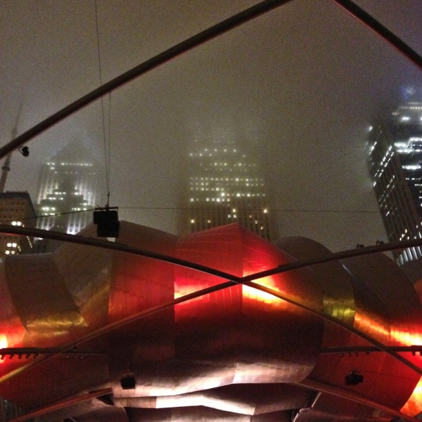
1. Context. Listening to the hypnotic Lesley Flanigan followed by the energetic, experimental music of eighth blackbird with Glenn Kotche (of Wilco) was entrancing on a warm, foggy evening. Flanigan's sound installations with layered electronic and vocals inset into acoustic noise and the impossibly complicated rhythms and themes created by the percussive eighth blackbird seemed to be in dialogue with Frank Gehry's ribbons of stainless steel and glinting curves at the Pritzker Pavilion.

2. Collaboration. Last night's music featured multiple collaborations and made me think about the momentum that is generated with different perspectives and inputs and creative energy. These extraordinarily talented musicians are working out a fabulously complex vision. It's undoubtedly a complicated group effort that lets each of them get beyond their own individual vision to a much bigger collaborative one.

3. Experimentation. It's good to experiment. New sounds, rhythms, instruments (and ways of using instruments) is standard fare for eighth blackbird. The work is not always easily accessible, but it coheres and challenges in a way that I love. Doing things that push technical and conceptual limits is part of our human need for finding new information within noise.

These are all topics I think about on a regular basis as key parts of my creative practice. I'm all about context and love experimenting...need to keep finding creative collaborations to get beyond my own vision. Thank you eighth blackbird + Lesley Flanigan + Glenn Kotche for an inspiring evening.

on the lawn | Pritzker pavilion


Emblems | catching light

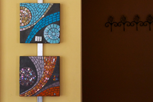
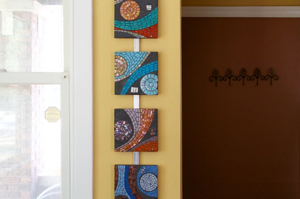
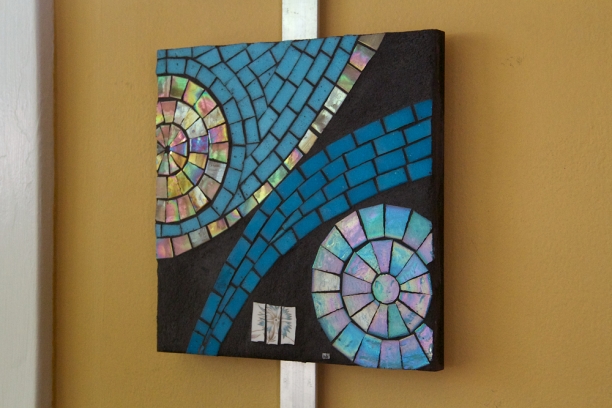
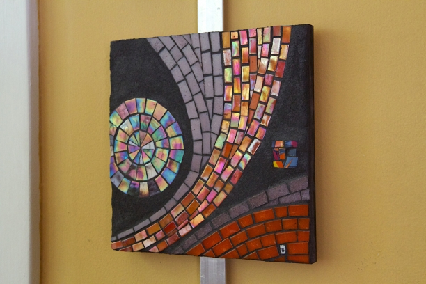
8“ x 8”  | vitreous glass, vintage china and ceramics and grout on wood emblems (2007) | 8" x 8" | vitreous glass with ceramic details

I made these Emblems between 2006-2008. Pointing to an original meaning of ‘emblem’ as inlaid, mosaic work, these small pieces feature hand-cut vitreous glass and inlays of recycled vintage china and ceramics within the grout elements. Emblems served as color studies, letting me explore vibrant colors combinations in stark contrast with the matte charcoal gray grout background. The graphic compositions were drawn from a larger work, Trace, to create open-ended pieces that point to something beyond themselves.  Based on a biological/cellular visual referent, Trace considers the continual change and movement in our daily lived experience.

I love the simplicity and playfulness of these pieces. Hanging them in sets seems to extend the energy of the individual pieces.

emblems (2007) | 8" x 8" | vitreous glass with ceramic details


emblems (2007) | 8" x 8" | vitreous glass with ceramic details


emblems (2007) | 8" x 8" | vitreous glass with ceramic details

Art and well-being | wandering in downtown Chicago

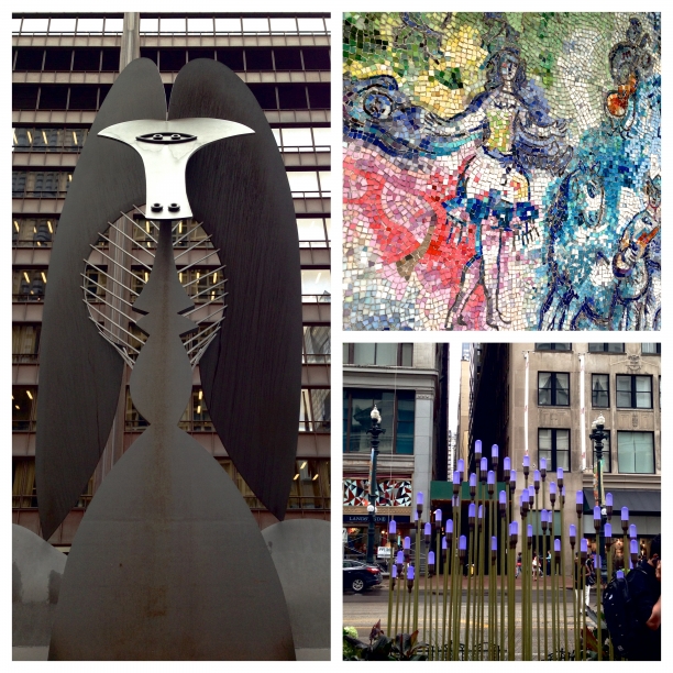
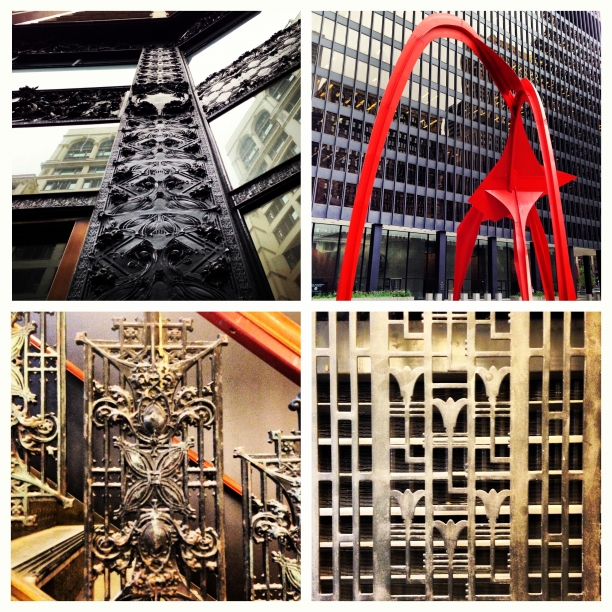
A meeting with Gensler Architecture took me downtown to the loop last week. After a great conversation about materials and surfaces and the interaction between art+design and well-being, I wandered for a couple of blocks to see the Picasso, Alexander Calder's Flamingo and the Chagall mosaic at Chase Plaza. Along the way, I could see Gehry's concert space at Millennium Park, stumbled upon a glass "flower" installation and found many architectural details. I recently reviewed the chapter on healthy cities in Esther Sternberg's 2009 book Healing Spaces: The science of place and well-being. She summarized urban design studies that have found architectural details and variation can encourage walking and therefore connect to health and well-being. NYC is seen as the model city for providing an engaging pedestrian experience with architecturally rich streetscapes. While Chicago is sprawling and chaotic compared to NYC, its skyscrapers and infrastructure and architectural detail are balanced with plantings and public art and the lake. When the weather cooperates, it's a fantastic wandering city, and I headed home to Evanston along the lake again captivated by the beauty and variety of this midwestern city. the Picasso | Chagall mosaics detail | glass art installation

architectural details | Calder's Flamingo | Chicago, IL


Bloom 4.2

inspirations | Bloom 4.2

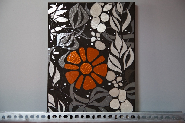
Bloom 4.0 is the next progression in the Bloom series that started taking form in 2009. I’ve always thought of Bloom as my ‘urban foliage’ idea…my ‘street flowers.’ The squared blooms are graphic and angular, belonging as much to the built environment as to the natural world. Glass rods add a strong linear element opposite the green leaf forms. If I had the nerve, they’d be my version of Invader, tiny pops of color and life installed on urban canvases. I settled for a temporary installation, Modern Ruins, to explore the effect of tiny Blooms against monumental urban wastelands.

A progression in technique (layering of glass explored in Trace 2.1) and concept (finding beauty and information in the structure and geometry of the built environment in Scan 5.1) brings me to Bloom 4.0 which combines two core ideas: finding beauty and information in unexpected places and connecting organic curves and rhythm of the natural world with the geometries of the urban environment. The second prototype in the Bloom 4.0 series features an industrial orange against grayscale foliage.

WIP | Bloom 4.2 | 12" x 16"


Abstracted botanical forms are layered with mechanical and structural elements. The negative space from a bicycle sprocket forms the orange 'bloom’ and linear elements in glass stringer refer to structure and support. The organic forms are realized in grayscale, suggesting the overlooked but ever-present and powerfully regenerative natural context for the urban world. Living in urbanized settings requires new ways of seeing and connecting with nature.

Bloom 4.2 | 12" x 16" | glass, gold, grout

Full set of images of Bloom 4.2.

So I met this leaf

I met a leaf on the way to yoga yesterday. I couldn't stop thinking about it. Wrong side up and covered with drops of moisture, it was a beautiful form that I could envision as a continuous element for the Bloom 4.0 series. I was delighted when it was still there on my way home.  Thinking in glass means considering how light and concept interact as well as the connection between form and technique (as in, can this form be cut from glass). There are more and less cut-able forms and some part of my drawing practice seems to be about finding the next cutting challenge. At one point, this significantly constrained my drawing but now, working in sheet glass, I can cut largely anything I can draw with some modifications. I am a little obsessed with creating forms with complex interior elements. Bloom 4.1 features flowing, organic forms that provide a background of abstract continuous foliage. I've been waiting to use these forms but at small scale it is really difficult to create smooth, coherent exterior and interior lines. This new leaf form is an easily cut additive form which can be reduced to a spare, stencil shape and still offer a continuous foliage structure for a small-scale resolution piece. leaf on the ground


leaf sketch


Bloom 4.2 protoype


Concepts: circuit lines and concrete

I often take pictures of sites that could form an interesting connection with an art installation. I keep coming back to my circuit line in stringer experiment, Connect 1.0. For an actual project, I'd use lines relevant to the site (ie maps or data sets) to develop the drawing. There would be technical issues to resolve with this idea (ie could the work be ungrouted for an exterior application?). Happily, concepts are all about imagining without worrying about technical realities.

Concept: urban lines on concrete


Repetition and change: blues

Nature always gets it right: providing the perfect balance of repetition and change. Some days the color of the lake and sky seems relatively static but yesterday the palette was changing minute-by-minute. Biking along the lakefront I couldn't take my eyes off the sky and lake. The clouds were scuttling by, creating a similarly dynamic visual experience. Here is a sampling of what I saw across a 2 hour timespan. Lake Michigan @ Clark Square | 11:00am | blues

Lake Michigan @ the Point at Northwestern | 11:22am | blues


Lake Michigan @ Clark Square | 12:51pm | blues


Urban exploring

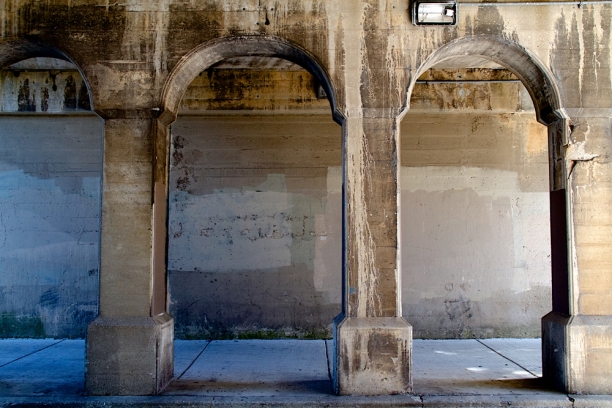
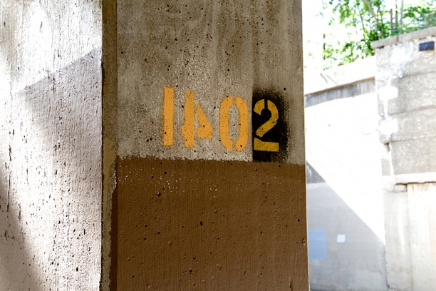
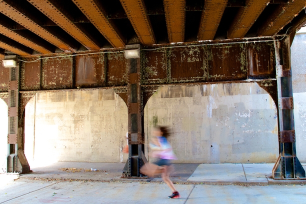
Summer is all about different rhythms and inputs and inspirations. Part of developing a sustainable studio practice requires spending more time on marketing and applications and submissions. But the only way I can stay motivated on the marketing front is if I'm getting equal amounts of reading and writing and photographing and drawing and, ideally, cutting time. This week my photography inputs were at the south Evanston viaducts at Mulford, a 5 minute bike ride from my studio. Photography has become an important tool in my intention to 'notice what you notice.' Over time, I've discovered that my images gradually inform my drawing practice in ways I can't predict or anticipate. I have been posting on Instagram lately and find it to be a quick and very playful way to notice and share a moment. Here are a few of yesterday's finds; I love these urban surfaces and textures and lines. viaducts at Mulford, Evanston, IL | concrete surfaces+lines

viaducts at Mulford, Evanston, IL | paint on concrete

viaducts at Mulford, Evanston, IL | metal and concrete surfaces + line


Reading landscape architect Roberto Burle Marx

A friend recently reminded me about Roberto "Burle" Marx, the modernist Brazilian landscape architect. I love the Copacabana beach mosaics and mural but had never explored his landscape projects. Working alongside modernist architects, Marx brought a painter's perspective to landscape design and a passion for reconnecting urban settings with the natural world. Organic, asymmetrical plantings brought colors and textures and curves to the rigid geometries of modernist buildings. He developed expertise in native Brazilian species and preferred massed plantings of single varieties of plants. Roberto Burle Marx | Cavanellas | c Malcolm Raggett

One of my interests in landscape architecture is the ways in which viewer movement and changing perspective are taken into consideration. As a viewer walks through a garden, form, rhythm and line shift. Anticipating how glass installations will work with movement. His landscapes were also photographed from above as they are seen from the buildings. These top-down views show stunning compositions of organic and modernist, structural forms rendered in plants. Marx incorporated several fantastic mosaic murals into his landscapes, making yet another point of connection for me with this amazing portfolio of work.

The pavements along the Copacabana beachfront are fantastic.

pavement along Copocabana | Roberto Burle Marx | c Malcolm Raggett

The pavement images made me think about the curved lines and inter-related forms in Connect 2.0. More about Connect 2.0 here. Of course now I want to see Connect 2.0 realized in grayscale glass...whoa.

Connect 2.2 detail | glass, hardware, grout | c Heather Hancock 2012


The full set of project images can be seen at Malcolm Raggett Photograpy.

Studio experiment: Bloom 4.1

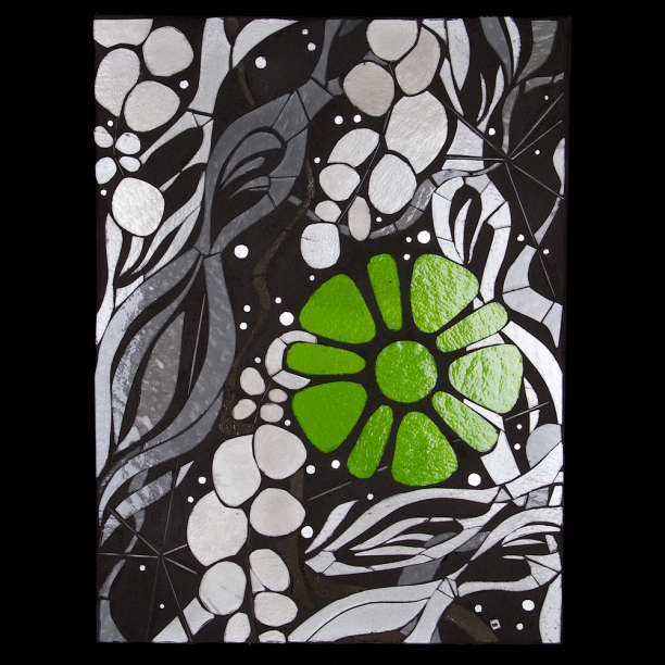
Bloom 4.1 | 12" x 16" | c Heather Hancock 2013

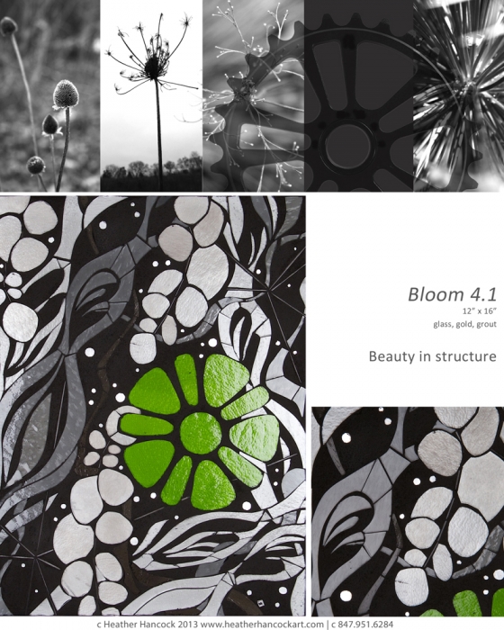
This week's studio experiment is the next progression in the Bloom series. I've always thought of Bloom as my 'urban foliage' idea...my 'street flowers.' The squared blooms are graphic and angular, belonging as much to the built environment as to the natural world. Glass rods add a strong linear element opposite the green leaf forms. If I had the nerve, they'd be my version of Invader, tiny pops of color and life installed on urban canvases. I settled for a temporary installation, Modern Ruins, to explore the effect of tiny Blooms against monumental urban wastelands.

A progression in technique (layering of glass explored in Trace 2.1) and concept (finding beauty and information in the structure and geometry of the built environment in Scan 5.1) brings me to Bloom 4.1 which combines two core ideas: finding beauty and information in unexpected places and connecting organic curves and rhythm of the natural world with the geometries of the urban environment.

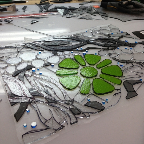
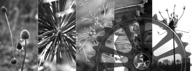
Abstracted botanical forms are layered with mechanical and structural elements. The negative space from a bicycle sprocket forms the 'green bloom' and linear elements in glass stringer refer to structure and support. The organic forms are realized in grayscale, suggesting the overlooked but ever-present and powerfully regenerative natural context for the urban world. Living in urbanized settings requires new ways of seeing and connecting with nature.

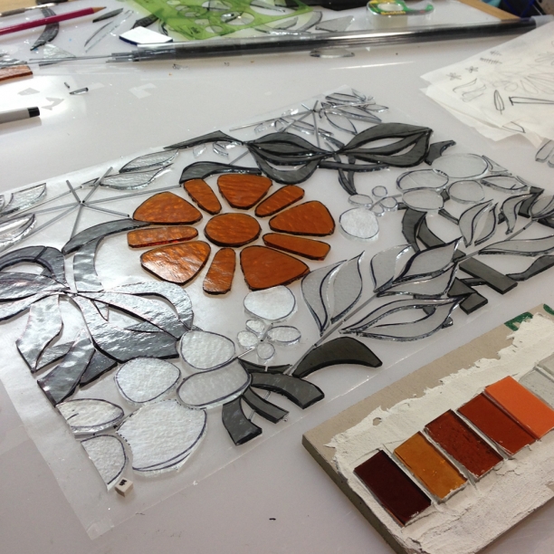
WIP cutting Bloom 4.1 | 12" x 16" | c Heather Hancock 2013


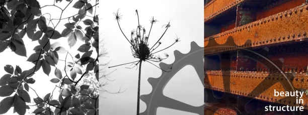
inspiration images for Bloom 4.1