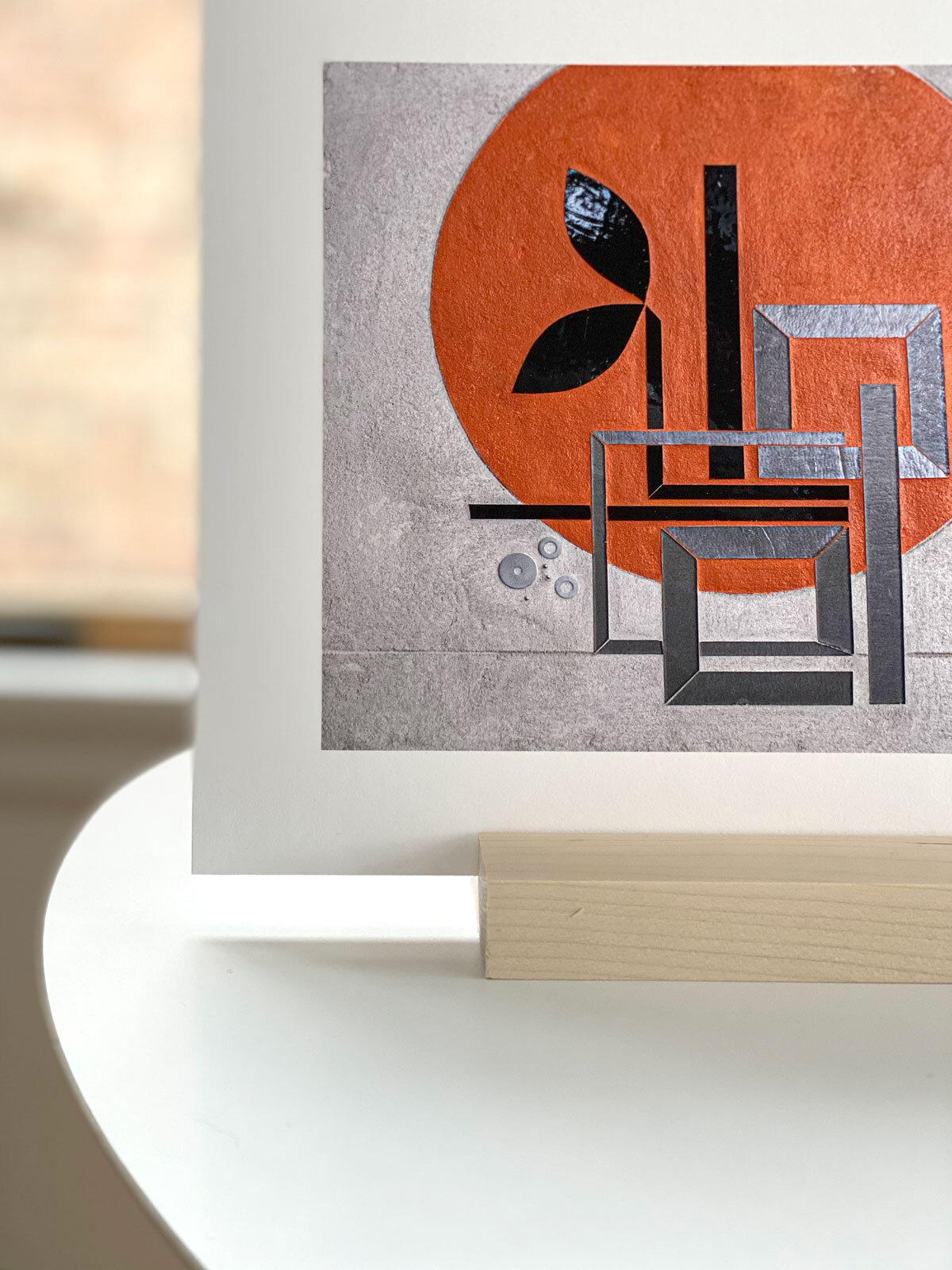
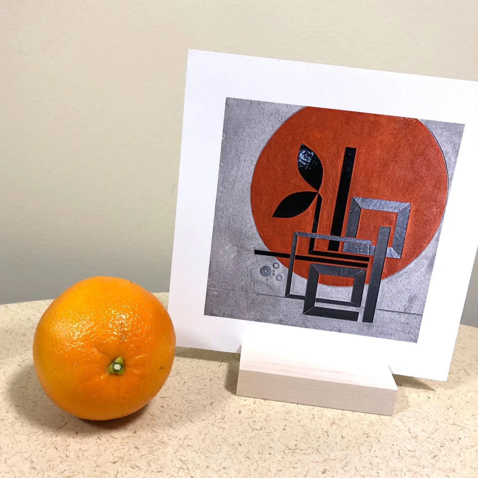
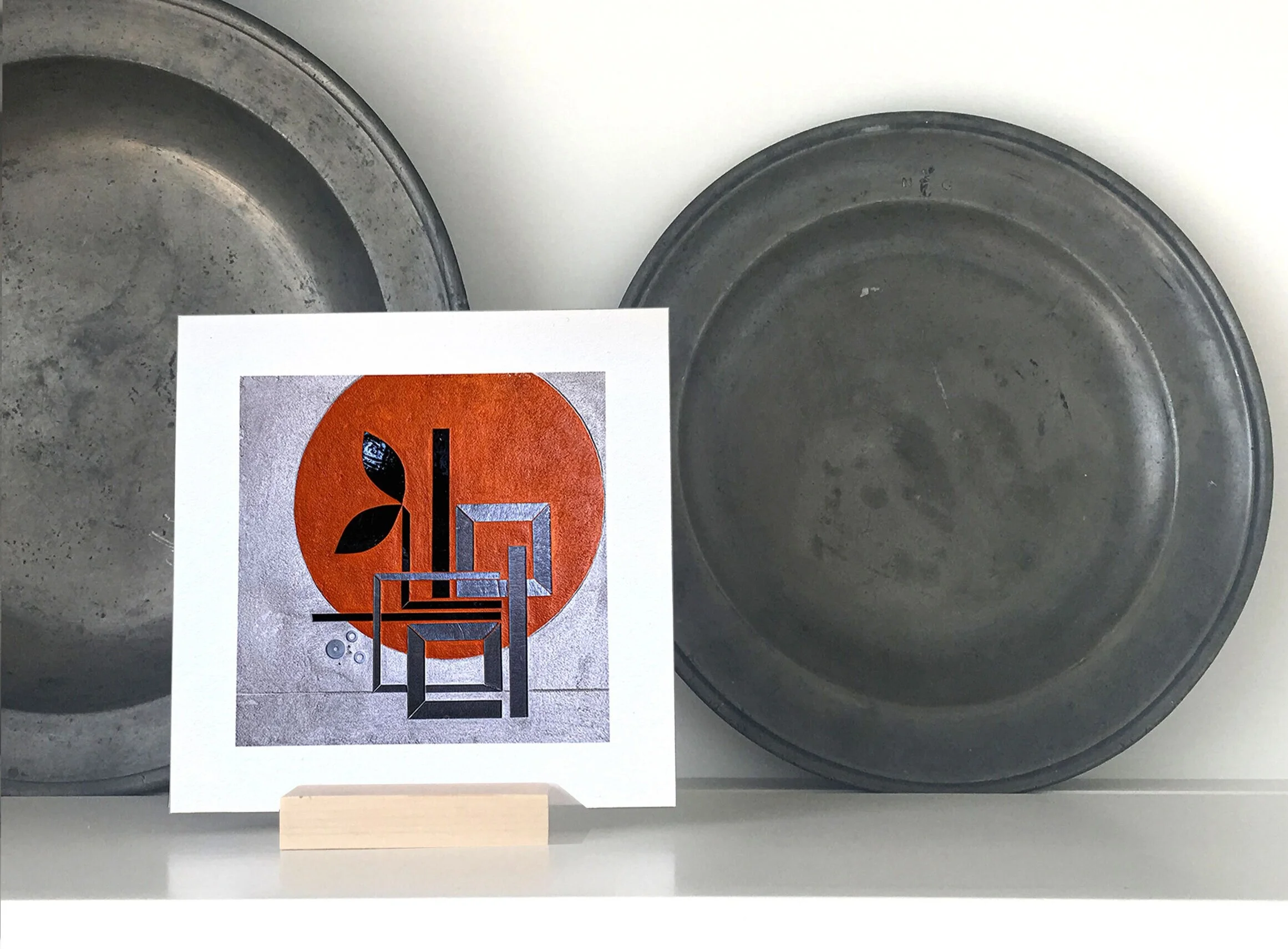
I love getting images of art prints settled into new homes. February art print, BUILD, features an intertwining vine full of possibility. Architectural building becomes a stand-in for the optimistic and deeply inspiring idea that we are all builders. This essentially creative act finds expression with myriad materials and tools and product.
Nature art: Icicle city
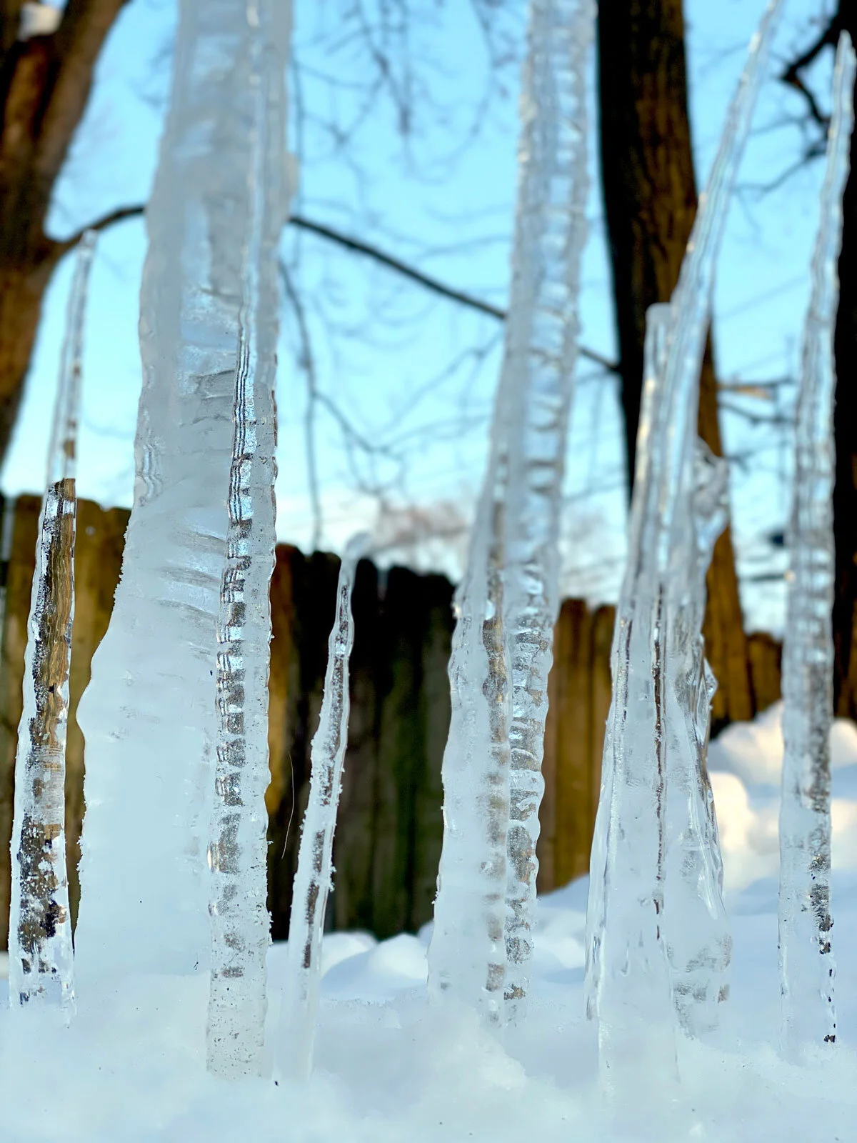
A couple weeks ago, Annie Asebrook proposed a 1 hour challenge: figure out a temporary concept ideally with only natural materials and 1 hour installation time as part of EvanstonMade’s Winter Wonderland at Canal Shores Golf club.
Since I ordinarily work with glass+concrete, it’s very freeing and playful to think about what materials and process can work as an entirely ephemeral experience. When Annie texted a picture of icicles I was immediately interested. Glass is a manmade material that mimics reflective materials in the natural world, especially water+ice. My interest in glass as an art medium comes from its unique capacity to catch and reflect light, creating a dynamic shifting visual experience that is a (very pale) imitation of the constant change and transformation we thrive on in the natural world.
Testing icicles 2/20/21

Testing icicles 2/20/21
Annie carefully extracted icicles from around her home+yard. I took to the alleys, finding unnoticed icicles in reach on the back of garages. This natural form, ubiquitous in early spring melts transformed into a building material.
We initially thought we would see an icicle forest take shape.
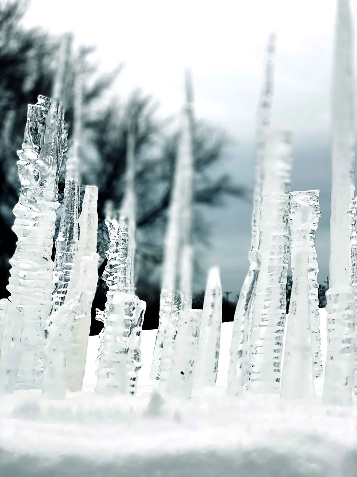
Detail Icicle city 2/21/21
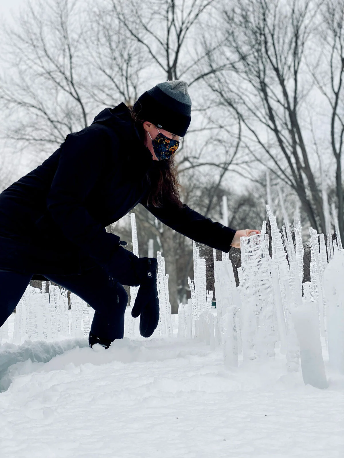
Annie Asebrook 2/21/21
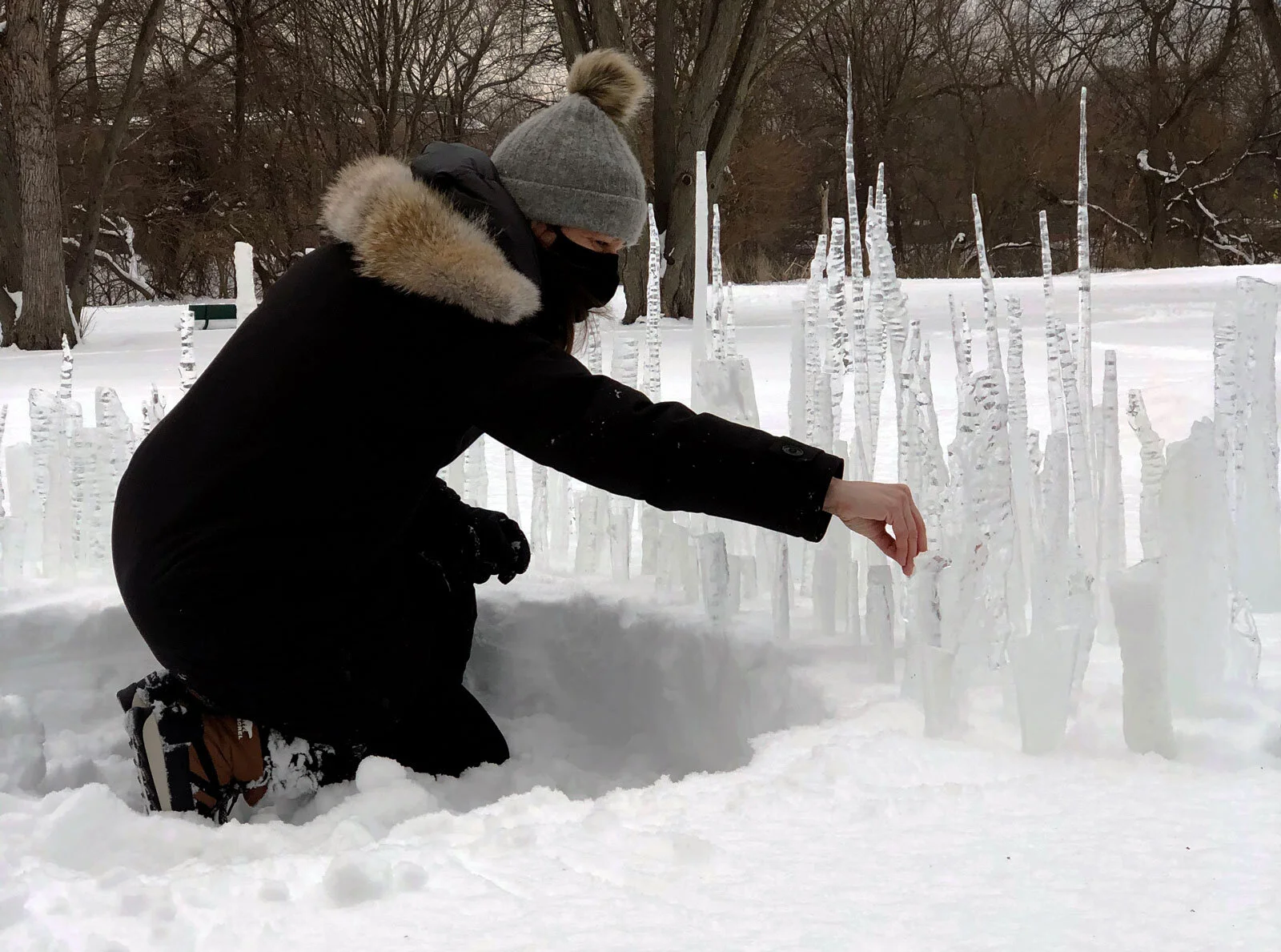
Heather Hancock 2/21/21
As we placed icicles a city skyline was clearly emerging. A lovely city-in-nature and nature-in-city connection.
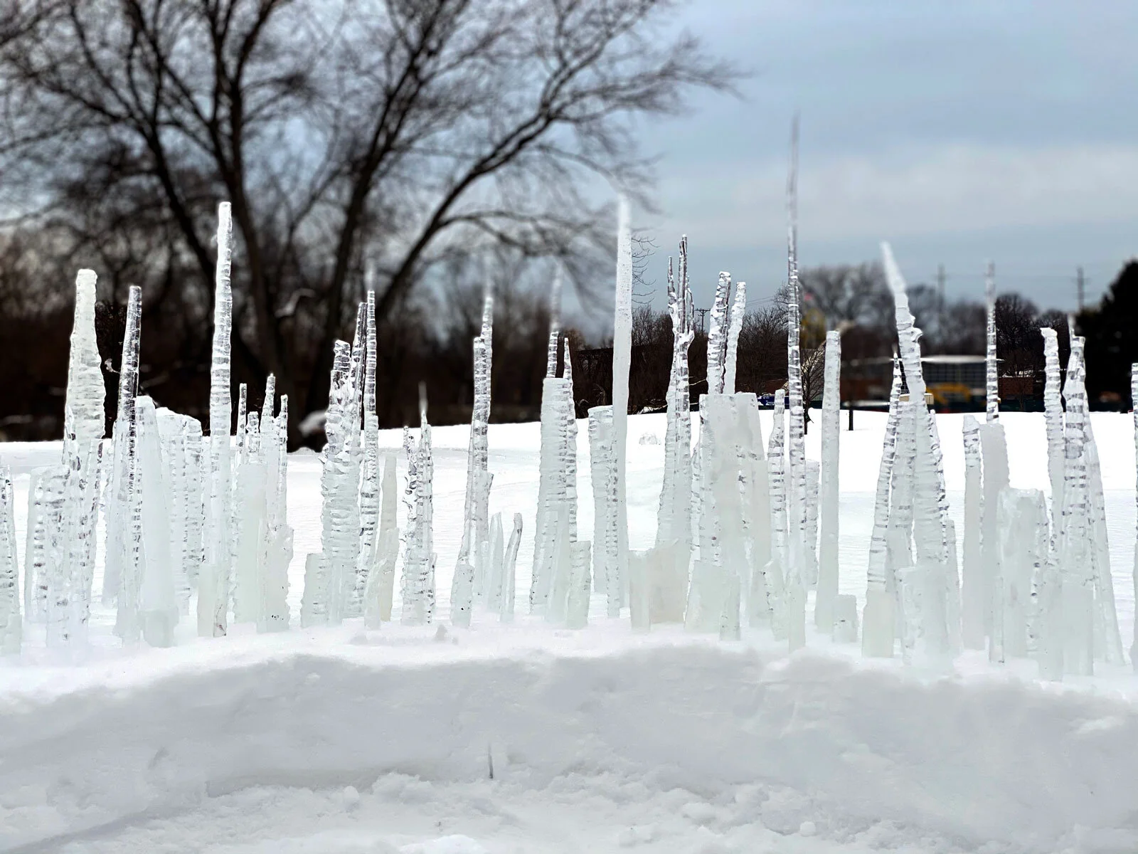
Icicle city (detail) Annie Asebrook + Heather Hancock 2/21/21
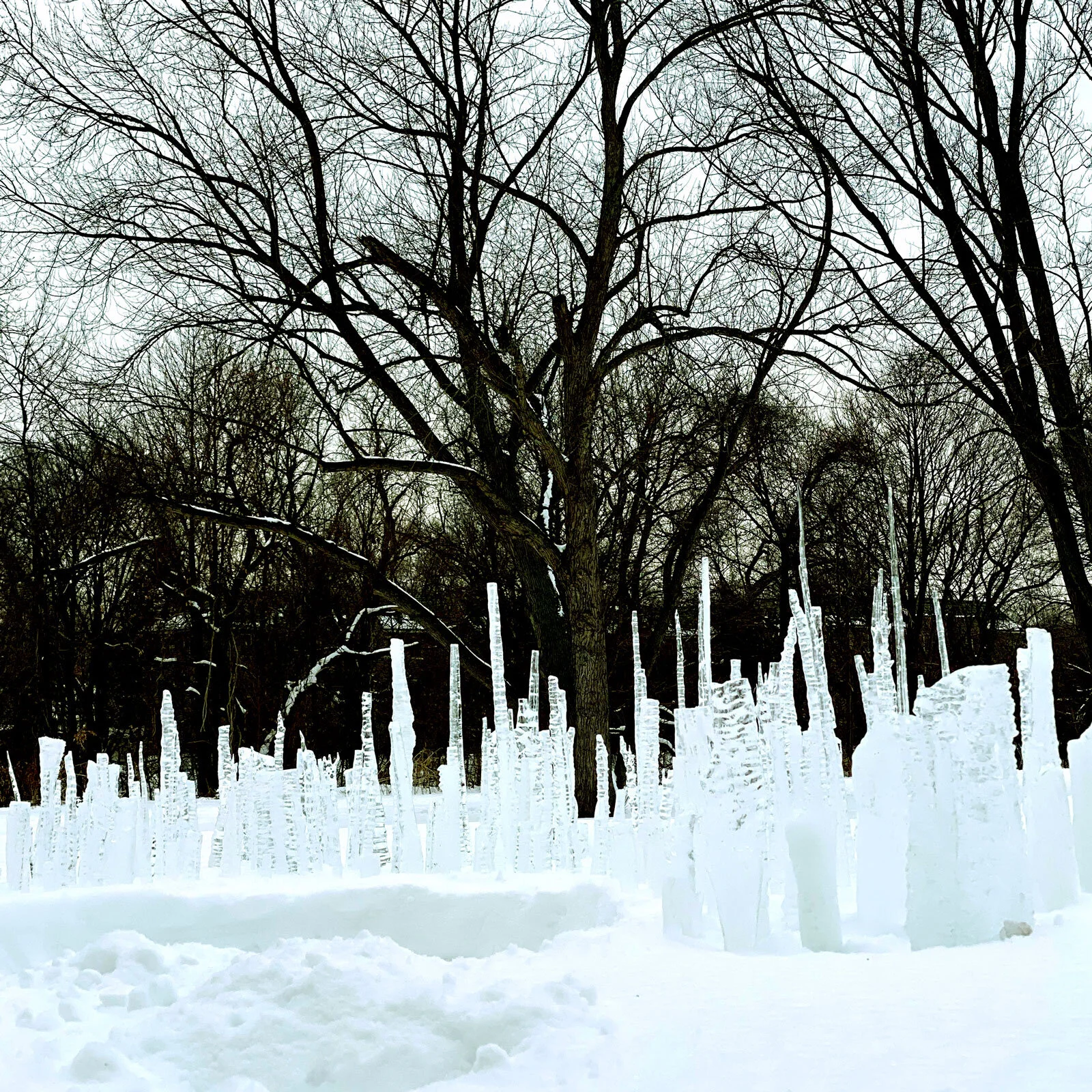
Icicle city (detail) Annie Asebrook + Heather Hancock 2/21/21
We took images knowing that with the temperature at 35 through the rest of the day and night the work was shrinking and would disappear by morning. Such a satisfying thing to create an ephemeral experience that returns to nature without a trace.
New ideas for spring GO series
I’m busy sketching ideas for spring GO series. Given my precision cutting approach to glass, I do refine ideas digitally. This helps translate ideas into material form. Things evolve while I’m cutting from this base composition. This spring is GO time! Heading back outdoors in search of color and signs of life and just maybe some social interaction. The words I’m encoding for this series include go, grow and bloom. And exploring lots of juicy ideas about nature-in-city and city-in-nature.


Happy Valentine's Day
February print arrived in time for Valentine’s—US shipments at least. : )
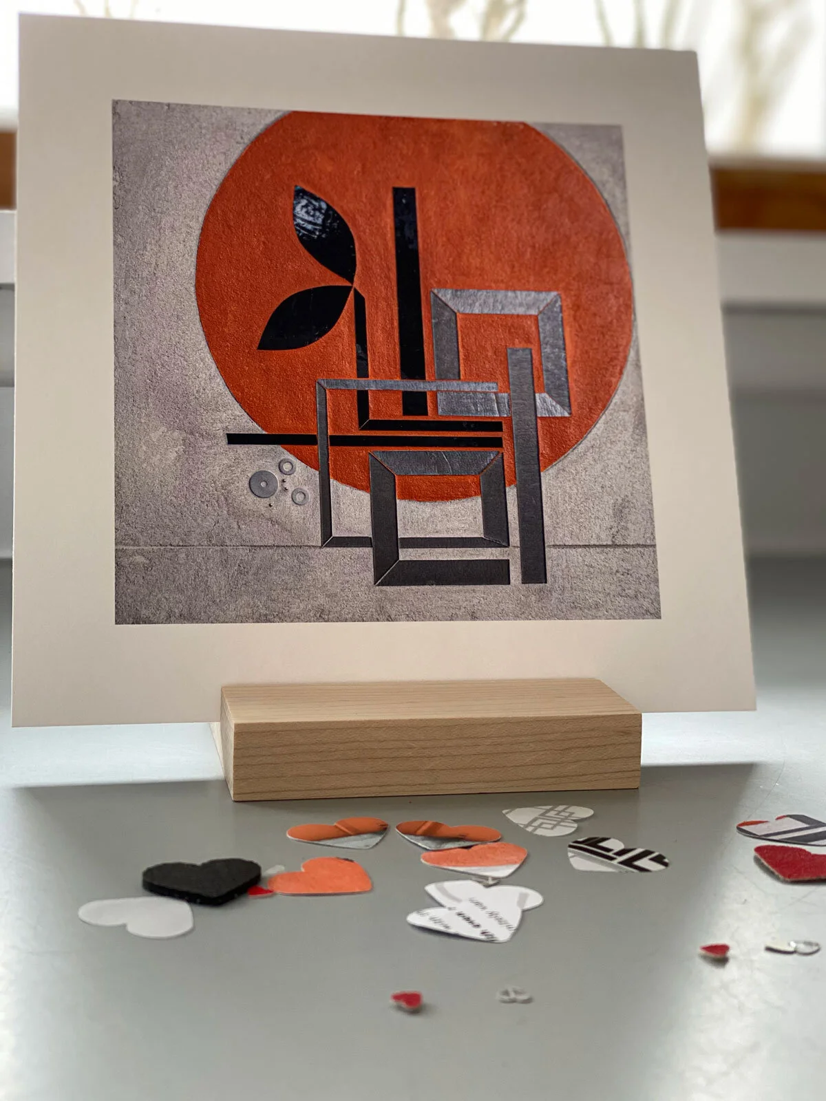
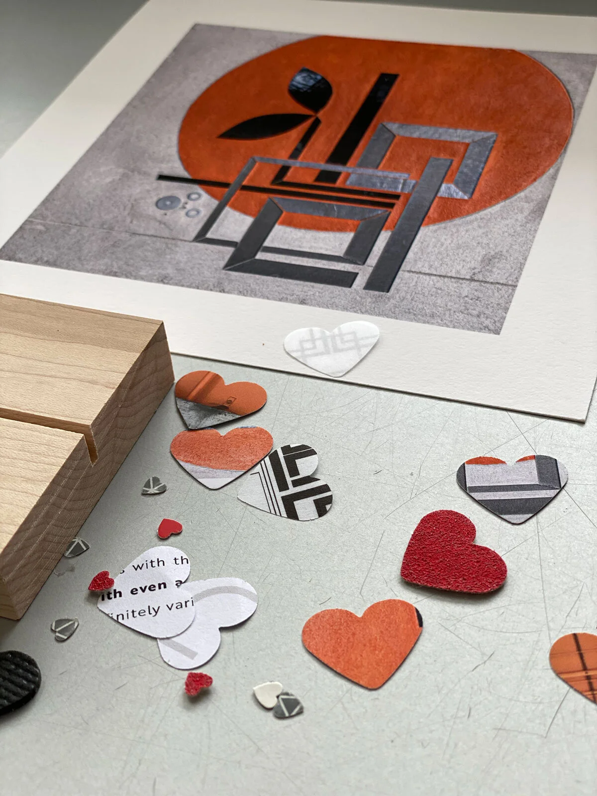
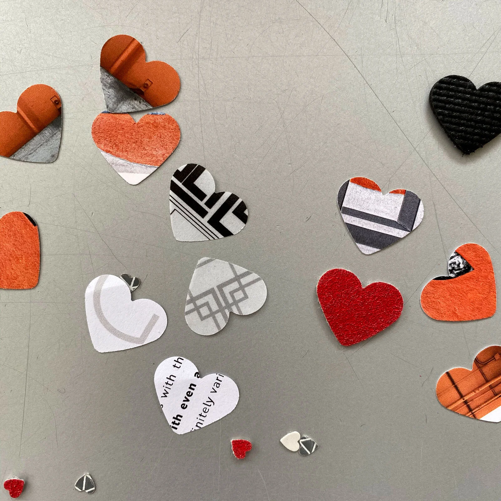
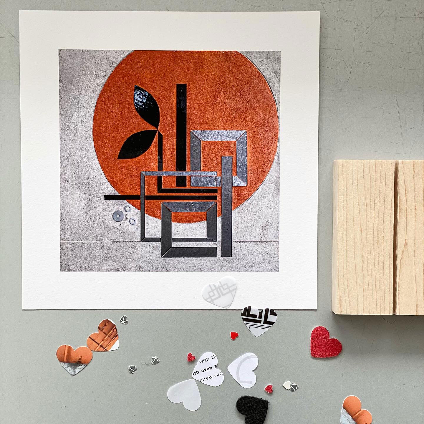
Crisp coherent line
in Fine Art
Something about a crisp coherent line that I find deeply satisfying: the horizon over Lake Michigan, precise rhythms of an architectural facade, street markings on asphalt.

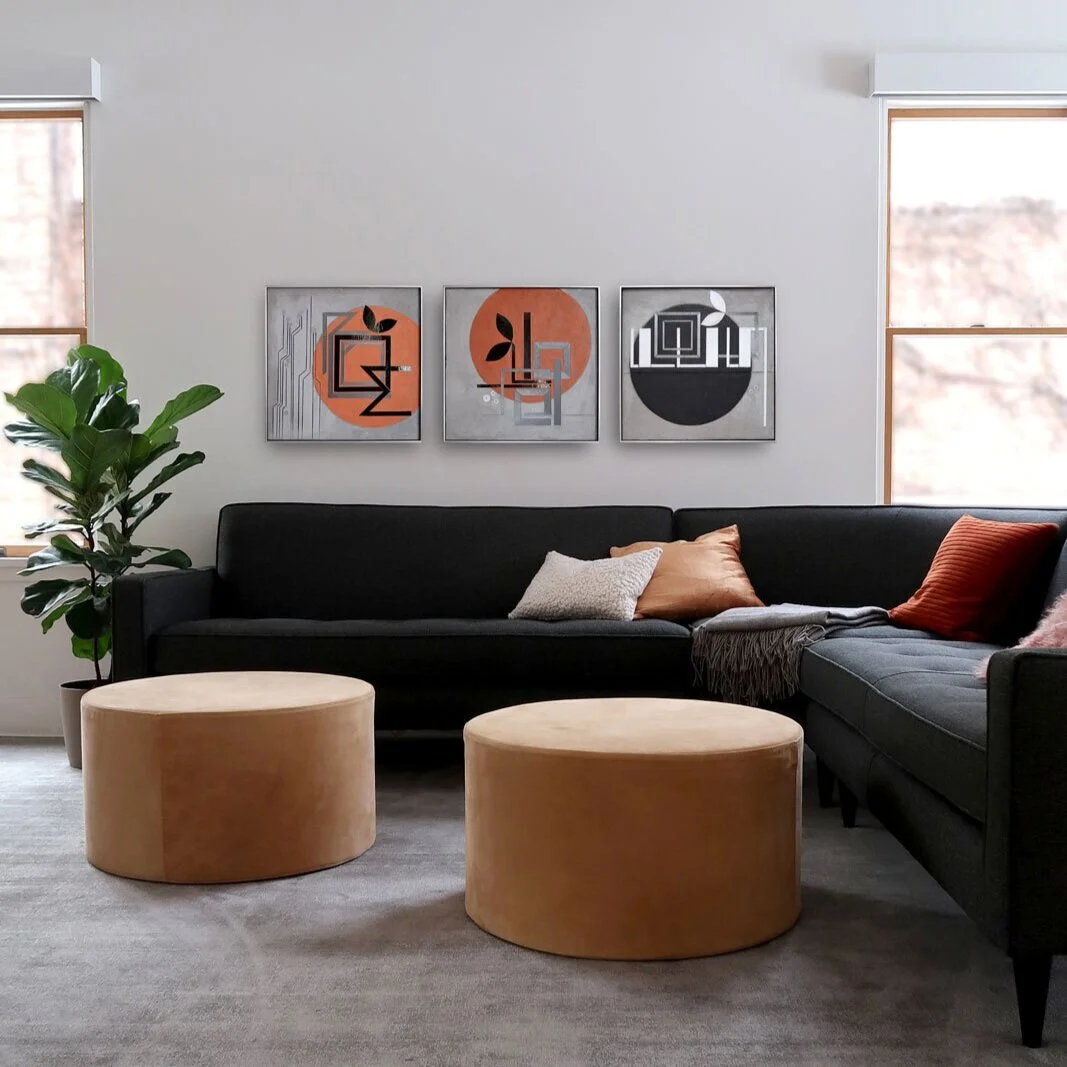
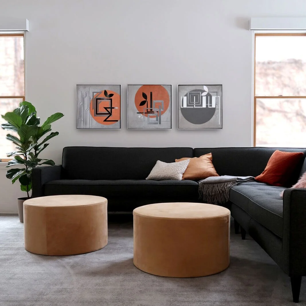
Final hanging | Art for home
I’m thrilled with this new hanging of ENCODE pieces. I love the grays+warm oranges in the white room. They are shimmering and catching light as I expected : )
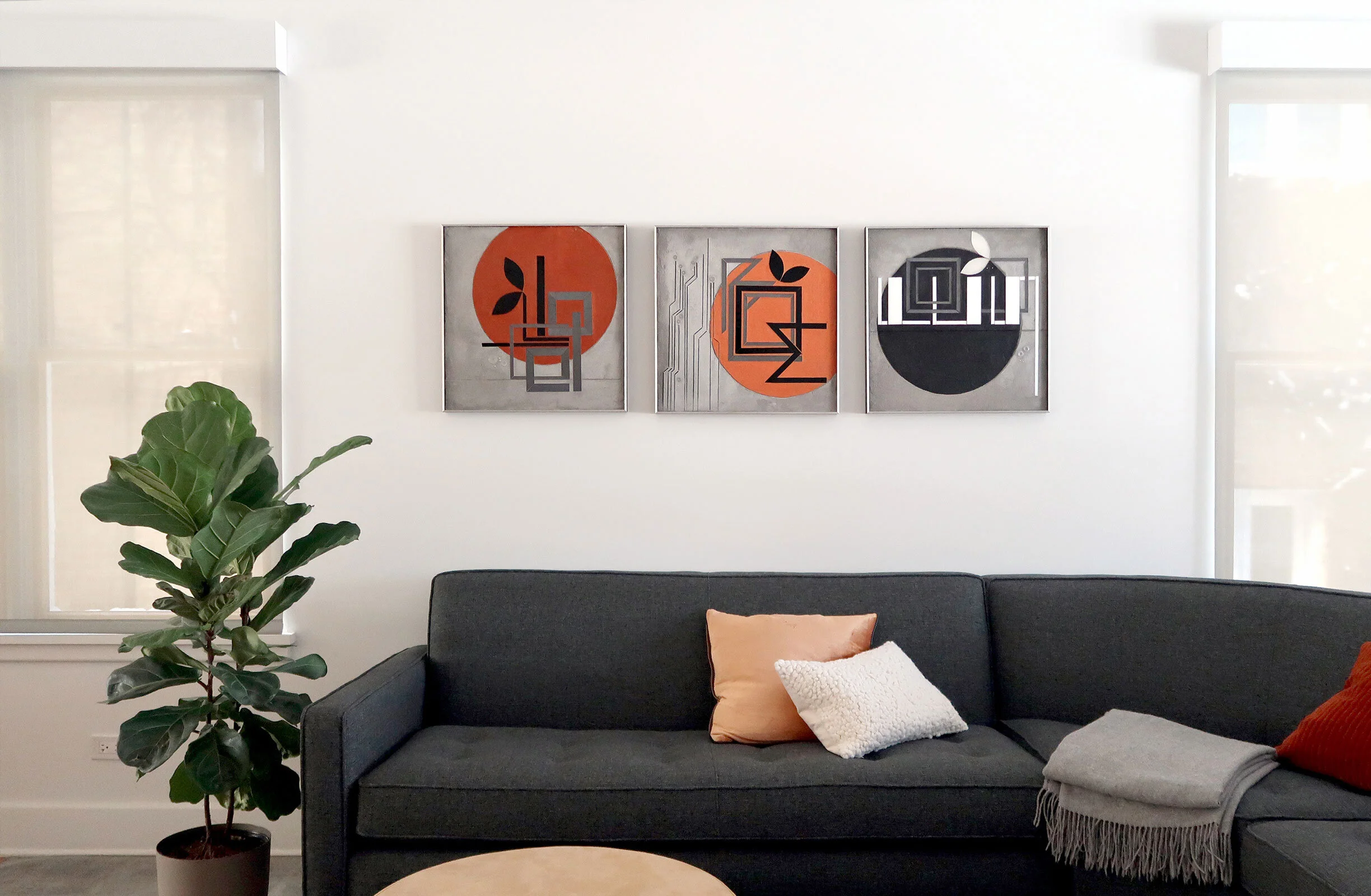
ENCODE: BUILD BLOOM FOCUS 20”x20” hand cut glass + paint c Heather Hancock
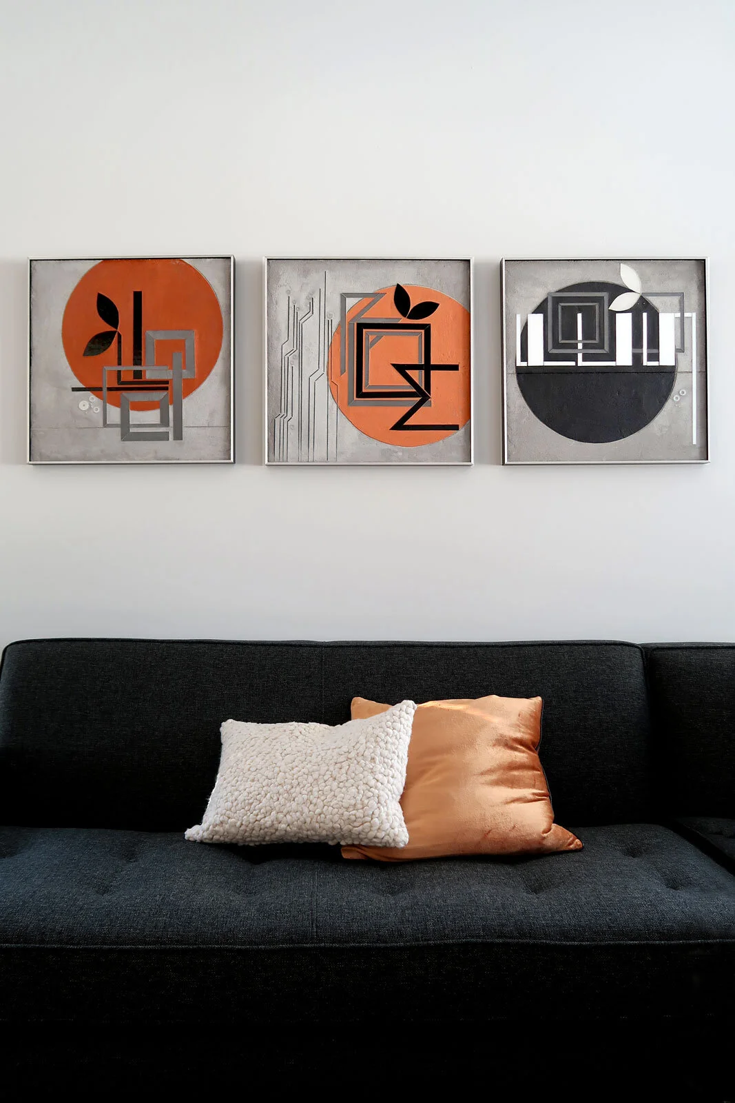
ENCODE: BUILD BLOOM FOCUS 20”x20” hand cut glass + paint c Heather Hancock
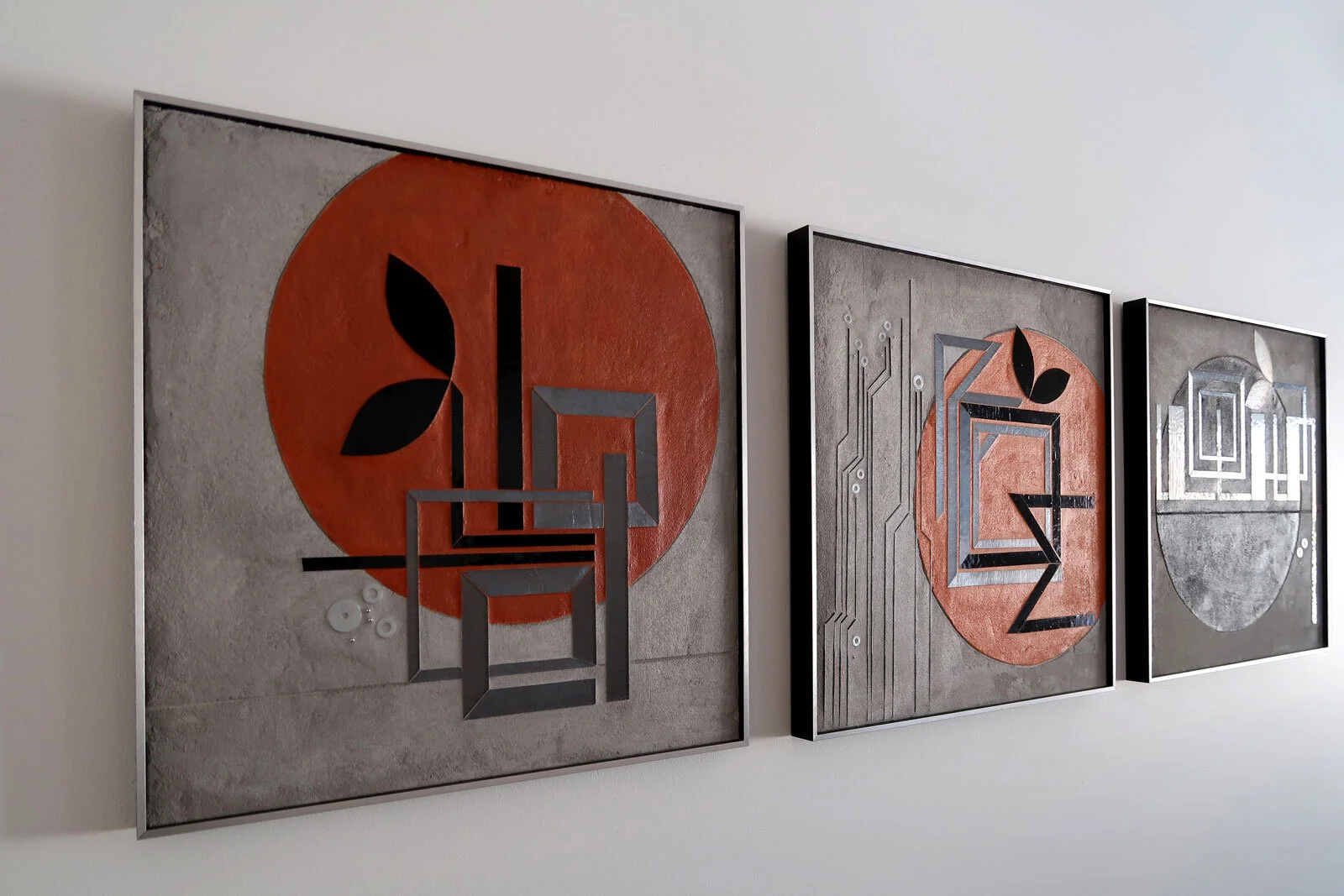
ENCODE: BUILD BLOOM FOCUS 20”x20” hand cut glass + paint c Heather Hancock
Repeating themes | Art in conversation
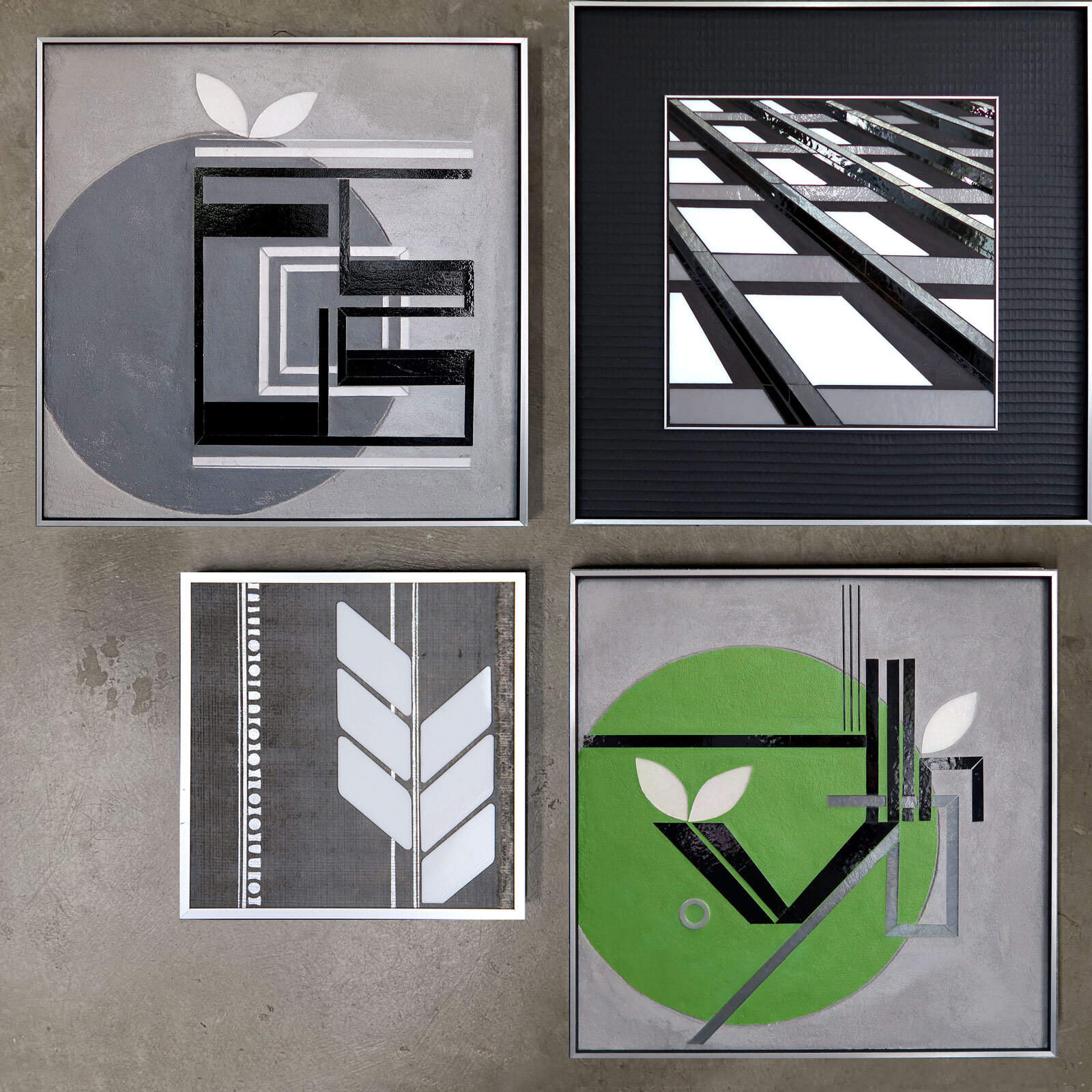
I am continuing to understand how my work is weaving together. Previous pieces and small technical sketches turn into new vocabulary elements. I am thinking again about how SCAN could be integrated into ENCODE as a compositional approach. I love the vertical flow of information conveyed in SCAN compositions. ENCODE emerged as a deconstructed simplified version of the text element. I could see SCAN composition now being informed by ENCODE with more negative space/silver textured canvas.
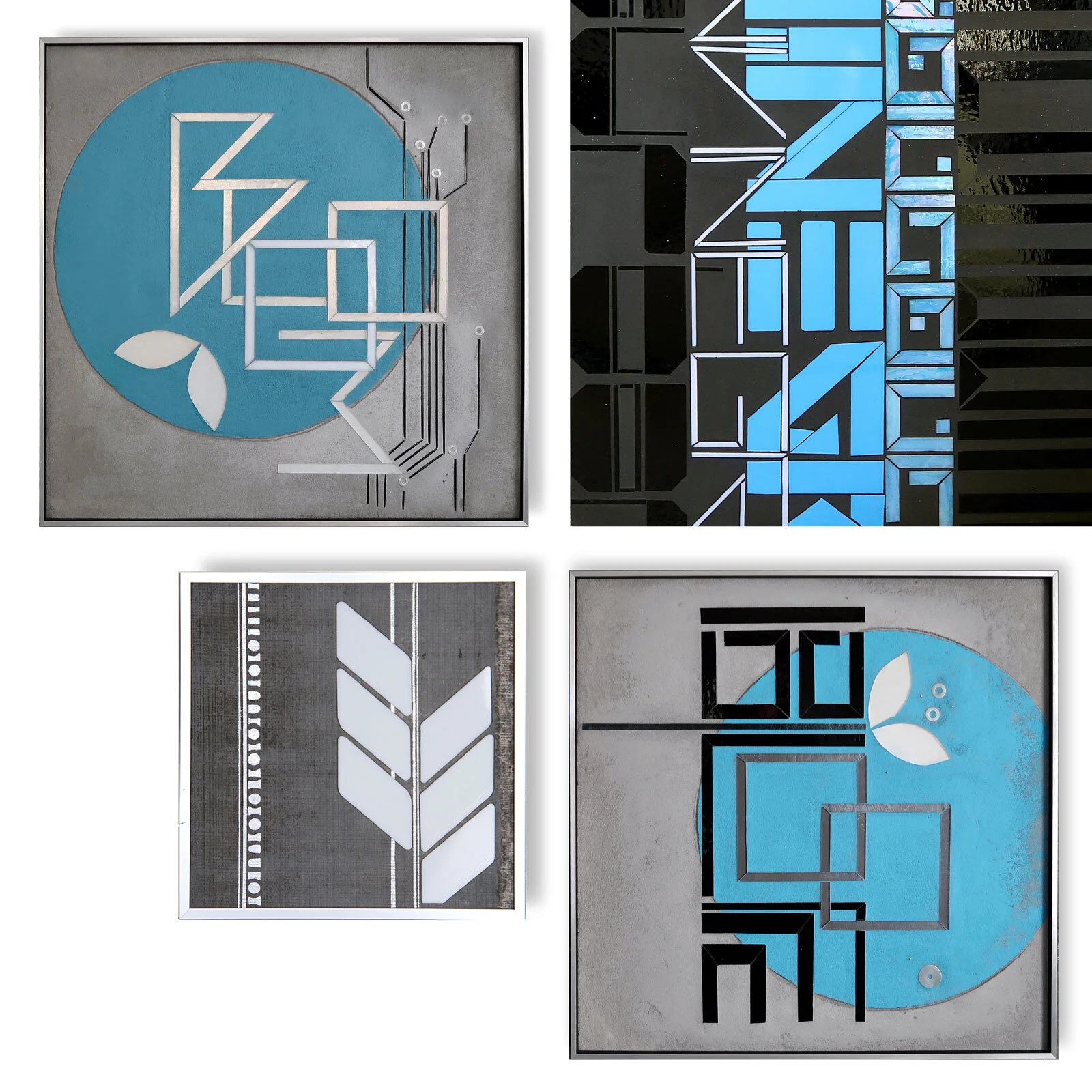
top L Encode: BLOOM 20”x20” | top R SCAN 26”x36” | bottom R Encode: BLOOM 20"x20” | bottom L urban vine 14”x14”
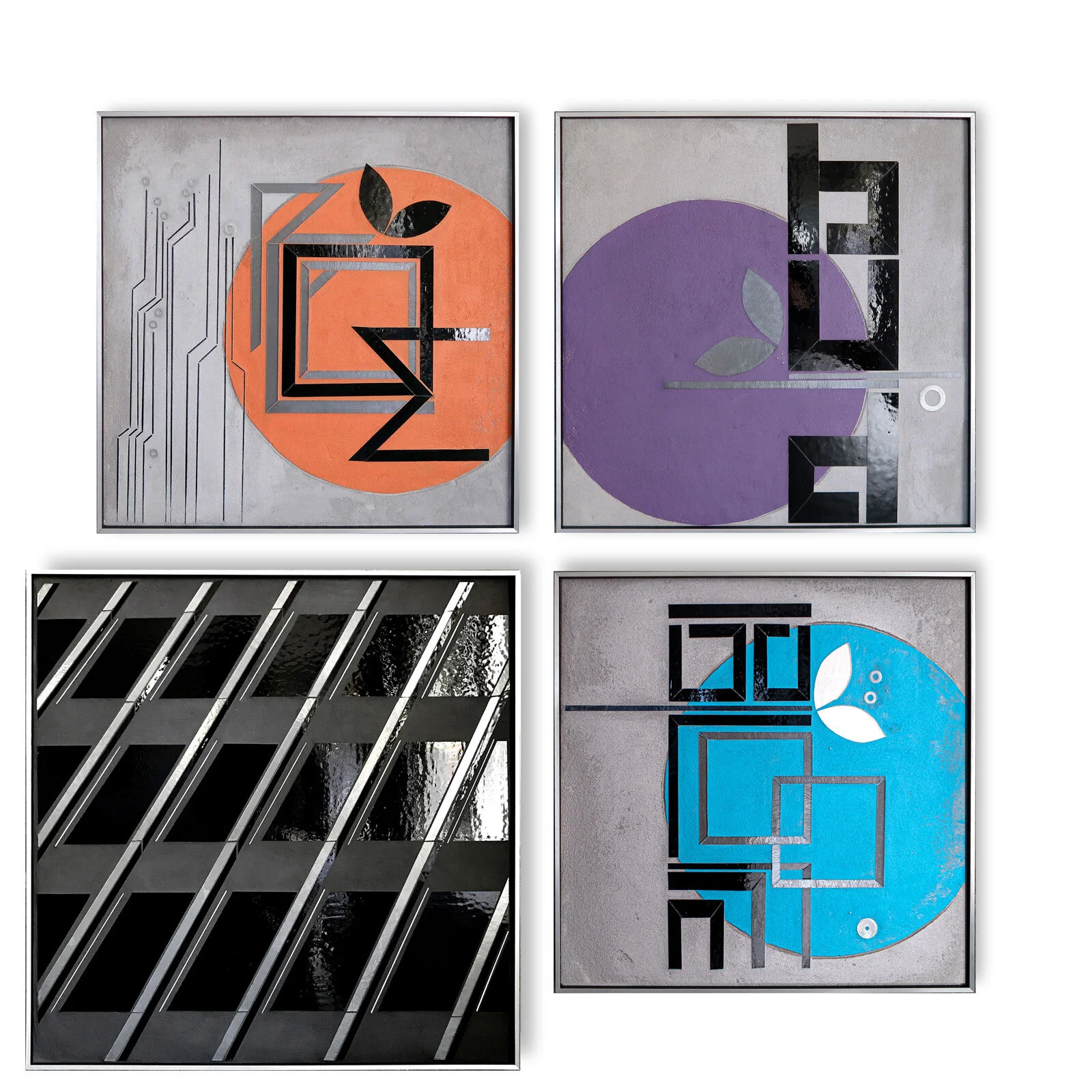
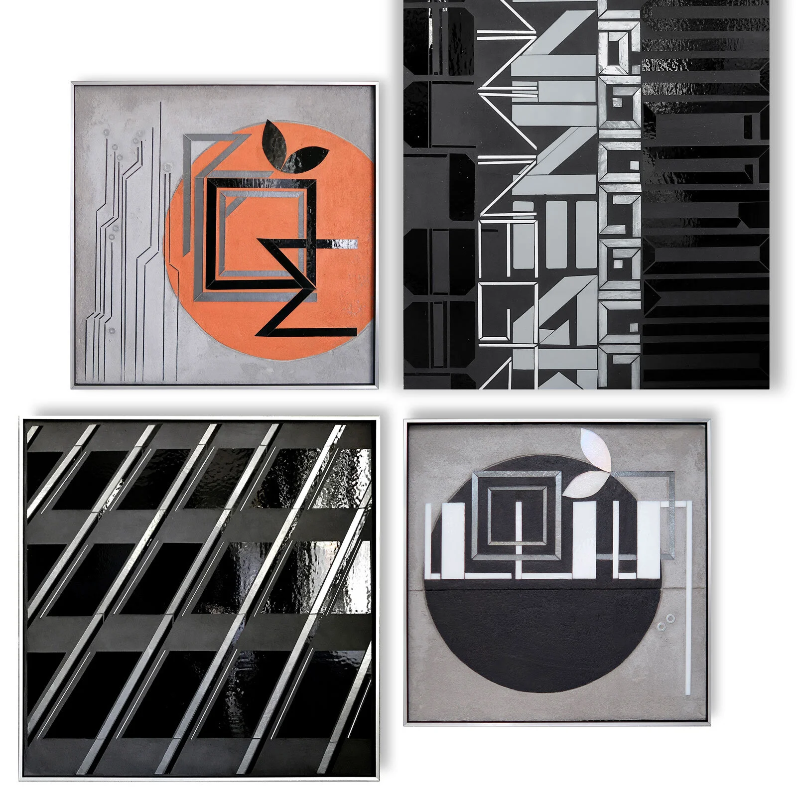
ENCODE | weaving together ideas + interests
I recently started grouping art across series and have noticed 3 things.
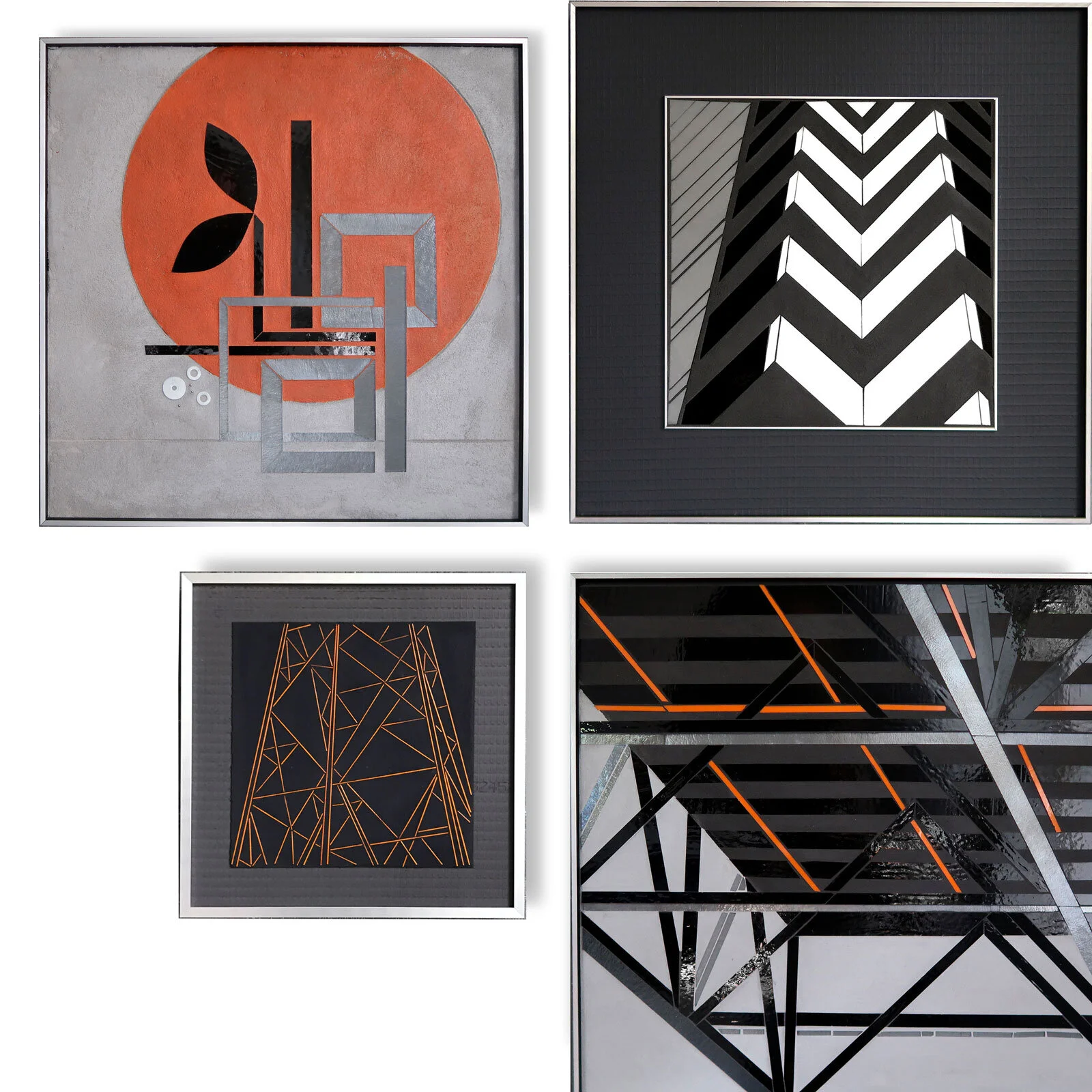
ENCODE: BUILD | REFLECT 22x22 | REFLECT Truss Study 24x24 | stringer sketch | power tower study
Concepts and motifs are starting to weave together and interconnect. I can see how small explorations have been incorporated in my visual vocabulary to be used in different ways in other work.
There is a common underlying theme of “seeing the city’"…or maybe more accurately “reading the city.”
Approaching the city as information, I have explored the vocabulary of architecture in REFLECT. Add in the human body+mind and regular architectural line and form is distorted by visual perception.
In ENCODE I am again exploring information. There’s implicit information in surfaces and textures and transitions (ie thinking city infrastructure: roadways, sidewalks, buildings). And there’s explicit information in signage and markings that guide, direct and limit behavior. ENCODE re-purposes this material and typographic vocabulary. Approaching language as a generative force, compositions use both form and content to offer new information. Inspiring ideas are presented as a partially abstracted sculptural form and embedded in enduring concrete.
The other piece to ENCODE is that reference to nature in the graphic leaf element. I often talk about the points of intersection between city+nature. But I’ve been thinking of a false dichotomy between city and nature, or an artificial boundary that simply doesn’t exist. Every city is plunked on top of nature…and nature rebounds and grows and does its best around our engineering. It is the ultimate model of resilience. Transforming and thriving in hard environment. There’s more to explore here for sure but for now, nature is fully integrated into this vocabulary. I struggle with whether this reduced/graphic approach is the right idea. Lots to think about here.
Adding in the circle seems to be all about joy for me. I’ve often incorporated circles into my work. I love how simple this painted circle is. It makes me happy.
I can start to see how work from different series is in interesting dialog.
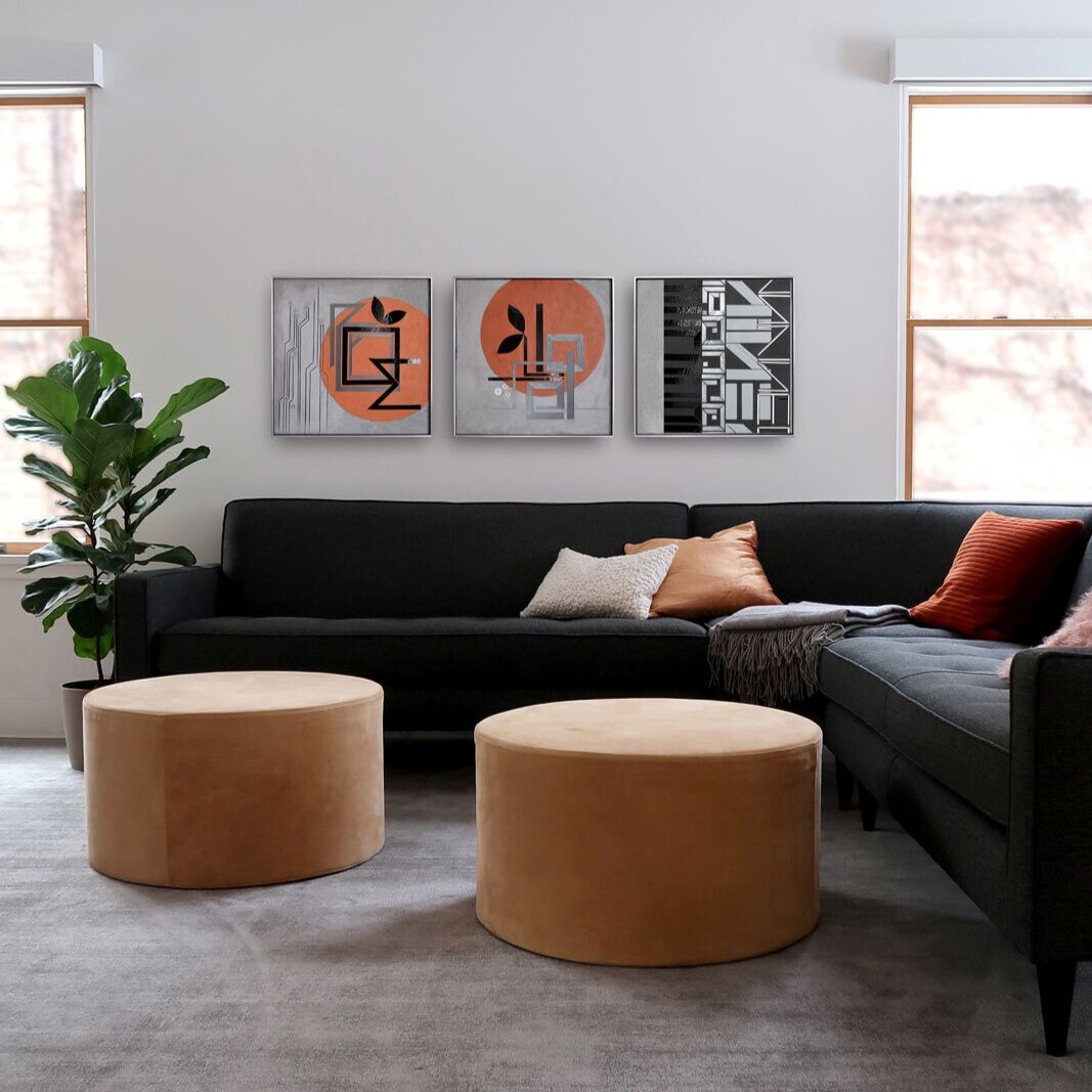
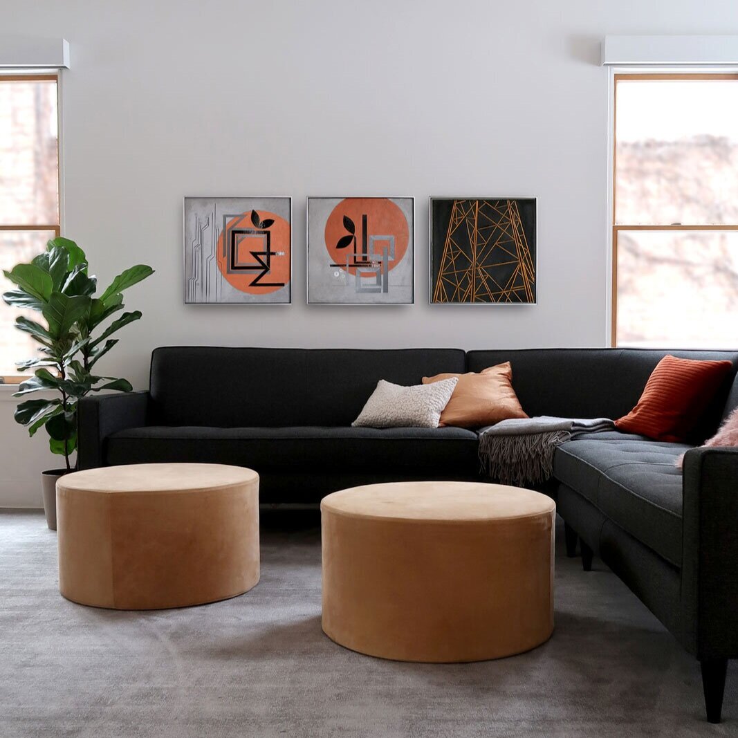


Art for home
Art for Residential Spaces
I’m working on an art hanging for our living room. I’ve banged nails into this wall for art hangings for years and it was high time for patching and a paint refresh. I used Benjamin Moore Decorator White. Looks great.
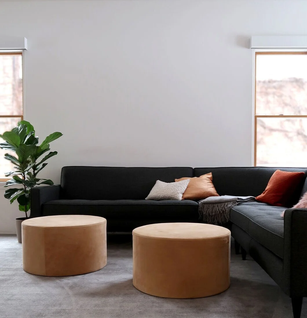
Benjamin Moore Decorator White refresh
I originally thought I wanted a set of two or three ENCODE pieces with pale steel blue accents. As I started looking at pieces in the space, turns out I’m more drawn to the warm oranges. And totally loving all the different shades of orange that I’ve explored this year. So thinking a set of ENCODES with orange and possibly balanced with one gray one.
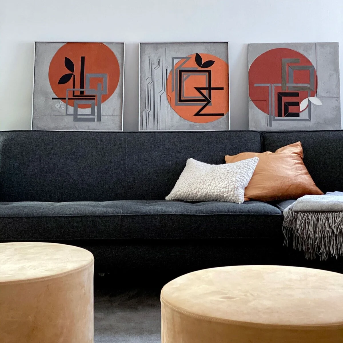
warm oranges | ENCODE series 20”x20” c Heather Hancock 2020
For now, my plan is to be able to hang sets of 2 and 3s on this wall. And swap out work over time. I love living with work and seeing the differences with daily and seasonal cycles. I’ll start with this grouping. And I am toying with softening the gray in the right panel. TBD.
Encode BLOOM BUILD FOCUS glass + paint 20”x20”
Inauguration day
Feels like a whole new start today. Staying focused on THRIVE. How do we make space for everyone to thrive? Looking forward to big ideas and renewed energy in 2021.
Green for white+gray January
I come back to green + gray again and again in my work. Nature finding a way to thrive around the hard cold urban textures of concrete and asphalt and brick serves as a model of resilience.

Winter Survival Edition | art prints (January THRIVE)

Winter Survival Edition | art prints (January THRIVE)
Encode art postcards | packaging up
The January prints arrived. So happy with how the texture and reflectance in my work translates into ink and paper. Now for packaging up.

Winter Survival Edition art prints | January

Winter Survival Edition art prints | January

Winter Survival Edition art prints | January
Encode art postcards | Winter Survival Edition
I’m thrilled with a new art subscription option that offers an easy way to live with art every day. Less ephemeral than Instagram…and not the full commitment of an original...one art postcard arrives per month for three months. The first print ships mid January with a gorgeous little maple photo stand crafted by Evanston woodworker Tony Sosa.
I see this as a new space for curation and innovation, taking work offline and back into the physical world. It gives me the ‘conversation’ over time I crave as an artist. I love how the prints translate texture and reflectance into ink and paper for a completely new experience of my work.

Winter Survival Edition 8”x8” art postcards | sent 1/month for 3 months

maple photo stand comes with 1st art postcard delivery

maple photo stand

Winter Survival Edition | art postcard series
REFLECT inspo
in Fine Art
And I have thousands of images of built world moments that inspire my REFLECT series. It is our interaction with the line and transitions in the streetscape that creates infinite unique perspectives and rhythms.


Sample inspo | REFLECT series

REFLECT 3.9 edge | 2@48”x30” glass c Heather Hancock 2019
ENCODE insp
in Fine Art
I’m updating my portfolio for 2021 with new work. As I scroll back through my iPhone pix I can see inspirations for color, composition and texture from visual moments I’ve noticed over the past several months. Here’s a small sampling of the every day moments that inspire my work.

Encode: BLOOM 20”x20” glass + paint c Heather Hancock 2020


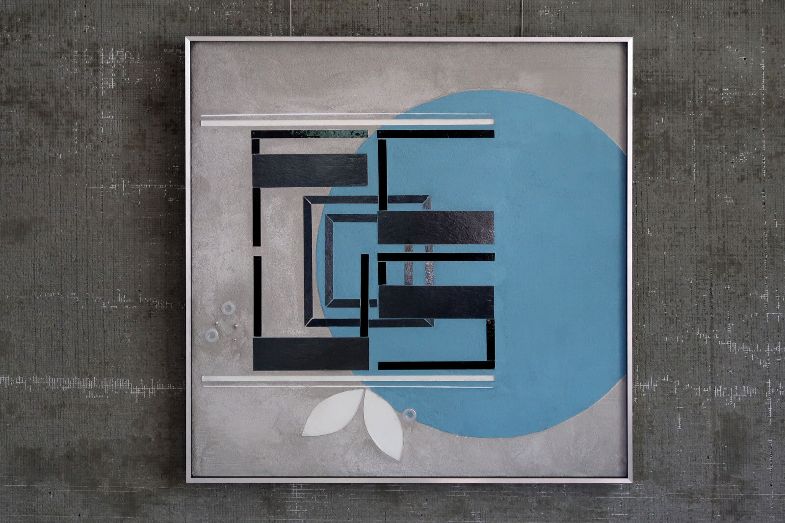
Encode FOCUS | glass + paint c Heather Hancock 2020
Happy New Year
in Fine Art
HNY cards going out today. Excited to be diving back into new projects. New ideas to build!

Encode BUILD + AIM | 20”x20” | glass + paint c Heather Hancock 2020

Holiday season making
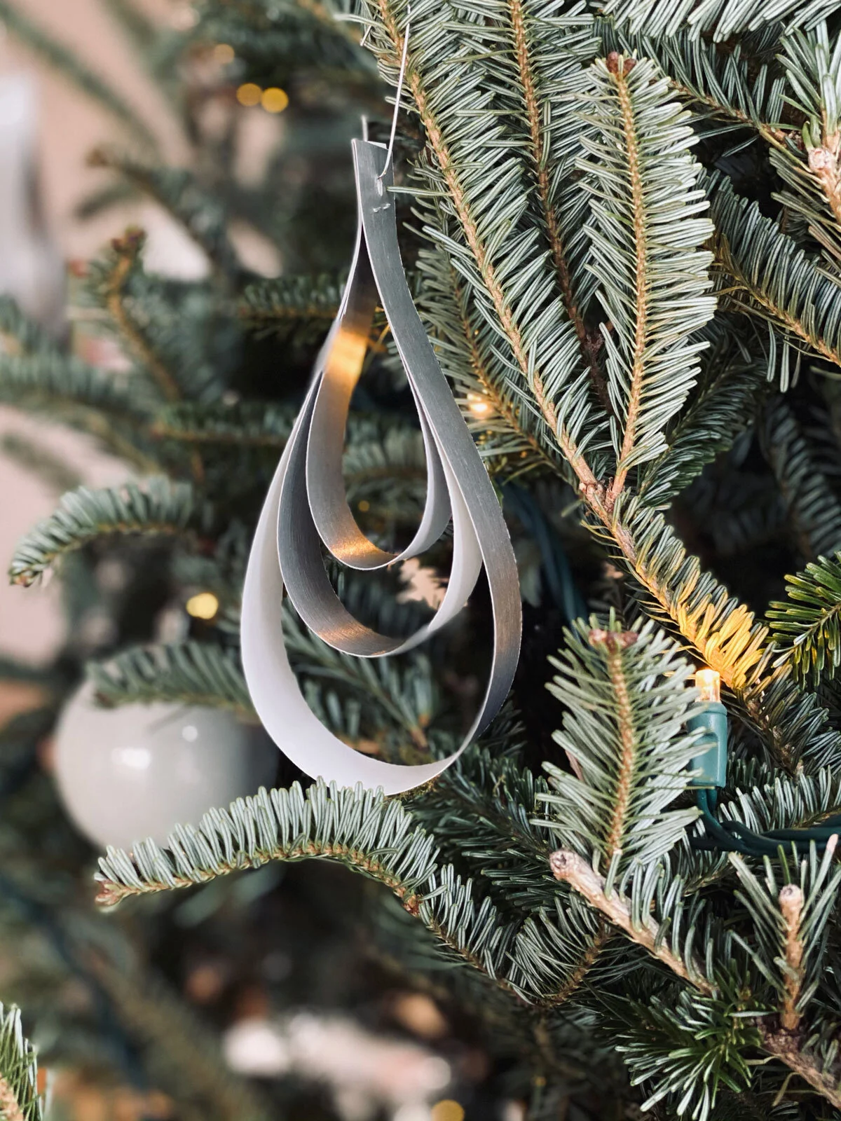
Every year I love experimenting with a new tree ornament idea.
This year, I had a huge supply of gorgeous silver Neenah paper to work with. And wanted a simple curving shape. Look at it straight on and the lines almost disappear and then re-appear as move to angle view. Simple. Beautiful. Catching light.




ENCODE: AIM 20”x20” glass + paint c Heather Hancock 2020
Grayscale kind of day
in Fine Art
Some days call for gray on gray.

ENCODE: Focus | hand cut glass + paint | 20”x20” c Heather Hancock 2020
I regularly cycle between popping saturated color and grayscale. I ended up working in mostly with grays, blacks and whites a few years ago when certain colors of glass were not readily available. I was exploring architectural form+line at the time so grayscale was an easy and logical simplification of my glass palette. I’m ready for color again, and finding my paint palette with ENCODE but I’m also mixing in some grayscale pieces and love how these look.

grayscale | ENCODE + REFLECT c Heather Hancock
I especially love to see the dialog with the architectural series. I can see that these different approaches to beauty and information in the cityscape are connected. There’s something so clear and crisp…helps me focus.

BUILD mix and matching
in Fine Art
Encode pieces offer a playful new approach to seeing the city. This work understands information as a key element of cityscapes and offers three types of information.
First, the material and dimensional nature of hand cut glass is understood in contrast with the textured, etched and painted canvas. This object-ness is surprising and satisfying in a 2D art hanging. Glass, concrete and paint are borrowed from the material vocabulary of contemporary architecture.
Second. The viewer is invited to decode an abstracted word form. Encode subverts the signage and information ubiquitous in the cityscape where it functions to control or limit behavior and repurposes it with a personal message of optimism and hope.
Third. The pieces shift and change with motion and light for a constantly changing visual experience. A viewer is invited into participation, co-creating the work with infinite variability. This enaction points to the idea of embodied cognition with mind, body and environment acting as an integrated system.