General

creative inspiration thanks to eighth blackbird at Millennium Park

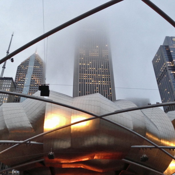
on the lawn_Pritzker pavilion Trying to keep summer going as long as possible. An 8:30pm swim on a 95-degree evening helped on Tuesday. Taking in the eighth blackbird et al concert at Pritzker Pavilion was last night's keep-summer-going activity.

3 take-aways from the evening:

1. Context. Listening to the hypnotic Lesley Flanigan followed by the energetic, experimental music of eighth blackbird with Glenn Kotche (of Wilco) was entrancing on a warm, foggy evening. Flanigan's sound installations with layered electronic and vocals inset into acoustic noise and the impossibly complicated rhythms and themes created by the percussive eighth blackbird seemed to be in dialogue with Frank Gehry's ribbons of stainless steel and glinting curves at the Pritzker Pavilion.

2. Collaboration. Last night's music featured multiple collaborations and made me think about the momentum that is generated with different perspectives and inputs and creative energy. These extraordinarily talented musicians are working out a fabulously complex vision. It's undoubtedly a complicated group effort that lets each of them get beyond their own individual vision to a much bigger collaborative one.

3. Experimentation. It's good to experiment. New sounds, rhythms, instruments (and ways of using instruments) is standard fare for eighth blackbird. The work is not always easily accessible, but it coheres and challenges in a way that I love. Doing things that push technical and conceptual limits is part of our human need for finding new information within noise.

These are all topics I think about on a regular basis as key parts of my creative practice. I'm all about context and love experimenting...need to keep finding creative collaborations to get beyond my own vision. Thank you eighth blackbird + Lesley Flanigan + Glenn Kotche for an inspiring evening.
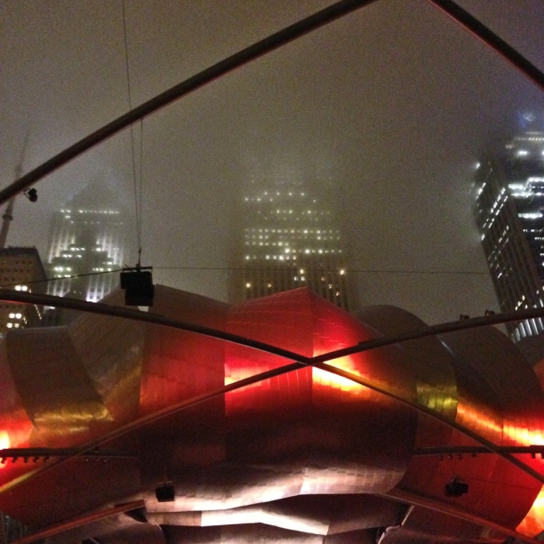
on the lawn | Pritzker pavilion


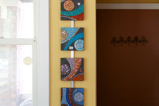
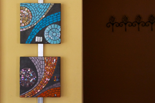
Emblems | catching light

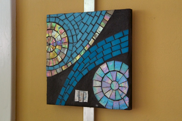
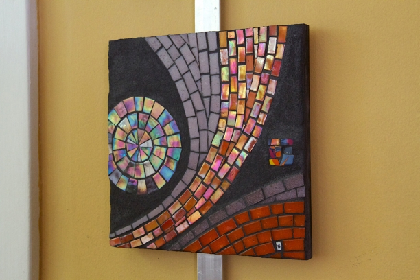
8“ x 8”  | vitreous glass, vintage china and ceramics and grout on wood emblems (2007) | 8" x 8" | vitreous glass with ceramic details

I made these Emblems between 2006-2008. Pointing to an original meaning of ‘emblem’ as inlaid, mosaic work, these small pieces feature hand-cut vitreous glass and inlays of recycled vintage china and ceramics within the grout elements. Emblems served as color studies, letting me explore vibrant colors combinations in stark contrast with the matte charcoal gray grout background. The graphic compositions were drawn from a larger work, Trace, to create open-ended pieces that point to something beyond themselves.  Based on a biological/cellular visual referent, Trace considers the continual change and movement in our daily lived experience.

I love the simplicity and playfulness of these pieces. Hanging them in sets seems to extend the energy of the individual pieces.

emblems (2007) | 8" x 8" | vitreous glass with ceramic details


emblems (2007) | 8" x 8" | vitreous glass with ceramic details


emblems (2007) | 8" x 8" | vitreous glass with ceramic details

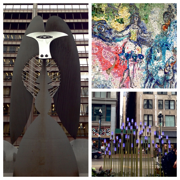
Art and well-being | wandering in downtown Chicago

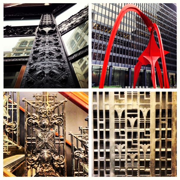
A meeting with Gensler Architecture took me downtown to the loop last week. After a great conversation about materials and surfaces and the interaction between art+design and well-being, I wandered for a couple of blocks to see the Picasso, Alexander Calder's Flamingo and the Chagall mosaic at Chase Plaza. Along the way, I could see Gehry's concert space at Millennium Park, stumbled upon a glass "flower" installation and found many architectural details. I recently reviewed the chapter on healthy cities in Esther Sternberg's 2009 book Healing Spaces: The science of place and well-being. She summarized urban design studies that have found architectural details and variation can encourage walking and therefore connect to health and well-being. NYC is seen as the model city for providing an engaging pedestrian experience with architecturally rich streetscapes. While Chicago is sprawling and chaotic compared to NYC, its skyscrapers and infrastructure and architectural detail are balanced with plantings and public art and the lake. When the weather cooperates, it's a fantastic wandering city, and I headed home to Evanston along the lake again captivated by the beauty and variety of this midwestern city. the Picasso | Chagall mosaics detail | glass art installation
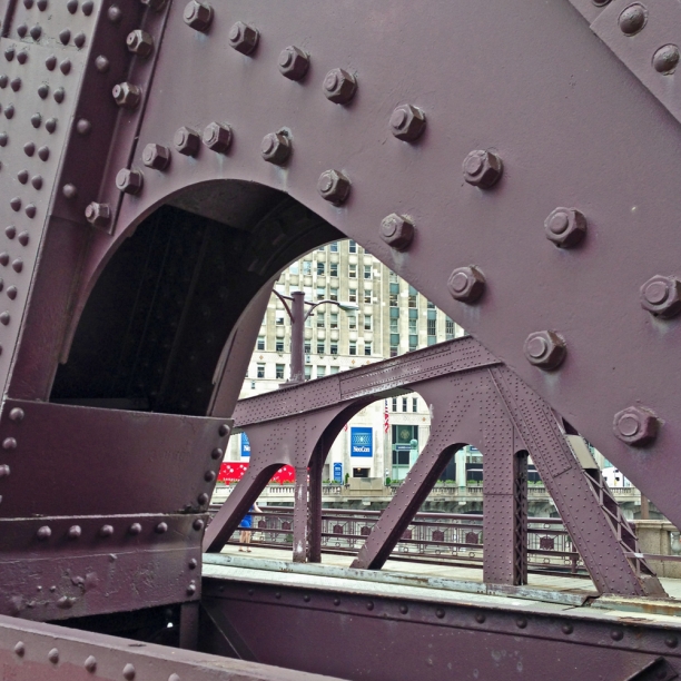
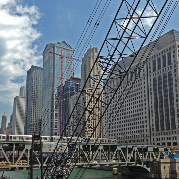
architectural details | Calder's Flamingo | Chicago, IL


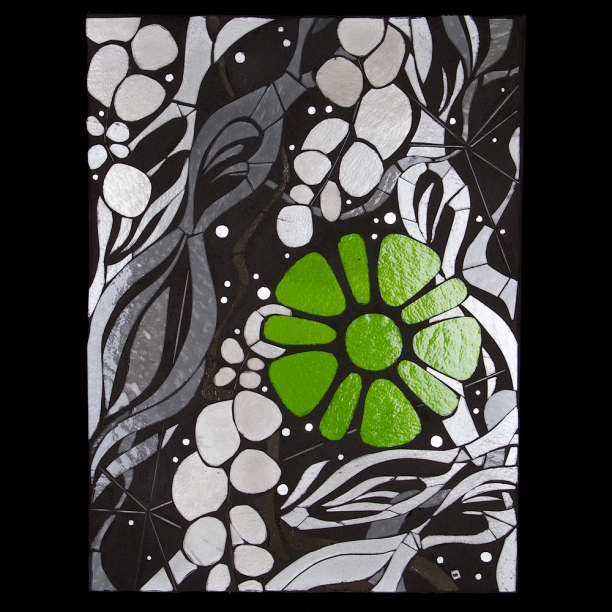
Bloom 4.2

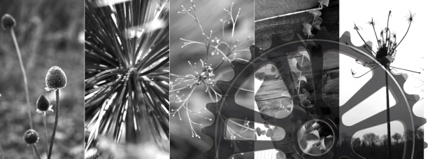
inspirations | Bloom 4.2

Bloom 4.0 is the next progression in the Bloom series that started taking form in 2009. I’ve always thought of Bloom as my ‘urban foliage’ idea…my ‘street flowers.’ The squared blooms are graphic and angular, belonging as much to the built environment as to the natural world. Glass rods add a strong linear element opposite the green leaf forms. If I had the nerve, they’d be my version of Invader, tiny pops of color and life installed on urban canvases. I settled for a temporary installation, Modern Ruins, to explore the effect of tiny Blooms against monumental urban wastelands.

A progression in technique (layering of glass explored in Trace 2.1) and concept (finding beauty and information in the structure and geometry of the built environment in Scan 5.1) brings me to Bloom 4.0 which combines two core ideas: finding beauty and information in unexpected places and connecting organic curves and rhythm of the natural world with the geometries of the urban environment. The second prototype in the Bloom 4.0 series features an industrial orange against grayscale foliage.

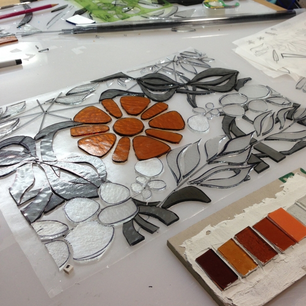
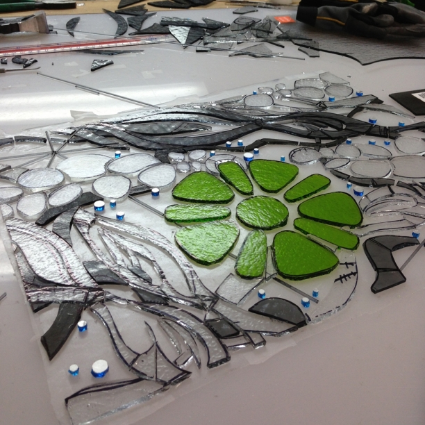
WIP | Bloom 4.2 | 12" x 16"


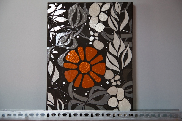
Abstracted botanical forms are layered with mechanical and structural elements. The negative space from a bicycle sprocket forms the orange 'bloom’ and linear elements in glass stringer refer to structure and support. The organic forms are realized in grayscale, suggesting the overlooked but ever-present and powerfully regenerative natural context for the urban world. Living in urbanized settings requires new ways of seeing and connecting with nature.

Bloom 4.2 | 12" x 16" | glass, gold, grout

Full set of images of Bloom 4.2.

So I met this leaf

I met a leaf on the way to yoga yesterday. I couldn't stop thinking about it. Wrong side up and covered with drops of moisture, it was a beautiful form that I could envision as a continuous element for the Bloom 4.0 series. I was delighted when it was still there on my way home.  Thinking in glass means considering how light and concept interact as well as the connection between form and technique (as in, can this form be cut from glass). There are more and less cut-able forms and some part of my drawing practice seems to be about finding the next cutting challenge. At one point, this significantly constrained my drawing but now, working in sheet glass, I can cut largely anything I can draw with some modifications. I am a little obsessed with creating forms with complex interior elements. Bloom 4.1 features flowing, organic forms that provide a background of abstract continuous foliage. I've been waiting to use these forms but at small scale it is really difficult to create smooth, coherent exterior and interior lines. This new leaf form is an easily cut additive form which can be reduced to a spare, stencil shape and still offer a continuous foliage structure for a small-scale resolution piece. leaf on the ground


leaf sketch


Bloom 4.2 protoype


Concepts: circuit lines and concrete

I often take pictures of sites that could form an interesting connection with an art installation. I keep coming back to my circuit line in stringer experiment, Connect 1.0. For an actual project, I'd use lines relevant to the site (ie maps or data sets) to develop the drawing. There would be technical issues to resolve with this idea (ie could the work be ungrouted for an exterior application?). Happily, concepts are all about imagining without worrying about technical realities.
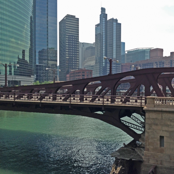
Concept: urban lines on concrete


Repetition and change: blues

Nature always gets it right: providing the perfect balance of repetition and change. Some days the color of the lake and sky seems relatively static but yesterday the palette was changing minute-by-minute. Biking along the lakefront I couldn't take my eyes off the sky and lake. The clouds were scuttling by, creating a similarly dynamic visual experience. Here is a sampling of what I saw across a 2 hour timespan. Lake Michigan @ Clark Square | 11:00am | blues

Lake Michigan @ the Point at Northwestern | 11:22am | blues


Lake Michigan @ Clark Square | 12:51pm | blues


Urban exploring

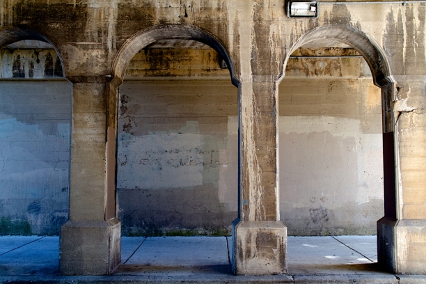
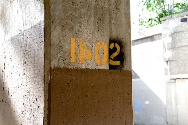
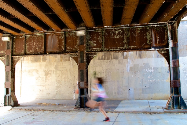
Summer is all about different rhythms and inputs and inspirations. Part of developing a sustainable studio practice requires spending more time on marketing and applications and submissions. But the only way I can stay motivated on the marketing front is if I'm getting equal amounts of reading and writing and photographing and drawing and, ideally, cutting time. This week my photography inputs were at the south Evanston viaducts at Mulford, a 5 minute bike ride from my studio. Photography has become an important tool in my intention to 'notice what you notice.' Over time, I've discovered that my images gradually inform my drawing practice in ways I can't predict or anticipate. I have been posting on Instagram lately and find it to be a quick and very playful way to notice and share a moment. Here are a few of yesterday's finds; I love these urban surfaces and textures and lines. viaducts at Mulford, Evanston, IL | concrete surfaces+lines

viaducts at Mulford, Evanston, IL | paint on concrete

viaducts at Mulford, Evanston, IL | metal and concrete surfaces + line


Reading landscape architect Roberto Burle Marx

A friend recently reminded me about Roberto "Burle" Marx, the modernist Brazilian landscape architect. I love the Copacabana beach mosaics and mural but had never explored his landscape projects. Working alongside modernist architects, Marx brought a painter's perspective to landscape design and a passion for reconnecting urban settings with the natural world. Organic, asymmetrical plantings brought colors and textures and curves to the rigid geometries of modernist buildings. He developed expertise in native Brazilian species and preferred massed plantings of single varieties of plants. Roberto Burle Marx | Cavanellas | c Malcolm Raggett

One of my interests in landscape architecture is the ways in which viewer movement and changing perspective are taken into consideration. As a viewer walks through a garden, form, rhythm and line shift. Anticipating how glass installations will work with movement. His landscapes were also photographed from above as they are seen from the buildings. These top-down views show stunning compositions of organic and modernist, structural forms rendered in plants. Marx incorporated several fantastic mosaic murals into his landscapes, making yet another point of connection for me with this amazing portfolio of work.

The pavements along the Copacabana beachfront are fantastic.

pavement along Copocabana | Roberto Burle Marx | c Malcolm Raggett

The pavement images made me think about the curved lines and inter-related forms in Connect 2.0. More about Connect 2.0 here. Of course now I want to see Connect 2.0 realized in grayscale glass...whoa.

Connect 2.2 detail | glass, hardware, grout | c Heather Hancock 2012


The full set of project images can be seen at Malcolm Raggett Photograpy.

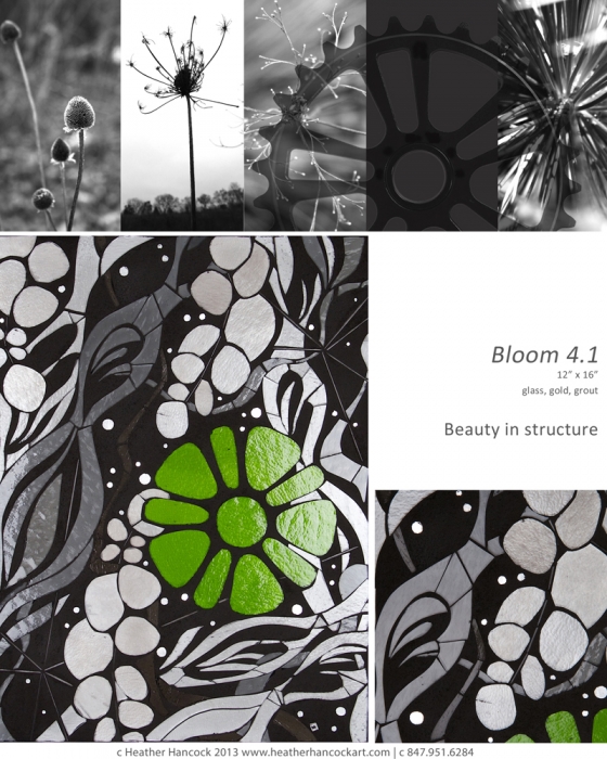
Studio experiment: Bloom 4.1

Bloom 4.1 | 12" x 16" | c Heather Hancock 2013

This week's studio experiment is the next progression in the Bloom series. I've always thought of Bloom as my 'urban foliage' idea...my 'street flowers.' The squared blooms are graphic and angular, belonging as much to the built environment as to the natural world. Glass rods add a strong linear element opposite the green leaf forms. If I had the nerve, they'd be my version of Invader, tiny pops of color and life installed on urban canvases. I settled for a temporary installation, Modern Ruins, to explore the effect of tiny Blooms against monumental urban wastelands.

A progression in technique (layering of glass explored in Trace 2.1) and concept (finding beauty and information in the structure and geometry of the built environment in Scan 5.1) brings me to Bloom 4.1 which combines two core ideas: finding beauty and information in unexpected places and connecting organic curves and rhythm of the natural world with the geometries of the urban environment.

Abstracted botanical forms are layered with mechanical and structural elements. The negative space from a bicycle sprocket forms the 'green bloom' and linear elements in glass stringer refer to structure and support. The organic forms are realized in grayscale, suggesting the overlooked but ever-present and powerfully regenerative natural context for the urban world. Living in urbanized settings requires new ways of seeing and connecting with nature.

WIP cutting Bloom 4.1 | 12" x 16" | c Heather Hancock 2013


inspiration images for Bloom 4.1

Impel 5.3

Impel 5.3 | 36" x 28" | c Heather Hancock 2013 Impel 5.3 is installed and sparkling in a brand new home on the northshore.

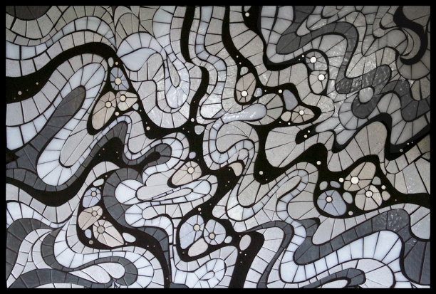
Impel offers a microcosm of the social landscape; we are constantly changing and being changed by interactions with others. Ribbons of grout and glass dance through the piece, pulling the eye through twists and curves. The visual reference for this piece was wisps of smoke that twist and double back in a mesmerizing layers and lines. Strong contrasts between luminous glass and matte grout, curving forms and the light- (and attention-) catching iridescence and shine of glass take the work beyond decoration to viewer engagement.

See full images of Impel 5.3 installed here.


Art + nature in Asheville, NC

Finally made it to Asheville for a long weekend get-away from flat Chicago. What a terrific combination of natural beauty, amazing food and serious art. Having grown up in driving range of the Canadian Rockies, I am admittedly a mountain snob; but driving into Asheville through the Cherokee National forest gave us our first look at these lush, misty mountains. Driving into Asheville through the Cherokee National Forest


We spent a day driving the Blue Ridge Parkway, the blues and greens were amazing in the bright sunshine. At times we could count as many as 9 ridges of blue receding into the distance. We hiked at Craggy Dome and then got down to a lovely waterfall farther along the Parkway at Linville Falls. The radically different vegetation made it feel like a jungle hike with roots and vines and giant rhododendrons threatening to overtake the trail.

Blue Ridge Parkway

And Asheville itself was much larger than I expected and has a very impressive arts and gallery scene. Blue Spiral and Haen (represents Evanston painter and friend Byron Gin) were inspiring. I had a great visit with Chuck Barnett at Gallery Asheville where I found a fresh, edgy art vibe that I liked. My favorite public art piece was Growth of the New Gods (Mel Chin, 2012), which features a giant basketball vine growing across the facade of the of Asheville Art Museum. So much more to explore next time.

Asheville faves


Meandering rivers

My pilot brother, Geoff, knows all about my ongoing fascination with meandering river forms and promised to keep me supplied with images from his flight paths around western Canada. Meanders are caused by a velocity differential that cuts away the river bank at one edge while letting sediment build up at the other. This gradually creates that fantastic 's' shape that I love and have used as the basis for several art pieces. See my Inscribe series for recent work. Here are the latest images from northern Alberta near Lake Athabasca and the May and Owl rivers.

river meanders from northern Alberta | courtesy of Geoff Hancock c 2013

Form hunting: leaves

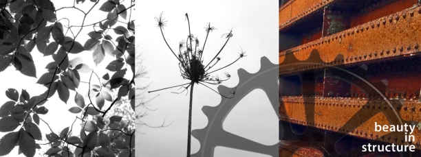
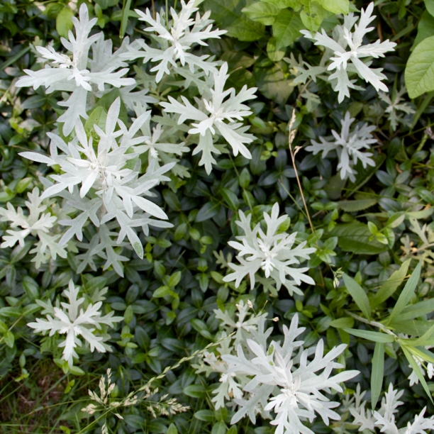
leaf hunting Went on a leaf hunt this morning for inspirations for new drawings. One of my favorite finds this morning is this foliage from a wild streetside parkway; almost like snowflake shapes from the top view.

The next series in development features abstracted botanical shapes in interaction with elements from the built environment. This is a continuation of my exploration of beauty and information. I am endlessly captivated by the information-rich natural world: a perfect balance of repetition and variation. The built environment has a completely different rhythm. The strong graphic lines in the built environment are functional, conveying information about strength, stability and movement. Living in urban settings requires a new way of connecting with beauty at the intersection points of the natural and built worlds.

foliage


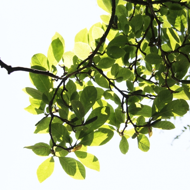
leaves in the sunlight

NeoCon 2013 at the Merchandise mart

First time to NeoCon today. NeoCon, short for The National Exposition of Contract Furnishings (ah, now that makes more sense), is an annual design world tradeshow at the Merchandise Mart. Contract furnishings are the central focus of the show but there are also surfaces, accessories, textiles, lighting, wall treatments, stone and ceramics and architectural systems. Neocon via Jackson St bridge

I wandered 7th and 8th floors. Found a few things in the surfaces category. Large-scale porcelains. Some acrylic resin products. A great CNC cutting studio, Ode Creative in Ann Arbor, Michigan.  Had an indepth conversation with Mapei. I wanted to compare notes with Laticrete but they weren't exhibiting. Favorite booth was hands down Sunbrella's. But in the end it was my green+blue+metal+glass Chicago that caught my eye as I came out of the Mart into a hazy late spring afternoon.

Chicago river from the Merchandise Mart

Jackson St bridge from the Merchandise Mart

Jackson St bridge from the Merchandise Mart

Work-in-progress: Impel 5.3

Impel 5.3 is underway and is the largest composition in the Impel series yet. Impel started in 2009 as a tiny inset in a kitchen backsplash that offered a social microcosm, a look at the interconnectedness of everyday life. At the time, I used a biological cell visual referent and have since refined the compositions using imagery of bubbles of oil in water, lines of ice and now smoke and vapor. For Impel 5.3, I wanted to get to more dancing, ribboning lines of grout and glass. I am doing plenty of clarifying and revising as I cut to get to the movement and energy I want. As always, I am focused on creating negative spaces in grout that will be equally compelling to the luminous glass elements. The palette is blue-grays. At this point, the lines are cut in blue-grays and blue-whites; the plan is to pull in blue tint glass for the interior forms. Impel 5.3 will be installed as a backsplash element in a brand new kitchen and will shimmer and shift with loads of natural light from south windows. Impel 5.3 glass palette


Impel 5.3 | 36" x 28" | cutting underway

See more of Impel series here.

Serendipitous reflections and refractions

I got such a nice email from a client this weekend. These extreme DIY-ers commissioned Realize8, a set of three mosaic insets which they embedded within tempered glass for an incredibly sleek installation. Check out the kitchen they did themselves--they integrated a lot of different elements into a sophisticated and cohesive space. Realize8 art backsplash


Realize8 art backsplash

On Sunday, she noticed a wild pattern of light refracted by one of the Realize 8 mosaic insets and sent these images. Their skylights must allow for this particular interaction of sunlight and glass.

Realize8 art backsplash | refracted light

Realize8 art backsplash | refracted light

I love these serendipitous reflections and refractions. My obsession with glass stems largely from the way in which the piece is co-created with the viewer in a given context. Glass comes to life by motion and interplay with light. Viewers passing by glass mosaics become participants in interaction with a series of moments that illuminate a space. All glass is reflectant but there are two materials that are particularly dynamic: 24k gold smalti and iridescent glass. 24k gold smalti is a spectacularly reflectant material and literally glows in low or indirect light conditions. Iridescent glass functions in a similar way shifting with light and movement but 'rainbow' iridescence can wildly expand the color palette. I typically use those with a more limited range of color variation to ensure a cohesive palette in all lighting conditions. I approach compositions thinking about how to use reflectance as a meaningful element that in shifting will catch attention and then contain new information to sustain attention.

More about Realize8 art installation can be found here.

Realize8 | detail