An information-scape at coLab Evanston

Amanda Bryant of HangItUp Chicago has invited me to hang work at coLab in Evanston. Amanda is bringing high quality original fine art into homes and offices using a rental model. She partners exclusively with Chicago area artists to connect with local clients, another angle on staying local. I met Amanda at Gallery, Now! and am delighted that she thought of my work for this light-filled, ideas-intensive workspace. coLab is a coworking and collaboration space for independent professionals and digital entrepreneurs. Working with coLab cofounder Miguel Wong has been fascinating. He has a clear vision of how art+aesthetics contribute to creating an inviting, energetic workspace. From programmers fixated on laptops to informal chats over coffee to afterhours events and meet-ups it's clear that Miguel and his partner Eric Harper are building the vibrant business community they envisioned for coLab.

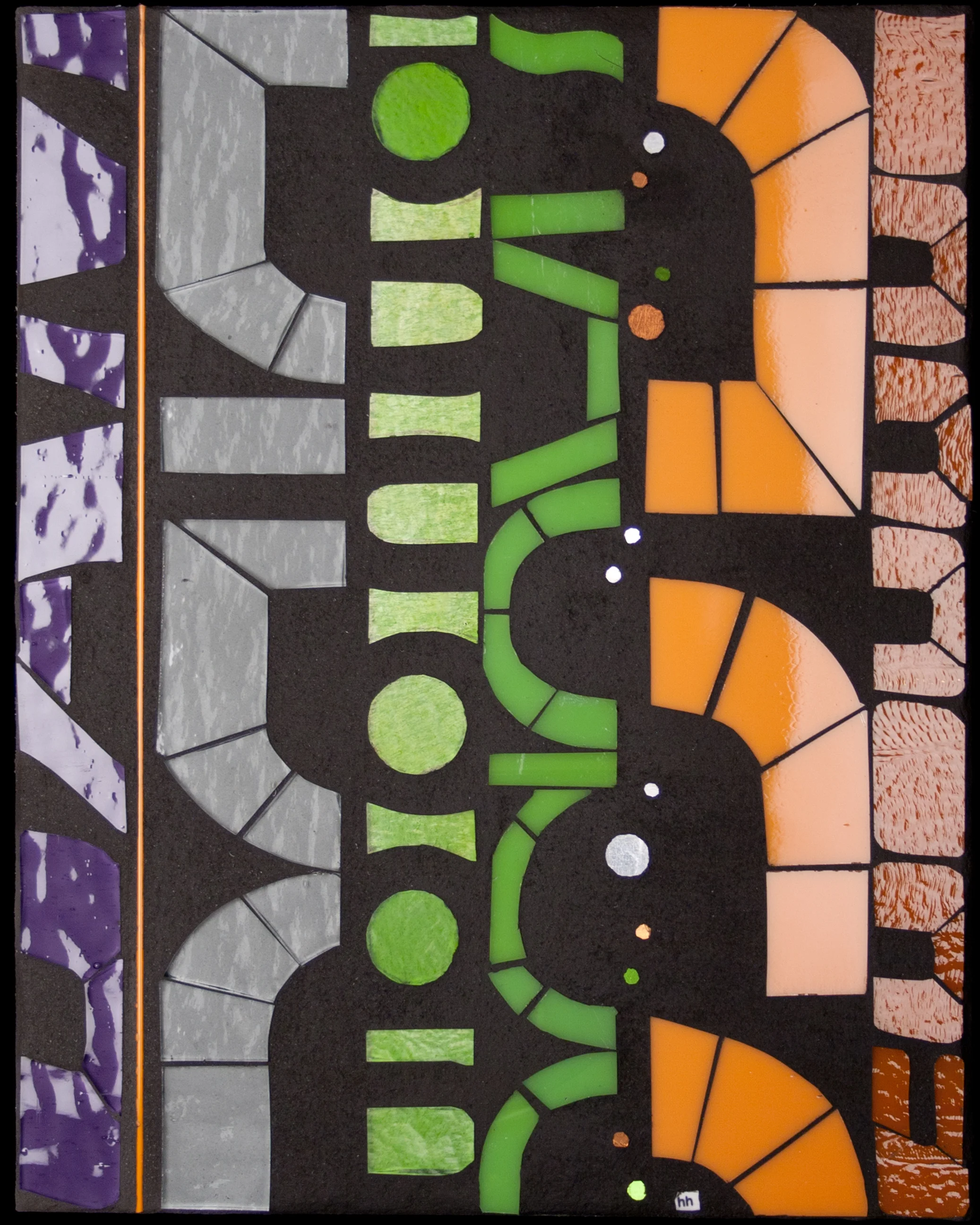
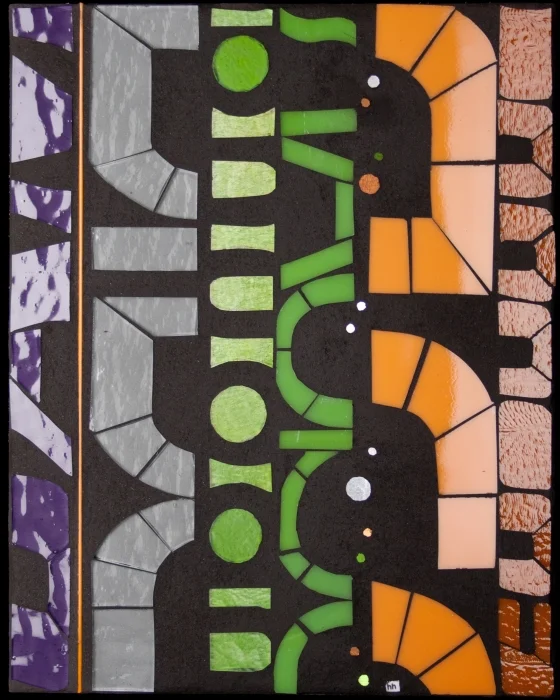
Pieces from the GLYPH and Scan series form an interesting conceptual connection with coLab where it's all about about information filtering, decoding and encoding. GLYPH's abstracted letter forms point to the creative potential of language. Scan considers our inherent interest in letter forms, offering abstracted text for our pattern-detecting, information-decoding minds. And they look pretty awesome lit up in the front windows at night.

More on coLab here: coLab 900 Chicago Ave | Suite 104 | Evanston, IL | 847.440.4880

More on HangItUp Chicago here: HangItUp Chicago

About Scan

I have been developing prototypes in a new series Scan over the past couple months. contemporary glass art I first started work on Scan in 2009. I had recently transitioned to using sheet glass and could envision a series of scrolling abstracted letter forms. As a speech language pathologist, I have a longstanding interest in language and cognition. Letter forms are inherently engaging to our pattern-detecting, information-decoding minds. With Scan, the viewer is enticed to decipher the abstracted letter forms. Using unfamiliar product names from construction materials reduces the contextual linguistic information to the point where decoding is impossible. Selective attention is activated to find pattern in the randomness. A seemingly simple act of reading is transformed into a cognitively demanding visual puzzle. In this way, the viewing experience points to that of the many people I encountered in clinical practice.

The first prototype of Scan was ungrouted glass on a painted background. The cutting was completely unfamiliar with radically new forms and shapes. I struggled to find a rhythm and ended up setting the piece aside, unfinished, and moving on to other projects.

Two things happened to bring me back to Scan this year. First, I started photographing labels from construction materials found around the studio and in my Home Depot wanderings. As I explored these images, I realized that the graphic retro fonts were perfect for Scan. The forms are solid, like building blocks and cropping these letters created lovely rounded, almost organic shapes.

Second. I read James Gleick's The Information. I am fascinated by effective information exchange between speaker and listener; that is, of the highly contextualized and personally relevant message. Gleick explores the history of information, information as message (the calculable point between randomness and pattern) and information systems and control. The centrality of information to technology and human life itself, shaping our daily lives and conscious moments renewed my interest in Scan as a visual exploration of information filtering and decoding.

Sectile cutting from strips of sheet glass lets me create these solid forms. The color palette was inspired by the original construction labels, a range of industrial greens, rusts and grays was translated into a popping bold palette of persimmon, burnt orange, spring and apple green and violet against charcoal gray. A sparkling line of gold circles suggests the bit, the smallest unit of information and the basis of computing technology. Language as information is beautiful and powerful and complex.

Twist 1.0

A new series is taking shape in the studio. Having grown up on a grain farm in northern Alberta, seasons and planting cycles are deeply engrained. I notice plants. I notice stems and leaves as much as blooms and fruit. I like watching color and form change across the growing season. I find deadheads just as interesting as full season blooms. Climbers and vines are particularly captivating: stunning lines are formed by incessant movement and twisting toward the light. I have been drawing Twist over this summer, using images of foliage and seaweed and vines as inspiration. I am equally interested in the luminous glass and the negative space of the matte grout.

Twist celebrates life and growth and vitality. It features spring and apple greens and new colors in my glass palette, pinks and corals. I have been searching for these colors since last fall. These tints from Bullseye require kiln firing to bring out their rich color. Many thanks to my good friend Paul Messink of Turtle Bay Glass for firing this glass.

The first piece is 10"x10". So many directions to explore with this new work. mixed media art

Studio Experiment: Connect 1.0

One of things that I have realized is that I'm essentially doing R&D: developing hypotheses, setting up experiments, executing, learning from the outcomes, revising my hypotheses and setting up the next experiment. Research has addressed concepts ranging from memory, the narrative self, the conscious moment through to identity and place, information processing and the evolving social landscape. Line, form, color, glass, adhesives, grouts are all variables in the research process. Every series is developed and iterated based on the outcomes of each experiment. I'm sure this model is a result of my science background and years of clinical practice in the data-driven healthcare industry. And I like it. I have always been compelled to understand why I'm doing what I'm doing. Same holds in my art studio/lab.

Within this R&D mindset, I want to do more small experiments this year. Take some outlier ideas in my drawing portfolio to develop and realize in glass. I always learn unexpected things in the translation from line to surface.

Connect 1.0 is an experiment with glass stringer. Stringer is tiny (2mm) and I am captivated by these precision lines, reduced even further by grout. I usually work with curving lines but I have had a circuit board sitting on my desk for months. I love the straight inter-connected lines and circles. I am fascinated by this maze as the basis of information flow and organization.

Impel 3: Linking interior + exterior

When architect Todd Pape and his wife Tracie started planning a conversion of their 3-car garage into a flexible indoor/outdoor space, they say that one of the things they agreed on early in the planning process was that they wanted to incorporate my art into the space. Love that. Todd, Tracie and their two school-aged (soccer fanatic) sons live on an astonishing country-in-the-city half-acre lot in the middle of Evanston. The original 1910 farmhouse is perched at one corner of the yard and at the other is a low-slung terracotta and brick clad garage. Rather than tackling a home renovation, Todd and Tracie saw the potential to convert their seldom used garage into a sleek indoor-outdoor multi-purpose space. Re-envisioning some of the building's original functional elements, Todd designed a minimal space that almost disappears as it points toward the outdoor world. Garage doors flood the space with natural light. When opened, the entire west wall disappears to create a literal indoor-outdoor connection--and in fact the garage door on the east wall can also be opened for an entirely open space. The original industrial concrete floors have been polished and stained a warm caramel. A mahogany pergola over a bluestone patio extends the space well into the yard and creates a striking facade for the 1-story building.

Todd and Tracie picked the Impel art series as the starting point for this commission. A nature-inspired palette of blues, greens and neutrals connects the work with their expansive yard and garden. Impel offers a social landscape, entities in interaction with each other and the environment leading to constant evolution and change. Impel1 and Impel2 were completed in 2009 and were my first large-scale pieces using sheet glass. I was thrilled with my newfound freedom to cut in glass the lines and forms I could envision and draw. Three years later, my cutting technique has continued to progress and new lines and refined forms can be seen in Impel3. I love the implication of constant movement and impingements that leave us changed and re-shaped, only to be changed again. The social landscape ideas connect directly with Tracie's work as a therapist and meditation mentor. And, in fact, one of the primary uses of the space will be Tracie's mediation practice.

At the entrance to the space, Todd had 8" x 8" niches constructed on either side of the door, lit by overhead sconces. Two 8" x 8" Impels cropped from the larger piece and worked at a much larger scale to create self-contained compositions prime the viewer for the full size Impel3 (24" x 24") seen directly upon entering the space. The interior wall where Impel3 hangs is painted with black chalkboard paint, adding a playful, kid-friendly feature to the space while at the same time creating a dramatic backdrop against which Impel3 floats and shimmers.

3-Day Sale with Fab.com

Fab.com and hhmosaics I am delighted to be collaborating with Fab.com to introduce Mosaic Elements to a wider audience of design enthusiasts. BLOOM, FLOAT and GLYPH are available to Fab.com members at special pricing now through Saturday, 5/19. Membership is easy--and free.

You can find the sale here at Fab.com

About FLOAT

FLOAT links directly back to earlier work in the Flow series. Flow explores movement through space and time with inevitable convergences and divergences. Trace (2006) was a four-part composition in this series, incorporating my ever-present circle form and organic interconnecting lines. My experiments with a threaded 24k gold smalti line as a linking device started with Trace. A recent commission for a healthcare facility brought me back to the Flow series which I used as a starting point to develop Float (2011), a multi-piece composition using new materials and cutting techniques. FLOAT has now been included in my Mosaic Elements series, offering the next iteration of movement through space and time. FLOAT suggests an aqueous setting and visual inspirations include droplets and bubble forms on water. The pieces in the Mosaic Element FLOAT series can be used as a narrative sequence with the shimmering sphere moving across the three pieces. Or a more graphic visual pattern emerges by using multiples of the same piece hung in different orientations. Color palette 'shine' suggests a sunlit daytime version while 'mist' conveys a shimmering moonscape.

See FLOAT Mosaic Elements

Searching for sparkle

I've had to search for sparkle this brown winter. Regular trips to the lakefront have yielded ice in many forms: countless different icicle formations, air bubbles in ice, ice crystals cantilevered over the sand, ice encrusted grass and trees, ice splashed rocks, ice spicules etc etc. But it just occurred to me that what I'm actually missing is hoar frost. I have never seen hoar frost in Chicago. The closest we get is when the cement-heavy lake-effect snow weighs down tree branches. But there's no sparkle. Often branches break. It's mostly bleak.

Waking up to an Alberta morning where literally every single branch and blade of grass is outlined in sparkling feathery ice cystals that glint and shimmer in the winter sunshine against an intense blue sky is pure magic. For a few hours there is a complete transformation from drab winter into a glittering wonderland, like living in a snowglobe.

I've always wondered about the unappealing name. "Hoar" comes from an Old English adjective which means showing signs of old age. If I were naming it, I'd call it "metamorphotic" frost for it's profound transformation of objects and landscape--or something more poetic like "ethereal" or "gossamer" frost. As a kid, hoar frost seemed like a random phenomenon but I'm sure my Dad could predict hoar frost conditions. It takes a clear, cold night where objects become colder than the surrounding air while a light wind circulates more humidified air allowing ice crystals to form and grow. Their size depends on temperature and humidity levels.

Gradually, the ice crystals fall away and it's back to winter normal. But there's always the chance of waking up in that sparkling magical place again tomorrow.

*Hoar Frost (2010) courtesy of the seriously talented photographer Adrian Michael based in Saskatoon, SK. You can see more of his fabulous images at www.adrianmichael.ca. I am particularly drawn to the familiar canadian landscapes made otherworldly in Adrian's 'Rockies' and 'Prairie' portfolios.