Impel 5.3

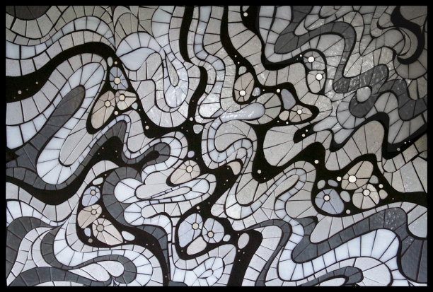
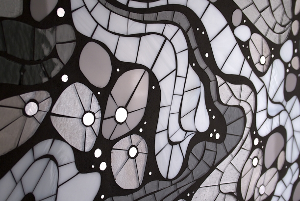
Impel 5.3 | 36" x 28" | c Heather Hancock 2013 Impel 5.3 is installed and sparkling in a brand new home on the northshore.

Impel offers a microcosm of the social landscape; we are constantly changing and being changed by interactions with others. Ribbons of grout and glass dance through the piece, pulling the eye through twists and curves. The visual reference for this piece was wisps of smoke that twist and double back in a mesmerizing layers and lines. Strong contrasts between luminous glass and matte grout, curving forms and the light- (and attention-) catching iridescence and shine of glass take the work beyond decoration to viewer engagement.

See full images of Impel 5.3 installed here.


Art + nature in Asheville, NC

Finally made it to Asheville for a long weekend get-away from flat Chicago. What a terrific combination of natural beauty, amazing food and serious art. Having grown up in driving range of the Canadian Rockies, I am admittedly a mountain snob; but driving into Asheville through the Cherokee National forest gave us our first look at these lush, misty mountains. Driving into Asheville through the Cherokee National Forest


We spent a day driving the Blue Ridge Parkway, the blues and greens were amazing in the bright sunshine. At times we could count as many as 9 ridges of blue receding into the distance. We hiked at Craggy Dome and then got down to a lovely waterfall farther along the Parkway at Linville Falls. The radically different vegetation made it feel like a jungle hike with roots and vines and giant rhododendrons threatening to overtake the trail.

Blue Ridge Parkway

And Asheville itself was much larger than I expected and has a very impressive arts and gallery scene. Blue Spiral and Haen (represents Evanston painter and friend Byron Gin) were inspiring. I had a great visit with Chuck Barnett at Gallery Asheville where I found a fresh, edgy art vibe that I liked. My favorite public art piece was Growth of the New Gods (Mel Chin, 2012), which features a giant basketball vine growing across the facade of the of Asheville Art Museum. So much more to explore next time.

Asheville faves


Meandering rivers

My pilot brother, Geoff, knows all about my ongoing fascination with meandering river forms and promised to keep me supplied with images from his flight paths around western Canada. Meanders are caused by a velocity differential that cuts away the river bank at one edge while letting sediment build up at the other. This gradually creates that fantastic 's' shape that I love and have used as the basis for several art pieces. See my Inscribe series for recent work. Here are the latest images from northern Alberta near Lake Athabasca and the May and Owl rivers.

river meanders from northern Alberta | courtesy of Geoff Hancock c 2013

Form hunting: leaves

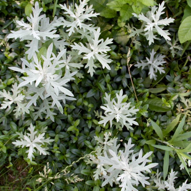
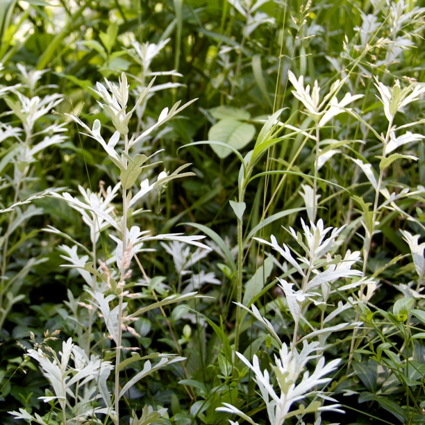
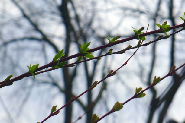
leaf hunting Went on a leaf hunt this morning for inspirations for new drawings. One of my favorite finds this morning is this foliage from a wild streetside parkway; almost like snowflake shapes from the top view.

The next series in development features abstracted botanical shapes in interaction with elements from the built environment. This is a continuation of my exploration of beauty and information. I am endlessly captivated by the information-rich natural world: a perfect balance of repetition and variation. The built environment has a completely different rhythm. The strong graphic lines in the built environment are functional, conveying information about strength, stability and movement. Living in urban settings requires a new way of connecting with beauty at the intersection points of the natural and built worlds.

foliage


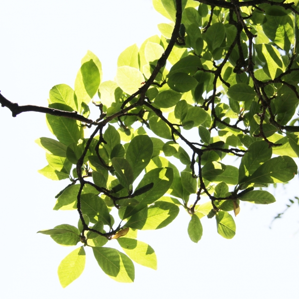
leaves in the sunlight

NeoCon 2013 at the Merchandise mart

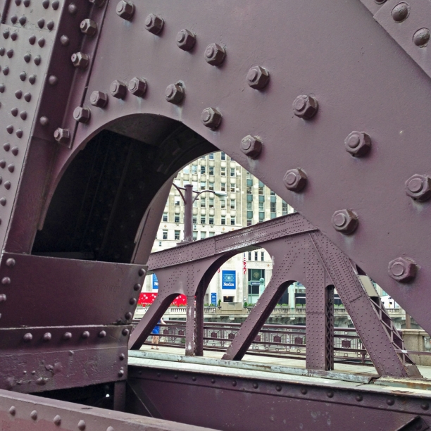
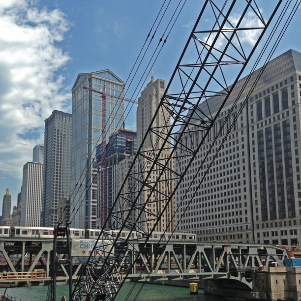
First time to NeoCon today. NeoCon, short for The National Exposition of Contract Furnishings (ah, now that makes more sense), is an annual design world tradeshow at the Merchandise Mart. Contract furnishings are the central focus of the show but there are also surfaces, accessories, textiles, lighting, wall treatments, stone and ceramics and architectural systems. Neocon via Jackson St bridge

I wandered 7th and 8th floors. Found a few things in the surfaces category. Large-scale porcelains. Some acrylic resin products. A great CNC cutting studio, Ode Creative in Ann Arbor, Michigan.  Had an indepth conversation with Mapei. I wanted to compare notes with Laticrete but they weren't exhibiting. Favorite booth was hands down Sunbrella's. But in the end it was my green+blue+metal+glass Chicago that caught my eye as I came out of the Mart into a hazy late spring afternoon.

Chicago river from the Merchandise Mart

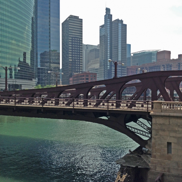
Jackson St bridge from the Merchandise Mart

Jackson St bridge from the Merchandise Mart

Work-in-progress: Impel 5.3

Impel 5.3 is underway and is the largest composition in the Impel series yet. Impel started in 2009 as a tiny inset in a kitchen backsplash that offered a social microcosm, a look at the interconnectedness of everyday life. At the time, I used a biological cell visual referent and have since refined the compositions using imagery of bubbles of oil in water, lines of ice and now smoke and vapor. For Impel 5.3, I wanted to get to more dancing, ribboning lines of grout and glass. I am doing plenty of clarifying and revising as I cut to get to the movement and energy I want. As always, I am focused on creating negative spaces in grout that will be equally compelling to the luminous glass elements. The palette is blue-grays. At this point, the lines are cut in blue-grays and blue-whites; the plan is to pull in blue tint glass for the interior forms. Impel 5.3 will be installed as a backsplash element in a brand new kitchen and will shimmer and shift with loads of natural light from south windows. Impel 5.3 glass palette


Impel 5.3 | 36" x 28" | cutting underway

See more of Impel series here.

Serendipitous reflections and refractions

I got such a nice email from a client this weekend. These extreme DIY-ers commissioned Realize8, a set of three mosaic insets which they embedded within tempered glass for an incredibly sleek installation. Check out the kitchen they did themselves--they integrated a lot of different elements into a sophisticated and cohesive space. Realize8 art backsplash


Realize8 art backsplash

On Sunday, she noticed a wild pattern of light refracted by one of the Realize 8 mosaic insets and sent these images. Their skylights must allow for this particular interaction of sunlight and glass.

Realize8 art backsplash | refracted light

Realize8 art backsplash | refracted light

I love these serendipitous reflections and refractions. My obsession with glass stems largely from the way in which the piece is co-created with the viewer in a given context. Glass comes to life by motion and interplay with light. Viewers passing by glass mosaics become participants in interaction with a series of moments that illuminate a space. All glass is reflectant but there are two materials that are particularly dynamic: 24k gold smalti and iridescent glass. 24k gold smalti is a spectacularly reflectant material and literally glows in low or indirect light conditions. Iridescent glass functions in a similar way shifting with light and movement but 'rainbow' iridescence can wildly expand the color palette. I typically use those with a more limited range of color variation to ensure a cohesive palette in all lighting conditions. I approach compositions thinking about how to use reflectance as a meaningful element that in shifting will catch attention and then contain new information to sustain attention.

More about Realize8 art installation can be found here.

Realize8 | detail


Scan 5.1

Our information-decoding minds are naturally attuned to pattern in the world around us. Finding pattern and information within noise is deeply rewarding--and a critical survival skill. Work in the Scan series considers pattern-detection in the context of linguistic symbols. Abstracted text elements from construction material labels are transformed into powerful, elegant forms that tempt the viewer to decode and decipher. Expanding beyond the linguistic context, Scan 5.1 incorporates pattern and information from architectural elements found in the urban landscape. Scan 5.1 | 14" x 14" | glass, stringer, grout on art board

Every time we drive the Chicago Skyway, I attempt to take images of the industrial corridor around Gary, IN. I can't resist the intricate geometry and repetition in the steel structures. The concepts of permanence and ephemerality are also present in the mismatch between the encoded information about structure and stability and longevity and the evidence of disrepair and decay and ruin.

Inspiration image | Urban landscape

In Scan 5.1, a collaged composition of abstracted architectural elements and linguistic elements, presents a broader approach to information-finding and and an entirely optimistic view of our interaction with place: there is beauty and information in structure. The geometry of a central pulley is reduced to its essence. Cut in warm ambers and animated with small points of iridescence, the form is re-imagined as an organic element. Stringer creates a lattice work, a kind of urban vine, based on smaller steel and cable structures. Grout creates the image of massive beams with the negative space completed in glass. Abstracted linguistic forms were cropped to emphasize curved and linking elements, pointing to the idea of letter forms as organic forms with endless creative potential.


Scan 5.1 | 14" x 14" | glass, stringer, grout on art board


Full set of images of Scan 5.1 can be seen here.


Ephemerality and permanence

My daughter and I attended an awe-inspiring 2 1/2 hour concert by the Chicago Youth Symphony Orchestra on Sunday evening. My daughter is in her fourth year of cello and has a truly gifted friend playing violin with the CYSO. We had no idea what we were in for. After the thrilling and familiar Tchaikovsky (Symphony No 4 in F minor) performed by the Concert Orchestra, the Symphony Orchestra (seriously?! there's an even more advanced group of these ridiculously talented young musicians!?) performed music from Stanley Kubrick's 2001: A Space Odyssey with work by Gyorgy Ligeti, Aram Kachaturian and Richard Strauss. The work is instantly recognizable and watching it take form on stage was spell-binding. Neither the Ligeti nor Strauss pieces adhere to typical symphonic structure. Ligeti's Atmospheres is described as sound mass--incredibly complex, layered points of sound are massed into a sound shape with tremendous depth and texture. Richard Strauss' Also sprach Zarathustra was played in its entirety--another seriously complicated, densely textured tonal poem. Conductor Allen Tinkham spoke briefly about the CYSO philosophy of music education as not about reading many, many individual notes, but about learning how to read individual notes as ideas that lead to more ideas and add up to big ideas. Love that. And see a tiny connection with how my work is progressing technically. It is critical that individual cut pieces, or tessera, are understood within the broader context of the full composition with each piece contributing to coherent progression in the movement of line or construction of form. Each individual piece contributes to the whole idea and in that each cut matters.

Attending a concert always raises the issue of the interplay between ephemerality and permanence for me. This music has been experienced by countless music-enthusiasts across the decades...and centuries. And each experience has been a unique interaction between score, conductor, musicians, instruments, performance space and acoustics, audience and individual listeners. A magical evening, now gone. In my work with glass, idea and aesthetic are permanently encoded in glass and grout. The work will, however, shift and shimmer with light and movement, offering the viewer a moment soon gone, yet filled with radiance.


Impel 5.1 | detail

Full images of Impel 5.1 | 12" x 24" can be seen here.

Information in structure: Next steps in Scan series

The concept for Scan 5.1 is taking shape. The Scan series is about detecting pattern and information using a linguistic context. Scan 5.1 extends the idea of finding information to the urban landscape. Forms were abstracted from a bridge or pulley or crane that I attempt to photograph every time we drive over the Chicago Skyway and get a glimpse into the awe-inspiring industrial landscape around Gary, IN. information in structure | bridge in Gary, IN

This particular commission is a wedding gift and a bridge certainly works as an interesting metaphor: a carefully designed and rigorously constructed structure to support, connect and move across an otherwise inaccesible span. Aesthetically, this will be an urban, collaged piece with significant black grout component. Getting to the right resolution for a small 14" x 14" piece presents some challenges. The plan is to use grout as the positive space and gray tint glass as the negative space for the element on the left. Stringer will be used to create the intricate structure on the right side of the piece. The pulley form was reduced down to a geometric shape that could be rendered in glass. Cut in pale amber and medium iridescent amber, I am expecting it to read as an organic element as well as an industrial form. This connects with the idea of beauty in structure.

composition | Scan 5.1| glass mosaic art

Spring geometry

I really need my micro-moment images in the fantastic overwhelm of spring to find specific geometries and patterns that at any bigger scale are impossibly intricate and complicated. Having watched this azalea from last fall and through the winter, I am fixated on the offset branches that give every bloom an equal access to light. The leaves have an even more intricate geometry, spiraling out at 137 degrees (is that it!? golden ratio?) so as not to overlap each other. Love.


beauty in structure | magnolia blooms


Information decoding: next steps in Scan series

I'm working on a next step in my Scan series. Scan originated as an exploration of our inclination to detect and decode pattern using a linguistic context. This impulse to decipher abstracted letter forms leads to the cognitive engagement I strive for in my work. Scan 3.0 is a series of collaged abstracted letter forms using paint and ungrouted glass. I loved how glass literally layers against the painted elements, functioning as both a form and a lens to access additional information. glass mosaic art

I want to figure out the grouted version of this work. The challenge is the limited resolution for layering using only cut glass elements. I have experimented with using underpainted elements but there are technical issues with not being able to use thinset and not having a perfectly clear adhesive alternative. An under-painted image in a grouted piece is also difficult to perceive at small scale.


Inscribe 3.1

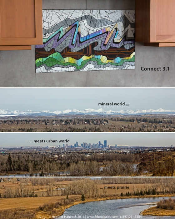
I used a google map image of a tiny oxbowed prairie river bordered by grasses and foliage to develop the concept image for Inscribe 2.1. The patchwork of tessellated fields stretched out beyond, intersected by the geometries of roads and buildings. I love this patchwork. I have always found it mesmerizing to watch the land from an airplane. The shapes are wildly varied and complicated from the air but on the ground we experience the landscape as seamless and coherent. glass art

When I sat down to discuss this next commission with the client, the idea of taking a topographic perspective made sense given the client's affinity for landscape and pattern in fields and natural forms of trees, rocks and rivers. I found aerial images of riverways and foliage in the Chicago area in interaction with the geometries of surveyed roads and farmland alongside the randomness of fields and crops and buildings.

Inscribe 3.1 is the next step in the series that considers our interaction with the land. A river form is a powerful dynamic form, constantly changing and evolving over time. Fractal lines result from this intersection of the natural world with the built world. Living in urbanized settings requires new ways of seeing and connecting with the land.


glass art


Full set of images of Inscribe 3.1 can be seen here.


Trace 3.1 | Inspired by neurobiology

16" x 16" | glass, gold, grout on cradled artboard


I remember when I first read about the emerging science of neuroplasticity and the potential for lifelong change and adaptability in Stuss and Benson's book, The Frontal Lobes. I was embarking on my undergraduate degree in Speech Pathology in the Faculty of Rehabilitation Medicine at the time and this concept was a game-changer. I went on to complete my Master of Science in Speech Pathology focusing on adult neurogenic communication disorders. I came to my art practice alongside a decade of clinical and administrative roles in Chicago area hospitals.

Neurobiological forms have deeply influenced my drawing practice. Curving, interconnected lines of axons, soma and dendrites form the infrastructure for the basic unit of communication in the brain, the action potential. Adequate activation leads to an electrical signal traversing the dendrites to connect with the next axons in the network. Tiny circles of gold are a recurrent element in my work, undoubtedly connected to synaptic transmission. The idea of our coherent self emerging from this impossible tangle of neurons is endlessly intriguing.

I was thrilled when a client asked if I could create a piece as a gift for a student completing her PhD in neurobiology at Columbia. The student counts Eric Kandel, a nobel prize winning neurobiologist, among her mentors. Eric Kandel is responsible for synthesizing a new understanding of memory. I highly recommend his 2007 book In Search of Memory. This past year I have read and re-read another book, Portraits of the Mind, which documents the amazing techniques of neuro-imaging. As it turns out, the author of this excellent book, Carl Schoonover, is also completing doctoral work in the same department at Columbia.

The challenge of Trace 3.1 was to use the gorgeous imagery of neurobiology to get to my own imagined lines and forms. I identified three or four images from Portraits of the Mind to study but I ended up using images of tree branches to arrive at this intertwined abstraction for Trace 3.1. Grout and glass make reference to neuroimaging techniques with the illumination of foregrounded elements while the tangled network recedes into the background. Biosensors have revolutionized neuroscience technique in studying pathways and interconnections which support various cognitive functions. The color palette of Trace 3.1 refers to the first biosensor, green fluorescent protein (GFP). I'm looking forward to more in this series.

neurobiology art inspirations


Full set of images of Trace 3.1 can be seen here.


Trace 3.1 detail