Nest | glass loves brick
Integrating glass alongside other architectural surfaces creates the opportunity for both a conceptual and material dialogue. I am interested in re-thinking ornamentation as an opportunity for meaningful viewer engagement.
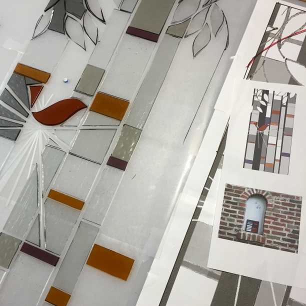
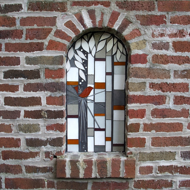
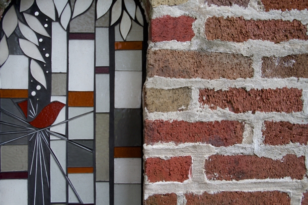
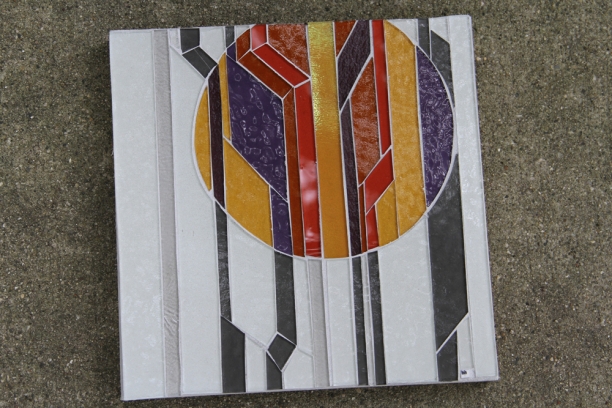
The niche is small and seen at a distance from the backyard patio, so bold, simple compositional elements with color palette tie-ins will create an integrated installation. Abstracted tree trunks using vertical elements play off the strong horizontal patterning of the brick. The completely lovely concept of home as nest is expressed using crisp, graphic elements.
The completed installation creates an interesting material dialogue between the polished glass and textured brick. The vertical elements play off the strong horizontal brick pattern, creating a new view in the niche with an integrated palette of whites, grays, ambers and violet.
Full set of images of Nest here
exterior art installation with brick
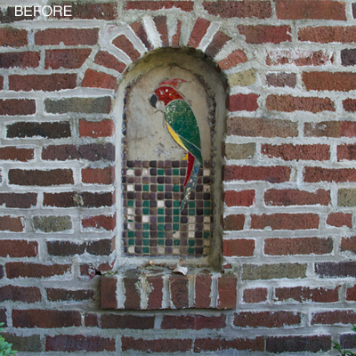
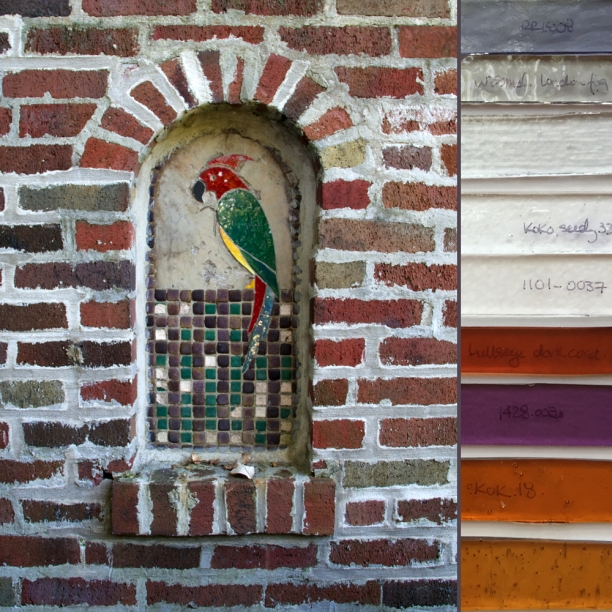
In my installation work, I approach glass as an architectural surface that can add a vibrant visual narrative to a space. Integrating glass alongside other precision architectural surfaces creates the opportunity for both a conceptual and material dialogue. I am interested in re-thinking ornamentation as an opportunity for meaningful viewer engagement. The next project integrates glass within a niche in a gorgeous textured brick wall. The goal is to create a composition that both connects with and reads against this strong brick patterning. The red ceramic parrot is out-of-context in an Evanston backyard; however, the homeowner has bird imagery in much of her extensive art collection so a re-working of the bird concept is a goal.
The niche is small and will be seen at a distance from the back yard and patio, so bold, simple compositional elements with color palette tie-ins will create an integrated installation. Abstracted tree trunks using vertical elements play off the strong horizontal patterning of the brick. The completely lovely concept of home as nest is expressed using crisp, graphic elements.
passiflora in situ
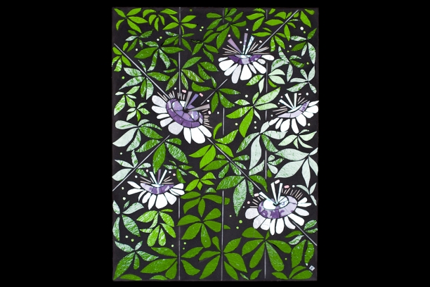
passiflora
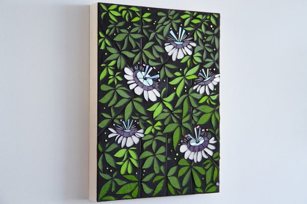
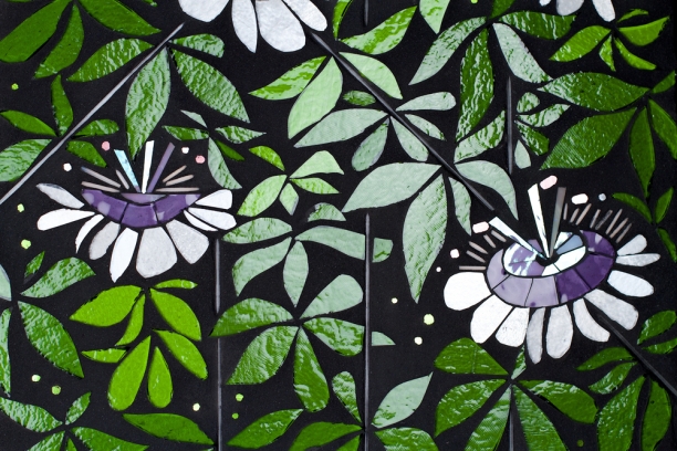
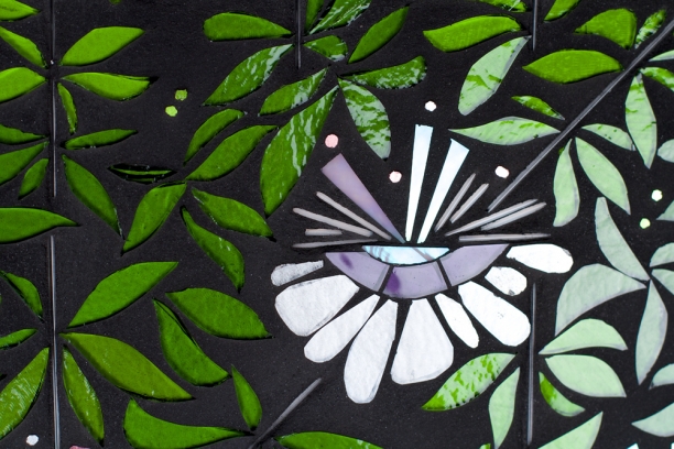
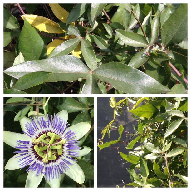
Ideally commissions get you to new discoveries and learning--Passiflora is a case in point. This commission is essentially a branding project. The collector asked for a composition featuring the passion flower both as an art hanging and to create visuals for business cards. The collector grows passion flowers in her lakefront urban courtyard and sees the geometrically complex, richly symbolic flower as a personal motif.
I approach glass as a low-res medium so all compositions are abstractions that will read in dimensional glass. Finding the essence of a real world object or concept and reducing it down to the salient features is step one in my process. I am also interested in the radical picturesque: constant change and transience that suggest states of becoming or unmaking rather than static perfection. I see the endless individual variations in nature as a way to understand objects and ideas as in transition. Encoding transience in the rigid permanent media of glass is an interesting challenge. Utilizing the reflective properties of glass so that select elements within the piece shift and shimmer with light and movement ensures the dynamic nature of the work. I also approach my drawings as a guideline. New rhythms emerge as the piece is built with variations in line and form echoing those found in nature.
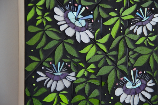
The passion flower is a tremendously complex bloom with layered geometric elements.
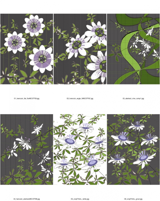
Preliminary concepts featured glass stringer as an obvious material proxy for the fringe-like interior element of the bloom. The first concepts flattened the flower to get the full geometry of the inner middle and exterior elements. While accurate, the blooms were flat and lifeless. I explored other compositions and found more energy by contrasting the vine elements with crisp structural lines of a deconstructed trellis and wall. Visualizing the blooms in profile gave me a way to find more variation in the petal structure. I cut this concept and then, in consultation with the client, decided the bloom elements needed additional definition and color to be readable as passion flowers.
The final concept then pulled in purple and iridescent mauves for the interior bloom elements. These edits bring the blooms to life in a shimmering abstraction of the actual geometries. Variations in form, size and color in the vine and bloom elements signal growth and becoming for the entire plant, a visual metaphor for the ongoing act of becoming.
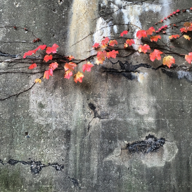
radicalized picturesque
In the Sympathy of Things: Ruskin and the Ecology of Design, architect and philosopher Lars Spuybroek writes about the need for a radicalized picturesque. We have a natural inclination to connect deeply with objects in our world. The loose ordering of pieces assembling into a coherent whole is deeply compelling in the picturesque but requires constant updating to avoid becoming an impossibly perfect, rigid image. This image epitomizes radicalized picturesque for me. Nature is in constant transition with continual change in line, form and palette. On a different time scale, nature is in interaction with the built world, bringing texture and roughness and complexity to pristine, regular architectural surfaces. These interactions ensure dynamic ever-changing points of visual interest in the built environment.
Nature gets it right every time.
Open Studios Evanston
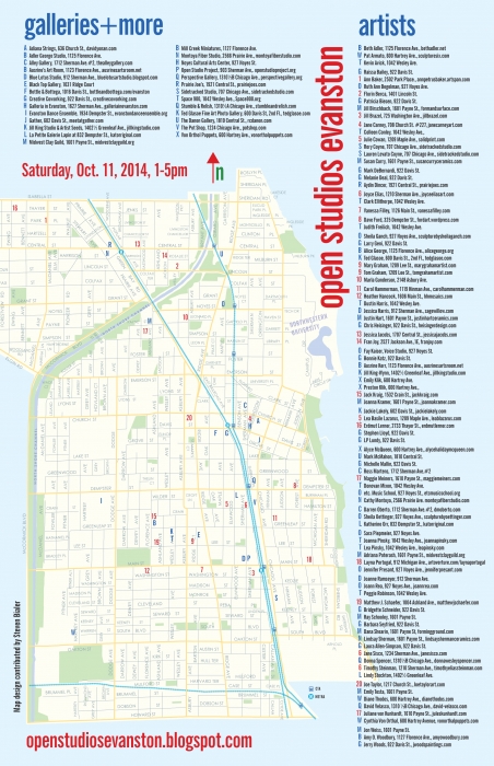
Looking forward to participating in the October Open Studios Evanston event this Saturday, 10/11 as part of Humanities Month celebrations around the city.
Oct Open Studios Evanston map PDF
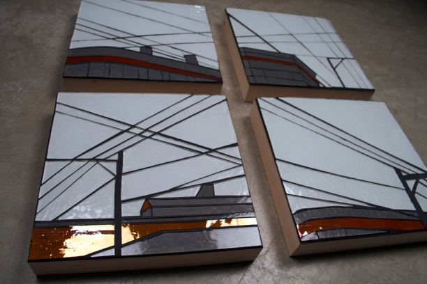
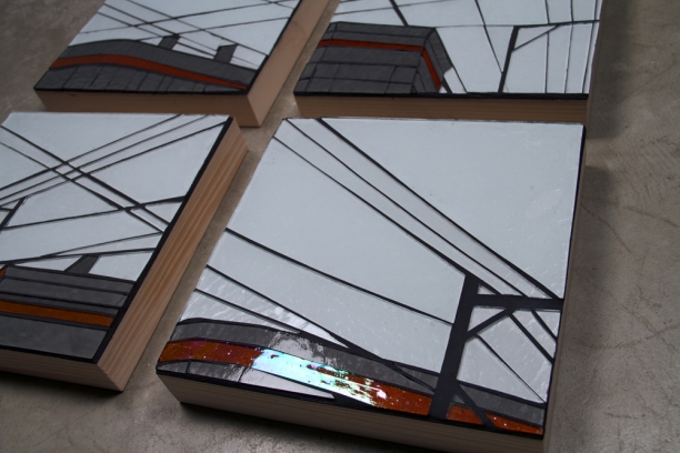
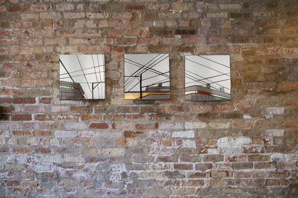
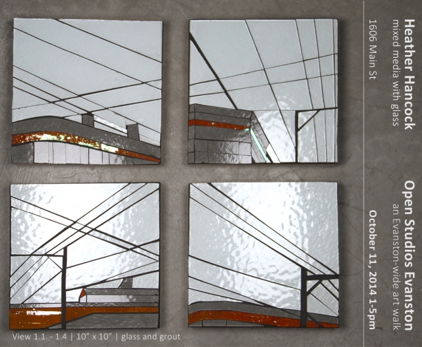
New work in the series View uses local Evanston street scenes as the basis for spare compositions in glass and grout.
1606 Main Street
1-5pm.
Proust project update: selecting scents
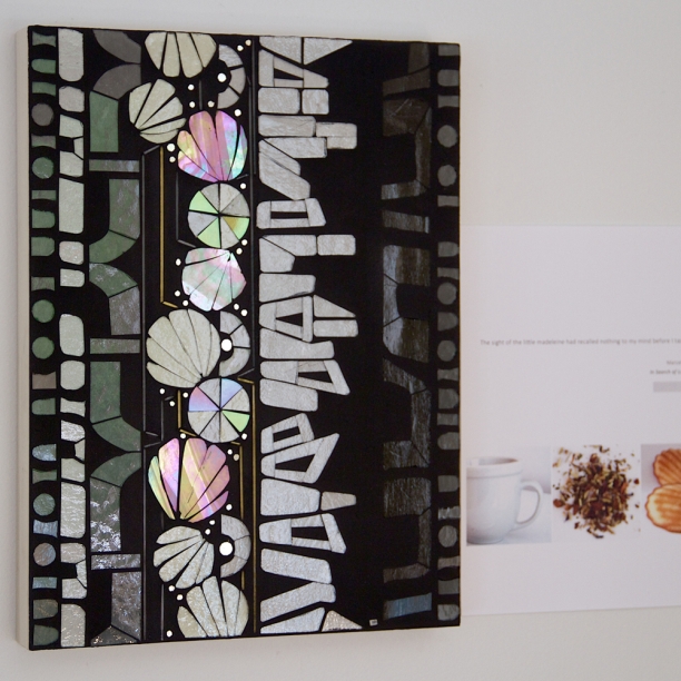
The Proust project is continuing to develop and take shape. I completed the majority of the art pieces for the project in the spring. Images of these art pieces are to be used as illustrations for a book on the neuroscience behind Marcel Proust’s In Search of Lost Time, written by Dr. Barry. Psychiatrist Dr. Barry explores the so-called “Proust phenomenon” in which intense, visceral memories are evoked by scents. Referencing throughout passages from Proust, the book explores topics of consciousness, memory, olfactory memory, involuntary memory, dreams, emotion and, ultimately, psychoanalysis in order to understand the evocative power of smell.
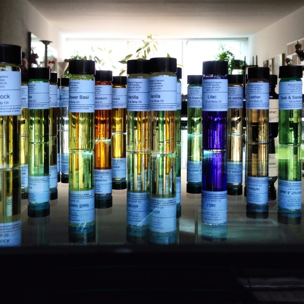
The next step in the project is to have scents micro-encapsulated and printed on cards with the art images. This will become a useful tool for readers in understanding how olfaction can trigger memory and connections.
The first scents to prototype are to accompany the madeleines and tea section. Saturday's meeting was about finding olfactory matches for cookies with notes of honey and almond and lime blossom tea.
The project has such interesting physical world elements (scents, tastes, art objects, photographs) alongside compelling text about the processes of mind that give rise to everyday lived experience. More as it takes shape.
View
I often notice compositions when I'm out running. A moving attentional frame finds a set of lines, an organic form or a repetitive pattern--discovering moments of aesthetic order in the urban environment. While nature maintains a perfect balance between repetition and variation, the built world can read as a highly repetitive sequence of hard material elements and chaotic transitions.
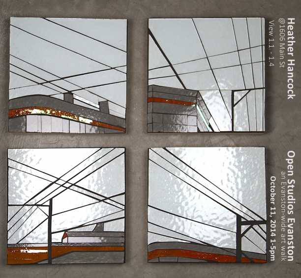
In View, I explore the rhythm and spare beauty of urbanscapes. Power lines criss-crossing the sky and architectural elements of building facades offer variation in line and form. Living in urban settings requires new ways of finding beauty and staying connected to nature.
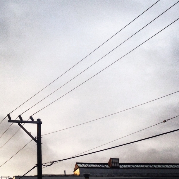
View started with this crop from an image taken on the alley at Greenleaf and Chicago in Evanston.
I'm participating in the Open Studios Evanston event again this fall as part of October Humanities Month. The inaugural Open Studios Evanston in June was a great event, connecting me with many new art collectors and neighbors. I'll be showing new work in the View series, along with many other studio experiments, prototypes and art pieces. Hope you'll get out and explore the 100+ artist studios+galleries +performances spaces participating on Oct 11th.
insta: El
Contemporary kitchen design: custom glass elements
I love a sleek, contemporary kitchen. My own kitchen features furniture-style pale gray laminate cabinets and drawers from German manufacturer Hofemeier, glossy gray Caesarstone and stainless steel. For us, the backsplash became an obvious space for a piece of functional art to bring visual interest and vibrancy to our otherwise neutral kitchen. Five mosaic insets with an animated abstract pattern vary the repetition of simple 1"x1" glass tile, bringing organic shapes and vibrant colors into the kitchen.
When it comes to a backsplash, there will be a designers and homeowners who want nothing but sleek, pristine surface. But there is another group looking to add some visual interest without compromising aesthetics in the central gathering space of any home. So can anything co-exist with sleek backsplash materials and custom cabinetry? Here are some renderings that range from an asymmetrically positioned small inset of cut glass through to a full-on celebration of light and color and form with abstracted botanicals.
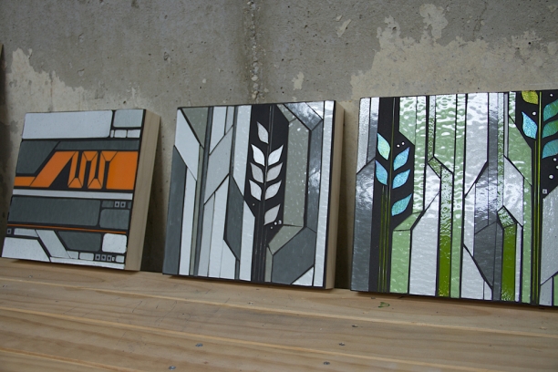
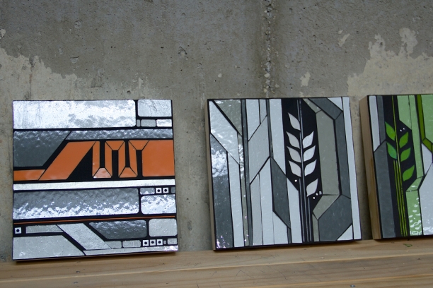
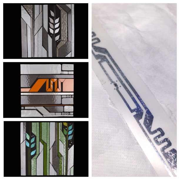
Grow (aka "digital prairie") comes from my interest in finding the points of intersection between the built and natural worlds. A prairie wheat form is re-envisioned within graphic circuit-board inspired line elements. Staying with grayscale lets the piece blend with the neutral kitchen, shimmering to add subtle visual texture and interest. The inset is the same width as as upper cab to create a coherent transition point.
Here Grow is rendered in a grayscale with greens palette. Grays and greens are so crisp. A pop of color in a neutral kitchen creates an immediate focal point and visual feature without changing the sophisticated feel of the space.
Or how about creating a much bigger impact with a full backsplash installation? Using a full palette of shimmering layered green glass brings the natural world indoors. A composition of abstracted letter forms from art series Scan makes reference to the urban world and creates a graphic, contemporary installation.
Get in touch. I'd love to hear about your project.
insta: architectural elements
summer nature fix: Alberta+BC
summer nature fix: Nova Scotia
 Summers always include catching up with our extended family in Canada. I see it as my nature fix. We spent time in the Annapolis Valley/Bay of Fundy area in Nova Scotia. I'm always overwhelmed by the sheer beauty and it takes me a few days to start taking photographs. Spectacular coves and beaches and forests everywhere. These are some highlights.
New Mosaic Art: Vertical garden concept
Rendering | Concept image Bloom is visualized as year-round color embedded within a vertical garden wall....
Growing season
The intricate circuitry line on my 5K race timing chip triggered another version of Urban Vine. The line is re-envisioned as vining and growing within a spare segmented urban landscape. Rendered in shimmering glass, the line comes to life with motion and light.
The built world is necessarily composed of segments, repeating elements and material transitions. Cut glass artworks have the same material requirements: individual elements and transitions composing a whole. This material connection makes it an ideal artform for inquiry into concepts of continuity and discontinuity, unity and intermittence in the natural and built worlds.
Living in urban settings requires new ways of discovering beauty and staying connected to nature.
See renderings of how I envision these concepts at larger scale.
Grow 1.0 | prototyping
 I have come back to this "Grow" concept that I started experimenting with in the fall. Connecting linear elements from the built world of technology and infrastructure with organic elements from the natural world, Grow is about finding unexpected points of beauty in the urban landscape. Living in urban settings requires new ways of finding beauty and connecting with nature.
These prototypes explore new color palettes and the varying degrees of complexity in the linear elements.
Living wall | concepts
I adore living walls. I clip them from magazines. I pin them onto my Pinterest board. I imagine how I could make one work in my little urban courtyard. But I'm pretty sure there's no such thing as a perennial living wall in our Chicago climate. Given our need for year-round color and visual interest, I'm thinking about glass as a sustainable, zero-maintenance proxy for plants. So I'm starting to generate concepts for a living wall in glass. And, as always, I want to figure out my own abstracted version. Presumably it would need to be a fairly large installation to create a visual impression so it needs to be easily fabricated. I like the idea of using my 'urban lines' (inspired by technology, infrastructure, traffic markings etc of the built world) to create a natural-meets-urban-world composition.

I used pale gray grout to keep the pieces very light and bright. And since it's an outdoor concept, I wanted to see it on an exterior surface.
